Showing posts with label THE SARTORIAL ELEGANCE OF SERIE A. Show all posts

Wednesday, 19 March 2025

THE SARTORIAL ELEGANCE OF SERIE A: PALERMO, 1990-92 [ABM]


Same old story: Palermo got their colours after a laundry incident turned their football shirts pink. The club had previously worn a combination of red and blue, so it's doubtful that such a mutation is even possible. In any case, the more widely accepted explanation is based upon a letter sent to the club's president, Joshua 'Giuseppe' Whitaker, in 1905 suggesting the change to pink and black to represent the rosolio and amaro produced by Whitaker's family business, which was drunk after a game in accordance with the result: rosolio – which is pink, sweet – after a win, and amaro – black, bitter – in defeat. (It is not known what was consumed in the event of a draw.)
The new colours weren't in fact implemented until 1907, the same year the club changed its name to Palermo Foot-Ball Club. Hitherto, they'd identified as the Anglo-Palermitan Athletic and Foot-Ball Club, reflecting the team's English ties: the aforementioned ornithologist Joseph Whitaker, Viceconsul Edward De Garston, Norman Olsen, George Blake, who had previously been involved in the establishment of Genoa Cricket and Football Club, as well as Ignazio Pagano, a local Italian who had been introduced to football during his two years spent studying in England.
The opportunity to actually play football was scarce and centred around matches against the crews of passing British ships. Indeed, the only other team in Sicily at the time was Messina FC, founded in 1900 by Alfredo Marangolo, who had studied alongside Ignazio Pagano in London. In 1901, the two of them would get together and organise a match between their respective teams, and again in 1904, before the arrangement was solidified with the creation of the Whitaker Challenge Cup in 1905. This annual fixture ran for four consecutive years (honours even) before the 1908 Messina earthquake put a terrible stop to it.
In its place, and quite independent from it, came the Lipton Challenge Cup. One of the crews Palermo had played against had been that of the Erin, a privately owned yacht belonging Sir Thomas Lipton. Palermo had won, and the tea-magnate rewarded them with a formidable trophy. Unable to commit to a rematch, Lipton stipulated that teams from Sicily and Campania should compete annually for the cup, which effectively meant Palermo playing against either Naples Foot-Ball Club or Unione Sportiva Internazionale Napoli. This competition ran until 1915, cut short by Italy's entrance into the First World War.
In the wake of the conflict, a number of smaller clubs emerged: Trinacria, Itala, Esperia, and Racing FBC. Valentino Columbo, who'd played for Palermo prior to the war, purchased Racing FBC, who played in blue and white halved shirt, and rebranded them Unione Sportiva Palermo. Within a year, he changed the colours to pink and black, facilitating a sense of continuity between the new club and the older one. More mergers were to follow – with Unione Sportiva Leoni in 1922, Sport Club Libertas Palermo in 1923, and 'Vigor' in 1927 – and another name change, to Palermo Football Club. Meanwhile, the team muddled along in Lega Sud, struggling financially.
By the time of Serie A's inauguration in 1929, Palermo were playing in Group D – the 'Southern Directory Circle' – and came top of it, gaining promotion into Serie B. Coincidently, that same year the club commissioned a new badge, which is worthy of note because it was designed by the Italian painter and futurist Giuseppe 'Pippo' Rizzo. Comprised of a horizontally inclined rhombus set against a stylised, brown leather football, it was replaced as early as 1932 after Palermo won promotion into Serie A. This was the moment at which the club adopted the symbol of the golden eagle, derived from the city’s coat of arms, which remains in place to this day.
 
Like so many other Italian football teams, Palermo would soon fall foul of Fascist initiatives. First they were obliged to ‘Italianise’ their name, and not long after were pressured into taking on the colours of municipal Palermo – red and yellow. In the midst of all this, they were relegated. If that wasn’t bad enough, in 1940 the FIGC kicked them out of the league due to insolvency.
Not for the first time, Palermo were forced into affiliation with a lesser but more economically stable local rival. The team in question was Juventina Palermo, who just so happened to wear the same colours that Racing FBC had. The partnership was retitled Unione Sportiva Palermo-Juventina and within a couple of years were playing in pink and black; within four, they were called more simply Unione Sportiva Palermo.
The 1950s and 1960s would represent a period of relative stability for Palermo. Flitting between series A and B, the most dramatic thing that happened to them was another change of name, to Società Sportiva Calcio Palermo, a by-product of the club listing itself as a joint-stock company. At some point during this period – probably the late 1960s – Palermo started experimenting with stripes. By the 1970s, this trend seemed to have passed, a decade that was spent almost entirely within the confines of Serie B.
 

1979-80

The idea that the football shirt, and sportswear in general, is something other than utilitarian came about in the 1970s. If you wanted to identify a 'year zero' then 1972 might do, when Adidas launched their trefoil logo in the run up to the Munich Olympics. Up until then, branding in football had been low key, often non-existent. By the end of the decade it would be ubiquitous, thanks to the efforts of firms such as Admiral, Umbro, Puma and, of course, Adidas. In Italy, the company that led the charge was Pouchain.
This golden age of footballing couture would last until the end of the century, whereafter sports kit started to become more technical – or would pretend to be. Even though the notion of the football shirt as high performing sportwear is slightly disingenuous, it is fair to say that the invention of manmade fabrics has been of some benefit to the game, has it has for many other sports. When Pouchain were active, acrylic was the material of choice, which had itself superseded wool and cotton. Ennerre favoured acrylic, before eventually getting on board with polyester in the early 1990s, while ABM liked to mix polyester with cotton.
Palermo have had gear manufactured by all three: Pouchain from 1979-80, Ennerre from 1980-86, and ABM from 1990-96. Designed by Piero Gratton, Pouchain’s shirt had by far the best badge: the silhouetted profile of an eagle's head framed within the outline of a diamond. The problem with it was that the fashion of the day dictated that the jerseys were tightly fitted. The Ennerre shirts were more forgiving but suffered from the fact that they didn’t incorporate the club’s insignia, which wasn’t so unusual back then (see also Como, Avellino, even Juventus). After two years with Ennerre’s offshoot company Ennedue, who were equally negligent, Hummel stepped into the fold. Again, the Danish firm didn’t see fit to incorporate a badge, but otherwise showed promise. Finally, ABM took over, and knocked the ball out of the park.
Palermo’s 1990-91 shirt might be their best. For one, it had a badge, although not Gratton’s, which the club had got rid of in 1987. Instead, a Iberian style shield, of the type Inter used throughout the 1980s, with an oblique pink and black stripe running through the middle and the basic outline of an eagle’s head over the top. The template itself was the same that was being used at Fiorentina, Piacenza, Messina and Ternana: collar, trimmed V-neck, ABM's logo running in vertical micropatterned lines within the fabric of the shirt. The sponsor was ‘Citta di Palermo’ in what I can only assume was some sort of tourism initiative, which let it down a bit.
For the next season, the minimal club crest was dropped for a more complicated rendering of an eagle almost in flight. The collar was now black, while the new sponsor – consumer electronics producer Sèleco – was printed in blue. ABM also produced a pink and black striped third version with diagonal micropatterning, which hardly seemed necessary but looked good all the same.
 

1991-92

The 1990s saw Palermo – or Unione Sportiva Città di Palermo, as they were known from 1994 onward – yo-yoing between series B and C. The new century brought with it a revival of fortune, with the club qualifying for the UEFA Cup/Europa League on three separate occasions. The bubble finally burst in 2019, whereupon Palermo were forced to reregister as Palermo Società Sportiva Dilettantistica and ply their trade in Serie D. Upon promotion into Serie C in 2020, they were permitted to restitute the name Palermo Football Club, and are currently playing in Serie B wearing gear supplied by Puma.

Monday, 23 September 2024

THE SARTORIAL ELEGANCE OF SERIE A: UDINESE CALCIO, 1987-90 [ABM]


Anyone with more than a passing interest in Italian football will probably know that the country's first football club was Genoa, established in 1893. But how many of us can name the second? Answer: Udinese, established in 1896. Just as Genoa began life as Genoa Cricket & Athletic Club, Udinese operated under the patronage of the Società Udinese di Ginnastica e Scherma (Udinese Gymnastics and Fencing Society). Such multifaceted sporting arrangements were not uncommon back then, and many an Italian team can testify to such origins. There normally came a point, however, when the football-oriented wing of these organizations would seek to establish its own identify.
For Udinese that point came in 1911, with the formation of the Associazione del Calcio Udine. Exchanging their all-black jerseys for black and white halved ones, the club registered with the Federazione Italiana Giuoco Calcio (FIGC), and were duly allocated a regional place in the 1912-13 Promozione. Pitted against Unione Sportiva Petrarca and Calcio Padova, Udinese came second in their group, which was enough to gain entry into the Veneto-Emilian section of next season's Prima Categoria, where they remained up World War 1.
Conflict over, Udinese became part of Associazione Sportiva Udinese, and the team's colours were again tinkered with: black-trimmed white shirts paired with white shorts and black socks. It was in this kit that Udinese made it to the first ever final of the Coppa Italia, losing to FC Vado by one goal, in 1922. [It should be noted that most of the so-called 'bigger' clubs in Italy were at the time registered with the Confederazione Calcistica Italiana and not eligible to compete in the Italian Cup, which was the initiative of the FIGC.] The same year the club was promoted into the newly created Prima Divisione, only to be relegated the following season.
Meanwhile, Udinese's mounting debts precipitated a separation from the Associazione Sportiva and would have ended in dissolution had the club's president, Alessandro del Torso, not raised enough money to keep them afloat. A reconfigured Associazione Calcio Udinese were promoted back into the Prima Divisione in 1825, but were relegated the year after into Group B of what was also called the Prima Divisione, given that the highest league had been rebranded as the Divisione Nazionale.


In 1930 Udinese advanced into a newly conceptualized Serie B as champions of the Prima Divisione, after coming top of Group C (Northern Division) and then defeating Palermo 3-1 in a played-off final. By now Udinese were wearing black and white striped shirts, a combination they would wear consistently over the course of the next five decades. Their form would remain consistent too, in a sense. The 1930s would be played out in Serie C, the 1940s saw Udinese competing in Serie B, the 1950s in Serie A, and the latter half of the '60s and most of the '70s spent back in Serie C.
It was towards the end of the 1970s that club began to revive itself. Having moved into a newly built stadium in 1976 – the Stadio Friuli, with its distinctive elliptical arch – Udinese completed a treble of sorts, finishing top of Group A of Serie C and winning both the Coppa Italia Lega Pro and the Anglo-Italian Cup. The following year, after abbreviating their name to Udinese Calcio, they were promoted into Serie A as champions of Serie B. Finally, in 1980, Udinese defeated Čelik Zenica in the final of the Coppa Mitropa.
 
After decades of sartorial stability, Udinese decided it was time for another change. Discarding the traditional black and white stripes, the club opted for a shirt con palo – literally, 'with pole'. In other words, white with a wide, black vertical stripe straight down the middle. Made by Pouchain it also featured a new crest, designed by the great Piero Gratton, depicting a zebra's head inscribed within a green circle. The badge didn't last long and was replaced in 1981 with a white shield displaying an inverted black V with a red Z beneath it – which stood for the home appliance manufacturer 'Zanussi', who had recently taken the club over – and the words 'udinese calcio' (lower case) printed above it. (For 1981-82, the jersey itself, produced by the Italian fashion brand Americanino, was adorned with the Z on its own, which I don't suppose went down very well.)
In 1984 Diadora succeeded Americanino as technical sponsor and made further alterations. The new shirt was essentially black but with a thick white band running diagonally from the left arm down across the torso, and also bore the name of a commercial sponsor, Agfacolor. Then in 1986 ABM took over from Diadora but left the jersey well alone.


Things came to a head in 1987. The Brazilian Zico had come and gone and Udinese's results hadn't been going their way. The club's involvement in the 1986 Italian football betting scandal saw them hit with a nine-point penalty deduction, resulting inevitably in relegation. As if taking stock, ABM reverted to the evenly gauged black and white stripes of Udinese's past. And a new sponsor: Rex, a high-end subsidiary of Zanussi. Writ in amber against a black background, and with a deliberately misaligned E, it brought welcome relief to an otherwise achromatic template – as did ABM's red, angular insignia. A neat, trimmed collar completed the look.
Udinese rounded off 1987-88 season in a mediocre tenth place, although the appointment of Nedo Sonetti as head coach in December had brought with it an improvement in form during the second half of the season. So it proved. In 1989, with the collar now removed, Udinese finished third, which got them back into Serie A. Foreign players were then purchased in an effort to stay there – the Argentines Abel Balbo and Nestor Sensini, Spanish veteran Ricardo Gallego – and a new coach too – Bruno Mazzia. ABM reinstated the missing collars, but everything else about the strip remained the same.
It didn't work out. Udinese were condemned to Serie B on the last day of the season, despite beating Inter 4-3. The club subsequently became embroiled in another match-fixing scandal that deferred their return to Serie A for a couple of years. Adidas replaced ABM before Lotto came along and ruined everything. Now firmly entrenched within Serie A, Udinese's gear is currently provided by Macron, who have seen fit to experiment with the various formats of their predecessors.

Saturday, 17 February 2024

THE SARTORIAL ELEGANCE OF SERIE A: SEVEN SHIRTS


Football shirts in the late 1990s described a sartorial nightmare, and this was as true in Italy as anywhere else. That grey and black horizontally striped 'third shirt' that Ronaldo wore for Inter. Juventus away, in which they won their last European Cup. Fiorentina jerseys sponsored by Nintendo, made by Fila. Parma in yellow and blue hoops. If they had fitted, that would have been something. Instead, they flapped about like an artisan’s smock.
One of the reasons for this was the rise of football as a global phenomenon, promulgated by the theatre of Italia '90. Hitherto, replica shirts had been aimed primarily at kids; hooligans didn’t tend to wear them for fear of attracting the wrong sort of attention. All of a sudden football was cool, and the fashion at that time was for loose fitting clothes. Companies that had only a passing association with the game, such as Puma, Reebok and Nike, decided that they’d like a piece of the action, which obliged more established firms, such as Adidas, Diadora and Kappa, to adopt more adventurous strategies. Nothing wrong with this from a business point of view, but fashion is not the same thing as good taste. Ergo, as football became more popular, the shirts became more ostentatious.
Up until the early 1980s they hadn’t been ostentatious enough. What changed was the introduction of polyester and the right for clubs to bear commercial sponsors. It is counter-intuitive that things like this could make a difference, but they did. Something else: back then, club badges and manufacturer emblems were sewn on, rather than printed, dye-sublimated or ironed, which gave the shirts a tactility that belied their true value. As well as all that, they fitted properly, were invariably V-necked and had collars.
Here are some of the finest examples.


INTERNAZIONALE, 1988-89


When Uhlsport took over from Le Coq Sportif in 1988 not much about Inter’s shirt changed: the sponsor remained the same, the club’s crest, the number of vertical stripes. What did change – aside from the manufacturer’s insignia and – was the textile: polyester in place of acrylic. This had an effect on the shade of blue, making it lighter, but it also allowed Uhlsport to radically overhaul the away shirt, which was white, installing a band of alternating blue and black rhomboids printed across the front of the shirt (the same motif would be adopted by the club generally, adorning flags and tickets).
The uppercase font of the sponsor, MISURA, is a delight, as are the two red dots that form part of it. The collar is simple, sleek and in harmony with the V-shaped neckline. Finally, Inter’s now defunct biscione ensign, with the gold star above, and Uhlsport’s logo, a black stylised letter U set against a white square with a red border. It was probably cheap to make but didn’t look it. How much of this was by design is another matter.


SAMPDORIA, 1988-90


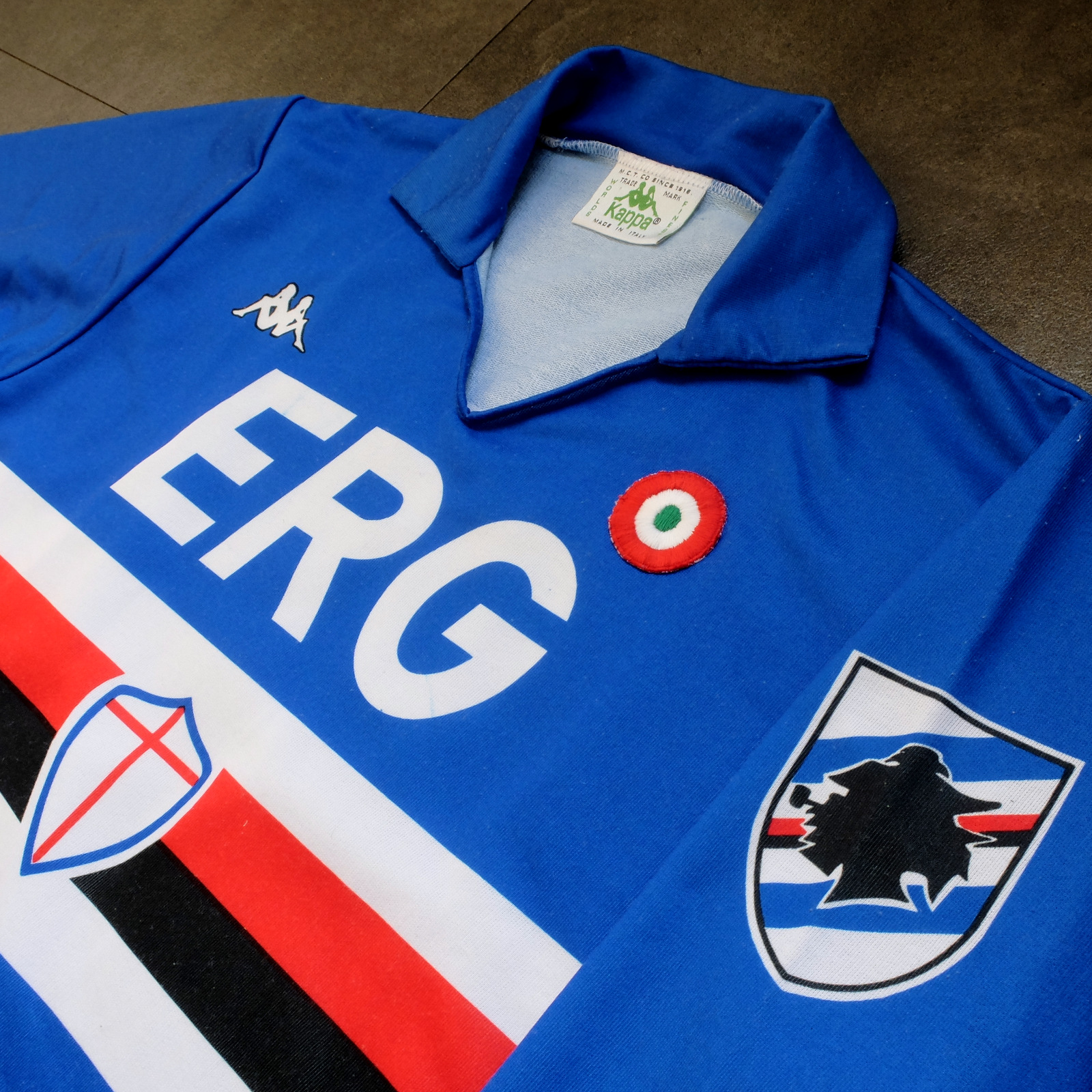
Sampdoria’s shirt rarely fails to deliver, but Kappa’s effort towards the end of the 1980s is the best of the lot. (Ennerre’s wasn’t bad either.) Oddly, what sets it apart, aside from the sinuous neckline and collar, is the italicised typeface of the sponsor, ERG. Everything else about it is routine. It has to be because there’s so much going on: the red, white and black horizontal stripes, the stemma San Giorgio at its centre, the manufacturer’s trademark. Maybe this is why in 1981 Ennerre decided to move the club’s crest to the left sleeve – to tidy it up a bit. At any rate, in doing so they made room for the coccarda, reward for winning the Coppa Italia. Sampdoria lifted the trophy in 1988 and again in 1989, so this particular jersey was never without it.
ASICS took over from Kappa in 1990 and barely changed a thing. They did, however, use a thinner material, which had the effect of altering the colour slightly, making it a touch lighter. 


NAPOLI, 1988-90


The jersey in which Napoli won their first ever scudetto is regarded as one of football’s greatest, but on closer inspection it can be found wanting. The sponsor, Buitoni, certainly looks the business, but the material – usually acrylic, sometimes cotton – belonged to a different era. In 1988 Ennerre finally got with the programme. While they continued to issue shirts made from their trademarked Lanetta (acrylic by another name), they also produced a polyester version, designed more than likely for the summer months.
At the same time Mars succeeded Buitoni as the club’s sponsor, initially written in white and then, later, black – presumably to improve visibility. Napoli won the UEFA Cup in 1989 and a second championship in 1990, whereafter the form of Diego Maradona began to deteriorate. It didn’t matter: he had become synonymous with Napoli and brought them unprecedented success, immortalising Ennerre’s shirt in the process.


FIORENTINA, 1989-90


When a friend introduced me to the delights of 110 Goals Italia Style in 1989 (on VHS) it wasn’t immediately obvious just how good Fiorentina’s shirt actually was. This is because they were wearing it with purple shirts and white socks, which detracted from its magnificence. When we sat down to watch the sequel in 1990, it became apparent (about a quarter of the way into it, as Baggio curls a diagonal ball into the back of Ascoli’s net) that Fiorentina were now wearing white shorts with purple socks. As well as that, they were sponsored by local rag La Nazione, rather than non-alcoholic aperitif Crodino, whose yellow and white lettering was less conspicuous than Crodino’s yellow and red. The shirt itself, made by ABM, was micropatterned, employing subtle shifts within the texture of fabric to create a pattern out of ABM’s logo – a stylised ‘S’ for Sportivo. It had a ribbed collar, a V-neck, and was of a moderately loose fit. The badge was the same that was reintroduced in 2021: a red fleur-de-lis appended to the letter ‘F’ set against a white circle with a purple border, far neater than the distended diamond-shaped crest Fiorentina used before and after. 
The following season ABM reinstated the purple shorts and Roberto Baggio was sold to Juventus.


A.S. ROMA, 1990-91


Roma had to wait until 1990 before Ennerre saw fit to provide them with polyester shirts, by which time the trend for micropatterning had begun to really take off. Strangely, Ennerre seemed to hedge their bets, supplying a plain, silky version as well as micropatterned one. (Napoli were presented with the same dilemma). The micropatterned version was hardly used, yet it is the superior iteration. The NR logo, repeated within the fabric of the shirt, is a neat design, and the jersey itself is a deeper, more satisfying shade of red. This, combined with Piero Gratton’s lupetto badge and the white italics of the sponsor, Barilla, qualify it as the club’s best shirt ever. Roma did well in it too, reaching the finals of both the UEFA Cup and the Coppa Italia, losing to Inter in the former and defeating Sampdoria in the latter. 


JUVENTUS, 1990-92


While AC Milan got to dress up in polyester as early as 1987, Juventus had to wait until 1988. Strange, considering that Kappa – the firm that issued both teams their kit – was a subsidiary of a larger firm called Maglificio Calzificio Torinese. The shirt in question, when it arrived, was sponsored by Ariston, the same company that had its name emblazoned upon the acrylic sarks Juventus wore the previous season. Then in 1989 Upim replaced Ariston, whose rounder font complimented the jersey’s simplicity. However, it still lacked something, which was colour. Juventus won the Coppa Italia in 1990, which provided it. Turns out they needn’t have bothered. Kappa, in a moment of genius, decided that their logo would now be coloured green. This seemingly innocuous detail meant that when the coccarda was removed in 1991, the shirt sustained its visual impact. In fact, it looked better without it, the green insignia on the right singularly complementing the two gold stars to the left. Danone succeeded Upim in ’92, and the svelte neckline and collar – the same that had graced the shirts of Sampdoria and Milan – were exchanged for something more substantial. Still a good effort, but the 1991-92 iteration takes the honours.


TORINO, 1992-93


By 1992-93 Italian football strips were on the slide, Umbro and Lotto being the main offenders. There were still some quality shirts knocking about – Brescia, Roma, Milan, Pescara, Juventus – but only one that really mattered: Torino’s. ABM were responsible, in a working relationship that stretched back to 1990. Nothing much changed throughout their three-year tenure, save for the sponsor in ‘91 (from Indesit to Beretta) and the introduction of a polo-style neck opening in ’92. (ASICS did a similar thing with Sampdoria’s jersey the same year but couldn’t resist adding horizontal stripes beneath the placket; less is always more.) Unlike with the shirts they’d supplied for clubs like Fiorentina, Pescara and Piacenza, ABM never embellished the fabric with their emblem. As a result, the deep burgundy really jumps out at you and contrasts nicely with the small amount of blue that features in Torino’s badge. It’s that collar that does it, though.

-------

If football tops like these were typical of the late 1990s then they would be highly prized, the reason being that people of a certain age became fans of Italian football off the back of Gazzetta Football Italia, which ran from 1992 through to 2002
. It’s question of cognitive bias: not of objective value judgements but subjective realities based upon nostalgia and fond memories. Precedently, football shirts had been governed by practical necessity, and were all the better for it. Thereafter, they became fashion accessories, as preposterous now as flares, bubble perms or a particularly bushy pair of sideburns.


[For a more in-depth analysis of each of these seven shirts, follow these links: Inter, Sampdoria, NapoliFiorentina, RomaJuventus, Torino.]

Wednesday, 5 July 2023

THE SARTORIAL ELEGANCE OF SERIE A: S.S.C. NAPOLI, 1988-90 [NR/ENNERRE]


Napoli’s colours are tenuously informed by those of their ancestors: Naples Foot-Ball Club and Unione Sportiva Internazionale Napoli. The former wore sky and navy blue striped shirts with black shorts and socks; the latter, darker blue shirts and socks with white shorts.
US Internazionale Napoli were in fact the result of a schism within Naples FBC itself. In 1911, wishing to engage teams from the north and perhaps feeling that the existing organisation wasn’t ambitious enough, the foreign (mostly English) members of Naples Foot-Ball Club decided to go it alone. The split imposed a financial burden on both parties and so in 1922 they re-amalgamated, taking on the name Foot-Ball Club Internazionale-Naples. As a sort of compromise, they would wear white-trimmed sky blue jerseys and socks paired with white shorts, the same that would become the colours of Associazione Calcio Napoli.
Yet the arrangement seemed to be skewed in the expatriates' favour. The appointed president, Emilio Reale, had also been president of Internazionale, and their chosen ground in Agnano was the one they used to play on. Even the sports’ press appeared to be in on it, habitually referring to the team as 'Internazionale' in their match reports.
The years that followed were relatively uneventful until the signing of the Charter of Viareggio in 1926, which granted the team entry into the newly formed Divisione Nazionale. The charter was essentially a Fascist initiative, and so under duress the company’s shareholders elected to take on the name Associazione Calcio Napoli, which had a more nationalist ring to it (one of the provisions of the charter was a ban on foreign players). It is this incarnation of the club that is officially recognised as being the first.
Napoli struggled and would have been relegated (twice) if the FIGC hadn’t intervened, on the basis that for the National Division to succeed it needed teams in it from the south. Just as well, because 1928-29 would effectively be a qualifying tournament for the leagues that were to proceed it: Series A and B
Again, Napoli got lucky. The original idea was to create two groups of 16 with the best eight in each being rewarded with a place in Serie A, while the remaining 16 teams would be allocated places in Serie B. Napoli finished eighth in their group, tied on points with Società Sportiva Lazio. A play-off ensued, which ended in a draw. A replay was on the cards until the club’s chairman, Giorgio Ascarelli, was able to convince the head of the FICG to expand Serie A to accommodate 18 teams, allowing both Napoli and Lazio to qualify. (Triestina were the beneficiary in the other group.)
Giorgio Ascarelli may have realised that this was a defining moment in the club’s history, for he prepared accordingly. William Garbutt, the English coach who had revolutionised Italian football during his 15 year stint with Genoa, was poached from southern rivals AS Roma. Attacking midfielders Antonio Vojak and Marcello Mihalich were signed from Juventus and Fiumana respectively, providing striker Attila Sallustro with support (although he’d done all right without them, scoring 22 goals the previous season). Finally, work began on a new purpose-built ground: Stadio Partenopeo – also known as Stadio Vesuvio, and soon to become Stadio Giorgio Ascarelli when the man who financed it died suddenly in February 1930, just a couple of weeks after its inauguration. The club finished the season in fifth place.

Napoli breezed through the 1930s but were then relegated in 1942. In 1944 they moved to a stadium in Vomero on a hill on the northwestern edge of the city, before events caught up with them and they were forced to suspend all activities.
In the aftermath of the Second World War Napoli were obliged to take part in the Serie A/B Centro-Sud Championship, a temporary solution designed to overcome the impracticality of travelling long distances in a country ravaged by conflict. Because most Serie A teams were from the north, they constituted one division, while the central and southern Serie A and B teams were put together in another. Given that Napoli were effectively a Serie B outfit they weren’t fancied, but won their group regardless. Not only did this put them through to the final, national round, but it ensured promotion to Serie A for the subsequent year.
Following a brief spell in Serie B from 1948-50 Napoli then managed eleven consecutive seasons in Italy’s top flight, whilst also constructing and moving into the Stadio San Paolo. On being relegated in 1961 they made it back into Serie A at the first attempt, winning the Coppa Italia in the process. The next year, after reaching the quarter finals of the Cup Winner’s Cup, where they lost to OFK Beograd on away goals, Napoli were again relegated. Burdened with debt, local businessman Roberto Fiore bought into the club in 1964, making it a joint-stock company. Now known as Società Sportiva Calcio Napoli, they won promotion the following year wearing for the most part their away strip: all white with a sbarra (sash or 'bar') tracing a diagonal line from the right shoulder of the shirt down to the left. (When running in the opposite direction, it is instead referred to as a banda.)
Former president Achille Lauro was still a 40% stakeholder and so invested in the team, bringing in Omar Sívori from Juventus and José Altafini from Milan. It paid dividends. SSC Napoli finished the championship in third place and were also victorious in the Coppa delle Alpi. They achieved this wearing a darker shade of blue, introduced in 1960. For 1966-67, which was also relatively successful, they would revert to the lighter blue more commonly associated with the club.
It would be another ten years before Napoli won another trophy – the Coppa Italia in 1976 – which is not to say they did badly in between. The club regularly finished in the higher echelons of Serie A and made the semi-finals of the Italian Cup on three occasions, wearing sky blue white-trimmed jerseys. The next significant change, both in the team’s fortunes and its livery, occurred in the mid-1980s.


1988-89

When Diego Armando Maradona signed for Napoli in 1984 their kit supplier was a manufacturer called Linea Time, more commonly associated with cycling. Despite doing a decent job, Ennerre/NR took over in 1985. Their acrylic jersey, sponsored by Buitoni, did away with the white trim and added a collar. [Ennerre also supplied a trimmed polyester version with faint pinstripes, possibly intended for warmer conditions.] The same strip was used for a consecutive season whereupon Napoli won their first Scudetto and third Coppa Italia.
In 1987, as testament to their recent achievements, Napoli’s shirt was adorned with both the scudetto and the coccarda – a shield and a roundel respectively, incorporating the colours of the Italian flag. To make room for the scudetto, the club's badge was moved to the left shoulder. The coccarda, meanwhile, was positioned directly beneath Ennerre's logo, just above the 'B' in Buitoni. It looked a mess. The club did, however, purchase the Brazilian striker Careca.
After winning nothing in 1987-88 the shirt could have potentially reverted to its previous configuration. Instead, the confectioners Mars took over sponsorship from food producer Buitoni. 'Mars' was initially printed in white, but was switched to black about halfway through the season, presumably to enhance its definition. Moreover, NR issued the shirt in two different materials: polyester and Lanetta, which is basically acrylic. New signings included the Brazilian Alemão from Atlético Madrid, Luca Fusi from Sampdoria, and Massimo Crippa from Torino. Napoli finished runners-up to Inter in the championship, lost to Sampdoria in the final of the Coppa Italia, but beat Stuggart over two legs to win the UEFA Cup. This unadorned jersey remained unchanged for following season, as Maradona led Napoli to victory in Serie A. They won more games, scored more goals, amassed more points than during their previous title-winning campaign, but the winning margin was less: two points more than AC Milan, compared to three ahead of Juventus. Maradona was top scorer with 16 league goals, Careca second with 10.
Maradona’s final season with Napoli would also be Ennerre’s (before Umbro stepped into the fold, ruining everything). NR didn’t see fit to change what wasn’t broken, although there were a few twists. Again, two shirts were made, both in polyester: a plain, almost silky iteration as before, and a matt version micro-patterned with the NR insignia. (AS Roma were presented with the same dilemma.) If that wasn’t enough, an alternative ‘Cup Shirt’ was produced. Blue with an undulating white band across the front, it was worn in the 5-1 drubbing of Juventus in the 1990 Supercoppa Italiana, against Cosenza in the Coppa Italia, Spartak Moscow in the second round of the European Cup (whereupon Napoli were beaten on penalties), and in a number of league games early on in the season. The template was also used for a red, third shirt, while the away kit was white with pale blue rhomboids running horizontally across the chest. Napoli ended the season in a disappointing eighth place.


Cup Shirt, 1990-91

Considering how few changes Ennerre actually made, it is amazing to think how many different jerseys they produced during their six year tenure. The 1986-7 edition seems to be the most popular, in which Napoli won their first scudetto. You might equally fancy the first Mars shirt; it might simply come down to whether you like your fonts with or without serifs. Or maybe you prefer the contrast in colour the scudetto and the coccarda bring, even if the overall effect is a bit busy. Whichever version you favour, they’re all representative of a specific moment in time: Maradona in his pomp, and the fairy tale he bestowed upon the city of Naples and its people.

Friday, 2 June 2023

THE SARTORIAL ELEGANCE OF SERIE A: A.S. ROMA, 1990-91 [NR/ENNERRE]


On the face of it, A.S. Roma is one of Italy’s younger football clubs. In fact, they were the result of a merger between three pre-existing associations: Foot Ball Club di Roma, formed in 1901, Società Sportiva Alba-Audace, in 1907, and Fortitudo-Pro Roma S.G.S., in 1908. The union came about in 1927 on the orders of the National Fascist Party, who were determined that the capital be suitably represented in a revamped Divisione Nazionale; both Società Sportiva Alba-Audace and Fortitudo-Pro Roma S.G.S. had been relegated from the same division in 1927, while Foot Ball Club di Roma had been plying their trade in the Prima Divisione, the de facto second tier of Italian football. Foot Ball Club di Roma would provide the infrastructure, financial muscle and the new club’s colours, while Alba and Fortitudo-Pro Roma supplied most of the players.
Foot Ball Club di Roma had worn carmine red shirts with yellow trim, matching socks and white shorts. A.S. Roma’s strip was to be the same, except with black socks. Within a year of the club’s formation, red and yellow striped jerseys were introduced. Within another two they were gone, the original configuration having been reinstated in time for Serie A’s inaugural season.
In 1938 the socks were altered to match the shirts, and it was in these colours that Roma won their first scudetto four years later. A period of decline ensued culminating in relegation, which may or may not have prompted the move to black shorts and socks. Roma were promoted the following season as champions, persisted with the black shorts and socks for another couple of years before returning to white shorts and red, yellow-trimmed socks.
The 1960s saw only minor alterations: various shades of red, plain collars, the addition of the coccarda to celebrate Roma’s victory in the 1964 Coppa Italia. Then in 1968-69 something peculiar happened. At the insistence of the coach, Helenio Herrera, Roma inverted their kit for the second half of the season; the away shirt became the home and the home became the away. This reversal remained in place until Herrera left the club in 1973.

The next significant change came about in 1978. Adidas, who had succeeded Lacoste as technical sponsor, produced a strip consisting of orange shirts paired with red shorts and socks. About midway through the season, Pouchain then took over from Adidas and brought in what's become known as the 'ice-lolly' jersey: bright red with white sleeves and yellow and orange stripes across the shoulders. Designed by Piero Gratton, it was all part of a re-branding exercise that included a new, modern looking club crest – the lupetto, or ‘wolf's head’.
The template proved to be divisive, and the relationship was anyway short-lived. In 1980, after winning another Coppa Italia – their third – Roma hooked up with a mysterious company by the name of Playground, who retained Gratton’s badge but otherwise reverted to type: all red, yellow trim edging towards orange. Another Coppa Italia triumph followed, and their league form continued to improve. Having finished sixth in 1980, Roma came second in ‘80-81, third in ‘81-82, before finally securing their second ever Serie A title in 1982-83, in shirts provided by the Belgian sportswear manufacturer Patrick.
Despite failing to defend their scudetto, Roma made a good go of it in 1983-84: they came second in the league, bagged their fifth Coppa Italia, and were runners up against Liverpool in the 1984 European Cup final (Liverpool decked out in red, A.S. Roma in white). By now the team's shirts were supplied by Kappa, an association that would last three years, culminating in yet another Coppa Italia triumph in 1986, beating Sampdoria over two legs. Thereafter, Roma formed an alliance with NR (Ennerre) that would run until 1991.


1979-80

Ennerre joined up with Roma during what was supposed to be Sven-Göran Eriksson’s third season in charge – 1986/87. Made from acrylic (or lanetta), the corresponding jersey bore the coccarda but failed to inspire anything higher than a seventh place finish in the league and a second-round exit in the Coppa Italia (courtesy of Bologna). Eriksson was shown the door in May, Angelo Sormani took temporary charge, before Nils Liedholm – the man who had guided A.S. Roma to their title win in 1983 – re-joined the club, intent on resurrecting past glories.
Notwithstanding the loss of Carlo Ancelotti to AC Milan – from where Leidholm had just came – Roma looked a decent proposition ahead of 1987-88. Club legends Giuseppe Giannini and Bruno Conti were still present and correct, Polish midfielder Zbigniew Boniek had another season left in him, and the new coach was able to lure promising defender Gianluca Signorini from Parma (who would leave after one season for Genoa) and the highly coveted German striker Rudi Völler from Werder Bremen. And so it proved. Völler took time to settle but Giannini rose to the occasion scoring 11 times from his position in midfield, helping Roma to secure third place behind Napoli and AC Milan, thus qualifying for the UEFA Cup.
1988-89’s campaign failed to meet expectations. Roma were knocked out in the third round of the UEFA Cup by East German minnows Dynamo Dresden, only made it as far as the second round of the Coppa Italia, and finished a disappointing seventh in Serie A. Nils Liedholm was sent packing, as were the under-performing Brazilian pairing of Andrade and Renato. On a brighter note, Rudi Völler appeared to be finding his feet, having scored 15 goals in all competitions.
Perhaps conscious that A.S. Roma’s form had begun to stagnate, Ennerre switched the configuration of the club’s crest with their company logo – the badge was transposed to the right, the NR insignia to the left – which seemed to have the desired effect. Roma finished the season in sixth place and made it to the semi-finals of the Coppa Italia, losing narrowly to eventual winners Juventus. The slight improvement in the club’s fortunes may more realistically be attributed to the appointment of Luigi Radice as coach.
At any rate, club president Dino Viola had already decided he wanted Ottavio Bianchi to assume coaching responsibilities, and would have employed him a year earlier if Bianchi’s contract with Napoli had allowed for it. (Radice had not been made aware of this and it left a sour taste in his mouth when it became clear that he’d merely been hired as temporary cover whilst Roma waited for Bianchi to become available.) Ottavio Bianchi, when he finally arrived in the summer of 1990, enlisted the services of his ex-Napoli employee Andrea Carnevale, who was very quickly caught out on a doping violation (along with goalkeeper Angelo Peruzzi) and banned from competing for the next 12 months. Brazilian defender Aldair signed from Benfica, shoring up a defence that already included the German centre-back Thomas Berthold.
Meanwhile, Ennerre decided to ditch the acrylic and embrace polyester. In every other respect the shirt was pretty much the same, save for two strands of yellow piping running diagonally from the neck down to under the arm. Moreover, as at Napoli, Ennerre supplied two versions of the same shirt: one in unembellished polyester and the other micro-patterned with NR’s magnificent logo. They also provided a second away jersey, in the same style as Napoli's so-called 'cup shirt'. White with a red and yellow convoluted stripe reaching from one arm to the other, the top was used sparingly but has since become something a cult classic.
Roma’s subsequent league form was erratic. However, in the UEFA Cup they ran riot and lost only narrowly over a two-legged final to Inter (Rudi Völler was the competition’s leading scorer with 10 goals). Then, less than a month later, Roma sealed an empathetic 4-2 aggregate victory over Serie A winners Sampdoria in the Coppa Italia.


The Curva Sud faithful would have to wait another ten years before their team lifted another trophy – A.S. Roma’s third scudetto – by which time they’d reverted to wearing white shorts and black socks. Actually, Roma’s kit has fared better over the years than many of their rivals’, but it's never quite hit the heights that Ennerre bestowed upon them during the latter half of the 1980s and early '90s.

Thursday, 5 January 2023

THE SARTORIAL ELEGANCE OF SERIE A: ATALANTA, 1989-91 [NR/ENNERRE]


Atalanta began life as the Bergamo Society of Gymnastics and Athletic Sports Atalanta in 1907, named in honour of the mythological Greek of the same name: huntress, slayer of centaurs, injurer of boars, the object of the Argonaut Meleager’s affections, and runner. The club was set up by a group of students who attended the prestigious Liceo Classico Paolo Sarpi, and who had in turn been members of the ‘The Young Orobia’ – Orobia being the name of the territory that formerly constituted north-eastern Lombardy.
At that time, Bergamo already had a football team, called Foot-Ball Club Bergamo. Established in 1904 by a Swiss textile-industrialist named Matteo Legler, they played in Italy’s Seconda Categoria, but it doesn’t seem they took it too seriously, forfeiting a game against Unione Sportiva Milanese so they could play in friendly against Chiasso in Switzerland. In the 1911, the club folded.
Meanwhile, the Bergamo Society of Gymnastics and Fencing – or Bergamasca for short – were looking to expand their interests. Sensing an opportunity, they offered Matteo Legler the job of setting up a football club, which he duly did, bringing with him financial clout and any of his mates who were still interested in kicking a ball about. Before long, football was the association’s main concern.
Atalanta’s fortunes were also on the up. After playing nothing more than friendlies on improvised terrain, the club gained access to a field large enough to meet the regulations laid out by the Federazione Italiana Giuoco Calcio (FIGC) and received official recognition from the governing body in 1914. The Great War intervened, and then in 1919 a problem arose. The FIGC would only permit one team from Bergamo to compete in what was then known as the Prima Categoria. The Italian championship was oversubscribed, meaning that teams had to win regional pre-season qualifiers to gain admittance into the group stage of the championship, with the aim of qualifying for the national semi-finals, which were also group-based. There was nothing for it but to play-off against each other. Bergmasca were favourites but Atalanta prevailed, two goals to nil.
Atalanta finished third in Lombardy Group B, which wasn't enough to get them into the semi-finals. In February 1920 it was decided that the best course of action would be to join forces to create Atalanta e Bergamasca di Ginnastica e Scherma, abbreviated soon after to Atalanta Bergamasca Calcio.
Whereas Atalanta had worn black and white vertical striped shirts, Bergmasca wore blue and white, which suggested a combination of the two. Initially, the newly formed club opted for blue and black halved jerseys with black shorts and socks, before settling for the blue and black vertically striped format worn to this day. The club crest incorporated horizontal black and white stripes occupying one of half of a shield with a field of solid blue in the other as a nod to both teams' history.

The Italian Championship was by now approaching its critical mass. Rather than reduce the number of competing teams, the competition was enlarged to accommodate more of them. It made no difference. Atalanta finished bottom of their Lombardian qualifying group – one of the six required to whittle down the numbers – and faced relegation. Following the schism that resulted in the formation of the rival Confederazione Calcistica Italiana (CCI), however, Atalanta kept their place in the Prima Categoria. Following the Columbo Compromise of 1922, they were then demoted to a newly formed Seconda Divisione.
In 1925, the Seconda Divisione became the Prima Divisione to allow for the creation of the Divisione Nazionale, into which Atalanta were promoted in 1928 – the same year they moved into their current stadium (known then as Stadio Mario Brumana). 1928-29 was to be last edition of the Divisione Nazionale before the move to a single-group format. As such, the top eight teams in each of the two groups that constituted the National Division would be granted entry into Serie A, the teams placed ninth to fourteenth place relegated to Serie B, and the bottom two teams demoted to the old First Division. Atalanta finished Group A in fourteenth place.
The club continued to play in Serie B up until they were promoted to Serie A in 1937, making it to the third round of the Coppa Italia in the process. In 1938, Atalanta were relegated, although they did make it as far as the quarter finals of the Italian Cup. In 1940 they were back in Serie A, where they would remain until 1958 (excepting the brief alteration to the format that came about after the Second World War). In 1959, Atalanta won Serie B for a second time, and in 1963 they were victorious in the Coppa Italia for the first.
Perhaps to celebrate, they decided now would be a good time to redesign their badge, reconfiguring the shield to include an image of their Greek namesake on the right, blue and black vertical stripes to the left, and the club's name above. Atalanta's fortunes thereafter were mixed, although never disastrous, flitting between Series A and B with mild regularity, a pattern that would persist for the rest of the decade and well into the next


The 1980s can be seen as something as a turning point, not just on the pitch but off it. In 1984, Atalanta came top of Serie B for the third time in their history and decided to give their badge a modernist revamp. Atalanta’s head was depicted in profile, her hair blowing behind her, suggesting movement, set against a blue background circled within a thin band of yellow  no text. Moreover, it appeared be made of leather. If you didn’t know better you’d think graphic designer Piero Gratton had a hand in it. The kit itself, which was nothing to write home about, was sponsored by Sit-In, manufactured by Ennerre.
Then in 1989, after having been relegated in 1987, the same year they reached the final of the Coppa Italia, Atalanta were back in Serie A with the same badge but a new sponsor, the energy provider TAMOIL. The bold, italic, uppercase font was hardly spectacular, but it was set in red against a white, rectangular background. The material was a silky polyester, and it had a collar. Then there was Ennerre’s delightfully minimal insignia, the letters ‘n’ and ‘r’ embroidered in green thread. Driven on by goals of Claudio Caniggia and Armando Madonna, Atalanta finished seventh, which was good enough to gain entry into the UEFA Cup. (They had actually qualified for the same competition the previous year, only to be then eliminated by Spartak Moscow in the first round.)
For the next season, TAMOIL was printed in white, doing away with the white backdrop, but apart from that the strip remained the same. Atalanta fared better in the UEFA Cup this time around, knocking out Dinamo Zagreb, Fenerbahçe and Cologne, before losing to eventual winners Internazionale in the quarter finals. They finished Serie A in tenth place with Evair and Caniggia as joint-top scorers, contributing 10 apiece.


1990-91

In 1991 Atalanta joined up with Lotto, and anybody who reads my stuff will know that I don't care much for shirts made by Lotto. In 1993 they tinkered with the badge, superimposing an oval to make room for the club’s name and the date of 1907. The distinctive profile of Atalanta was unaltered, and remains as it is to this very day. Thank God for small mercies.