Showing posts with label Fiorentina. Show all posts

Saturday, 17 February 2024

THE SARTORIAL ELEGANCE OF SERIE A: SEVEN SHIRTS


Football shirts in the late 1990s described a sartorial nightmare, and this was as true in Italy as anywhere else. That grey and black horizontally striped 'third shirt' that Ronaldo wore for Inter. Juventus away, in which they won their last European Cup. Fiorentina jerseys sponsored by Nintendo, made by Fila. Parma in yellow and blue hoops. If they had fitted, that would have been something. Instead, they flapped about like an artisan’s smock.
One of the reasons for this was the rise of football as a global phenomenon, promulgated by the theatre of Italia '90. Hitherto, replica shirts had been aimed primarily at kids; hooligans didn’t tend to wear them for fear of attracting the wrong sort of attention. All of a sudden football was cool, and the fashion at that time was for loose fitting clothes. Companies that had only a passing association with the game, such as Puma, Reebok and Nike, decided that they’d like a piece of the action, which obliged more established firms, such as Adidas, Diadora and Kappa, to adopt more adventurous strategies. Nothing wrong with this from a business point of view, but fashion is not the same thing as good taste. Ergo, as football became more popular, the shirts became more ostentatious.
Up until the early 1980s they hadn’t been ostentatious enough. What changed was the introduction of polyester and the right for clubs to bear commercial sponsors. It is counter-intuitive that things like this could make a difference, but they did. Something else: back then, club badges and manufacturer emblems were sewn on, rather than printed, dye-sublimated or ironed, which gave the shirts a tactility that belied their true value. As well as all that, they fitted properly, were invariably V-necked and had collars.
Here are some of the finest examples.


INTERNAZIONALE, 1988-89


When Uhlsport took over from Le Coq Sportif in 1988 not much about Inter’s shirt changed: the sponsor remained the same, the club’s crest, the number of vertical stripes. What did change – aside from the manufacturer’s insignia and – was the textile: polyester in place of acrylic. This had an effect on the shade of blue, making it lighter, but it also allowed Uhlsport to radically overhaul the away shirt, which was white, installing a band of alternating blue and black rhomboids printed across the front of the shirt (the same motif would be adopted by the club generally, adorning flags and tickets).
The uppercase font of the sponsor, MISURA, is a delight, as are the two red dots that form part of it. The collar is simple, sleek and in harmony with the V-shaped neckline. Finally, Inter’s now defunct biscione ensign, with the gold star above, and Uhlsport’s logo, a black stylised letter U set against a white square with a red border. It was probably cheap to make but didn’t look it. How much of this was by design is another matter.


SAMPDORIA, 1988-90
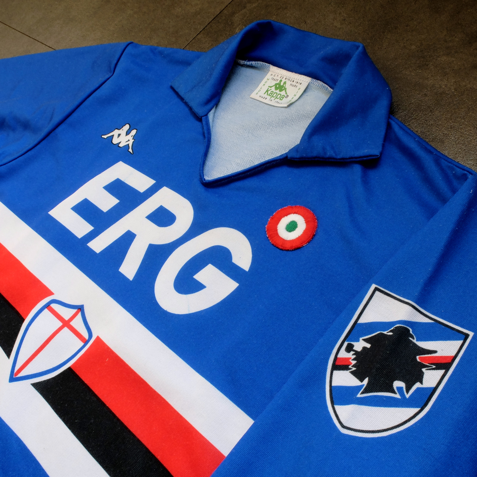


Sampdoria’s shirt rarely fails to deliver, but Kappa’s effort towards the end of the 1980s is the best of the lot. (Ennerre’s wasn’t bad either.) Oddly, what sets it apart, aside from the sinuous neckline and collar, is the italicised typeface of the sponsor, ERG. Everything else about it is routine. It has to be because there’s so much going on: the red, white and black horizontal stripes, the stemma San Giorgio at its centre, the manufacturer’s trademark. Maybe this is why in 1981 Ennerre decided to move the club’s crest to the left sleeve – to tidy it up a bit. At any rate, in doing so they made room for the coccarda, reward for winning the Coppa Italia. Sampdoria lifted the trophy in 1988 and again in 1989, so this particular jersey was never without it.
ASICS took over from Kappa in 1990 and barely changed a thing. They did, however, use a thinner material, which had the effect of altering the colour slightly, making it a touch lighter. 


NAPOLI, 1988-90


The jersey in which Napoli won their first ever scudetto is regarded as one of football’s greatest, but on closer inspection it can be found wanting. The sponsor, Buitoni, certainly looks the business, but the material – usually acrylic, sometimes cotton – belonged to a different era. In 1988 Ennerre finally got with the programme. While they continued to issue shirts made from their trademarked Lanetta (acrylic by another name), they also produced a polyester version, designed more than likely for the summer months.
At the same time Mars succeeded Buitoni as the club’s sponsor, initially written in white and then, later, black – presumably to improve visibility. Napoli won the UEFA Cup in 1989 and a second championship in 1990, whereafter the form of Diego Maradona began to deteriorate. It didn’t matter: he had become synonymous with Napoli and brought them unprecedented success, immortalising Ennerre’s shirt in the process.


FIORENTINA, 1989-90


When a friend introduced me to the delights of 110 Goals Italia Style in 1989 (on VHS) it wasn’t immediately obvious just how good Fiorentina’s shirt actually was. This is because they were wearing it with purple shirts and white socks, which detracted from its magnificence. When we sat down to watch the sequel in 1990, it became apparent (about a quarter of the way into it, as Baggio curls a diagonal ball into the back of Ascoli’s net) that Fiorentina were now wearing white shorts with purple socks. As well as that, they were sponsored by local rag La Nazione, rather than non-alcoholic aperitif Crodino, whose yellow and white lettering was less conspicuous than Crodino’s yellow and red. The shirt itself, made by ABM, was micropatterned, employing subtle shifts within the texture of fabric to create a pattern out of ABM’s logo – a stylised ‘S’ for Sportivo. It had a ribbed collar, a V-neck, and was of a moderately loose fit. The badge was the same that was reintroduced in 2021: a red fleur-de-lis appended to the letter ‘F’ set against a white circle with a purple border, far neater than the distended diamond-shaped crest Fiorentina used before and after. 
The following season ABM reinstated the purple shorts and Roberto Baggio was sold to Juventus.


A.S. ROMA, 1990-91


Roma had to wait until 1990 before Ennerre saw fit to provide them with polyester shirts, by which time the trend for micropatterning had begun to really take off. Strangely, Ennerre seemed to hedge their bets, supplying a plain, silky version as well as micropatterned one. (Napoli were presented with the same dilemma). The micropatterned version was hardly used, yet it is the superior iteration. The NR logo, repeated within the fabric of the shirt, is a neat design, and the jersey itself is a deeper, more satisfying shade of red. This, combined with Piero Gratton’s lupetto badge and the white italics of the sponsor, Barilla, qualify it as the club’s best shirt ever. Roma did well in it too, reaching the finals of both the UEFA Cup and the Coppa Italia, losing to Inter in the former and defeating Sampdoria in the latter. 


JUVENTUS, 1990-92


While AC Milan got to dress up in polyester as early as 1987, Juventus had to wait until 1988. Strange, considering that Kappa – the firm that issued both teams their kit – was a subsidiary of a larger firm called Maglificio Calzificio Torinese. The shirt in question, when it arrived, was sponsored by Ariston, the same company that had its name emblazoned upon the acrylic sarks Juventus wore the previous season. Then in 1989 Upim replaced Ariston, whose rounder font complimented the jersey’s simplicity. However, it still lacked something, which was colour. Juventus won the Coppa Italia in 1990, which provided it. Turns out they needn’t have bothered. Kappa, in a moment of genius, decided that their logo would now be coloured green. This seemingly innocuous detail meant that when the coccarda was removed in 1991, the shirt sustained its visual impact. In fact, it looked better without it, the green insignia on the right singularly complementing the two gold stars to the left. Danone succeeded Upim in ’92, and the svelte neckline and collar – the same that had graced the shirts of Sampdoria and Milan – were exchanged for something more substantial. Still a good effort, but the 1991-92 iteration takes the honours.


TORINO, 1992-93


By 1992-93 Italian football strips were on the slide, Umbro and Lotto being the main offenders. There were still some quality shirts knocking about – Brescia, Roma, Milan, Pescara, Juventus – but only one that really mattered: Torino’s. ABM were responsible, in a working relationship that stretched back to 1990. Nothing much changed throughout their three-year tenure, save for the sponsor in ‘91 (from Indesit to Beretta) and the introduction of a polo-style neck opening in ’92. (ASICS did a similar thing with Sampdoria’s jersey the same year but couldn’t resist adding horizontal stripes beneath the placket; less is always more.) Unlike with the shirts they’d supplied for clubs like Fiorentina, Pescara and Piacenza, ABM never embellished the fabric with their emblem. As a result, the deep burgundy really jumps out at you and contrasts nicely with the small amount of blue that features in Torino’s badge. It’s that collar that does it, though.

-------

If football tops like these were typical of the late 1990s then they would be highly prized, the reason being that people of a certain age became fans of Italian football off the back of Gazzetta Football Italia, which ran from 1992 through to 2002
. It’s question of cognitive bias: not of objective value judgements but subjective realities based upon nostalgia and fond memories. Precedently, football shirts had been governed by practical necessity, and were all the better for it. Thereafter, they became fashion accessories, as preposterous now as flares, bubble perms or a particularly bushy pair of sideburns.


[For a more in-depth analysis of each of these seven shirts, follow these links: Inter, Sampdoria, NapoliFiorentina, RomaJuventus, Torino.]

Saturday, 1 September 2018

THE SARTORIAL ELEGANCE OF SERIE A: FIORENTINA, 1988-90 [ABM]


Upon its formation in 1926, ACF Fiorentina wore red and white halved shirts, representative of the city of Florence (or more specifically its flag and coat of arms) as well as the two teams from which the new club was formed: Club Sportivo Firenze, who had worn white shirts, and Palestra Ginnastica Fiorentina Libertas, who had worn red. The iconic purple jerseys, used to this day, were introduced in 1929, but nobody can say exactly why. The myth that often prevails is that it was result of a laundering incident. In fact, the switch in livery was a decision made by Luigi Ridolfi, the club's then president, inspired by the kit worn by Újpest, a Hungarian football team against whom Fiorentina played a friendly match in 1928.
It was in this configuration that Fiorentina won their first scudetto in 1956: purple collared shirts, white shorts and purple socks, with a red fleur-de-lis (a stylised lily, or ‘giglio’) set against a white rhombus acting as the club's badge. The presence of a badge of any sort was quite unusual for the time, but it seems to be something Fiorentina adopted from the moment they started wearing purple shirts.
Fiorentina were champions again in 1968-69, now wearing black shorts. It is unclear what motivated this change, or when it came into effect, although the club's two Coppa Italia triumphs in 1961 and 1966 were achieved in white shorts. In any case, the next season Fiorentina were back to wearing white shorts, the fleur-de-lis appended to the corner of the scudetto that adorned the jersey.

The 1970s saw little in the way of sartorial change. Then, in 1980, construction magnate Flavio Pontello assumed control of Fiorentina and appointed his son, Ranieri, as president. Within a year they’d changed the club’s badge and struck a deal with the clothing company JD Farrow’s to sponsor the kit, which was not the done thing back then. The new circular emblem comprised of half a fleur-de-lis appended to the letter F, taking on the appearance of a halberd, and was displayed in the middle of a red-trimmed shirt, occupying a fair proportion of it, with the club’s sponsor transcribed above. On top of all that, the team now wore purple shorts.
Fiorentina’s new look was not popular, but when Pontello & Son started investing in actual players opinions softened. In 1981-82, the club finished Serie A in second place and would probably have won the championship had a goal not been controversially disallowed against Caligari in the last game of the season. Thereafter Fiorentina’s form was inconsistent: in 1983 they placed fifth, in ‘84 third, and in ‘85 ninth. Meanwhile, Ennerre had taken over as kit supplier and set about reducing the size of the club’s inflated crest, while also accommodating car manufacturer Opel as the team sponsor.
1985-86’s strip could itself be considered iconic. The red trim was discarded, white shorts were reintroduced, and the badge moved to the more usual position over the left breast. This made room for Ennerre’s wonderfully minimal green insignia on the right, while the sponsor was set against a white band wrapped around the trunk of the shirt. Fiorentina managed a respectable fourth place that term, although it’s worth pointing out that they drew 13 of their 30 matches, which wouldn’t now place them quite so high (at the time, two points were awarded for a win, inflating the value of a drawn game). Moreover, their top scorer was the defender Daniel Passarella, prompting Inter to divest Fiorentina of the player’s services.
For what would be club captain Giancarlo Antognoni’s final year at the club, Ennerre handed over shirt making responsibilities to the their subsidiary brand, N2 (or 'Ennedue'), to be sponsored by the non-alcoholic aperitif Crodino. N2 reverted to issuing purple shorts, and Fiorentina finished a disappointing ninth, although new signing Ramon Diaz impressed with 10 goals and Nicola Berti was looking like good value after his transfer from Parma in 1985. In 1987 Sven-Goran Eriksson was drafted in as technical director, to be assisted by Sergio Santarini in the role of coach. The managerial partnership coincided with the emergence of Roberto Baggio as a force to be reckoned with after struggling with a serious knee injury the previous season. Fiorentina ended the campaign in eighth place, Diaz scoring seven leagues goals, Baggio six.
The situation for 1988-89 looked precarious. Nicola Berti and Ramon Diaz had both signed for Trapattoni‘s Inter, while doubts still remained regarding Baggio's fitness. Incoming players included defensive-midfielder Dunga, signed from Pisa, and striker Stefano Borgonovo, taken on loan from AC Milan. At the same time sportswear firm ABM succeeded Ennerre/N2, introducing a micro-patterned shirt utilising subtle shifts in the fabric’s texture [65% polyester, 35% cotton] to make a pattern out of the manufacturer’s logo.
Fiorentina did all right, finishing in seventh place and reaching the quarter finals of the Coppa Italia. Fortuitously, AC Milan went on to win the European Cup and Sampdoria the Coppa Italia, effectively freeing up an extra place in the UEFA Cup, which went to Fiorentina after they defeated Roma in a play-off. Even more auspicious was the fact that Baggio and Borgonovo had formed a very effective partnership – as well as a close friendship – scoring 15 and 14 goals respectively. Or it would have been if AC Milan didn’t then recall their man to provide cover for Marco Van Basten.


For 1989-90, Fiorentina were furnished with white shorts and purple socks. It is this iteration of the ABM strip that is by far the best. Local rag La Nazione took over as sponsor, their uppercase, serif-font emblazoned in yellow (yellow being the complimentary colour of purple). The red parallelogram that constituted ABM’s logo complemented the simplicity of the giglio, as well as making its presence felt against the whiteness of the shorts.
Fiorentina replaced Borgonovo with Argentine striker Oscar Dertycia, as well as bringing in Czech midfielder Luboš Kubík, winger Renato Buso, and defender Giuseppe Volpecina, among others. The results were mixed. On the one hand Fiorentina only just avoided relegation after beating Atalanta in their final game. On the other they reached the UEFA Cup final, controversially losing to Juventus 3-1 over two legs; Fiorentina were forced to play their home leg in Avellino, despite having played the rest of their European campaign in Perugia, which was far closer to home (Stadio Artemio Franchi was undergoing refurbishment prior to the 1990 World Cup and judged unfit for European competition). Nonetheless, the images of Roberto Baggio and the rest of the team, resplendent in purple and white, are some of Fiorentina’s finest.


ABM hung around for another year but reverted to issuing purple shorts, as well as adding white trim to the neck-line. In 1991, Lotto took over, and all was lost. Not only did the white shorts go for good but so did Pontello’s giglio. In an era where clubs re-design their insignias with mild regularity, one can only hope it might one day make a return.

Wednesday, 1 August 2018

STADIA: STADI COMUNALE ARTEMIO FRANCHI, FLORENCE AND SIENA


Purple permeates the city – Florence in Tuscany – in tribute to the football team that represents it – ACF Fiorentina, aka La Viola. It is said that the colour has no actual connotation but came about fortuitously after the original red-and-white halved shirts of Fiorentina were washed, presumably at too high a temperature, and the colours ran. Most likely apocryphal, and cannot explain the switch from black to white shorts that followed. In any case, such a diffusion would have resulted in pink.
Conversely, the club's badge is informed by the city's heraldry. The roles are transposed, a fleur-de-lis does for both, typically in red mounted on a white background, certainly in the case of Fiorentina and often for the metropolis too. An ordinary state of affairs, except Florence is a UNESCO designated World Heritage Site – has been since 1982 – remarkable for its Renaissance architecture. Football is an irrelevance generally for those who visit here and few will make the connection, let alone be aware of it. But the effect is the same: purple seems to suit the environment, just as if some design agency had proposed it as an apposite hue (no doubt for an exorbitant fee).

Stadio Comunale Artemio Franchi is placed well away from the older material that draws in the tourists, probably with intent. Why locate something as utilitarian as a football stadium alongside buildings as venerable as the Cattedrale di Santa Maria del Fiore, the Palazzo Vecchio? Yet the Artemio Franchi offers more than mere function and was perhaps as progressive in its day as the Il Duomo di Firenze was in its.
Pier Luigi Nervi was tasked with building the ground: a structural engineer and architect renowned for his pioneering appropriation of reinforced concrete, and a progenitor of Italian Modernism. Work began in 1930, was completed in 1932, and the stadium has changed little since. It could be said that Stadio Artemio Franchi kick started Nervi’s career. His portfolio is impressive: he designed the UNESCO Headquarters in Paris; the Torino Esposizioni in – you guessed it – Turin; the Palazzetto dello Sport in Rome; the ‘Hall of the Pontifical Audiences’, which bridges the border between Italy and the Vatican City; and he also had a hand in engineering the Pirelli Tower in Milan. [Built some 25 years later, Nervi’s finest contribution to stadium architecture is actually the Stadio Flaminio in Rome, which the Italian Rugby Federation is supposedly in the process of bastardising while their rugby team play out their international fixtures at the capital’s aesthetically flawed Stadio Olimpico.]


The slightly out-of-town location of the Artemio Franchi works to its advantage. It is a very low-rise structure, save for its svelte tower, and would be utterly overwhelmed among the grandeur of central Florence. Instead, we have residential tenements to the west, the modest Stadio Luigi Ridolfi to the south (a municipal athletics facility), and unabridged views towards the mountains north and east – the Florentine hills of Fiesole and Settignano. Trees dot the perimeter and a road encircles it. The stadium’s concrete framework can be viewed from all around.
From above, the stadium’s footprint traces a rather awkward ‘D’ shape. This is because the Artemio Franchi once accommodated a 220 metre sprint track – so long to cater for the completion of marathons. In preparation for the 1990 World Cup, the entire running track was removed to allow for a second, shallower tier, requiring that the pitch be lowered by 2.4 metres. This in turn facilitated the extraction of the temporary stands set behind each goal, which stood in isolation and probably didn’t hold that many spectators anyway, as well as freeing up the parterre to function once more as a parterre, rather than the secondary viewing platform it had ineffectually become. Other changes included the replacement of some pretty awful roof extensions with ones more sympathetic – although still far from ideal – and the installation of individual seats in place of the existing wooden benches. The seats of the new lower tier were initially green, which worked, the rest a tasteful shade of grey. Now almost all are grey save for those in the tribuna centrale (grandstand) and the lower tier facing it, which are purple – as is the club’s name spelled out in seats in the tier above; this also works. Since the 1990 renovations, the concrete has been refinished a second time and the stairways have been painted yellow.
Despite the increased capacity, plastic chairs, and the removal of much of the clutter that afflicted the stadium prior to 1990, it is many of Artemio Franchi’s pre-existing features that make it interesting: three helicoid staircases that provide external access to the upper gallery; the tower – streamlined, glass-fronted, almost art-nouveau; the bare concrete underside of the terracing and its gentle curve; the outward facade of the tribuna; the roof. The tower might be considered extraneous, the stairs merely salutary, the façade functional, but the roof is to be greatly admired. It is cantilevered – or not, depending how you interpret the stresses placed on the bifurcating structure supporting it: 24 corbels, the tiers below serving as their counterweight. It is a shame the two (genuinely cantilevered) roof extensions weren’t done away with completely, but the original structure doesn’t provide much coverage.
It’s all very pleasing, yet Fiorentina has plans to construct a new home. Perhaps this is why, contrary to the attention lavished on Artemio Franchi’s interior in recent years, the exterior – the underside of the exposed terraces – is spalled, shabby, and neglected. The ground of arch-rivals Juventus has been cited as an inspiration and probable template, a stadium that was built on the site of the much maligned Stadio delle Alpi, which was too large, had a running track, lacked intimacy and atmosphere: built anew in 1990, things didn’t work out and Juventus ended up again sharing the Stadio Olimpico with Torino, before they knocked the Alpi down and put the Juventus Stadium in its place. Fiorentina does not share a ground, and theirs is listed, comfortable in its surroundings. Does it not seem absurd to move away from a unique and perfectly serviceable structure in Florence only to then mimic a building contrived to address a predicament that had arisen in Turin? Could Il Duomo di Firenze have once been torn down and the Mole Antonelliana replicated in its place?


If only Siena was faced with such a dilemma. Despite sharing a name, Siena’s Artemio Franchi – aka Montepaschi Arena – is shambolic by comparison. But then, Siena have not met with the same success as their northern cousin, or much success at all.
Siena have been playing football since 1908, which is longer than Fiorentina, who formed in 1926. Siena’s Artemio Franchi is a very low key affair. Little remains of the structure as it was in 1938 when the ground hosted its first game: a friendly against another Tuscan neighbour, Empoli. Initially consisting of just a single grandstand, it wasn’t until 1955 that the stadium grew in size with the construction of an additional stand directly opposite. These two stands remain, and stood alone for a long while, quietly overlooking the athletics’ track, and themselves quietly overlooked by the surrounding tenements and lines of trees. This wouldn’t do for Serie A, but AC Siena had never played in Serie A. Then, in 2003 AC Siena were promoted to Serie A, and they would have to do something about their stadium.
I can find no definitive information as to whether the Artemio Franchi was expanded in stages or all at once. What I can tell you is that the ground as it looks now was pretty much how I came across it when I visited in 2005, so however they went about it, it took less than two years to complete. In any case, the result is a mess, quite frankly, but not without its charm, comprised of – count them – twelve distinct sections with a collective capacity of 15,373.
The Tribuna Danilo Nannini (the original, covered section of the ground) has aged remarkably well. The cantilevered roof resembles a smaller, slightly less daring version of the one seen at the Artemio Franchi in Florence. Its underside is even the same colour: a sort of pale yellow. To its rear, a private road providing access and the Fortezza Medicea obscured by trees; to its side, a small covered section with room enough for 40 wheelchair users. The Danilo Nannini itself holds 1,500 fans, despite not being be much more than 60 metres in length.
If you’ve come to Siena as a tourist, by car or by bus, chances are you’ve approached from its south-western aspect having disembarked along the western edge of the Fortezza Medicea and wandered through the Giardini Pubblici. There in front of you is the entrance to the Curva Ospiti (Guest Curve). Now would be a good time to point out that Siena’s Artemio Franchi is surrounded by higher ground, which means its barely discernible from any angle. If you tore down the fences, cut back the shrubs, chopped down the trees and tilted your head downwards then you’d behold a symmetry of steel: at the curve’s apex, a fairly low-rise structure; either side, two sets of much larger terraces fan diagonally out; at each end, smaller sections. The Curva Ospiti takes up the smaller section closest to the tribuna, two of the larger sections next along, and the wider, shallower terracing directly behind the goal. Collectively, these stands can accommodate 3,000 away supporters. The south-easterly sections constitute the Curva Beneforti (also known as the Curva San Domenico in tribute to the Basilica of San Domenico that stands behind) and can house 2,000 fans.
Next, the Gradinata De Luca – capacity: 4,081 – on the ground’s eastern edge facing the tribuna. The stand that was added in 1955 has been extended upon, probably about doubling its capacity. This seems natural, but the façade of the lower tier is now completely hidden. Because of the buildings that line Viale Curtatone it wasn’t particularly visible in the first place, and not everyone will consider that a bad thing. Still, the reinforced concrete supports are one of the few architectural details of interest here, so it is a bit of a shame.
Which leaves the Curva Robur and its little brother squeezed into the corner between the Robur and the Gradinata De Luca. The Curva Robur holds 4,700 and it’s from where the ultras offer their support. The other stands have followed the shape of the athletics track. Not the Robur, which has been built parallel to the goal-line on top of the defunct athletics’ track, almost as if it was never there. Behind, more trees, a large hotel, and the Regione Toscana Genio Civile, which I think is something related to civil engineering.
All these (relatively) recent additions are essentially temporary structures that have become permanent. They are supported by identical steel trusses and are equipped with identical green, plastic seats. Behind them all, either trees or buildings, or both. It is this backdrop, augmented by the fact that the stadium has been built into the ground to maintain a lower profile, that provides a cohesion that is structurally lacking. The ground is so beautifully hemmed in, that those coming to marvel at the Piazza del Campo will probably miss it.


Curva Robur circa 2005

In 2009/2010, AC Siena were relegated to Serie B. They bounced straight back only to be relegated for a second time in 2013. Within a year the club was bankrupt and had to register under a different name – Robur Siena – and begin again in Serie D (although they have since been promoted to Serie C).
Siena had plans to build a new ground, but these have understandably been shelved. The concept looked strong but, as with Fiorentina, it involved moving away from the town centre, sacrificing views and vistas that imbue a sense of identity and create a unique atmosphere. Neither club should mind if such schemes never reach fruition.