Showing posts with label 1992. Show all posts

Wednesday, 19 March 2025

THE SARTORIAL ELEGANCE OF SERIE A: PALERMO, 1990-92 [ABM]


Same old story: Palermo got their colours after a laundry incident turned their football shirts pink. The club had previously worn a combination of red and blue, so it's doubtful that such a mutation is even possible. In any case, the more widely accepted explanation is based upon a letter sent to the club's president, Joshua 'Giuseppe' Whitaker, in 1905 suggesting the change to pink and black to represent the rosolio and amaro produced by Whitaker's family business, which was drunk after a game in accordance with the result: rosolio – which is pink, sweet – after a win, and amaro – black, bitter – in defeat. (It is not known what was consumed in the event of a draw.)
The new colours weren't in fact implemented until 1907, the same year the club changed its name to Palermo Foot-Ball Club. Hitherto, they'd identified as the Anglo-Palermitan Athletic and Foot-Ball Club, reflecting the team's English ties: the aforementioned ornithologist Joseph Whitaker, Viceconsul Edward De Garston, Norman Olsen, George Blake, who had previously been involved in the establishment of Genoa Cricket and Football Club, as well as Ignazio Pagano, a local Italian who had been introduced to football during his two years spent studying in England.
The opportunity to actually play football was scarce and centred around matches against the crews of passing British ships. Indeed, the only other team in Sicily at the time was Messina FC, founded in 1900 by Alfredo Marangolo, who had studied alongside Ignazio Pagano in London. In 1901, the two of them would get together and organise a match between their respective teams, and again in 1904, before the arrangement was solidified with the creation of the Whitaker Challenge Cup in 1905. This annual fixture ran for four consecutive years (honours even) before the 1908 Messina earthquake put a terrible stop to it.
In its place, and quite independent from it, came the Lipton Challenge Cup. One of the crews Palermo had played against had been that of the Erin, a privately owned yacht belonging Sir Thomas Lipton. Palermo had won, and the tea-magnate rewarded them with a formidable trophy. Unable to commit to a rematch, Lipton stipulated that teams from Sicily and Campania should compete annually for the cup, which effectively meant Palermo playing against either Naples Foot-Ball Club or Unione Sportiva Internazionale Napoli. This competition ran until 1915, cut short by Italy's entrance into the First World War.
In the wake of the conflict, a number of smaller clubs emerged: Trinacria, Itala, Esperia, and Racing FBC. Valentino Columbo, who'd played for Palermo prior to the war, purchased Racing FBC, who played in blue and white halved shirt, and rebranded them Unione Sportiva Palermo. Within a year, he changed the colours to pink and black, facilitating a sense of continuity between the new club and the older one. More mergers were to follow – with Unione Sportiva Leoni in 1922, Sport Club Libertas Palermo in 1923, and 'Vigor' in 1927 – and another name change, to Palermo Football Club. Meanwhile, the team muddled along in Lega Sud, struggling financially.
By the time of Serie A's inauguration in 1929, Palermo were playing in Group D – the 'Southern Directory Circle' – and came top of it, gaining promotion into Serie B. Coincidently, that same year the club commissioned a new badge, which is worthy of note because it was designed by the Italian painter and futurist Giuseppe 'Pippo' Rizzo. Comprised of a horizontally inclined rhombus set against a stylised, brown leather football, it was replaced as early as 1932 after Palermo won promotion into Serie A. This was the moment at which the club adopted the symbol of the golden eagle, derived from the city’s coat of arms, which remains in place to this day.
 
Like so many other Italian football teams, Palermo would soon fall foul of Fascist initiatives. First they were obliged to ‘Italianise’ their name, and not long after were pressured into taking on the colours of municipal Palermo – red and yellow. In the midst of all this, they were relegated. If that wasn’t bad enough, in 1940 the FIGC kicked them out of the league due to insolvency.
Not for the first time, Palermo were forced into affiliation with a lesser but more economically stable local rival. The team in question was Juventina Palermo, who just so happened to wear the same colours that Racing FBC had. The partnership was retitled Unione Sportiva Palermo-Juventina and within a couple of years were playing in pink and black; within four, they were called more simply Unione Sportiva Palermo.
The 1950s and 1960s would represent a period of relative stability for Palermo. Flitting between series A and B, the most dramatic thing that happened to them was another change of name, to Società Sportiva Calcio Palermo, a by-product of the club listing itself as a joint-stock company. At some point during this period – probably the late 1960s – Palermo started experimenting with stripes. By the 1970s, this trend seemed to have passed, a decade that was spent almost entirely within the confines of Serie B.
 

1979-80

The idea that the football shirt, and sportswear in general, is something other than utilitarian came about in the 1970s. If you wanted to identify a 'year zero' then 1972 might do, when Adidas launched their trefoil logo in the run up to the Munich Olympics. Up until then, branding in football had been low key, often non-existent. By the end of the decade it would be ubiquitous, thanks to the efforts of firms such as Admiral, Umbro, Puma and, of course, Adidas. In Italy, the company that led the charge was Pouchain.
This golden age of footballing couture would last until the end of the century, whereafter sports kit started to become more technical – or would pretend to be. Even though the notion of the football shirt as high performing sportwear is slightly disingenuous, it is fair to say that the invention of manmade fabrics has been of some benefit to the game, has it has for many other sports. When Pouchain were active, acrylic was the material of choice, which had itself superseded wool and cotton. Ennerre favoured acrylic, before eventually getting on board with polyester in the early 1990s, while ABM liked to mix polyester with cotton.
Palermo have had gear manufactured by all three: Pouchain from 1979-80, Ennerre from 1980-86, and ABM from 1990-96. Designed by Piero Gratton, Pouchain’s shirt had by far the best badge: the silhouetted profile of an eagle's head framed within the outline of a diamond. The problem with it was that the fashion of the day dictated that the jerseys were tightly fitted. The Ennerre shirts were more forgiving but suffered from the fact that they didn’t incorporate the club’s insignia, which wasn’t so unusual back then (see also Como, Avellino, even Juventus). After two years with Ennerre’s offshoot company Ennedue, who were equally negligent, Hummel stepped into the fold. Again, the Danish firm didn’t see fit to incorporate a badge, but otherwise showed promise. Finally, ABM took over, and knocked the ball out of the park.
Palermo’s 1990-91 shirt might be their best. For one, it had a badge, although not Gratton’s, which the club had got rid of in 1987. Instead, a Iberian style shield, of the type Inter used throughout the 1980s, with an oblique pink and black stripe running through the middle and the basic outline of an eagle’s head over the top. The template itself was the same that was being used at Fiorentina, Piacenza, Messina and Ternana: collar, trimmed V-neck, ABM's logo running in vertical micropatterned lines within the fabric of the shirt. The sponsor was ‘Citta di Palermo’ in what I can only assume was some sort of tourism initiative, which let it down a bit.
For the next season, the minimal club crest was dropped for a more complicated rendering of an eagle almost in flight. The collar was now black, while the new sponsor – consumer electronics producer Sèleco – was printed in blue. ABM also produced a pink and black striped third version with diagonal micropatterning, which hardly seemed necessary but looked good all the same.
 

1991-92

The 1990s saw Palermo – or Unione Sportiva Città di Palermo, as they were known from 1994 onward – yo-yoing between series B and C. The new century brought with it a revival of fortune, with the club qualifying for the UEFA Cup/Europa League on three separate occasions. The bubble finally burst in 2019, whereupon Palermo were forced to reregister as Palermo Società Sportiva Dilettantistica and ply their trade in Serie D. Upon promotion into Serie C in 2020, they were permitted to restitute the name Palermo Football Club, and are currently playing in Serie B wearing gear supplied by Puma.

Tuesday, 28 June 2022

THE SARTORIAL ELEGANCE OF SERIE A: ASCOLI CALCIO, 1991-92 [NR/ENNERRE]


When the Federazione Italiana Giuoco Calcio (FIGC) set up the Terza Divisione in 1922, the commune of Ascoli Piceno didn’t have a team in it. Nor had they in the league that preceded it – the Promozione – which excluded clubs southeast of Tuscany and Emilia-Romagna. Then in 1923, the FICG established regional divisions in Lazio, Puglia, Marche and Campania. Marche and Campania had enough teams to justify the inclusion of two groups – same as the northern leagues. By 1926, Marche had just one, comprising Gruppo Sportivo Vis Pesaro, Vigor Senigallia, Unione Sportiva Sambenedettese, and Circolo Sportivo Vigor, who were from Ascoli Piceno.
Circolo Sportivo Vigor actually started off as Candido Augusto Vecchi in 1898, named in honour of a local Garibaldian colonel. Typically, football was not the association’s main concern, cycling was, and only friendly games against minor local teams were played. The change of name came about in 1905, for what Ascoli Calcio’s website mysteriously describes as ‘political reasons’.
It wasn’t until 1919 that football became the primary focus, and the Unione Sportiva Ascolana was the result. Their cause was helped further when the municipality elected to build a stadium. The Comunale dei Giardini was completed in 1926, the same year the club was granted entry into the Terza Divisione (Marche Section), having reverted to their previous designation. Circolo Sportivo Vigor subsequently came top of their group and so were promoted to the Seconda Divisione (Group South), which is where they stayed for next few seasons.
In 1929, they changed their name again, to Società Sportiva Ascoli, and won promotion into the Prima Divisione off the back of it. Unfortunately, due to the restructuring of the leagues, the Prima Divisione was the first division in name only and was in effect Italian football’s third tier. Divided into six interregional groups, the top two teams in the four Northern groups were then split across another two groups with the winner of each being allowed into Serie B. The same theory was applied to the two Southern groups, but with just one spot to play for.
Ascoli never made it beyond the preliminary stages before demoting itself in 1933, despite having just finished sixth in a group of fourteen. The following year they went bankrupt, which may explain the decision to voluntarily drop down a league. If that wasn’t bad enough, the club re-registered as Fascio Giovanile di Combattimento di Ascoli, albeit just for a season. The second division then became the first, so the first could become Serie C, and by 1938 Ascoli were competing in it.
We can only assume that throughout all of this Ascoli, under whichever guise, were wearing black and white striped shirts. ‘The social colours are black and white,’ is the only thing Ascoli’s website has to say on the subject, and there are photographs taken in the 1940s to corroborate this. In any case, after the end of the war Ascoli carried on where they’d left off, but struggled. In 1948 they were relegated to the Promozione, and in 1955 to the Promozione Regionale. To stop the rot, the club merged with the Società Sportiva Lillo Del Duca to become Associazione Sportiva Del Duca Ascoli. It seemed to do the trick, and by 1959 they were playing in group B of Serie C.
 
It would take just over a decade for Ascoli to finally make it into Serie B, and as soon as they did they changed their name to Ascoli Calcio 1898. These were the beginnings of the club’s glory years, when they punched above their weight (Ascoli Piceno is not a big place). In 1972-73 – their first season in Serie B – Ascoli came fourth, missing out on promotion by a single point. The next year they made sure of it, coming second, equal to the champions, Varese, on points, but not goal difference.
As debut seasons in Serie A go, 1974-75 wasn’t bad one. Ascoli placed 12th in what was at that time a 16-team league, and commissioned a new badge. Whereas their previous insignia had involved some sort of shield – split down the middle with black and white vertical stripes occupying one half, a rendering of a castle the other – this iteration was circular with ‘A.S. ASCOLI 1898’ written around its periphery. In 1976 they finished 14th and were relegated.


Within a couple of years, Ascoli were back in Serie A, as winners of Serie B, wearing gear supplied by Admiral – the English firm’s naval trademark appended to the right side of the chest. The next season (still in Serie A) the club hooked up with Pouchain. What Pouchain did for Italian football is a subject in itself, revolutionising the very notion of what a football strip could be. Graphic designer Piero Gratton was the man responsible, and for Ascoli he got rid of the castle and replaced it with a cartoon woodpecker (the team’s nickname is I Picchi – 'The Woodpeckers'). Unfortunately, the partnership lasted just two years, whereupon Ascoli partnered up with the Italian jeans company POP84, who promptly ditched Gratton’s distinctive motif.
A contract with Adidas followed in 1984, and the introduction of another new badge. Set within a green, rectangular border with rounded corners, a woodpecker was depicted in profile with a modernist simplicity of which Gratton would surely have approved. On the downside, Adidas’s tenure would be marred by the presentation of the club’s commercial sponsors: first Olio San Giorgio, slapped across the chest like an afterthought, and then Norditalia, written in a jarringly Gothic script. Both versions were V-necked, neither had a collar.
After a brief sojourn in Serie B, Ascoli switched to Uhlsport. The shirt was all right, with a narrower stripe and a black collar, but was again let down by the sponsor: MICROMAX written in white on black in an indistinguishable font. Adidas returned in 1989 and used the same design as before, although the new sponsor, COCIF, was easier on the eye than the previous incumbents. Relegation ensued.


In 1991, after Walter Casagrande’s 22 goals helped secure another promotion, Ascoli Calcio signed up with Ennerre (NR). At once, industrial washing manufacturer IMESA climbed on board as commercial sponsor. Utilising the template Ennerre had provided for Napoli, Atalanta and Roma the previous season, the shirt suddenly looked the business. In IMESA, Ascoli at last had a typeface that worked: round, bold, uppercase, with a red dot where the horizontal bar of the letter 'A' would usually be. The collar was now white, as was the neckline, and stripes were of a satisfying gauge. Finally, Ennerre’s green logo complimented the green outline of Ascoli’s stylised badge, which they would soon relinquish.
Ascoli Calcio went straight back down but this time didn’t bounce straight back up. IMESA jumped ship, COCIF were reinstated, and in 1995 the club dropped down into Serie C wearing kit made by Admiral. The delineated woodpecker was wheeled out for the club's centenary in 1998, sewn onto the right sleeve, and was then gone again.

Saturday, 9 October 2021

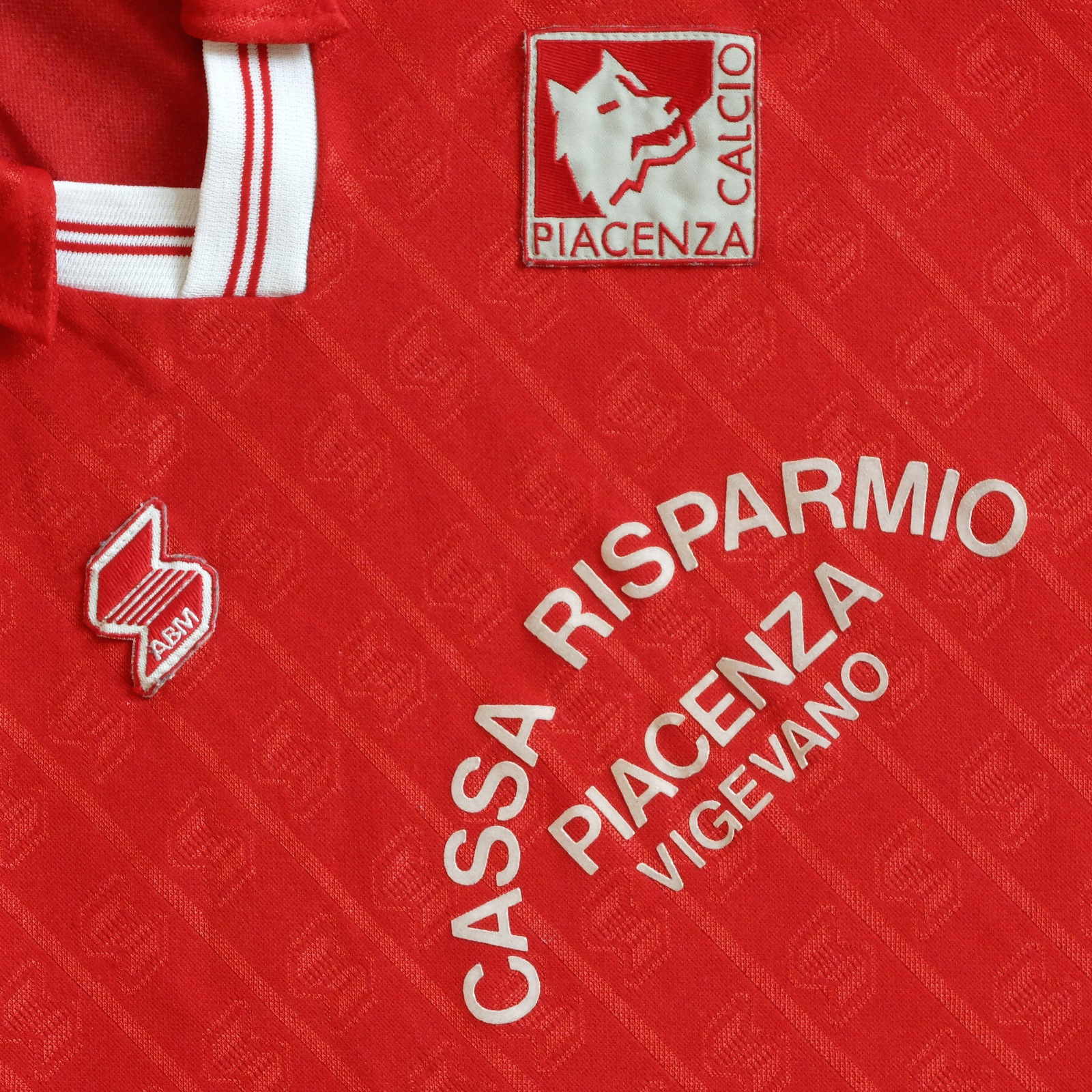
THE SARTORIAL ELEGANCE OF SERIE A: PIACENZA CALCIO, 1990-92 [ABM]


Piacenza Football Club was formed in 1919, the result of a merger between two Piacentino clubs – Giovine Italia and Unione Football Club Piacenza – under the stewardship of an eighteen year-old student by the name of Giovanni Dosi. After registering with the Federazione Italiana Giuoco Calcio (FIGC), they were granted admittance into the 1919-20 La Promozione Emiliana, came out on top and were promoted into the Prima Categoria wearing red and white kit.
The Emilian section of the Prima Categoria was separated into two groups of five. Piacenza participated in Group A, drawn against Modena, Parma, Reggiana and Carpi, and finished third, which wasn’t enough to qualify for the next round. The following season the football federation split in two, with many of the smaller clubs remaining with the FIGC and the larger, more successful teams breaking away to form the Prima Divisione, overseen by the newly created Confederazione Calcistica Italiana (CCI). Piacenza won their three-team qualifying group, ahead of Parma and Mantovana, but came last in the regional finals behind SPAL, Virtus Bolognese and Parma.
The schism between the competing associations was resolved in 1922 by way of the Colombo Compromise, which had the effect of consigning Piacenza to a lower, second division – a sort of regional Serie B. Except there was no way out of it, although teams still faced the threat of relegation. It could be said, then, that the Charter of Viareggio in 1926 was of potential benefit for clubs stuck in the lower divisions. The idea behind the charter was to nationalise the sport (in the name of Fascism), meaning that the existing Northern and Southern leagues would be amalgamated. The restructured Divisione Nazionale comprised two leagues of ten, whereafter the top three teams in each would play against each other to determine the winner. All well and good but it had the effect of downgrading the division beneath: the Prima Divisione became the second tier and the Seconda Divisione (North and South) the third.
It’s doubtful that such machinations had any material effect on Piacenza’s fortunes. What did have an impact was the decision in 1928 to divide the Divisione Nazionale into Series A and B. In 1927-28, the club finished top of Group D of the Second Division (North) which would ordinarily would have seen them promoted into Italian football’s second tier, except the First Division – the second division in all but name – now became the third. Piacenza remained in the First Division up until 1935, at which point it was renamed Serie C.
Piacenza Calcio would have to wait a while before they could play legitimately in Serie B. I say legitimately because in the aftermath of World War II they briefly featured in a combined Serie B/C Alta Italia, a temporary solution in the face of logistical and bureaucratic restrictions on travel. By 1948-49 they were back in Serie C.
After a brief spell in Serie IV/D, Piacenza were promoted to Serie B in 1968-69, but were then relegated. I have read that in the 1960s Piacenza sometimes wore white shirts with a red sash but I can find no images to corroborate this. In any case, upon the club’s return to Serie B in 1974-75 they were wearing red shirts, white shorts and red socks.
 

1975-76

In 1983 a man by the name of Leonardo Garilli became Piacenza’s president. One of the first things this qualified mechanical engineer did, aside from implementing some sort of fiscal structure, was to commission a new badge. The graphic designer(s) responsible drew upon the province’s heraldry: a red shield encapsulating a silver square and a Roman ‘she-wolf’. The shield was discarded, the square rotated through 45 degrees, and the wolf’s head rendered with a simplicity worthy of Piero Gratton himself. It is used to this day.
The new emblem didn’t appear on Piacenza’s actual shirts until 1986, provided by a company named Dafra. The club immediately won promotion into Serie B as champions, Armando Madonna the star of the show. (A young Giuseppe Signori made 14 appearances, scored one goal.) NR then took over as technical supplier while Cassa Risparmio Piacenza continued as commercial sponsor, albeit with e Vigevano now appended to their name. Despite starting well, Piacenza ended their campaign in 13th place. The following year they were relegated, and ‘Beppe’ Signori was sold to Foggia for 1.5 billion lire.
After an indifferent season in 1989-90, Piacenza added a second Serie C (1) championship to its palmarès in 1990-91. They did this wearing clobber manufactured by Abbigliamento Sportivo (ABM) utilising the same template employed at Fiorentina, Salernitana, Palermo, Messina (but not Torino). Made from polyester and cotton, the jersey was micropatterned with ABM’s motif running in vertical lines. It had a collar, an elasticated V-neck and was loose-fitting, as most jerseys were during this period.
Piacenza bedded in. They took on loan the goalkeeper Davide Pinato from Atalanta and attacking midfielder Armando Madonna from Lazio, who had been sold to Atalanta in 1988 after his previous five-year stint with Piacenza. More significantly, the striker Antonio De Vitis signed from Udinese. They finished mid-table.


In 1992-93, Piacenza won promotion into Serie A. In the meantime, ABM had tinkered with the shirt, adding a pop-stud neck opening (used at Torino), a more abstract micropattern and a white collar. The club made a quick return to Serie B but an equally speedy return to Serie A, this time as champions. Moreover, Piacenza made it stick, spending five consecutive seasons in Italy’s preeminent division before again being relegated, by which time Lotto was supplying the gear.
Unfortunately, the club went bankrupt in 2012, re-established itself as Società Sportiva Dilettantistica Piacenza Calcio 1919 in 2013 (subsequently shortened to Piacenza Calcio 1919) and have only been able to make it back as far as Serie C.

Saturday, 4 September 2021

THE SARTORIAL ELEGANCE OF SERIE A: BRESCIA CALCIO, 1992-94 [UHLSPORT]


Brescia Calcio came about in 1911 after the coming together of the Società Ginnastica La Victoria Brescia and Unione Sportiva Bresciana e Gimnasium. They wore then orange and blue vertical stripes with black shorts, a fairly unusual combination in itself but not as distinctive as the white V set against a blue background that has typified the shirt since. Società Ginnastica La Victoria Brescia – who were themselves the result of a merger between Forti e Liberi and Club Sportivo Brixia – had played in blue jerseys with a white vertical line down the middle, which would suggest that Unione Sportiva Bresciana e Gimnasium may well have worn orange. At any rate, by 1915 Football Club Brescia, as they were now known, were playing in blue and white stripes in Group E of the Prima Categoria.
Despite the FIGC’s efforts to reinstall the single league format trialled in 1909-10, the sheer weight of numbers wanting to compete after the end of the First World War meant a return to the bloated format they’d been lumbered with before the conflict started. In the event, Brescia finished their preliminary round – Group A: Lombardy Section – in second place behind Inter, thus qualifying for the national semi-finals, finishing fifth in a pool of six. They did this wearing plain (savoy) blue.
It was in 1927 that Brescia came up with the distinguishing white V, or chevron, and did so in homage to the ‘Fathers of Peace’ (Voluntas Pace) who granted the team use their stadium (Stadio di Viale Piave) for a nominal fee. The intervening period had proved to be reasonably successful, so when the FIGC finally established Serie A as a singular league in 1929-30, the Biancazzurri were part of it. Moreover, they finished its inaugural season in ninth place, seven points clear of relegation.
 
In 1936 the club changed its name to Associazione Calcio Brescia and were subsequently relegated. After a brief stint in Serie C, Brescia made it into Serie A in 1943. The Second World War necessitated a temporary retreat to the multigroup set-up, lasting until 1946-47, whereupon the club was again demoted to Serie B. In between – 1940 to be precise – they’d reverted to wearing all blue. In 1948, Brescia inverted their colours – white shirt, blue shorts – but by the 1950s had effected an about-face.
In 1961 the chevron was reintroduced, and in 1965 Brescia were promoted into Serie A as champions. They managed three consecutive seasons in Italy’s top flight before being relegated, but bounced back the following year. For their return to Serie A, the jersey was altered once more, except this time the V was replaced with a diagonal white stripe, or sash. This configuration lasted as long as Brescia’s tenure in Serie A – just one term. Perhaps sensing that this radical departure had brought them bad luck, the chevron was hastily reinstated and remained in place until 1974. Thereafter, the club experimented with a more diminutive V before reverting to plain blue in summer of ’76, the year they officially became Brescia Calcio.


And that’s how things pretty much stayed until Uhlsport took over from Bontempi Sport in 1991-92, the season Brescia won Serie B under the guidance of Romanian coach Mircea Lucescu. In truth, Uhlsport’s first crack at the shirt wasn’t all that, the revived chevron obscured by the emblem of the club’s new sponsor, CAB (Credito Agrario Bresciano).
In 1992, no doubt under the direction of Lucescu, Brescia signed Florin Răducioiu from Verona, Ioan Sabău from Feyenoord, and the mercurial Gheorghe Hagi from real Madrid, although they also sold their top scorer, Maurizio Ganz, to Atalanta. At the same time, Uhlsport got their act together. The dark blue lozenge behind the sponsor’s initials was got rid of, revealing the chevron underneath. Where the ends of the white V had previously faded into blue towards the shoulder, they now remained constant. The club’s badge was no longer printed but sewn on, as was the manufacturer’s own insignia. Finally, Uhlsport adopted a geometrically micropatterned fabric (also used for Verona and Cremonese) that gave the shirt a vivid sheen. The away version, in red, was equally lustrous.
Brescia lost their relegation playoff against Udinese and went straight back down, kept the same strip and went straight back up. This time around, ABM would provide the gear – not their best – but the result was the same, just more comprehensive: Brescia finished bottom of the table.


The club’s best years were ahead of them, courtesy of Roberto Baggio, wearing kits supplied by Garman, Umbro and Kappa, all of them hideous. Aside from the occasional foray into Serie A, Brescia have once again made Serie B their home, which isn’t a bad place to be, all things considered. Indeed, they have spent more seasons in Italian football’s second tier than any other team: 63 and counting.

Saturday, 20 February 2021

THE SARTORIAL ELEGANCE OF SERIE A: GENOA C.F.C. 1990-94 [ERREA]


Genoa Cricket and Football Club is the oldest surviving football club in Italy. Founded in 1893 by a consortium of British businessmen, it was originally known as Genoa Cricket and Athletic Club. Football was a mere sideline initially, played at the Piazza d'Armi del Campasso on Saturdays against whichever group of British merchant sailors happened to be in town. Shirts were white to reflect the organisation’s English heritage.
In 1886 an English doctor named James Richardson Spensley arrived in Genoa to provide medical care for those same sailors passing through the Mediterranean, by way of the Suez Canal, to and from India. Prior to his emigration, he’d been employed as a medical advisor for a maritime insurance company in Sunderland, and in between offshore assignments had put together a football team with players drawn from his father’s congregation. Spensley played in goal and would later qualify as a referee, all the time fostering more obscure interests, such as studying oriental religion or learning Sanskrit.
This background was of great benefit when Spensley joined the Genoa Cricket and Athletic Club and set about persuading its conservative membership into taking football more seriously. He successfully petitioned the board to allow ‘foreigners’ in on the act – local Italians, as well as Swiss and Austrian expatriates – and within a couple of years Spensley’s cosmopolitan outfit was competing against teams from Turin in the first ever Campionato Italiano di Football. What’s more, they were victorious. Buoyed by their success, the club renamed itself the Genoa Cricket and Football Club and changed its colours to blue and white vertical stripes. Genoa won the Campionato again in 1899 and 1900 before losing the final to Milan in 1901. At this point, Genoa CFC took on the red and dark blue halved shirts they wear to this day.
It’s worth going over all of this because there appears to be no reason why Genoa decided upon the colours that they did. The intermediate blue and white stripes may have been a nod to Genovese’s coastal prominence but could also have been symbolic of Spensley’s effort to de-Anglicise the institution. The red and dark blue configuration adopted in 1901 might equally have been an attempt to reconcile the two. After all, Genoa’s badge made no secret of its Anglo-Saxon origins.


Notwithstanding the club’s resurgence during the 1920s, Genoa have never met with the level of success they experienced in those halcyon days prior to the First World War. Their last trophy of note was 1937’s Coppa Italia, although it would be another twenty years before the rot really set in. The 1960s and ‘70s were generally spent playing in Serie B, with a brief incursion into Serie C in 1970-71. Promotion in 1981 preceded a three year spell in Serie A, followed by five consecutive seasons occupying Italian football’s second tier.
In 1988-89, Genoa won Serie B and thus promotion back into Serie A. They did this wearing gear manufactured by Errea, breaking a six year association with Adidas. Adidas had good form producing shirts for Italian teams (Torino, Hellas Verona, Bari) but the strip they provided for Genoa came up short. In truth, the shirts that the newly signed captain Gianluca Signorini and his squad wore in 1988-89 weren’t much better. Errea replaced the iconic Adidas stripes running down the arms with their own interpretation, incorporating their logo repeated in red set against a white background, but it looked dated and clashed with the overly stylised typeface of the sponsor (hosiery manufacturer Levante).
Ahead of Genoa’s return to the top flight, they brought in three Uruguayans: midfielders Rubén Paz and José Perdomo, and the accomplished forward Carlos Aguilera. Meanwhile, Mita took over as sponsor, dispensing a more modest, albeit italicised font more suited to the shirt. Genoa finished the season in 11th place, just two points clear of the relegation zone.
In 1990, Errea ditched the white trim, incorporated micro-patterned pinstripes, and suddenly Genoa looked the business. Osvaldo Bagnoli replaced Francesco Scoglio as coach and brought in Brazilian defender Branco, Czech striker Tomáš Skuhravý, and Italian midfielder Mario Bortolazzi who would stay with the club for next eight years. Genoa finished fourth in the league, qualifying for the UEFA Cup, with Aguilera and Skuhravý scoring 15 goals apiece.
1991-92’s shirt remained much the same, save for alterations to the collar and badge. Genoa’s existent crest consisted of a (modern French) shield depicting a golden griffin against a red and blue background surmounted by the cross of St. George – no text. The redesigned badge featured a more intricately drawn griffin against a blue background, flanked by two draping flags breaking the sides of the (heater-shaped) shield with ‘GENOA’ printed along the curved, upper edge and ‘1893’ towards the shield’s apex. The club ended their campaign in a disappointing 14th place, although they did make it to the semi-finals of the UEFA Cup, bowing out honourably to Ajax who then went on to beat Torino in the final.
For the next season, SAIWA (Società Accomandita Industria Wafer Affini) replaced Mita as sponsor. This probably wouldn’t have made too much difference to the jersey if Errea hadn’t decided to tamper with the micropattern. The new motif could be described as kaleidoscopic, and the sturdier, upper-case font used by SAIWA was more conducive. Meanwhile, Bagnoli moved to Inter, Aguilera was sold to Torino, John van't Schip joined from Ajax, and Genoa finished in 13th place.
For 1993-94, Genoa wore the same shirt save for a small emblem attached to the left arm celebrating the club’s centenary. They improved upon the previous season’s performance, finishing eleventh. Thereafter, Kenwood replaced SAIWA as club patron, Errea added superfluous white trim to the sleeves and collar, and Genoa were relegated.
 

1993-94

It took more than ten years for Genoa to claw their way back into Serie A. When they finally made it, Errea were still supplying the kit and had reverted to using the club's traditional insignia. At the time of writing, Genoa wear Kappa, bringing to an end a seven-year affiliation with Lotto.
 

Saturday, 26 December 2020

THE SARTORIAL ELEGANCE OF SERIE A: HELLAS VERONA, 1992-95 [UHLSPORT]


Associazione Calcio Hellas was named in honour of the Hellenic Republic at the suggestion of Professor Decio Corubolo, who taught Greek at the Liceo ginnasio statale Scipione Maffei. Rather than wearing the colours that this association implied, the club opted for black and white halved shirts. The year this happened – 1903 – football was only played professionally within the regions of Piedmont, Lombardy and Liguria, and so A.C. Hellas had to content itself with friendly games against local sides. By the time they found themselves competing in the Prima Categoria (Emilia-Veneto division) in 1910, they were sporting the colours of the city of Verona, derived from the municipality’s coat of arms – a yellow cross against a blue background.
In 1919 A.C. Hellas merged with F.C. Verona to become Football Club Hellas Verona. Ten years later, at the behest of the fascist regime, two more teams were assimilated: Bentegodi and Scaligera. The resulting enterprise was retitled Associazione Calcio Verona, which may or may not have been intended as an anti-Greco gesture (by 1940 Italy and Greece would be at war with each other). Unfortunately, Hellas Verona had just finished Group B of the Divisione Nazionale in 13th place, thus failing to qualify for Serie A’s inaugural season.
World War II saw A.C. Verona relegated to Serie C, although they were back in Serie B by the end of it. In the meantime they experimented with a number of configurations – such as grey shirts with a horizontal blue and yellow band around the middle in 1946-47 – before settling for yellow shirts and blue shorts.
After coming close in 1948, Verona were promoted to Serie A in 1956. To celebrate they adopted to a kit resembling that of Boca Juniors, but were subsequently relegated. The following year Verona absorbed yet another local team, by the name of A.S. Hellas. Sensing an opportunity to connect with its past, the club rechristened itself Associazione Calcio Hellas Verona. Another change or colours: blue shorts, white jerseys with blue sleeves, and hint of yellow adorning the neckline. It’s uncertain how long they persisted with this arrangement but it appears that by the end of the decade their shirts were once again yellow.
Hellas Verona returned to Serie A in 1968 wearing blue and yellow vertically striped jerseys paired with black shorts – had been since 1964. The team’s second spell in Italy’s top flight was relatively successful, lasting six consecutive seasons. In 1970 they reverted to yellow shirts with blue trim, before switching to blue shirts with yellow trim the following year. Shorts were by now generally white.


1984-85

The strip Verona wore during their title winning campaign of 1984-85 is considered to be one of their best. Manufactured by Adidas and sponsored by Canon, it differed slightly from previous kits in that the shorts were also blue while the shirts incorporated yellow pinstripes. Ricoh replaced Canon in 1986, then Hummel took over from Adidas in 1987. The partnership with Hummel lasted three years, culminating in relegation. Adidas stepped back into the fold, the club were immediately promoted, whereafter Verona hooked up with German firm Uhlsport.
Verona’s kit for 1991-92 was mediocre. All blue with a yellow collar and yellow rectangles running down the outside edge of the arms, the sponsor, Rana, printed in a white, rounded uppercase font, it looked cheap. Predictably, the away kit was a mere inversion of the home. However, there existed a superfluous third shirt comprising the same yellow and blue stripes that had been worn during the second half of the 1960s. Relegation ensued, but the jersey was reappropriated for home use the following season.
The shirt itself adhered to the same template Uhlsport were using for U.S. Cremonese. The stripes were of roughly the same gauge, the fabric was micropatterned in the same manner, both had collars, and the manufacturer’s logo and club’s badge were sewn on, except the sponsor’s name was black. The badge is of particular interest. In 1984, club president Ferdinando Chiampan had commissioned the advertising agency Orti Manara to come up with a new insignia. The chosen design included two mastiffs facing away from each other, joined in the middle by a staircase/ladder – symbols relating to the local heraldry – to form a stylised V, encapsulated within a sort of rhombus. The first iteration had the mastiffs and the edging rendered in yellow. Uhlsport inverted the colour scheme and added the colours of the Italian flag within the top-left border and ‘Verona F.C.’ in the one diametrically opposite.


The Uhlsport years were ineffectual. The reason the word ‘Hellas’ had been omitted from the revamped badge was because in February 1991 the club had to re-register under a different name to avoid bankruptcy. In 1995 they got their old name back, swapped Uhlsport for Errea, were promoted and then relegated again. It would get worse before it got better. Hellas Verona are currently enjoying a second consecutive season in Serie A, their kit supplied by Macron. 

Friday, 20 November 2020

THE SARTORIAL ELEGANCE OF SERIE A: U.S. CREMONESE, 1992-95 [UHLSPORT]


As is often the case, Cremonese haven’t always worn their current colours. In 1903, the year the club came together, they wore white shirts adorned with a lilac collar, paired with black shorts and socks. Cremonese was a mere sporting association back then, and it’s not even certain they played any football. This changed in 1910, around the time they changed their name to Unione Sportiva Cremonese. Football was catching on, and the following year the team appointed a coach by the name of Nino Gandelli, with aim of playing the sport competitively. It seems he took the role seriously enough, recruiting the best local talent he could find, and by 1912 they'd signed up with the Federazione Italiana Giuoco Calcio (FICG).
Ahead of the 1913-14 Promozione, U.S. Cremonese merged with the recently formed Associazione Calcio Cremona. A new strip was in order, and it was towards the city’s heraldry that they looked for inspiration. Cremona’s coat of arms consists of a shield split down the middle, with silver and red horizontal stripes on one side and on the other a depiction of an arm holding aloft a golden ball. For now, the colours would do: grey shirts with red trim, to be worn with white shorts.
Cremonese’s first season was a success, winning promotion into the Prima Categoria at the first attempt. The following year’s campaign was mediocre, and when Italy joined The Great War in 1915 so did many of their players (most notably goalkeeper Giovanni Zini, who served as a stretcher-bearer but died in Cividale del Friuli in 1915 after contracting typhus).
In 1919, Cremonese assimilated another local team by the name of Football Club Aurora. Despite bolstering their ranks the club finished bottom of their six-team group, which ordinarily would have resulted in relegation back to the Promozione. The Prima Categoria was in effect a qualifying round whereby teams competed in regional divisions to gain entry into the national semi-finals. The regional committees operated with complete autonomy, determining how many teams over however many leagues were allowed to take part. Ahead of the 1920-21 season, rather than reduce the number of entrants, as the FICG and a few of the bigger clubs were keen to do, Lombardia elected to move from three groups of six to six groups of four, making room for Cremonese.
The next five years were spent playing in a restructured Prima Divisione. Then in 1926 tensions between the FICG and Confederazione Calcistica Italiana (CCI) finally gave way to the establishment of a national league, under the auspices of the (Fascist) Direttorio Divisioni Superiori (DDS). At the same time Cremonese embellished their grey shirts with a red cross, only to finish their group in ninth place. Once more, this should have been low enough to see them relegated, but an enforced merger between Sampierdarenese and Andrea Doria (albeit a temporary one) freed up and extra space.
In 1928 Cremonese tinkered with their strip for a third time, exchanging the cross for a horizontal stripe wrapped around the chest. Seventh place was enough to qualify for the preceding season’s inaugural single-group format – in other words, Serie A – from which they were immediately relegated. They continued to play in Serie B up until 1938, whereupon they dropped down into Serie C. In 1942 Cremonese returned to Serie B but were again relegated in 1951. For their 50th anniversary, they wore grey and red quartered shirts before finally settling for the stripes worn to this day.


The 1960s were spent playing in Serie C with the occasional foray into Serie D. The 1970s saw some improvement, culminating in promotion to Serie B in 1977 – the same season that saw Cremonese decked out in red shirts with a single grey stripe descending vertically from left shoulder. Relegation swiftly followed, but by 1981 they were back playing in Serie B.
In 1984 Cremonese finally made a return to Serie A after a 54 year absence. Unfortunately, the man who scored most of the goals that got them there – a certain Gianluca Vialli – was subsequently sold to Sampdoria. His replacement, the Brazilian forward Juary, made little impact and the club finished bottom of the table. But Cremonese appeared to have turned a corner and over the course of the next decade were promoted to Serie A on four separate occasions, oscillating between the top two tiers of Italian football. In the first instance their gear had been supplied by Puma. The second time around it was ABM (1988-89) and then Patrick (1990-91). For 1992-93’s successful push for promotion the kit was supplied by German sports manufacturer Uhlsport.

Uhlsport made shirts for a number of Italian football teams in the late ‘80s and early ‘90s, most notably Inter and Bologna, as well as Verona and Brescia. They all came with collars, as did most shirts tailored towards the Italian market at that time. In truth, the jersey Uhlsport came up with was not so different to the ones that ABM and Patrick had provided before them. There were, however, a few compelling disparities.
First off, ABM and Patrick never bothered with appending the club’s crest. In ABM’s case, this may have come down to financial expediency, given that ABM were attaching crests to the shirts of Fiorentina, Torino, Pescara, Palermo. In any case, the absence of a badge cheapened the jersey. Moreover, Cremonese had redesigned their crest in 1985, and it was worthy of attachment: a simplified rendering of a golden ball held aloft, as depicted in the city’s coat of arms, with a diagonal red and grey bend (sinister) behind it. (When Uhlsport handed over to Puma in 1997, the club reverted to its traditional emblem.)
Second, the team’s sponsors during Patrick and ABM’s tenures did not present as nicely as the one that adorned the Uhlsport shirts – local retailer Moncart. It’s not that the company name was written in a particularly distinctive font, just that the simplicity of Moncart’s sans-serif, uppercase lettering worked well in this instance.
Finally, Uhlsport had recently discovered the art of micro-patterning. To be fair, this was a relatively recent phenomenon, and it’s debatable whether Inter’s shirt would have benefitted from it, but in the case of Cremonese it combined well with the colours, muting them slightly.


In 1995-96 cured-meat specialist Negroni took over sponsorship from Moncart, Enrico Chiesa returned to his parent-club, Sampdoria, and U.S. Cremonese were relegated. But I Grigiorossi had survived three consecutive seasons in Serie A, a feat not bettered by them before or since, and they did it wearing a shirt of some distinction.
 

Monday, 17 August 2020

THE SARTORIAL ELEGANCE OF SERIE A: PESCARA CALCIO, 1992-93 [PIENNE]


Pescara Calcio’s roots can be traced back to 1926 when two teams, Aternum Castellamare and Ursus Pescara, merged to form Tito Acerbo. After just one season Tito Acerbo, who wore blue and yellow, were kicked out of the Second Southern Division for irregular activities and quickly reformed as Unione Sportiva Adriatico, wearing black and blue. After finishing 3rd in the regional Third (Abruzzi) Division, Unione Sportiva Adriatico then split up and reinvented itself as the Società Sportiva Abruzzo, reverting to the blue and yellow colours of its forebear.
After taking a brief sabbatical, the club was re-admitted to the Third Division, winning promotion to the Second in 1931 and the First the year after, whereupon they became known as Associazione Calcio Pescara. This iteration lasted an unprecedented four years before again dissolving, possibly in reaction to the restructuring of the leagues that was taking place at the time; the formation of Series A, B and C.
In 1936 the Società Sportiva Pescara was established, sporting the pale-blue and white stripes worn to this day. Perhaps for this reason, this date is recognised as the formal beginning of the club and what preceded it a mere footnote. At any rate, Pescara appeared to be on a surer footing, gaining promotion to Serie C in 1938, Serie B in 1940, and winning something called the Torneo Misto Abruzzese in 1945, a tournament designed to keep footballers active during the final years of the Second World War. Unfortunately, they were unable to capitalise on their regional success and by 1950 had dropped down into the newly formed Serie IV.
Discounting the club’s move into the Stadio Adriatico-Giovanni Cornacchia in 1955, the following twenty years were fairly uneventful, spent in and around Serie C before finally making it back into Serie B in 1974. Società Sportiva Pescara duly registered as a public limited company, becoming Pescara Calcio SpA in the process. This economic restructuring served them well and in 1976-77 Pescara were promoted to Serie A for the first time in their history. They only lasted one season there but bounced straight back after defeating Monza in a play-off. Relegated again the next season, by 1982 Pescara were back in Serie C, were promoted again the following year, and then languished in Serie B for the following three seasons.

Pescara won Serie B in 1986-87, and so the most successful period in their history began. At the time their shirts were manufactured by N2 (Ennedue), a sort of subsidiary of the more recognisable NR (Ennerre), and sponsored by Cassa di Risparmio Pescara. They stuck with NR until being relegated in 1988-89, although were by now sponsored by Gelati Gis. Pescara spent the next two years wearing kit manufactured by ABM Sport before switching to Pienne in 1991-92, the same year they were promoted back into Serie A.
The Pienne shirt wasn’t substantially different to ABM's effort. Both had collars, the width of the pale-blue and white vertical stripes were about the same, and both companies incorporated their emblem into the fabric of the shirt. Whereas ABM’s logo was/is a geometric representation of the letter S, Pienne’s was/is a cartoon snake, or maybe even a worm. It looked more like a worm but a snake seems more credible. This embroidered serpent, its shadow repeated in the texture of the shirt, made for a distinctive and attractive motif. Gelati Gis was printed in navy blue ink, except the dot of the second ‘I’ which was red. The away kit was arguably more interesting but wasn’t really much of an away kit. The top half was white, the lower dark blue, with light blue quadrilaterals horizontally bisecting the two. Shorts were also dark blue, as opposed to the home versions, which were white. Socks were white in both instances. (A third option, predominantly red, was also utilised.)


Pescara acquired some decent players ahead of their return to Serie A. The Brazilian midfielder Dunga and Italian striker Stefano Borgonovo joined from Fiorentina, Senegalese defender Roger Mendy and Danish defender John Sivebæk signed from Monaco, while Ottavio Palladini proved an adequate replacement in midfield for fans’ favourite Michele Gelsi, who had left for Perugia but would ultimately return to Pescara in 1994.
It wasn’t enough. Despite defeating Roma in their opening game, and then narrowly losing to reigning champions AC Milan 4-5 in their next, Pescara finished the season in 18th place and were relegated. Gradual decline followed before bankruptcy befell them in 2009. They soon reformed as Delfino Pescara 1936 Srl and gained entry into the Lega Pro Prima Divisione – Serie C1 in old money – and immediately won promotion into Serie B. Since then they’ve spent two seasons in Serie A and have improved upon their stadium. Shirts are currently made by Errea.

Saturday, 31 August 2019

THE SARTORIAL ELEGANCE OF SERIE A: A.S. BARI, 1990-92 [ADIDAS]


Adidas has been a provider of football kits since such firms made it palpably clear that they were providing them (in the 1970s). Indeed, Adidas were one of the first companies to do so, appending their three-striped motif to the shoulders of the football shirts they provided, as well as their instantly recognisable ‘trefoil’ logo to the chest (as distinct from the rather bland ‘3 bar’ emblem they’ve been utilising since the early 1990s).
Despite a visible presence on the international scene, Adidas were not back then the dominant presence they are today, and this would have been especially true in Italy. That said, by the early 1980s there were three Italian teams of reasonable repute being supplied kit by the German conglomerate: Hellas Verona, Torino F.C. and A.S. Bari. Verona won their 1984-85 scudetto wearing Adidas – and very nice shirts they were too – in an association that lasted from 1983 through to 1987, whereupon the Veronese switched allegiance to Hummel. Torino worked with Adidas from 1984 to 1988 before hooking up with ABM, winning nothing. But Bari got there first and stayed with Adidas for the longest: from 1981 all the way through to 1997.

White football kits aren’t the most interesting and rely upon a tasteful splash of colour, or some other quirk, to liven them up. Real Madrid’s all-white strip was improved immeasurably when purple trim was added in the early 1980s. Leeds United, who modelled their strip on Real Madrid’s at Don Revie’s behest, found salvation by way of the wonderfully bizarre badge they introduced in 1973 (and jettisoned for something more conservative in 1977).
Bari’s colours are white with red trim. It’s not the most exciting of juxtapositions, but in the hands of Adidas it was made to work. Their earliest effort adhered to the traditional format: three red stripes running off the shoulder and the trefoil on the chest. In 1983 vertical pinstripes were added – in red, naturally – to be replaced in 1984 with thicker, horizontal stripes across the shoulders and thinner ones beneath. Then in 1985 – as Englishmen abroad Paul Rideout and Gordon Cowans joined the club – Adidas reintroduced the pinstripes.
Or did they? That season – 1985-86 – Bari were furnished with no less than five different shirts: the default white, pinstriped affair; a red, diagonally pinstriped shirt, presumably to be worn against opposition wearing white (clubs were not obliged back then to wear their second strip away from home); a blue iteration in case the red one didn’t suffice; a white, pinstriped shirt with red shoulder-panelling and sleeves; a red, pinstriped shirt with white shoulder-panelling and sleeves. It appears that those last two were issued for the winter months, but why they were adopted at all I have no idea. All these jerseys were pleasingly sponsored by Cassa di Risparmio di Puglia, written across the chest in an arc to make room for the bank’s insignia.
Perhaps bored of these striated schematics, Adidas then reverted to supplying Bari with an all-white strip (allowing for the three-stripes down the shoulder and the sides of the shorts, the trefoil logo, and a red collar) and would continue doing so for the next four years. The one constant throughout all of this was Bari’s tidy club crest: a cockerel in profile, rendered with modernist simplicity by graphic designer Piero Gratton.


In 1989 A.S. Bari gained promotion from Serie B into Serie A. The following year they were hosting World Cup football at their new home, the impressive Stadio San Nicola.
It was around this period that Adidas decided that their three-stripe template needed shaking up. They proceeded cautiously, introducing a variety of configurations, many of which ended up on display at the 1990 World Cup. The strange, fragmented design that adorned the shirts of Czechoslovakia and the USSR, for example, must have been deemed a failure for it was swiftly abandoned. Strangely, the top in which West Germany won the tournament did not prove to be indicative of the direction Adidas wished to take. Nor those provided for Yugoslavia, Columbia, or for the USA and Romania. The shirts given to Cameroon and Egypt, on the other hand, became something of an Adidas staple, worn by the likes of Olympique Marseille, Anderlecht, Bayern Munich, and the Republic of Ireland (although not at Italia ’90). And then there was what the United Arab Emirates were wearing, which was also what France, Poland and Ghana wore, except France, Poland and Ghana hadn’t qualified for the 1990 World Cup. It was this template that Adidas would use at Bari for the next two seasons.
In truth this new wave of football shirt couture rarely delivered – overly complicated patterns rarely do in this context. Yet it somehow worked at Bari. In fact, Bari’s strip was pretty much identical to that of the UAE and is almost impossible to describe. The body of the shirt is white but the area covering the shoulders, and running diagonally towards the neck, is red, except on the top of the shoulders, which is white save for three red (Adidas) stripes sublimated over the top. Along the boundary between the red on the shoulder and the white of the trunk there are three hollow parallelograms running diagonally upwards either side of the chest, their outlines inverted. Sleeves are red on the outer side and white underneath the arm. Shorts and socks are white and exhibit Adidas’s obligatory red trim.
What really sets the kit off nicely, though, is the sponsor’s name, Sud Factoring, all lower case, printed in what looks like Goudy Heavy Face. And Bari’s badge, positioned just below the clavicle so as not to interfere with those parallelograms (as is Adidas’s trefoil geometrically opposite).


David Platt

Bari’s tenure in Serie A would be short-lived. In 1990-91 they finished in 13th place, four points above the relegation zone. They had some fairly decent players – Giovanni Loseto in defence, Pietro Maiellaro in midfield, João Paulo up front – and in ’91 brought in Daniele Fortunato from Juventus, Zvonimir Boban on loan from AC Milan, and David Platt from Aston Villa. To no avail. A. S. Bari were relegated, Adidas hung around for a couple more seasons, whereafter Lotto filled the void, and the shirt went downhill from there.