Showing posts with label Roma. Show all posts

Friday, 22 November 2024

STADIA: STADIO OLIMPICO, ROME


The received wisdom is that the 1990 World Cup lumbered Italy with a whole bunch of white elephants: ill-conceived stadiums that prioritised form over function, that were badly built, badly designed and then badly maintained. There is some truth in this, but it is a truth that applies to anything and everything: shopping malls, office blocks, warehouses, schools, leisure centres, airports, train stations, bus stations, parks, carparks, highways, bridges, public housing, mansions, palaces. The built environment can date very quickly, can fall apart very quickly.

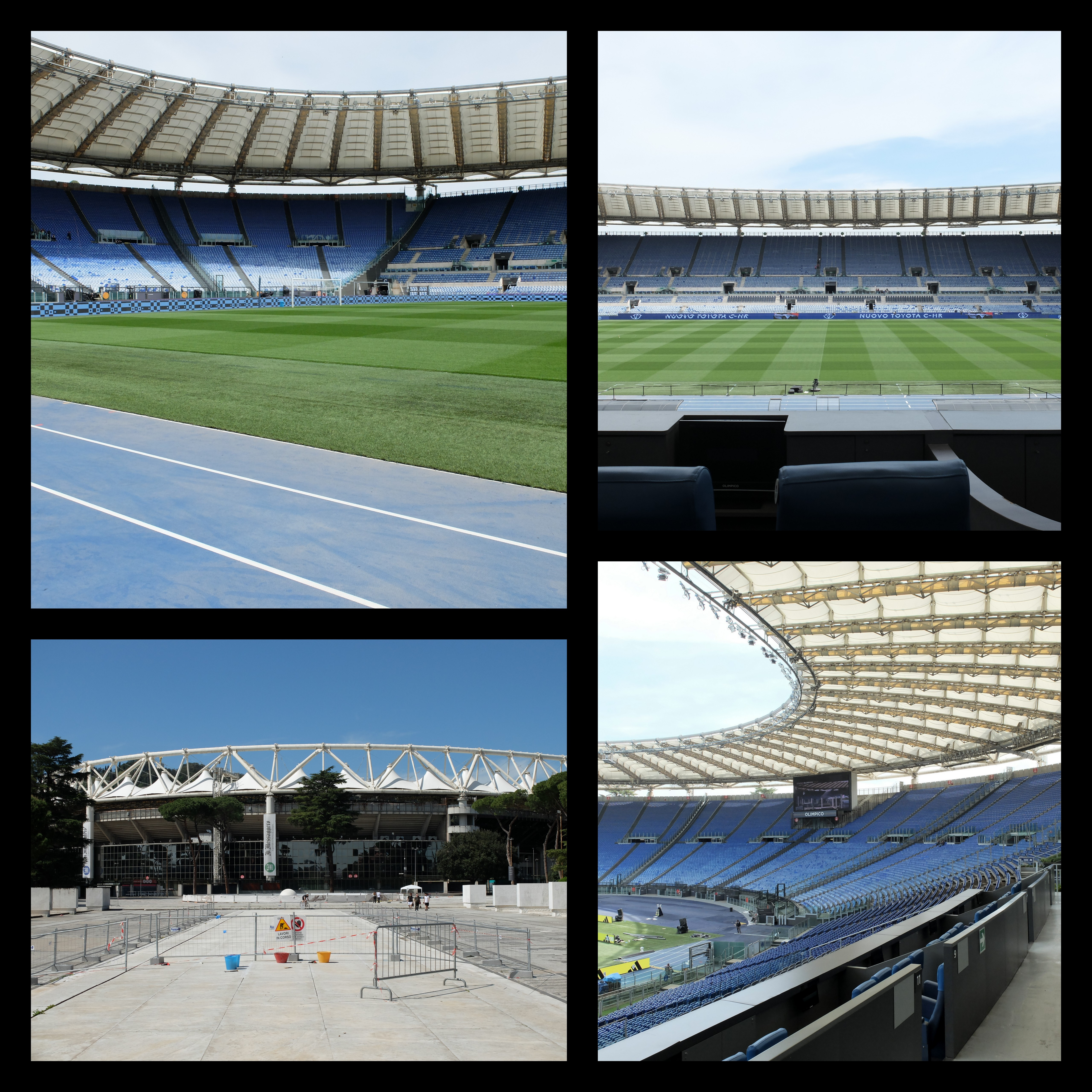
In fact, the fate that has befallen the twelve venues that were selected for Italia ’90 is not in any way equal. Two of the stadia no longer exist: the Stadio Delle Alpi in Turin and the Stadio Sant'Elia in Cagliari. Udine's Stadio Friuli has been remodelled – only the tribuna, which predates the World Cup, survives – and the Stadio Artemio Franchi in Florence is undergoing a similar process. The condition of the remaining eight is various. Until recently, Bari’s San Nicola was in a bad way, but has since  been smartened up. The same can be said for the Stadio Diego Armando Maradona, but only of its interior – its exterior is a mess. Bologna and Palermo seem to be doing ok, at least from a distance, while Genoa and Verona look to be on a gradual downward trajectory. The only grounds that have retained their character, while still being regarded as functioning international venues, are Milan’s San Siro and Rome’s Stadio Olimpico. Some will complain about the condition of the San Siro but what they’re really griping about is the lack of corporate facilities; its general condition is actually rather good. The condition of the Stadio Olimpico, on the other hand, is very good.

The Stadio Olimpico was opened in 1953, though it was conceived of in 1926. Originally known as Stadio dei Cipressi (Stadium of the Cypress Trees), it was to be part of a larger sports’ complex commissioned by the Opera Nazionale Balilla (ONB), named the Foro Mussolini. A Fascist initiative, in other words. The architect Enrico Del Debbio was given the task of realising the project, with mixed results. The Stadio dei Marmi, which is a training facility rather than an actual stadium, appears as some sort of neoclassical joke. The Palazzo della Farnesina, however (which was not part of the same project but nonetheless overlooks it), exhibits signs of Italian Rationalism. This was Fascist architecture all over, a collusion between the modern and the ancient. In any case, Del Debbio never got to finish the job; just a single tier of it, dug into the ground. Not what modern stadia – especially not totalitarian stadia – were made of.
Stadio dei Cipressi was located on an area of marshland at the bottom of Monte Mario, which despite being the highest of all the hills in Rome is not one of the seven that the city is known for. When it was decided to enlarge the ground in 1937, with an eye on hosting the 1940 Summer Olympics, Debbio’s replacement, Luigi Moretti, simply built into the hill itself, utilising the displaced soil to raise the of level the playing field by four metres. The sides of the stadium that didn’t lean into Monte Mario were built of concrete.
There would be no Summer Olympics in 1940, and the stadium as it was saw little in the way of sporting action. Instead it welcomed Adolf Hitler on his state visit to Rome in 1938, staged a military celebration of the Tripartite Pact in 1941, and was used as a storage facility by Allied troops in 1944. After the war, control of the stadium was handed over to the Italian National Olympic Committee, suggesting that the idea of accommodating the Olympic Games had never gone away. In 1951, work began on redeveloping the site, headed by the engineer Carlo Roccatelli and architect Cesare Valle. (Annibale Vitellozzi, who had designed Roma Termini railway station, became involved after Roccatelli passed away in 1951.)
Central to the refurbishment was doing away with the structure’s reliance on Monte Mario. This part of the stadium was completely demolished, the hill excavated and a continuous tier built in its place, clad in travertine and enveloping what remained of the old one. The pitch was countersunk by 4.5 metres to limit the height of the stadium outside to 13 metres – it was felt that the structure shouldn’t dominate the buildings that surrounded it, nor compete with the hill. The Stadio dei Centomila (Stadium of the 100,000) as it was provisionally called, actually had an official capacity of 65,000, but considering how few seats there were it could easily hold more; at least 80,000 were present for the Italian national team’s inaugural match against Hungary. In 1960 the Olympic Games would finally come to Rome, by which time the stadium was being referred to as the Stadio Olimpico. It would be another 30 years before the ground changed in any overtly recognisable way.


1950s

If the 1990 World Cup final was to be played in Rome then it needed a stadium worthy of the occasion, which the Stadio Olimpico wasn't. A number of options were considered: build a new national stadium in the EUR district south-west of the capital, expand the Stadio Flaminio just down the road from the Stadio Olimpico, or renovate the Stadio Olimpico. Enlarging the Stadio Flaminio was quickly dismissed due to a lack of surrounding space, while building a new stadium from scratch was deemed too costly and too time-consuming. The Stadio Olimpico, then, would have to do.

The problem was the criteria in place for hosting a world cup final, which included a minimum all-seated capacity of 80,000 with at least two-thirds of that to be undercover. The Stadia Olimpico at that time had room for approximately 70,000 and no roof to speak of. Moreover, the stadium lacked a strong visual identity, which might not have strictly mattered but probably did, given what was happening in Milan and Turin.
The solutions to the first two problems were relatively simple: knock down and rebuild the curved ends to bring them closer to the action, extend the Tevere and Monte Mario grandstands to increase capacity, and put a roof over it all. In doing this, the curvature of the end terraces, which stood some way back from the goal-line, was reduced, bringing them 10 metres closer to the field of play. These new curvas would be 80 rows deep, meaning that the tribunes had to be extended by 20 so as to meet up with them at the top.
Once work began, it became apparent that the Monte Mario’s foundations were in no fit state to sustain the planned extension and had to be demolished. Its replacement was rebuilt in a manner that more gracefully followed the sweep of the new north and south curves, without the jarring intersections that would inflict the tribuna opposite. (It also had the unintended but beneficial consequence of freeing up room for various service facilities that would have otherwise been housed in temporary, external structures.) Meanwhile, aluminium terraces supported by wooden, lamellar beams were appended to the back of the Tevere – as had been planned for the Monte Mario. The original façade was preserved, bookended by two cylindrical stairwells wrapped around columns that also upheld the roof, the only visible trace of the original construction.
The roof itself was more problematic. The initial design called for eight reinforced concrete towers with the roof suspended from it, but the Ministry of Cultural Heritage objected, successfully, on the grounds that it would negatively impact the view towards Monte Mario. Its replacement did away with the towers, thus maintaining a much lower profile, and was arguably the more attractive solution anyway. Comprised of an elliptical, reticular metal frame with a triangular cross-section, it rested upon 16 columns encircling the stadium’s perimeter, four of them made of concrete – incorporating the aforementioned stairwells – the rest steel. From the frame were attached 78 52-metre long galvanised steel cables, rather like the spokes of a bicycle wheel, which held in place the roof covering itself, made of a translucent glass-wool membrane coated with PTFE (the actual name for Teflon).
A final detail of note is the band of dark glass panels that runs around the stadium’s exterior, pausing either side of the unadorned Tribuna Tevere. It was an odd choice for a building so beholden to the nature of its environment but isn’t as obtrusive as it might sound, reflecting back at you the many stone pines dotted about the area.


It has been pointed out that the Stadio Olimpico and Stadio Diego Maradona are of a similar vintage, although this neglects the fact that the Stadio Olimpico was almost entirely rebuilt for the World Cup. The point still stands. Rome has never let the situation get out of hand; it has tended to the upkeep of its stadium and to the condition of the immediate surroundings.

It is not the prettiest of stadiums, nor the most architecturally daring. The roof is the most interesting thing about it, which was ahead of its time, but the structure itself is born out of pragmatism. The cool blue running track blends in harmoniously with the similarly coloured seating, imbuing the place with a sense of calm. Renovations carried out in 2007/08, in readiness for the Champions League final in 2009, weren’t radical but cemented the ground’s status as UEFA 5-star venue. That it was awarded the opening ceremony of 2020 European Football Championships was more than a mere gesture.

Saturday, 17 February 2024

THE SARTORIAL ELEGANCE OF SERIE A: SEVEN SHIRTS


Football shirts in the late 1990s described a sartorial nightmare, and this was as true in Italy as anywhere else. That grey and black horizontally striped 'third shirt' that Ronaldo wore for Inter. Juventus away, in which they won their last European Cup. Fiorentina jerseys sponsored by Nintendo, made by Fila. Parma in yellow and blue hoops. If they had fitted, that would have been something. Instead, they flapped about like an artisan’s smock.
One of the reasons for this was the rise of football as a global phenomenon, promulgated by the theatre of Italia '90. Hitherto, replica shirts had been aimed primarily at kids; hooligans didn’t tend to wear them for fear of attracting the wrong sort of attention. All of a sudden football was cool, and the fashion at that time was for loose fitting clothes. Companies that had only a passing association with the game, such as Puma, Reebok and Nike, decided that they’d like a piece of the action, which obliged more established firms, such as Adidas, Diadora and Kappa, to adopt more adventurous strategies. Nothing wrong with this from a business point of view, but fashion is not the same thing as good taste. Ergo, as football became more popular, the shirts became more ostentatious.
Up until the early 1980s they hadn’t been ostentatious enough. What changed was the introduction of polyester and the right for clubs to bear commercial sponsors. It is counter-intuitive that things like this could make a difference, but they did. Something else: back then, club badges and manufacturer emblems were sewn on, rather than printed, dye-sublimated or ironed, which gave the shirts a tactility that belied their true value. As well as all that, they fitted properly, were invariably V-necked and had collars.
Here are some of the finest examples.


INTERNAZIONALE, 1988-89


When Uhlsport took over from Le Coq Sportif in 1988 not much about Inter’s shirt changed: the sponsor remained the same, the club’s crest, the number of vertical stripes. What did change – aside from the manufacturer’s insignia and – was the textile: polyester in place of acrylic. This had an effect on the shade of blue, making it lighter, but it also allowed Uhlsport to radically overhaul the away shirt, which was white, installing a band of alternating blue and black rhomboids printed across the front of the shirt (the same motif would be adopted by the club generally, adorning flags and tickets).
The uppercase font of the sponsor, MISURA, is a delight, as are the two red dots that form part of it. The collar is simple, sleek and in harmony with the V-shaped neckline. Finally, Inter’s now defunct biscione ensign, with the gold star above, and Uhlsport’s logo, a black stylised letter U set against a white square with a red border. It was probably cheap to make but didn’t look it. How much of this was by design is another matter.


SAMPDORIA, 1988-90


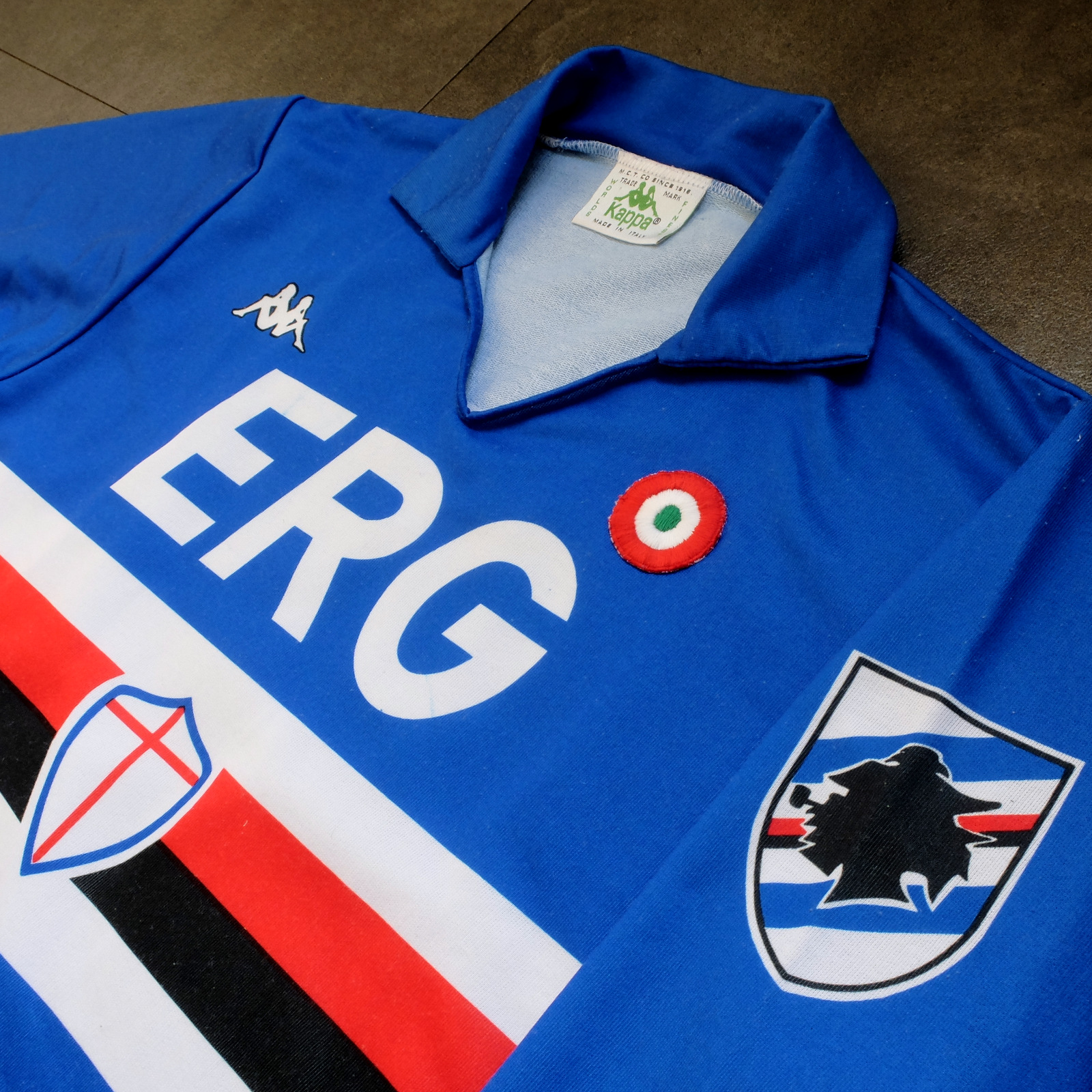
Sampdoria’s shirt rarely fails to deliver, but Kappa’s effort towards the end of the 1980s is the best of the lot. (Ennerre’s wasn’t bad either.) Oddly, what sets it apart, aside from the sinuous neckline and collar, is the italicised typeface of the sponsor, ERG. Everything else about it is routine. It has to be because there’s so much going on: the red, white and black horizontal stripes, the stemma San Giorgio at its centre, the manufacturer’s trademark. Maybe this is why in 1981 Ennerre decided to move the club’s crest to the left sleeve – to tidy it up a bit. At any rate, in doing so they made room for the coccarda, reward for winning the Coppa Italia. Sampdoria lifted the trophy in 1988 and again in 1989, so this particular jersey was never without it.
ASICS took over from Kappa in 1990 and barely changed a thing. They did, however, use a thinner material, which had the effect of altering the colour slightly, making it a touch lighter. 


NAPOLI, 1988-90


The jersey in which Napoli won their first ever scudetto is regarded as one of football’s greatest, but on closer inspection it can be found wanting. The sponsor, Buitoni, certainly looks the business, but the material – usually acrylic, sometimes cotton – belonged to a different era. In 1988 Ennerre finally got with the programme. While they continued to issue shirts made from their trademarked Lanetta (acrylic by another name), they also produced a polyester version, designed more than likely for the summer months.
At the same time Mars succeeded Buitoni as the club’s sponsor, initially written in white and then, later, black – presumably to improve visibility. Napoli won the UEFA Cup in 1989 and a second championship in 1990, whereafter the form of Diego Maradona began to deteriorate. It didn’t matter: he had become synonymous with Napoli and brought them unprecedented success, immortalising Ennerre’s shirt in the process.


FIORENTINA, 1989-90


When a friend introduced me to the delights of 110 Goals Italia Style in 1989 (on VHS) it wasn’t immediately obvious just how good Fiorentina’s shirt actually was. This is because they were wearing it with purple shirts and white socks, which detracted from its magnificence. When we sat down to watch the sequel in 1990, it became apparent (about a quarter of the way into it, as Baggio curls a diagonal ball into the back of Ascoli’s net) that Fiorentina were now wearing white shorts with purple socks. As well as that, they were sponsored by local rag La Nazione, rather than non-alcoholic aperitif Crodino, whose yellow and white lettering was less conspicuous than Crodino’s yellow and red. The shirt itself, made by ABM, was micropatterned, employing subtle shifts within the texture of fabric to create a pattern out of ABM’s logo – a stylised ‘S’ for Sportivo. It had a ribbed collar, a V-neck, and was of a moderately loose fit. The badge was the same that was reintroduced in 2021: a red fleur-de-lis appended to the letter ‘F’ set against a white circle with a purple border, far neater than the distended diamond-shaped crest Fiorentina used before and after. 
The following season ABM reinstated the purple shorts and Roberto Baggio was sold to Juventus.


A.S. ROMA, 1990-91


Roma had to wait until 1990 before Ennerre saw fit to provide them with polyester shirts, by which time the trend for micropatterning had begun to really take off. Strangely, Ennerre seemed to hedge their bets, supplying a plain, silky version as well as micropatterned one. (Napoli were presented with the same dilemma). The micropatterned version was hardly used, yet it is the superior iteration. The NR logo, repeated within the fabric of the shirt, is a neat design, and the jersey itself is a deeper, more satisfying shade of red. This, combined with Piero Gratton’s lupetto badge and the white italics of the sponsor, Barilla, qualify it as the club’s best shirt ever. Roma did well in it too, reaching the finals of both the UEFA Cup and the Coppa Italia, losing to Inter in the former and defeating Sampdoria in the latter. 


JUVENTUS, 1990-92


While AC Milan got to dress up in polyester as early as 1987, Juventus had to wait until 1988. Strange, considering that Kappa – the firm that issued both teams their kit – was a subsidiary of a larger firm called Maglificio Calzificio Torinese. The shirt in question, when it arrived, was sponsored by Ariston, the same company that had its name emblazoned upon the acrylic sarks Juventus wore the previous season. Then in 1989 Upim replaced Ariston, whose rounder font complimented the jersey’s simplicity. However, it still lacked something, which was colour. Juventus won the Coppa Italia in 1990, which provided it. Turns out they needn’t have bothered. Kappa, in a moment of genius, decided that their logo would now be coloured green. This seemingly innocuous detail meant that when the coccarda was removed in 1991, the shirt sustained its visual impact. In fact, it looked better without it, the green insignia on the right singularly complementing the two gold stars to the left. Danone succeeded Upim in ’92, and the svelte neckline and collar – the same that had graced the shirts of Sampdoria and Milan – were exchanged for something more substantial. Still a good effort, but the 1991-92 iteration takes the honours.


TORINO, 1992-93


By 1992-93 Italian football strips were on the slide, Umbro and Lotto being the main offenders. There were still some quality shirts knocking about – Brescia, Roma, Milan, Pescara, Juventus – but only one that really mattered: Torino’s. ABM were responsible, in a working relationship that stretched back to 1990. Nothing much changed throughout their three-year tenure, save for the sponsor in ‘91 (from Indesit to Beretta) and the introduction of a polo-style neck opening in ’92. (ASICS did a similar thing with Sampdoria’s jersey the same year but couldn’t resist adding horizontal stripes beneath the placket; less is always more.) Unlike with the shirts they’d supplied for clubs like Fiorentina, Pescara and Piacenza, ABM never embellished the fabric with their emblem. As a result, the deep burgundy really jumps out at you and contrasts nicely with the small amount of blue that features in Torino’s badge. It’s that collar that does it, though.

-------

If football tops like these were typical of the late 1990s then they would be highly prized, the reason being that people of a certain age became fans of Italian football off the back of Gazzetta Football Italia, which ran from 1992 through to 2002
. It’s question of cognitive bias: not of objective value judgements but subjective realities based upon nostalgia and fond memories. Precedently, football shirts had been governed by practical necessity, and were all the better for it. Thereafter, they became fashion accessories, as preposterous now as flares, bubble perms or a particularly bushy pair of sideburns.


[For a more in-depth analysis of each of these seven shirts, follow these links: Inter, Sampdoria, Napoli, Fiorentina, Roma, Juventus, Torino.]

Friday, 2 June 2023

THE SARTORIAL ELEGANCE OF SERIE A: A.S. ROMA, 1990-91 [NR/ENNERRE]


On the face of it, A.S. Roma is one of Italy’s younger football clubs. In fact, they were the result of a merger between three pre-existing associations: Foot Ball Club di Roma, formed in 1901, Società Sportiva Alba-Audace, in 1907, and Fortitudo-Pro Roma S.G.S., in 1908. The union came about in 1927 on the orders of the National Fascist Party, who were determined that the capital be suitably represented in a revamped Divisione Nazionale; both Società Sportiva Alba-Audace and Fortitudo-Pro Roma S.G.S. had been relegated from the same division in 1927, while Foot Ball Club di Roma had been plying their trade in the Prima Divisione, the de facto second tier of Italian football. Foot Ball Club di Roma would provide the infrastructure, financial muscle and the new club’s colours, while Alba and Fortitudo-Pro Roma supplied most of the players.
Foot Ball Club di Roma had worn carmine red shirts with yellow trim, matching socks and white shorts. A.S. Roma’s strip was to be the same, except with black socks. Within a year of the club’s formation, red and yellow striped jerseys were introduced. Within another two they were gone, the original configuration having been reinstated in time for Serie A’s inaugural season.
In 1938 the socks were altered to match the shirts, and it was in these colours that Roma won their first scudetto four years later. A period of decline ensued culminating in relegation, which may or may not have prompted the move to black shorts and socks. Roma were promoted the following season as champions, persisted with the black shorts and socks for another couple of years before returning to white shorts and red, yellow-trimmed socks.
The 1960s saw only minor alterations: various shades of red, plain collars, the addition of the coccarda to celebrate Roma’s victory in the 1964 Coppa Italia. Then in 1968-69 something peculiar happened. At the insistence of the coach, Helenio Herrera, Roma inverted their kit for the second half of the season; the away shirt became the home and the home became the away. This reversal remained in place until Herrera left the club in 1973.

The next significant change came about in 1978. Adidas, who had succeeded Lacoste as technical sponsor, produced a strip consisting of orange shirts paired with red shorts and socks. About midway through the season, Pouchain then took over from Adidas and brought in what's become known as the 'ice-lolly' jersey: bright red with white sleeves and yellow and orange stripes across the shoulders. Designed by Piero Gratton, it was all part of a re-branding exercise that included a new, modern looking club crest – the lupetto, or ‘wolf's head’.
The template proved to be divisive, and the relationship was anyway short-lived. In 1980, after winning another Coppa Italia – their third – Roma hooked up with a mysterious company by the name of Playground, who retained Gratton’s badge but otherwise reverted to type: all red, yellow trim edging towards orange. Another Coppa Italia triumph followed, and their league form continued to improve. Having finished sixth in 1980, Roma came second in ‘80-81, third in ‘81-82, before finally securing their second ever Serie A title in 1982-83, in shirts provided by the Belgian sportswear manufacturer Patrick.
Despite failing to defend their scudetto, Roma made a good go of it in 1983-84: they came second in the league, bagged their fifth Coppa Italia, and were runners up against Liverpool in the 1984 European Cup final (Liverpool decked out in red, A.S. Roma in white). By now the team's shirts were supplied by Kappa, an association that would last three years, culminating in yet another Coppa Italia triumph in 1986, beating Sampdoria over two legs. Thereafter, Roma formed an alliance with NR (Ennerre) that would run until 1991.


1979-80

Ennerre joined up with Roma during what was supposed to be Sven-Göran Eriksson’s third season in charge – 1986/87. Made from acrylic (or lanetta), the corresponding jersey bore the coccarda but failed to inspire anything higher than a seventh place finish in the league and a second-round exit in the Coppa Italia (courtesy of Bologna). Eriksson was shown the door in May, Angelo Sormani took temporary charge, before Nils Liedholm – the man who had guided A.S. Roma to their title win in 1983 – re-joined the club, intent on resurrecting past glories.
Notwithstanding the loss of Carlo Ancelotti to AC Milan – from where Leidholm had just came – Roma looked a decent proposition ahead of 1987-88. Club legends Giuseppe Giannini and Bruno Conti were still present and correct, Polish midfielder Zbigniew Boniek had another season left in him, and the new coach was able to lure promising defender Gianluca Signorini from Parma (who would leave after one season for Genoa) and the highly coveted German striker Rudi Völler from Werder Bremen. And so it proved. Völler took time to settle but Giannini rose to the occasion scoring 11 times from his position in midfield, helping Roma to secure third place behind Napoli and AC Milan, thus qualifying for the UEFA Cup.
1988-89’s campaign failed to meet expectations. Roma were knocked out in the third round of the UEFA Cup by East German minnows Dynamo Dresden, only made it as far as the second round of the Coppa Italia, and finished a disappointing seventh in Serie A. Nils Liedholm was sent packing, as were the under-performing Brazilian pairing of Andrade and Renato. On a brighter note, Rudi Völler appeared to be finding his feet, having scored 15 goals in all competitions.
Perhaps conscious that A.S. Roma’s form had begun to stagnate, Ennerre switched the configuration of the club’s crest with their company logo – the badge was transposed to the right, the NR insignia to the left – which seemed to have the desired effect. Roma finished the season in sixth place and made it to the semi-finals of the Coppa Italia, losing narrowly to eventual winners Juventus. The slight improvement in the club’s fortunes may more realistically be attributed to the appointment of Luigi Radice as coach.
At any rate, club president Dino Viola had already decided he wanted Ottavio Bianchi to assume coaching responsibilities, and would have employed him a year earlier if Bianchi’s contract with Napoli had allowed for it. (Radice had not been made aware of this and it left a sour taste in his mouth when it became clear that he’d merely been hired as temporary cover whilst Roma waited for Bianchi to become available.) Ottavio Bianchi, when he finally arrived in the summer of 1990, enlisted the services of his ex-Napoli employee Andrea Carnevale, who was very quickly caught out on a doping violation (along with goalkeeper Angelo Peruzzi) and banned from competing for the next 12 months. Brazilian defender Aldair signed from Benfica, shoring up a defence that already included the German centre-back Thomas Berthold.
Meanwhile, Ennerre decided to ditch the acrylic and embrace polyester. In every other respect the shirt was pretty much the same, save for two strands of yellow piping running diagonally from the neck down to under the arm. Moreover, as at Napoli, Ennerre supplied two versions of the same shirt: one in unembellished polyester and the other micro-patterned with NR’s magnificent logo. They also provided a second away jersey, in the same style as Napoli's so-called 'cup shirt'. White with a red and yellow convoluted stripe reaching from one arm to the other, the top was used sparingly but has since become something a cult classic.
Roma’s subsequent league form was erratic. However, in the UEFA Cup they ran riot and lost only narrowly over a two-legged final to Inter (Rudi Völler was the competition’s leading scorer with 10 goals). Then, less than a month later, Roma sealed an empathetic 4-2 aggregate victory over Serie A winners Sampdoria in the Coppa Italia.


The Curva Sud faithful would have to wait another ten years before their team lifted another trophy – A.S. Roma’s third scudetto – by which time they’d reverted to wearing white shorts and black socks. Actually, Roma’s kit has fared better over the years than many of their rivals’, but it's never quite hit the heights that Ennerre bestowed upon them during the latter half of the 1980s and early '90s.