

Football shirts in the late 1990s described a sartorial
nightmare, and this was as true in Italy as anywhere else. That grey and black
horizontally striped 'third shirt' that Ronaldo wore for Inter. Juventus away, in
which they won their last European Cup. Fiorentina jerseys sponsored by
Nintendo, made by Fila. Parma in yellow and blue hoops. If they had fitted, that
would have been something. Instead, they flapped about like an artisan’s smock.
One of the reasons for this was the rise of football
as a global phenomenon, promulgated by the theatre of Italia '90. Hitherto, replica shirts had been aimed primarily at kids; hooligans didn’t tend to wear
them for fear of attracting the wrong sort of attention. All of a sudden football was cool, and the fashion at that time was for loose fitting clothes. Companies
that had only a passing association with the game, such as Puma, Reebok
and Nike, decided that they’d like a piece of the action, which obliged more established firms, such
as Adidas, Diadora and Kappa, to adopt more adventurous strategies. Nothing
wrong with this from a business point of view, but fashion is not the same
thing as good taste. Ergo, as football became more popular, the shirts became more ostentatious.
Up until the early 1980s they hadn’t been ostentatious
enough. What changed was the introduction of polyester and the right for clubs
to bear commercial sponsors. It is counter-intuitive that things like this could
make a difference, but they did. Something else: back then, club badges and
manufacturer emblems were sewn on, rather than printed, dye-sublimated or
ironed, which gave the shirts a tactility that belied their true value. As well as all that, they fitted properly,
were invariably V-necked and had collars.
Here are some of the finest examples.
INTERNAZIONALE, 1988-89

When Uhlsport took over from Le Coq Sportif in 1988 not much about Inter’s shirt changed: the sponsor remained the same, the club’s
crest, the number of vertical stripes. What did change – aside from the manufacturer’s
insignia and – was the textile: polyester in place of acrylic. This had an effect on the shade of blue, making it lighter, but it also allowed Uhlsport to radically overhaul the away shirt, which was white, installing a band of alternating blue and black rhomboids printed across the front of the shirt (the same motif would be adopted by the club generally, adorning flags and tickets).
The uppercase font of
the sponsor, MISURA, is a delight, as are the two red dots that form part of it. The collar is simple, sleek and in harmony with the V-shaped neckline. Finally,
Inter’s now defunct biscione ensign, with the gold star above, and
Uhlsport’s logo, a black stylised letter U set against a white square with a
red border. It was probably cheap to make but didn’t look it. How much of this
was by design is another matter.
SAMPDORIA, 1988-90
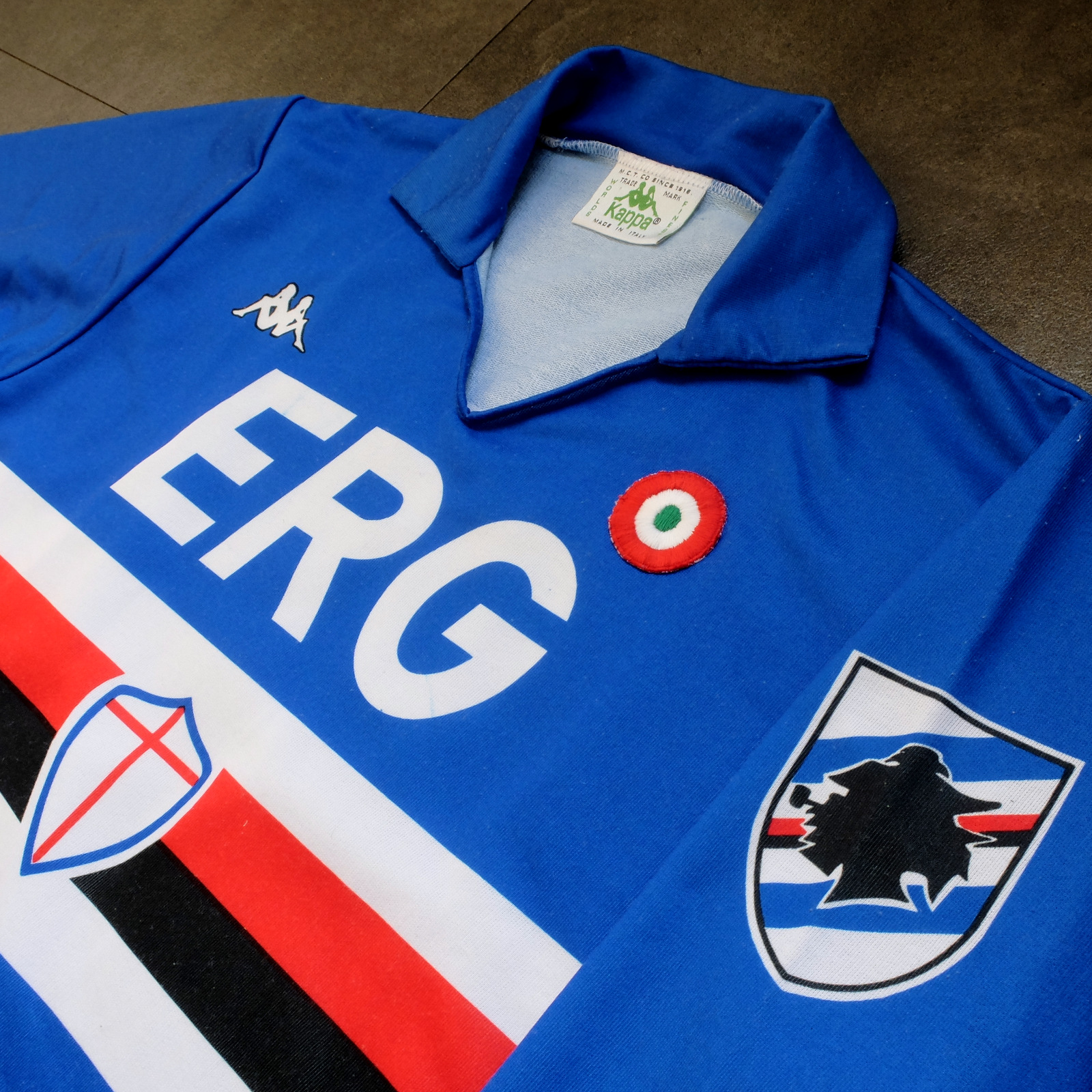
Sampdoria’s shirt rarely fails to deliver, but Kappa’s
effort towards the end of the 1980s is the best of the lot. (Ennerre’s wasn’t
bad either.) Oddly, what sets it apart, aside from the sinuous neckline and
collar, is the italicised typeface of the sponsor, ERG. Everything else
about it is routine. It has to be because there’s so much going on: the red,
white and black horizontal stripes, the stemma San Giorgio at its centre,
the manufacturer’s trademark. Maybe this is why in 1981 Ennerre decided to move the club’s crest to the left sleeve – to tidy
it up a bit. At any rate, in doing so they made room for the coccarda, reward
for winning the Coppa Italia. Sampdoria lifted the trophy in 1988 and again in
1989, so this particular jersey was never without it.
ASICS took over from Kappa in 1990 and barely changed
a thing. They did, however, use a thinner material, which had the effect of
altering the colour slightly, making it a touch lighter.
NAPOLI, 1988-90

The jersey in which Napoli won their first ever scudetto is regarded as one of football’s greatest, but on closer inspection it can be found wanting. The sponsor, Buitoni, certainly looks the business, but the material – usually acrylic, sometimes cotton – belonged to a different era. In 1988 Ennerre finally got with the programme. While they continued to issue shirts made from their trademarked Lanetta (acrylic by another name), they also produced a polyester version, designed more than likely for the summer months.
At the same time Mars succeeded Buitoni as the club’s sponsor, initially written in white and then, later, black – presumably to improve visibility. Napoli won the UEFA Cup in 1989 and a second championship in 1990, whereafter the form of Diego Maradona began to deteriorate. It didn’t matter: he had become synonymous with Napoli and brought them unprecedented success, immortalising Ennerre’s shirt in the process.
FIORENTINA, 1989-90

When a friend introduced me to the delights of 110
Goals Italia Style in 1989 (on VHS) it wasn’t immediately obvious
just how good Fiorentina’s shirt actually was. This is because they were
wearing it with purple shirts and white socks, which detracted from its
magnificence. When we sat down to watch the sequel in 1990, it became
apparent (about a quarter of the way into it, as Baggio curls a diagonal ball into
the back of Ascoli’s net) that Fiorentina were now
wearing white shorts with purple socks. As well as that, they were sponsored by
local rag La Nazione, rather than non-alcoholic aperitif Crodino, whose
yellow and white lettering was less conspicuous than Crodino’s yellow and red. The
shirt itself, made by ABM, was micropatterned, employing subtle shifts within
the texture of fabric to create a pattern out of ABM’s logo – a stylised ‘S’
for Sportivo. It had a ribbed collar, a V-neck, and was of a moderately
loose fit. The badge was the same that was reintroduced in 2021: a red fleur-de-lis
appended to the letter ‘F’ set against a white circle with a purple border, far
neater than the distended diamond-shaped crest Fiorentina used before and
after.
The following season ABM reinstated the purple shorts
and Roberto Baggio was sold to Juventus.
A.S. ROMA, 1990-91

Roma had to wait until 1990 before Ennerre saw fit to provide them with polyester shirts, by which time the trend for micropatterning had begun to really take off. Strangely, Ennerre seemed to hedge their bets, supplying a plain, silky version as well as micropatterned one. (Napoli were presented with the same dilemma). The micropatterned version was hardly used, yet it is the superior iteration. The NR logo, repeated within the fabric of the shirt, is a neat design, and the jersey itself is a deeper, more satisfying shade of red. This, combined with Piero Gratton’s lupetto badge and the white italics of the sponsor, Barilla, qualify it as the club’s best shirt ever. Roma did well in it too, reaching the finals of both the UEFA Cup and the Coppa Italia, losing to Inter in the former and defeating Sampdoria in the latter.
JUVENTUS, 1990-92

While AC Milan got to dress up in polyester as early
as 1987, Juventus had to wait until 1988. Strange, considering that Kappa – the
firm that issued both teams their kit – was a subsidiary of a larger firm called
Maglificio Calzificio Torinese. The shirt in question, when it arrived, was
sponsored by Ariston, the same company that had its name emblazoned upon the
acrylic sarks Juventus wore the previous season. Then in 1989 Upim replaced
Ariston, whose rounder font complimented the jersey’s simplicity. However,
it still lacked something, which was colour. Juventus won the Coppa Italia in
1990, which provided it. Turns out they needn’t have bothered. Kappa, in a
moment of genius, decided that their logo would now be coloured green. This seemingly
innocuous detail meant that when the coccarda was removed in 1991, the shirt sustained
its visual impact. In fact, it looked better without it, the green insignia on
the right singularly complementing the two gold stars to the left. Danone succeeded Upim in ’92, and the svelte neckline
and collar – the same that had graced the shirts of Sampdoria and Milan – were
exchanged for something more substantial. Still a good effort, but the 1991-92
iteration takes the honours.
TORINO, 1992-93

By 1992-93 Italian football strips were on the slide,
Umbro and Lotto being the main offenders. There were still some quality shirts
knocking about – Brescia, Roma, Milan, Pescara, Juventus – but only one that
really mattered: Torino’s. ABM
were responsible, in a working relationship that stretched back to 1990. Nothing much changed throughout their three-year tenure, save for the sponsor in ‘91 (from Indesit to
Beretta) and the introduction of a polo-style neck opening in ’92. (ASICS did a
similar thing with Sampdoria’s jersey the same year but couldn’t resist adding
horizontal stripes beneath the placket; less is always more.) Unlike with the shirts they’d supplied for clubs like Fiorentina, Pescara and Piacenza, ABM
never embellished the fabric with their emblem. As a result,
the deep burgundy really jumps out at you and contrasts nicely with the small amount of blue that features in Torino’s badge. It’s
that collar that does it, though.
-------


.JPG)