Showing posts with label 1991. Show all posts

Wednesday, 19 March 2025

THE SARTORIAL ELEGANCE OF SERIE A: PALERMO, 1990-92 [ABM]


Same old story: Palermo got their colours after a laundry incident turned their football shirts pink. The club had previously worn a combination of red and blue, so it's doubtful that such a mutation is even possible. In any case, the more widely accepted explanation is based upon a letter sent to the club's president, Joshua 'Giuseppe' Whitaker, in 1905 suggesting the change to pink and black to represent the rosolio and amaro produced by Whitaker's family business, which was drunk after a game in accordance with the result: rosolio – which is pink, sweet – after a win, and amaro – black, bitter – in defeat. (It is not known what was consumed in the event of a draw.)
The new colours weren't in fact implemented until 1907, the same year the club changed its name to Palermo Foot-Ball Club. Hitherto, they'd identified as the Anglo-Palermitan Athletic and Foot-Ball Club, reflecting the team's English ties: the aforementioned ornithologist Joseph Whitaker, Viceconsul Edward De Garston, Norman Olsen, George Blake, who had previously been involved in the establishment of Genoa Cricket and Football Club, as well as Ignazio Pagano, a local Italian who had been introduced to football during his two years spent studying in England.
The opportunity to actually play football was scarce and centred around matches against the crews of passing British ships. Indeed, the only other team in Sicily at the time was Messina FC, founded in 1900 by Alfredo Marangolo, who had studied alongside Ignazio Pagano in London. In 1901, the two of them would get together and organise a match between their respective teams, and again in 1904, before the arrangement was solidified with the creation of the Whitaker Challenge Cup in 1905. This annual fixture ran for four consecutive years (honours even) before the 1908 Messina earthquake put a terrible stop to it.
In its place, and quite independent from it, came the Lipton Challenge Cup. One of the crews Palermo had played against had been that of the Erin, a privately owned yacht belonging Sir Thomas Lipton. Palermo had won, and the tea-magnate rewarded them with a formidable trophy. Unable to commit to a rematch, Lipton stipulated that teams from Sicily and Campania should compete annually for the cup, which effectively meant Palermo playing against either Naples Foot-Ball Club or Unione Sportiva Internazionale Napoli. This competition ran until 1915, cut short by Italy's entrance into the First World War.
In the wake of the conflict, a number of smaller clubs emerged: Trinacria, Itala, Esperia, and Racing FBC. Valentino Columbo, who'd played for Palermo prior to the war, purchased Racing FBC, who played in blue and white halved shirt, and rebranded them Unione Sportiva Palermo. Within a year, he changed the colours to pink and black, facilitating a sense of continuity between the new club and the older one. More mergers were to follow – with Unione Sportiva Leoni in 1922, Sport Club Libertas Palermo in 1923, and 'Vigor' in 1927 – and another name change, to Palermo Football Club. Meanwhile, the team muddled along in Lega Sud, struggling financially.
By the time of Serie A's inauguration in 1929, Palermo were playing in Group D – the 'Southern Directory Circle' – and came top of it, gaining promotion into Serie B. Coincidently, that same year the club commissioned a new badge, which is worthy of note because it was designed by the Italian painter and futurist Giuseppe 'Pippo' Rizzo. Comprised of a horizontally inclined rhombus set against a stylised, brown leather football, it was replaced as early as 1932 after Palermo won promotion into Serie A. This was the moment at which the club adopted the symbol of the golden eagle, derived from the city’s coat of arms, which remains in place to this day.
 
Like so many other Italian football teams, Palermo would soon fall foul of Fascist initiatives. First they were obliged to ‘Italianise’ their name, and not long after were pressured into taking on the colours of municipal Palermo – red and yellow. In the midst of all this, they were relegated. If that wasn’t bad enough, in 1940 the FIGC kicked them out of the league due to insolvency.
Not for the first time, Palermo were forced into affiliation with a lesser but more economically stable local rival. The team in question was Juventina Palermo, who just so happened to wear the same colours that Racing FBC had. The partnership was retitled Unione Sportiva Palermo-Juventina and within a couple of years were playing in pink and black; within four, they were called more simply Unione Sportiva Palermo.
The 1950s and 1960s would represent a period of relative stability for Palermo. Flitting between series A and B, the most dramatic thing that happened to them was another change of name, to Società Sportiva Calcio Palermo, a by-product of the club listing itself as a joint-stock company. At some point during this period – probably the late 1960s – Palermo started experimenting with stripes. By the 1970s, this trend seemed to have passed, a decade that was spent almost entirely within the confines of Serie B.
 

1979-80

The idea that the football shirt, and sportswear in general, is something other than utilitarian came about in the 1970s. If you wanted to identify a 'year zero' then 1972 might do, when Adidas launched their trefoil logo in the run up to the Munich Olympics. Up until then, branding in football had been low key, often non-existent. By the end of the decade it would be ubiquitous, thanks to the efforts of firms such as Admiral, Umbro, Puma and, of course, Adidas. In Italy, the company that led the charge was Pouchain.
This golden age of footballing couture would last until the end of the century, whereafter sports kit started to become more technical – or would pretend to be. Even though the notion of the football shirt as high performing sportwear is slightly disingenuous, it is fair to say that the invention of manmade fabrics has been of some benefit to the game, has it has for many other sports. When Pouchain were active, acrylic was the material of choice, which had itself superseded wool and cotton. Ennerre favoured acrylic, before eventually getting on board with polyester in the early 1990s, while ABM liked to mix polyester with cotton.
Palermo have had gear manufactured by all three: Pouchain from 1979-80, Ennerre from 1980-86, and ABM from 1990-96. Designed by Piero Gratton, Pouchain’s shirt had by far the best badge: the silhouetted profile of an eagle's head framed within the outline of a diamond. The problem with it was that the fashion of the day dictated that the jerseys were tightly fitted. The Ennerre shirts were more forgiving but suffered from the fact that they didn’t incorporate the club’s insignia, which wasn’t so unusual back then (see also Como, Avellino, even Juventus). After two years with Ennerre’s offshoot company Ennedue, who were equally negligent, Hummel stepped into the fold. Again, the Danish firm didn’t see fit to incorporate a badge, but otherwise showed promise. Finally, ABM took over, and knocked the ball out of the park.
Palermo’s 1990-91 shirt might be their best. For one, it had a badge, although not Gratton’s, which the club had got rid of in 1987. Instead, a Iberian style shield, of the type Inter used throughout the 1980s, with an oblique pink and black stripe running through the middle and the basic outline of an eagle’s head over the top. The template itself was the same that was being used at Fiorentina, Piacenza, Messina and Ternana: collar, trimmed V-neck, ABM's logo running in vertical micropatterned lines within the fabric of the shirt. The sponsor was ‘Citta di Palermo’ in what I can only assume was some sort of tourism initiative, which let it down a bit.
For the next season, the minimal club crest was dropped for a more complicated rendering of an eagle almost in flight. The collar was now black, while the new sponsor – consumer electronics producer Sèleco – was printed in blue. ABM also produced a pink and black striped third version with diagonal micropatterning, which hardly seemed necessary but looked good all the same.
 

1991-92

The 1990s saw Palermo – or Unione Sportiva Città di Palermo, as they were known from 1994 onward – yo-yoing between series B and C. The new century brought with it a revival of fortune, with the club qualifying for the UEFA Cup/Europa League on three separate occasions. The bubble finally burst in 2019, whereupon Palermo were forced to reregister as Palermo Società Sportiva Dilettantistica and ply their trade in Serie D. Upon promotion into Serie C in 2020, they were permitted to restitute the name Palermo Football Club, and are currently playing in Serie B wearing gear supplied by Puma.

Friday, 2 June 2023

THE SARTORIAL ELEGANCE OF SERIE A: A.S. ROMA, 1990-91 [NR/ENNERRE]


On the face of it, A.S. Roma is one of Italy’s younger football clubs. In fact, they were the result of a merger between three pre-existing associations: Foot Ball Club di Roma, formed in 1901, Società Sportiva Alba-Audace, in 1907, and Fortitudo-Pro Roma S.G.S., in 1908. The union came about in 1927 on the orders of the National Fascist Party, who were determined that the capital be suitably represented in a revamped Divisione Nazionale; both Società Sportiva Alba-Audace and Fortitudo-Pro Roma S.G.S. had been relegated from the same division in 1927, while Foot Ball Club di Roma had been plying their trade in the Prima Divisione, the de facto second tier of Italian football. Foot Ball Club di Roma would provide the infrastructure, financial muscle and the new club’s colours, while Alba and Fortitudo-Pro Roma supplied most of the players.
Foot Ball Club di Roma had worn carmine red shirts with yellow trim, matching socks and white shorts. A.S. Roma’s strip was to be the same, except with black socks. Within a year of the club’s formation, red and yellow striped jerseys were introduced. Within another two they were gone, the original configuration having been reinstated in time for Serie A’s inaugural season.
In 1938 the socks were altered to match the shirts, and it was in these colours that Roma won their first scudetto four years later. A period of decline ensued culminating in relegation, which may or may not have prompted the move to black shorts and socks. Roma were promoted the following season as champions, persisted with the black shorts and socks for another couple of years before returning to white shorts and red, yellow-trimmed socks.
The 1960s saw only minor alterations: various shades of red, plain collars, the addition of the coccarda to celebrate Roma’s victory in the 1964 Coppa Italia. Then in 1968-69 something peculiar happened. At the insistence of the coach, Helenio Herrera, Roma inverted their kit for the second half of the season; the away shirt became the home and the home became the away. This reversal remained in place until Herrera left the club in 1973.

The next significant change came about in 1978. Adidas, who had succeeded Lacoste as technical sponsor, produced a strip consisting of orange shirts paired with red shorts and socks. About midway through the season, Pouchain then took over from Adidas and brought in what's become known as the 'ice-lolly' jersey: bright red with white sleeves and yellow and orange stripes across the shoulders. Designed by Piero Gratton, it was all part of a re-branding exercise that included a new, modern looking club crest – the lupetto, or ‘wolf's head’.
The template proved to be divisive, and the relationship was anyway short-lived. In 1980, after winning another Coppa Italia – their third – Roma hooked up with a mysterious company by the name of Playground, who retained Gratton’s badge but otherwise reverted to type: all red, yellow trim edging towards orange. Another Coppa Italia triumph followed, and their league form continued to improve. Having finished sixth in 1980, Roma came second in ‘80-81, third in ‘81-82, before finally securing their second ever Serie A title in 1982-83, in shirts provided by the Belgian sportswear manufacturer Patrick.
Despite failing to defend their scudetto, Roma made a good go of it in 1983-84: they came second in the league, bagged their fifth Coppa Italia, and were runners up against Liverpool in the 1984 European Cup final (Liverpool decked out in red, A.S. Roma in white). By now the team's shirts were supplied by Kappa, an association that would last three years, culminating in yet another Coppa Italia triumph in 1986, beating Sampdoria over two legs. Thereafter, Roma formed an alliance with NR (Ennerre) that would run until 1991.


1979-80

Ennerre joined up with Roma during what was supposed to be Sven-Göran Eriksson’s third season in charge – 1986/87. Made from acrylic (or lanetta), the corresponding jersey bore the coccarda but failed to inspire anything higher than a seventh place finish in the league and a second-round exit in the Coppa Italia (courtesy of Bologna). Eriksson was shown the door in May, Angelo Sormani took temporary charge, before Nils Liedholm – the man who had guided A.S. Roma to their title win in 1983 – re-joined the club, intent on resurrecting past glories.
Notwithstanding the loss of Carlo Ancelotti to AC Milan – from where Leidholm had just came – Roma looked a decent proposition ahead of 1987-88. Club legends Giuseppe Giannini and Bruno Conti were still present and correct, Polish midfielder Zbigniew Boniek had another season left in him, and the new coach was able to lure promising defender Gianluca Signorini from Parma (who would leave after one season for Genoa) and the highly coveted German striker Rudi Völler from Werder Bremen. And so it proved. Völler took time to settle but Giannini rose to the occasion scoring 11 times from his position in midfield, helping Roma to secure third place behind Napoli and AC Milan, thus qualifying for the UEFA Cup.
1988-89’s campaign failed to meet expectations. Roma were knocked out in the third round of the UEFA Cup by East German minnows Dynamo Dresden, only made it as far as the second round of the Coppa Italia, and finished a disappointing seventh in Serie A. Nils Liedholm was sent packing, as were the under-performing Brazilian pairing of Andrade and Renato. On a brighter note, Rudi Völler appeared to be finding his feet, having scored 15 goals in all competitions.
Perhaps conscious that A.S. Roma’s form had begun to stagnate, Ennerre switched the configuration of the club’s crest with their company logo – the badge was transposed to the right, the NR insignia to the left – which seemed to have the desired effect. Roma finished the season in sixth place and made it to the semi-finals of the Coppa Italia, losing narrowly to eventual winners Juventus. The slight improvement in the club’s fortunes may more realistically be attributed to the appointment of Luigi Radice as coach.
At any rate, club president Dino Viola had already decided he wanted Ottavio Bianchi to assume coaching responsibilities, and would have employed him a year earlier if Bianchi’s contract with Napoli had allowed for it. (Radice had not been made aware of this and it left a sour taste in his mouth when it became clear that he’d merely been hired as temporary cover whilst Roma waited for Bianchi to become available.) Ottavio Bianchi, when he finally arrived in the summer of 1990, enlisted the services of his ex-Napoli employee Andrea Carnevale, who was very quickly caught out on a doping violation (along with goalkeeper Angelo Peruzzi) and banned from competing for the next 12 months. Brazilian defender Aldair signed from Benfica, shoring up a defence that already included the German centre-back Thomas Berthold.
Meanwhile, Ennerre decided to ditch the acrylic and embrace polyester. In every other respect the shirt was pretty much the same, save for two strands of yellow piping running diagonally from the neck down to under the arm. Moreover, as at Napoli, Ennerre supplied two versions of the same shirt: one in unembellished polyester and the other micro-patterned with NR’s magnificent logo. They also provided a second away jersey, in the same style as Napoli's so-called 'cup shirt'. White with a red and yellow convoluted stripe reaching from one arm to the other, the top was used sparingly but has since become something a cult classic.
Roma’s subsequent league form was erratic. However, in the UEFA Cup they ran riot and lost only narrowly over a two-legged final to Inter (Rudi Völler was the competition’s leading scorer with 10 goals). Then, less than a month later, Roma sealed an empathetic 4-2 aggregate victory over Serie A winners Sampdoria in the Coppa Italia.


The Curva Sud faithful would have to wait another ten years before their team lifted another trophy – A.S. Roma’s third scudetto – by which time they’d reverted to wearing white shorts and black socks. Actually, Roma’s kit has fared better over the years than many of their rivals’, but it's never quite hit the heights that Ennerre bestowed upon them during the latter half of the 1980s and early '90s.

Thursday, 5 January 2023

THE SARTORIAL ELEGANCE OF SERIE A: ATALANTA, 1989-91 [NR/ENNERRE]


Atalanta began life as the Bergamo Society of Gymnastics and Athletic Sports Atalanta in 1907, named in honour of the mythological Greek of the same name: huntress, slayer of centaurs, injurer of boars, the object of the Argonaut Meleager’s affections, and runner. The club was set up by a group of students who attended the prestigious Liceo Classico Paolo Sarpi, and who had in turn been members of the ‘The Young Orobia’ – Orobia being the name of the territory that formerly constituted north-eastern Lombardy.
At that time, Bergamo already had a football team, called Foot-Ball Club Bergamo. Established in 1904 by a Swiss textile-industrialist named Matteo Legler, they played in Italy’s Seconda Categoria, but it doesn’t seem they took it too seriously, forfeiting a game against Unione Sportiva Milanese so they could play in friendly against Chiasso in Switzerland. In the 1911, the club folded.
Meanwhile, the Bergamo Society of Gymnastics and Fencing – or Bergamasca for short – were looking to expand their interests. Sensing an opportunity, they offered Matteo Legler the job of setting up a football club, which he duly did, bringing with him financial clout and any of his mates who were still interested in kicking a ball about. Before long, football was the association’s main concern.
Atalanta’s fortunes were also on the up. After playing nothing more than friendlies on improvised terrain, the club gained access to a field large enough to meet the regulations laid out by the Federazione Italiana Giuoco Calcio (FIGC) and received official recognition from the governing body in 1914. The Great War intervened, and then in 1919 a problem arose. The FIGC would only permit one team from Bergamo to compete in what was then known as the Prima Categoria. The Italian championship was oversubscribed, meaning that teams had to win regional pre-season qualifiers to gain admittance into the group stage of the championship, with the aim of qualifying for the national semi-finals, which were also group-based. There was nothing for it but to play-off against each other. Bergmasca were favourites but Atalanta prevailed, two goals to nil.
Atalanta finished third in Lombardy Group B, which wasn't enough to get them into the semi-finals. In February 1920 it was decided that the best course of action would be to join forces to create Atalanta e Bergamasca di Ginnastica e Scherma, abbreviated soon after to Atalanta Bergamasca Calcio.
Whereas Atalanta had worn black and white vertical striped shirts, Bergmasca wore blue and white, which suggested a combination of the two. Initially, the newly formed club opted for blue and black halved jerseys with black shorts and socks, before settling for the blue and black vertically striped format worn to this day. The club crest incorporated horizontal black and white stripes occupying one of half of a shield with a field of solid blue in the other as a nod to both teams' history.

The Italian Championship was by now approaching its critical mass. Rather than reduce the number of competing teams, the competition was enlarged to accommodate more of them. It made no difference. Atalanta finished bottom of their Lombardian qualifying group – one of the six required to whittle down the numbers – and faced relegation. Following the schism that resulted in the formation of the rival Confederazione Calcistica Italiana (CCI), however, Atalanta kept their place in the Prima Categoria. Following the Columbo Compromise of 1922, they were then demoted to a newly formed Seconda Divisione.
In 1925, the Seconda Divisione became the Prima Divisione to allow for the creation of the Divisione Nazionale, into which Atalanta were promoted in 1928 – the same year they moved into their current stadium (known then as Stadio Mario Brumana). 1928-29 was to be last edition of the Divisione Nazionale before the move to a single-group format. As such, the top eight teams in each of the two groups that constituted the National Division would be granted entry into Serie A, the teams placed ninth to fourteenth place relegated to Serie B, and the bottom two teams demoted to the old First Division. Atalanta finished Group A in fourteenth place.
The club continued to play in Serie B up until they were promoted to Serie A in 1937, making it to the third round of the Coppa Italia in the process. In 1938, Atalanta were relegated, although they did make it as far as the quarter finals of the Italian Cup. In 1940 they were back in Serie A, where they would remain until 1958 (excepting the brief alteration to the format that came about after the Second World War). In 1959, Atalanta won Serie B for a second time, and in 1963 they were victorious in the Coppa Italia for the first.
Perhaps to celebrate, they decided now would be a good time to redesign their badge, reconfiguring the shield to include an image of their Greek namesake on the right, blue and black vertical stripes to the left, and the club's name above. Atalanta's fortunes thereafter were mixed, although never disastrous, flitting between Series A and B with mild regularity, a pattern that would persist for the rest of the decade and well into the next


The 1980s can be seen as something as a turning point, not just on the pitch but off it. In 1984, Atalanta came top of Serie B for the third time in their history and decided to give their badge a modernist revamp. Atalanta’s head was depicted in profile, her hair blowing behind her, suggesting movement, set against a blue background circled within a thin band of yellow  no text. Moreover, it appeared be made of leather. If you didn’t know better you’d think graphic designer Piero Gratton had a hand in it. The kit itself, which was nothing to write home about, was sponsored by Sit-In, manufactured by Ennerre.
Then in 1989, after having been relegated in 1987, the same year they reached the final of the Coppa Italia, Atalanta were back in Serie A with the same badge but a new sponsor, the energy provider TAMOIL. The bold, italic, uppercase font was hardly spectacular, but it was set in red against a white, rectangular background. The material was a silky polyester, and it had a collar. Then there was Ennerre’s delightfully minimal insignia, the letters ‘n’ and ‘r’ embroidered in green thread. Driven on by goals of Claudio Caniggia and Armando Madonna, Atalanta finished seventh, which was good enough to gain entry into the UEFA Cup. (They had actually qualified for the same competition the previous year, only to be then eliminated by Spartak Moscow in the first round.)
For the next season, TAMOIL was printed in white, doing away with the white backdrop, but apart from that the strip remained the same. Atalanta fared better in the UEFA Cup this time around, knocking out Dinamo Zagreb, Fenerbahçe and Cologne, before losing to eventual winners Internazionale in the quarter finals. They finished Serie A in tenth place with Evair and Caniggia as joint-top scorers, contributing 10 apiece.


1990-91

In 1991 Atalanta joined up with Lotto, and anybody who reads my stuff will know that I don't care much for shirts made by Lotto. In 1993 they tinkered with the badge, superimposing an oval to make room for the club’s name and the date of 1907. The distinctive profile of Atalanta was unaltered, and remains as it is to this very day. Thank God for small mercies.


Tuesday, 28 June 2022

THE SARTORIAL ELEGANCE OF SERIE A: ASCOLI CALCIO, 1991-92 [NR/ENNERRE]


When the Federazione Italiana Giuoco Calcio (FIGC) set up the Terza Divisione in 1922, the commune of Ascoli Piceno didn’t have a team in it. Nor had they in the league that preceded it – the Promozione – which excluded clubs southeast of Tuscany and Emilia-Romagna. Then in 1923, the FICG established regional divisions in Lazio, Puglia, Marche and Campania. Marche and Campania had enough teams to justify the inclusion of two groups – same as the northern leagues. By 1926, Marche had just one, comprising Gruppo Sportivo Vis Pesaro, Vigor Senigallia, Unione Sportiva Sambenedettese, and Circolo Sportivo Vigor, who were from Ascoli Piceno.
Circolo Sportivo Vigor actually started off as Candido Augusto Vecchi in 1898, named in honour of a local Garibaldian colonel. Typically, football was not the association’s main concern, cycling was, and only friendly games against minor local teams were played. The change of name came about in 1905, for what Ascoli Calcio’s website mysteriously describes as ‘political reasons’.
It wasn’t until 1919 that football became the primary focus, and the Unione Sportiva Ascolana was the result. Their cause was helped further when the municipality elected to build a stadium. The Comunale dei Giardini was completed in 1926, the same year the club was granted entry into the Terza Divisione (Marche Section), having reverted to their previous designation. Circolo Sportivo Vigor subsequently came top of their group and so were promoted to the Seconda Divisione (Group South), which is where they stayed for next few seasons.
In 1929, they changed their name again, to Società Sportiva Ascoli, and won promotion into the Prima Divisione off the back of it. Unfortunately, due to the restructuring of the leagues, the Prima Divisione was the first division in name only and was in effect Italian football’s third tier. Divided into six interregional groups, the top two teams in the four Northern groups were then split across another two groups with the winner of each being allowed into Serie B. The same theory was applied to the two Southern groups, but with just one spot to play for.
Ascoli never made it beyond the preliminary stages before demoting itself in 1933, despite having just finished sixth in a group of fourteen. The following year they went bankrupt, which may explain the decision to voluntarily drop down a league. If that wasn’t bad enough, the club re-registered as Fascio Giovanile di Combattimento di Ascoli, albeit just for a season. The second division then became the first, so the first could become Serie C, and by 1938 Ascoli were competing in it.
We can only assume that throughout all of this Ascoli, under whichever guise, were wearing black and white striped shirts. ‘The social colours are black and white,’ is the only thing Ascoli’s website has to say on the subject, and there are photographs taken in the 1940s to corroborate this. In any case, after the end of the war Ascoli carried on where they’d left off, but struggled. In 1948 they were relegated to the Promozione, and in 1955 to the Promozione Regionale. To stop the rot, the club merged with the Società Sportiva Lillo Del Duca to become Associazione Sportiva Del Duca Ascoli. It seemed to do the trick, and by 1959 they were playing in group B of Serie C.
 
It would take just over a decade for Ascoli to finally make it into Serie B, and as soon as they did they changed their name to Ascoli Calcio 1898. These were the beginnings of the club’s glory years, when they punched above their weight (Ascoli Piceno is not a big place). In 1972-73 – their first season in Serie B – Ascoli came fourth, missing out on promotion by a single point. The next year they made sure of it, coming second, equal to the champions, Varese, on points, but not goal difference.
As debut seasons in Serie A go, 1974-75 wasn’t bad one. Ascoli placed 12th in what was at that time a 16-team league, and commissioned a new badge. Whereas their previous insignia had involved some sort of shield – split down the middle with black and white vertical stripes occupying one half, a rendering of a castle the other – this iteration was circular with ‘A.S. ASCOLI 1898’ written around its periphery. In 1976 they finished 14th and were relegated.


Within a couple of years, Ascoli were back in Serie A, as winners of Serie B, wearing gear supplied by Admiral – the English firm’s naval trademark appended to the right side of the chest. The next season (still in Serie A) the club hooked up with Pouchain. What Pouchain did for Italian football is a subject in itself, revolutionising the very notion of what a football strip could be. Graphic designer Piero Gratton was the man responsible, and for Ascoli he got rid of the castle and replaced it with a cartoon woodpecker (the team’s nickname is I Picchi – 'The Woodpeckers'). Unfortunately, the partnership lasted just two years, whereupon Ascoli partnered up with the Italian jeans company POP84, who promptly ditched Gratton’s distinctive motif.
A contract with Adidas followed in 1984, and the introduction of another new badge. Set within a green, rectangular border with rounded corners, a woodpecker was depicted in profile with a modernist simplicity of which Gratton would surely have approved. On the downside, Adidas’s tenure would be marred by the presentation of the club’s commercial sponsors: first Olio San Giorgio, slapped across the chest like an afterthought, and then Norditalia, written in a jarringly Gothic script. Both versions were V-necked, neither had a collar.
After a brief sojourn in Serie B, Ascoli switched to Uhlsport. The shirt was all right, with a narrower stripe and a black collar, but was again let down by the sponsor: MICROMAX written in white on black in an indistinguishable font. Adidas returned in 1989 and used the same design as before, although the new sponsor, COCIF, was easier on the eye than the previous incumbents. Relegation ensued.


In 1991, after Walter Casagrande’s 22 goals helped secure another promotion, Ascoli Calcio signed up with Ennerre (NR). At once, industrial washing manufacturer IMESA climbed on board as commercial sponsor. Utilising the template Ennerre had provided for Napoli, Atalanta and Roma the previous season, the shirt suddenly looked the business. In IMESA, Ascoli at last had a typeface that worked: round, bold, uppercase, with a red dot where the horizontal bar of the letter 'A' would usually be. The collar was now white, as was the neckline, and stripes were of a satisfying gauge. Finally, Ennerre’s green logo complimented the green outline of Ascoli’s stylised badge, which they would soon relinquish.
Ascoli Calcio went straight back down but this time didn’t bounce straight back up. IMESA jumped ship, COCIF were reinstated, and in 1995 the club dropped down into Serie C wearing kit made by Admiral. The delineated woodpecker was wheeled out for the club's centenary in 1998, sewn onto the right sleeve, and was then gone again.

Saturday, 9 October 2021

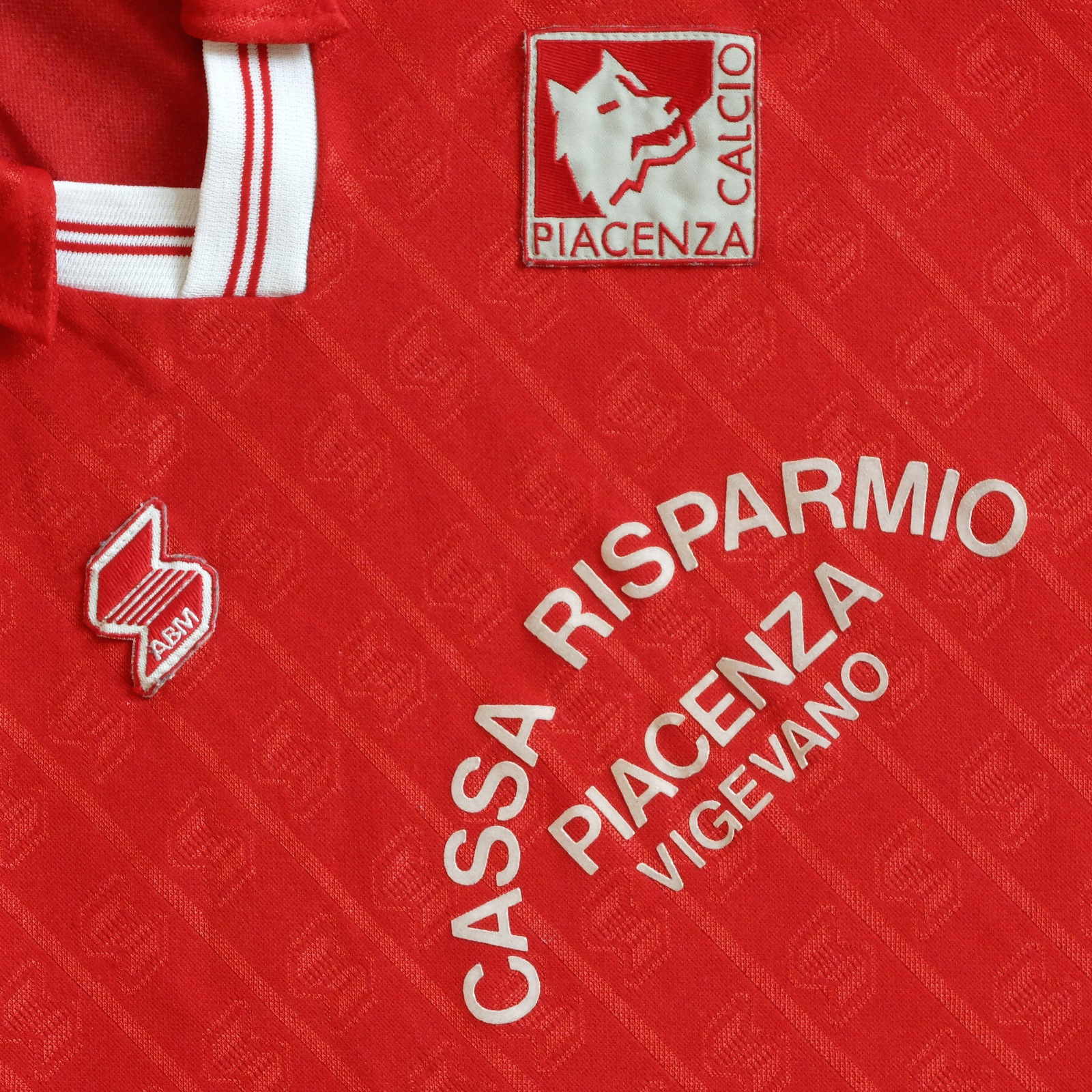
THE SARTORIAL ELEGANCE OF SERIE A: PIACENZA CALCIO, 1990-92 [ABM]


Piacenza Football Club was formed in 1919, the result of a merger between two Piacentino clubs – Giovine Italia and Unione Football Club Piacenza – under the stewardship of an eighteen year-old student by the name of Giovanni Dosi. After registering with the Federazione Italiana Giuoco Calcio (FIGC), they were granted admittance into the 1919-20 La Promozione Emiliana, came out on top and were promoted into the Prima Categoria wearing red and white kit.
The Emilian section of the Prima Categoria was separated into two groups of five. Piacenza participated in Group A, drawn against Modena, Parma, Reggiana and Carpi, and finished third, which wasn’t enough to qualify for the next round. The following season the football federation split in two, with many of the smaller clubs remaining with the FIGC and the larger, more successful teams breaking away to form the Prima Divisione, overseen by the newly created Confederazione Calcistica Italiana (CCI). Piacenza won their three-team qualifying group, ahead of Parma and Mantovana, but came last in the regional finals behind SPAL, Virtus Bolognese and Parma.
The schism between the competing associations was resolved in 1922 by way of the Colombo Compromise, which had the effect of consigning Piacenza to a lower, second division – a sort of regional Serie B. Except there was no way out of it, although teams still faced the threat of relegation. It could be said, then, that the Charter of Viareggio in 1926 was of potential benefit for clubs stuck in the lower divisions. The idea behind the charter was to nationalise the sport (in the name of Fascism), meaning that the existing Northern and Southern leagues would be amalgamated. The restructured Divisione Nazionale comprised two leagues of ten, whereafter the top three teams in each would play against each other to determine the winner. All well and good but it had the effect of downgrading the division beneath: the Prima Divisione became the second tier and the Seconda Divisione (North and South) the third.
It’s doubtful that such machinations had any material effect on Piacenza’s fortunes. What did have an impact was the decision in 1928 to divide the Divisione Nazionale into Series A and B. In 1927-28, the club finished top of Group D of the Second Division (North) which would ordinarily would have seen them promoted into Italian football’s second tier, except the First Division – the second division in all but name – now became the third. Piacenza remained in the First Division up until 1935, at which point it was renamed Serie C.
Piacenza Calcio would have to wait a while before they could play legitimately in Serie B. I say legitimately because in the aftermath of World War II they briefly featured in a combined Serie B/C Alta Italia, a temporary solution in the face of logistical and bureaucratic restrictions on travel. By 1948-49 they were back in Serie C.
After a brief spell in Serie IV/D, Piacenza were promoted to Serie B in 1968-69, but were then relegated. I have read that in the 1960s Piacenza sometimes wore white shirts with a red sash but I can find no images to corroborate this. In any case, upon the club’s return to Serie B in 1974-75 they were wearing red shirts, white shorts and red socks.
 

1975-76

In 1983 a man by the name of Leonardo Garilli became Piacenza’s president. One of the first things this qualified mechanical engineer did, aside from implementing some sort of fiscal structure, was to commission a new badge. The graphic designer(s) responsible drew upon the province’s heraldry: a red shield encapsulating a silver square and a Roman ‘she-wolf’. The shield was discarded, the square rotated through 45 degrees, and the wolf’s head rendered with a simplicity worthy of Piero Gratton himself. It is used to this day.
The new emblem didn’t appear on Piacenza’s actual shirts until 1986, provided by a company named Dafra. The club immediately won promotion into Serie B as champions, Armando Madonna the star of the show. (A young Giuseppe Signori made 14 appearances, scored one goal.) NR then took over as technical supplier while Cassa Risparmio Piacenza continued as commercial sponsor, albeit with e Vigevano now appended to their name. Despite starting well, Piacenza ended their campaign in 13th place. The following year they were relegated, and ‘Beppe’ Signori was sold to Foggia for 1.5 billion lire.
After an indifferent season in 1989-90, Piacenza added a second Serie C (1) championship to its palmarès in 1990-91. They did this wearing clobber manufactured by Abbigliamento Sportivo (ABM) utilising the same template employed at Fiorentina, Salernitana, Palermo, Messina (but not Torino). Made from polyester and cotton, the jersey was micropatterned with ABM’s motif running in vertical lines. It had a collar, an elasticated V-neck and was loose-fitting, as most jerseys were during this period.
Piacenza bedded in. They took on loan the goalkeeper Davide Pinato from Atalanta and attacking midfielder Armando Madonna from Lazio, who had been sold to Atalanta in 1988 after his previous five-year stint with Piacenza. More significantly, the striker Antonio De Vitis signed from Udinese. They finished mid-table.


In 1992-93, Piacenza won promotion into Serie A. In the meantime, ABM had tinkered with the shirt, adding a pop-stud neck opening (used at Torino), a more abstract micropattern and a white collar. The club made a quick return to Serie B but an equally speedy return to Serie A, this time as champions. Moreover, Piacenza made it stick, spending five consecutive seasons in Italy’s preeminent division before again being relegated, by which time Lotto was supplying the gear.
Unfortunately, the club went bankrupt in 2012, re-established itself as Società Sportiva Dilettantistica Piacenza Calcio 1919 in 2013 (subsequently shortened to Piacenza Calcio 1919) and have only been able to make it back as far as Serie C.

Wednesday, 30 September 2020

THE SARTORIAL ELEGANCE OF SERIE A: BOLOGNA FC, 1988-91 [UHLSPORT]


Bologna Football Club was founded in 1909 and from the start played in red and blue. The reason for this is fortuitous and involves an Austro-Hungarian by the name of Emilio Arnstein and Italian called Arrigo Gradi. Arnstein was born in Votice, in what is now the Czech Republic, and studied in Prague and Vienna before moving to Trieste, where he formed Black Star Football Club along with his brother and a handful of English ex-pats. In 1908 he moved to Bologna and immediately set about finding the local football club. Legend has that a taxi took him straight to Prati di Caprara, a military training facility hired out to any local teams that needed it. There Arnstein met Gradi, wearing the red and blue halved shirt of the college he had previously attended in Switzerland.
Gradi, along with his brothers, a Swiss dentist by the name of Louis Rauch, and a number of students from the local Spanish College (including Antonio Bernabéu, brother of Santiago, who would later play for and preside over Real Madrid) had set up a team of sorts by the name of Felsineo. It was Armstein who provided the impetus to establish a proper club, and in 1909 a patron was found willing to support the venture in the shape of Carlo Sandoni, president of the Circolo Turistico Bolognese. Louis Rauch was subsequently appointed as president, Emilio Arnstein was named as a director and Arrigo Gradi club captain.
By 1910 Bologna Football Club was no longer under Sandoni’s patronage and Arnstein was president. The jersey they'd initially come up with was modelled on the one Gradi had been wearing on that fateful day in 1908. Perhaps in an attempt to define their own image – or to differentiate themselves from the Genoa Cricket & Football Club –  the shirts were now modified to form vertical stripes of the same colour, which is the template the club uses to this day.
There has been an exception: in 1925, the year Bologna won their first scudetto, they played in green at the behest of their then manager Enrico Sabattini, in tribute to the Austrian club Rapid Vienna. You could imagine a precedent such as that sticking, but Bologna soon reverted to their traditional colours and over the course of the next 16 years added another five championships to their palmarès. In fact, for a while Bologna – alongside Juventus – were considered the preeminent force in Italian football, and with seven championships to their name are historically the sixth most successful team to play in Serie A.
Bologna were last crowned champions in 1964, were runners up in ’66 and finished third in ’67. In the early 1970s came two Coppa Italia victories. In 1982 Bologna were relegated for the first time in the club's history, and within a year found themselves playing in Serie C1. Bologna won promotion straight back into Serie B, but struggled. Luigi Corioni assumed the club’s presidency in 1985 and in ‘87 brought in a young manager called Luigi Maifredi, who he’d worked with previously while at Ospitaletto. The appointment paid immediate dividends with Bologna finishing the season in first place.
 

1970-71 [Courtesy Bologna FC 1909.]

From 1982 though to 1988, Bologna’s kit was made by Ennerre/NR. For their return to Serie A, Uhlsport became the club's technical supplier. Whereas Ennere had utilised four broad-gauge stripes, Uhlsport opted for five with a dark blue one down the middle. (Bologna may be known as the Rossoblù, but the blue is more often than not navy blue.) The shirt was V-necked, fitted with a collar, and was sponsored by Italian coffee roaster Segafredo Zanetti. Shorts and socks were also blue. Whereas Ennerre’s shirts had been made from their trademark heavyweight fabric Lanetta, Uhlsport’s were polyester. Bologna ended their first season back in Serie A in 14th place.
The next year, against the backdrop of a stadium that was being renovated ahead of the 1990 World Cup, Bologna fared better. Having added the Brazilian midfielder Geovani Silva, German striker Herbert Waas, Hungarian defender Nikolaj Iliev and ex-Juventus and San Marino midfielder Massimo Bonini to their ranks, Bologna finished the season in a very respectable 8th place – high enough to gain entry into next year's UEFA Cup. The shirts in which they achieved this feat were identical to those they'd worn the season before, save for the sponsor's name printed upon them: Mercatone Uno in place Segafredo Zanetti. Away from home, the previous all-white strip was embellished to include a blue and red horizontal stripe flicking diagonally upward towards the left shoulder, which made it more interesting.
Bologna’s success came at a price, attracting the attention of Juventus who promptly installed Luigi Maifredi as Dino Zoff’s successor. In 1991 Bologna were relegated, wearing the same shirt, although not before making it to the quarter finals of both the Coppa Italia and the UEFA Cup, losing out to Napoli and Sporting Lisbon respectively.
Uhlsport stood by Bologna but Mercatone Uno didn’t. The electronics manufacturer Sinudyne  took over as the club’s sponsor, whose typeface wasn’t nearly as eye-catching as Segafredo’s or Mercatone’s. Perhaps for this reason Uhlsport employed micropatterning, and also came up with their best away shirt yet: white as before, but with alternating dark blue and red inverted triangles running down the side of sleeves, and ascending from right to left under the sponsor’s name.
 

1989-91

Things didn’t work out. Luigi Maifredi was re-instated as coach after his unsuccessful stint at Juventus, but could only secure 13
th place. He then left again ten games into the next season to join Genoa, Bologna were relegated to Serie C, and bankruptcy followed. The club quickly re-registered as Bologna Football Club 1909 and clawed their way back to Serie A, where they’ve been playing since 2015.

Saturday, 31 August 2019

THE SARTORIAL ELEGANCE OF SERIE A: A.S. BARI, 1990-92 [ADIDAS]


Adidas has been a provider of football kits since such firms made it palpably clear that they were providing them (in the 1970s). Indeed, Adidas were one of the first companies to do so, appending their three-striped motif to the shoulders of the football shirts they provided, as well as their instantly recognisable ‘trefoil’ logo to the chest (as distinct from the rather bland ‘3 bar’ emblem they’ve been utilising since the early 1990s).
Despite a visible presence on the international scene, Adidas were not back then the dominant presence they are today, and this would have been especially true in Italy. That said, by the early 1980s there were three Italian teams of reasonable repute being supplied kit by the German conglomerate: Hellas Verona, Torino F.C. and A.S. Bari. Verona won their 1984-85 scudetto wearing Adidas – and very nice shirts they were too – in an association that lasted from 1983 through to 1987, whereupon the Veronese switched allegiance to Hummel. Torino worked with Adidas from 1984 to 1988 before hooking up with ABM, winning nothing. But Bari got there first and stayed with Adidas for the longest: from 1981 all the way through to 1997.

White football kits aren’t the most interesting and rely upon a tasteful splash of colour, or some other quirk, to liven them up. Real Madrid’s all-white strip was improved immeasurably when purple trim was added in the early 1980s. Leeds United, who modelled their strip on Real Madrid’s at Don Revie’s behest, found salvation by way of the wonderfully bizarre badge they introduced in 1973 (and jettisoned for something more conservative in 1977).
Bari’s colours are white with red trim. It’s not the most exciting of juxtapositions, but in the hands of Adidas it was made to work. Their earliest effort adhered to the traditional format: three red stripes running off the shoulder and the trefoil on the chest. In 1983 vertical pinstripes were added – in red, naturally – to be replaced in 1984 with thicker, horizontal stripes across the shoulders and thinner ones beneath. Then in 1985 – as Englishmen abroad Paul Rideout and Gordon Cowans joined the club – Adidas reintroduced the pinstripes.
Or did they? That season – 1985-86 – Bari were furnished with no less than five different shirts: the default white, pinstriped affair; a red, diagonally pinstriped shirt, presumably to be worn against opposition wearing white (clubs were not obliged back then to wear their second strip away from home); a blue iteration in case the red one didn’t suffice; a white, pinstriped shirt with red shoulder-panelling and sleeves; a red, pinstriped shirt with white shoulder-panelling and sleeves. It appears that those last two were issued for the winter months, but why they were adopted at all I have no idea. All these jerseys were pleasingly sponsored by Cassa di Risparmio di Puglia, written across the chest in an arc to make room for the bank’s insignia.
Perhaps bored of these striated schematics, Adidas then reverted to supplying Bari with an all-white strip (allowing for the three-stripes down the shoulder and the sides of the shorts, the trefoil logo, and a red collar) and would continue doing so for the next four years. The one constant throughout all of this was Bari’s tidy club crest: a cockerel in profile, rendered with modernist simplicity by graphic designer Piero Gratton.


In 1989 A.S. Bari gained promotion from Serie B into Serie A. The following year they were hosting World Cup football at their new home, the impressive Stadio San Nicola.
It was around this period that Adidas decided that their three-stripe template needed shaking up. They proceeded cautiously, introducing a variety of configurations, many of which ended up on display at the 1990 World Cup. The strange, fragmented design that adorned the shirts of Czechoslovakia and the USSR, for example, must have been deemed a failure for it was swiftly abandoned. Strangely, the top in which West Germany won the tournament did not prove to be indicative of the direction Adidas wished to take. Nor those provided for Yugoslavia, Columbia, or for the USA and Romania. The shirts given to Cameroon and Egypt, on the other hand, became something of an Adidas staple, worn by the likes of Olympique Marseille, Anderlecht, Bayern Munich, and the Republic of Ireland (although not at Italia ’90). And then there was what the United Arab Emirates were wearing, which was also what France, Poland and Ghana wore, except France, Poland and Ghana hadn’t qualified for the 1990 World Cup. It was this template that Adidas would use at Bari for the next two seasons.
In truth this new wave of football shirt couture rarely delivered – overly complicated patterns rarely do in this context. Yet it somehow worked at Bari. In fact, Bari’s strip was pretty much identical to that of the UAE and is almost impossible to describe. The body of the shirt is white but the area covering the shoulders, and running diagonally towards the neck, is red, except on the top of the shoulders, which is white save for three red (Adidas) stripes sublimated over the top. Along the boundary between the red on the shoulder and the white of the trunk there are three hollow parallelograms running diagonally upwards either side of the chest, their outlines inverted. Sleeves are red on the outer side and white underneath the arm. Shorts and socks are white and exhibit Adidas’s obligatory red trim.
What really sets the kit off nicely, though, is the sponsor’s name, Sud Factoring, all lower case, printed in what looks like Goudy Heavy Face. And Bari’s badge, positioned just below the clavicle so as not to interfere with those parallelograms (as is Adidas’s trefoil geometrically opposite).


David Platt

Bari’s tenure in Serie A would be short-lived. In 1990-91 they finished in 13th place, four points above the relegation zone. They had some fairly decent players – Giovanni Loseto in defence, Pietro Maiellaro in midfield, João Paulo up front – and in ’91 brought in Daniele Fortunato from Juventus, Zvonimir Boban on loan from AC Milan, and David Platt from Aston Villa. To no avail. A. S. Bari were relegated, Adidas hung around for a couple more seasons, whereafter Lotto filled the void, and the shirt went downhill from there.


Sunday, 1 July 2018

THE SARTORIAL ELEGANCE OF SERIE A: JUVENTUS, 1991-94 [KAPPA]


When Ian Rush finally joined up with Juventus in the summer of 1987, after being loaned back to Liverpool for the previous season, Michel Platini informed the Welshman he’d arrived two, maybe three years too late and that the club was entering a period of transition. Most of the players Rush had played, and lost, against in the European Cup Final two years earlier had moved on – Zbigniew Boniek, Paolo Rossi, Maro Tardelli, etc. – while Platini himself had confirmed his retirement. Antonio Cabrini and club captain Gaetano Scirea were still present but well past their prime, Scirea having just turned 34. They did have Michael Laudrup, but he was not at this point anywhere near being the player he would later become at Barcelona.
What might also have frustrated Rush was the fact that his new shirt was a museum piece in comparison to the natty number he’d been wearing at Liverpool. Italian sportswear companies were slow to more on from acrylic, and although the current shirt wasn’t unattractive, it would have seemed relatively heavy and overly long. Just to really rub it in, no sooner had Rush returned to Liverpool than Kappa got their act together and started utilising contemporary fabrics.

The change in material did not have an immediate impact on Juventus’s form. Nor did the arrival of Portuguese Rui Barros or Ukrainian Oleksandr Zavarov. What did appear to signal an upward turn in the club’s fortune was the acquisition of Salvatore Schillaci from Messina, Pierluigi Casiraghi from Monza, and taking on department-store chain Upim as patron in place of home-appliance manufacturer Ariston. 1989-90 was a good season for the ‘Old Lady’ that saw them lift both the Coppa Italia, narrowly beating AC Milan, and the UEFA Cup, comfortably beating Fiorentina.
The jersey in which Juventus ended their three year barren spell incorporated hollow, inverted, micropatterned squares forming part of a larger matrix of hollow, inverted, micropatterned squares (what's technically known as a 'jacquard'). It was a nice shirt but suffered from a lack of colour, and the absence of the club’s crest; in its place, just two gold stars signifying over 20 scudetti won. When the actual scudetto – or even the coccarda – adorned the shirt, then it became a thing of great beauty.


Despite winning two trophies, Juventus had come no nearer to landing the championship, finishing fourth, and manager Dino Zoff was shown the door. He was not alone: Zavarov was out, as was Belarusian Sergei Aleinikov, who’d only lasted one season, and so too Rui Barros, who moved on to Monaco. The new coach, Luigi Maifredi, brought with him defender Marco Antonio De Marchi from Bologna, and was also provided with World Cup winning midfielder Thomas Häßler, Brazilian defender Júlio César, and attacking midfielder, and national hero, Roberto Baggio, who claimed his transfer from Fiorentina had been forced upon him.
1990-91 did not go as planned, for which Maifredi paid the ultimate price. However, as winners of the previous year’s Coppa Italia, Juventus bore the coccarda. Moreover, Kappa decided that their company’s logo – the silhouette of a man and woman sat back-to-back – should now be coloured green. This minor detail meant that when the coccarda was absent the following season the shirt maintained its visual interest. Indeed, it seemed to look better without the scudetto or the coccarda, the green Kappa logo on the right side singularly complementing the two gold stars on the left.
In the meantime Juventus had reappointed Giovanni Trapattoni as coach, the man who had previously guided the club to six titles within nine years (the period Platini was referring to when lecturing Rush). In his first season in charge Juventus finished second in the league behind champions AC Milan. In 1992, food producer Danone took over as sponsor and the shirt’s V-neck was trimmed, otherwise the kit remained very much the same. Trapattoni then guided Juventus to their second UEFA Cup victory in four years, beating Borussia Dortmund 6-1 on aggregate, and then in 1993-94 finished Serie A as runners up – again losing out to AC Milan – before ‘Trap’ left to take over at Bayern Munich.


1991-92

Depending on how you like your collars and fonts will determine which iteration of this kit you prefer. Personally, I think the Upim version edges it. In any case, the phlegmatic Frenchman was right: Juventus had been a team in transition. By the time they secured the title in 1995, under the stewardship of Marcello Lippi, Kappa had ditched their green insignia, reverting to black, and started doing terrible things to their shirts’ neckline. Lotto would soon take over as supplier, and later Nike, but neither would come close to offering the simplicity and purity of design Kappa provided during this transitory phase in the early 1990s.