Showing posts with label Juventus. Show all posts

Saturday, 17 February 2024

THE SARTORIAL ELEGANCE OF SERIE A: SEVEN SHIRTS


Football shirts in the late 1990s described a sartorial nightmare, and this was as true in Italy as anywhere else. That grey and black horizontally striped 'third shirt' that Ronaldo wore for Inter. Juventus away, in which they won their last European Cup. Fiorentina jerseys sponsored by Nintendo, made by Fila. Parma in yellow and blue hoops. If they had fitted, that would have been something. Instead, they flapped about like an artisan’s smock.
One of the reasons for this was the rise of football as a global phenomenon, promulgated by the theatre of Italia '90. Hitherto, replica shirts had been aimed primarily at kids; hooligans didn’t tend to wear them for fear of attracting the wrong sort of attention. All of a sudden football was cool, and the fashion at that time was for loose fitting clothes. Companies that had only a passing association with the game, such as Puma, Reebok and Nike, decided that they’d like a piece of the action, which obliged more established firms, such as Adidas, Diadora and Kappa, to adopt more adventurous strategies. Nothing wrong with this from a business point of view, but fashion is not the same thing as good taste. Ergo, as football became more popular, the shirts became more ostentatious.
Up until the early 1980s they hadn’t been ostentatious enough. What changed was the introduction of polyester and the right for clubs to bear commercial sponsors. It is counter-intuitive that things like this could make a difference, but they did. Something else: back then, club badges and manufacturer emblems were sewn on, rather than printed, dye-sublimated or ironed, which gave the shirts a tactility that belied their true value. As well as all that, they fitted properly, were invariably V-necked and had collars.
Here are some of the finest examples.


INTERNAZIONALE, 1988-89


When Uhlsport took over from Le Coq Sportif in 1988 not much about Inter’s shirt changed: the sponsor remained the same, the club’s crest, the number of vertical stripes. What did change – aside from the manufacturer’s insignia and – was the textile: polyester in place of acrylic. This had an effect on the shade of blue, making it lighter, but it also allowed Uhlsport to radically overhaul the away shirt, which was white, installing a band of alternating blue and black rhomboids printed across the front of the shirt (the same motif would be adopted by the club generally, adorning flags and tickets).
The uppercase font of the sponsor, MISURA, is a delight, as are the two red dots that form part of it. The collar is simple, sleek and in harmony with the V-shaped neckline. Finally, Inter’s now defunct biscione ensign, with the gold star above, and Uhlsport’s logo, a black stylised letter U set against a white square with a red border. It was probably cheap to make but didn’t look it. How much of this was by design is another matter.


SAMPDORIA, 1988-90
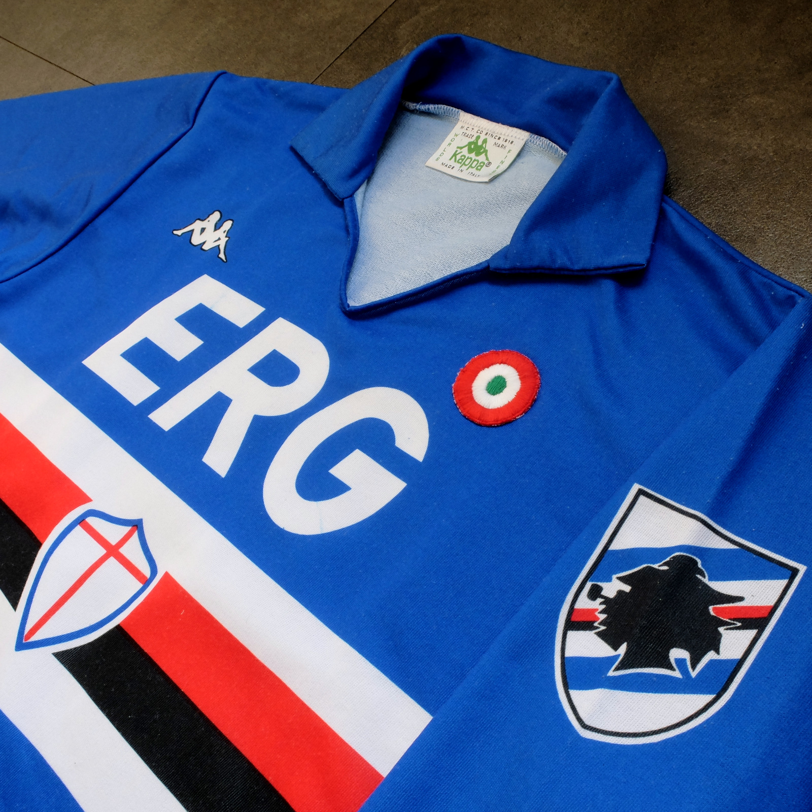


Sampdoria’s shirt rarely fails to deliver, but Kappa’s effort towards the end of the 1980s is the best of the lot. (Ennerre’s wasn’t bad either.) Oddly, what sets it apart, aside from the sinuous neckline and collar, is the italicised typeface of the sponsor, ERG. Everything else about it is routine. It has to be because there’s so much going on: the red, white and black horizontal stripes, the stemma San Giorgio at its centre, the manufacturer’s trademark. Maybe this is why in 1981 Ennerre decided to move the club’s crest to the left sleeve – to tidy it up a bit. At any rate, in doing so they made room for the coccarda, reward for winning the Coppa Italia. Sampdoria lifted the trophy in 1988 and again in 1989, so this particular jersey was never without it.
ASICS took over from Kappa in 1990 and barely changed a thing. They did, however, use a thinner material, which had the effect of altering the colour slightly, making it a touch lighter. 


NAPOLI, 1988-90


The jersey in which Napoli won their first ever scudetto is regarded as one of football’s greatest, but on closer inspection it can be found wanting. The sponsor, Buitoni, certainly looks the business, but the material – usually acrylic, sometimes cotton – belonged to a different era. In 1988 Ennerre finally got with the programme. While they continued to issue shirts made from their trademarked Lanetta (acrylic by another name), they also produced a polyester version, designed more than likely for the summer months.
At the same time Mars succeeded Buitoni as the club’s sponsor, initially written in white and then, later, black – presumably to improve visibility. Napoli won the UEFA Cup in 1989 and a second championship in 1990, whereafter the form of Diego Maradona began to deteriorate. It didn’t matter: he had become synonymous with Napoli and brought them unprecedented success, immortalising Ennerre’s shirt in the process.


FIORENTINA, 1989-90


When a friend introduced me to the delights of 110 Goals Italia Style in 1989 (on VHS) it wasn’t immediately obvious just how good Fiorentina’s shirt actually was. This is because they were wearing it with purple shirts and white socks, which detracted from its magnificence. When we sat down to watch the sequel in 1990, it became apparent (about a quarter of the way into it, as Baggio curls a diagonal ball into the back of Ascoli’s net) that Fiorentina were now wearing white shorts with purple socks. As well as that, they were sponsored by local rag La Nazione, rather than non-alcoholic aperitif Crodino, whose yellow and white lettering was less conspicuous than Crodino’s yellow and red. The shirt itself, made by ABM, was micropatterned, employing subtle shifts within the texture of fabric to create a pattern out of ABM’s logo – a stylised ‘S’ for Sportivo. It had a ribbed collar, a V-neck, and was of a moderately loose fit. The badge was the same that was reintroduced in 2021: a red fleur-de-lis appended to the letter ‘F’ set against a white circle with a purple border, far neater than the distended diamond-shaped crest Fiorentina used before and after. 
The following season ABM reinstated the purple shorts and Roberto Baggio was sold to Juventus.


A.S. ROMA, 1990-91


Roma had to wait until 1990 before Ennerre saw fit to provide them with polyester shirts, by which time the trend for micropatterning had begun to really take off. Strangely, Ennerre seemed to hedge their bets, supplying a plain, silky version as well as micropatterned one. (Napoli were presented with the same dilemma). The micropatterned version was hardly used, yet it is the superior iteration. The NR logo, repeated within the fabric of the shirt, is a neat design, and the jersey itself is a deeper, more satisfying shade of red. This, combined with Piero Gratton’s lupetto badge and the white italics of the sponsor, Barilla, qualify it as the club’s best shirt ever. Roma did well in it too, reaching the finals of both the UEFA Cup and the Coppa Italia, losing to Inter in the former and defeating Sampdoria in the latter. 


JUVENTUS, 1990-92


While AC Milan got to dress up in polyester as early as 1987, Juventus had to wait until 1988. Strange, considering that Kappa – the firm that issued both teams their kit – was a subsidiary of a larger firm called Maglificio Calzificio Torinese. The shirt in question, when it arrived, was sponsored by Ariston, the same company that had its name emblazoned upon the acrylic sarks Juventus wore the previous season. Then in 1989 Upim replaced Ariston, whose rounder font complimented the jersey’s simplicity. However, it still lacked something, which was colour. Juventus won the Coppa Italia in 1990, which provided it. Turns out they needn’t have bothered. Kappa, in a moment of genius, decided that their logo would now be coloured green. This seemingly innocuous detail meant that when the coccarda was removed in 1991, the shirt sustained its visual impact. In fact, it looked better without it, the green insignia on the right singularly complementing the two gold stars to the left. Danone succeeded Upim in ’92, and the svelte neckline and collar – the same that had graced the shirts of Sampdoria and Milan – were exchanged for something more substantial. Still a good effort, but the 1991-92 iteration takes the honours.


TORINO, 1992-93


By 1992-93 Italian football strips were on the slide, Umbro and Lotto being the main offenders. There were still some quality shirts knocking about – Brescia, Roma, Milan, Pescara, Juventus – but only one that really mattered: Torino’s. ABM were responsible, in a working relationship that stretched back to 1990. Nothing much changed throughout their three-year tenure, save for the sponsor in ‘91 (from Indesit to Beretta) and the introduction of a polo-style neck opening in ’92. (ASICS did a similar thing with Sampdoria’s jersey the same year but couldn’t resist adding horizontal stripes beneath the placket; less is always more.) Unlike with the shirts they’d supplied for clubs like Fiorentina, Pescara and Piacenza, ABM never embellished the fabric with their emblem. As a result, the deep burgundy really jumps out at you and contrasts nicely with the small amount of blue that features in Torino’s badge. It’s that collar that does it, though.

-------

If football tops like these were typical of the late 1990s then they would be highly prized, the reason being that people of a certain age became fans of Italian football off the back of Gazzetta Football Italia, which ran from 1992 through to 2002
. It’s question of cognitive bias: not of objective value judgements but subjective realities based upon nostalgia and fond memories. Precedently, football shirts had been governed by practical necessity, and were all the better for it. Thereafter, they became fashion accessories, as preposterous now as flares, bubble perms or a particularly bushy pair of sideburns.


[For a more in-depth analysis of each of these seven shirts, follow these links: Inter, Sampdoria, Napoli, Fiorentina, Roma, Juventus, Torino.]

Tuesday, 10 December 2019

STADIA: JUVENTUS STADIUM AND STADIO OLIMPICO GRANDE TORINO, TURIN


Built in 1990 specifically for the World Cup, the Stadio delle Alpi, although an impressive structure in and of itself, made for a bad football stadium. The usual thing: poor sight-lines, a running track, remote location, no atmosphere. Juventus and Torino persisted in playing there until 2006, by which point Juventus were averaging crowds of about 25,000 across all competitions – Torino marginally less – in a ground with room enough for 69,000, compared to the approximate 47,000 thousand they’d been drawing in at the Stadio Comunale in 1998 (although it should be noted that attendances began to decline throughout all of Italy over the same period).
Actually, the delle Alpi’s number was up as early as 2002 when Juventus purchased the property off the city council for €25 million with a view to knocking it down and constructing something more modest in its place – the same year a Coppa Italia encounter between Juventus and Sampdoria attracted a mere 237 supporters. Plans for a new 41,000-seater stadium were finally unveiled in November 2008, with the project scheduled to commence the following year. In the meantime, both Juventus and Torino were able to return to the Stadio Comunale – now known as Stadio Olimpico – after it had been substantially renovated ahead of the 2006 Winter Olympics. By September 2011 the Juventus Stadium was complete.

Stadio delle Alpi was pre-fabricated, meaning it was manufactured off-site and then pieced together on location. It follows that such a structure is easier to take down, and that much of its material is recoverable. Accordingly, in developing the new stadium a ‘sustainable construction policy’ was adopted that is reckoned to have recouped around €2.3 million in costs: the redundant terracing, for example, was reduced to aggregate and used to shore up the new ground’s foundations; something like 6,000 tons of various metals were recycled. Numerous energy-saving strategies were also incorporated into the design – solar energy, district heating, the trapping of rainwater, and so on. Consider too that by scaling downwards Juventus were able to sell land to the retail outlet Conad for around €20.25 million. Not only did this nearly cover the cost of the site itself, but the Area 12 Shopping Centre that Conad subsequently constructed, in partnership with French Hypermarket chain E. Leclerc, provided the sort of amenities that were beyond the football club’s reach: shops, bars, restaurants, as well as 2,000 parking spaces.
All in all, then, the new stadium appears to represent a neat piece of business. It looks like a neat piece of business. Comprised of a continuous, curved rectangular bowl, its simplicity is almost the most striking thing about it; only the row of the executive boxes squeezed between the two tiers of the west side and the ‘premium club’ seats directly in front break the monotony. But look up and you’ll notice two inverted V-shaped pylons at either end of the ground pulling on steel tensioning-cables attached to the trusses that support the roof. This is surely a nod to the old Stadio delle Alpi, whose roof was upheld in a similar fashion. Even the canopy itself bears some similarity, divided into sections with translucent gaps in-between letting in light.
The lower tier is about twice as deep as the upper ring of seating and is as tight to the pitch as the available space will allow. Seats are mostly white but fade to black towards the rear, with three yellow stars behind each goal denoting over 30 scudetti won. The 56 concrete monoliths that anchored the cables that supported the delle Alpi’s roof have been left in situ, as has the landscaped mound that encircled them – formed to diminish the ground’s profile against the backdrop of the Alps. As such the lower tier is indiscernible from without. The visible, upper stratum has been swathed in a skirt of grey panelling, save for a ring horizontal green, white and red panels around the stadium’s rim. Although in the main cosmetic, this façade gives protection against the elements for spectators congregating around the concourse that surrounds the top tier, which is uncluttered and with plenty of room to move about in.
Some have argued that the ground’s capacity should have been higher. Project manager and chief architect Gino Zavanella has pointed out that Juventus are currently averaging crowds of between 38,000 and 39,000, so it's about right. In any case, the club stipulated that they’d sooner sell out than have 10,000-odd seats left empty. More bothersome is the charge that, against minor opposition, the Juventus Stadium can be an uninspiring place, that the hardcore fans save themselves for bigger games and at other times the home support can be fairly sedate.


The Stadio Olimpico was built for the 1933’s Littoriali del Sport – an event set up by the National Fascist Party to celebrate itself – and the International University Games to be held that same year. The prospect of hosting the 1934 FIFA World Cup may also have been a factor, although work on the stadium had already begun when the tournament was awarded to Italy, after much deliberation, in October 1932.
Although still rotten, Mussolini was a very different egg to Hitler and allowed Italian architects to build pretty much however they liked (out of indifference rather than benevolence). In 1927, Umberto Costanzini wrapped Bologna’s Stadio Littoriale, as it was then called, in a red-bricked neoclassical façade. Just three years later and Pier Luigi Nervi was experimenting with raw, reinforced concrete at the Stadio Giovanni Berta – named after a Florentine fascist – in a manner that all but anticipated Brutalism. Thus, it’s not so remarkable that Raffaello Fagnoni’s stadium in Turin ended up having something of the International Style about it, or even that it originally bore Mussolini’s name: Stadio Municipale Benito Mussolini.
The ground’s frontage comprised of a wall painted terracotta red with a concertinaed grill of concrete and glass running along the top of it. Above that, slender stanchions with two-story high tessellated glass screens in between. Finally, the overarching underside of the upper tier, finished in a smooth layer of raw cement – the height of modernity. Inside, the stadium consisted of two tiers with the obligatory parterre providing access via a series of bridged stairways. As was usual for the period, only one side of the ground was covered. Although not as striking as the roof Nervi erected in Florence, the elliptical nature of the Stadio Municipale made for an attractive canopy, even if it didn’t offer much in the way of protection.
Juventus moved in first, in 1933, while Torino continued to play at Stadio Filadelfia until 1963, whereupon they joined Juventus at what had by now been rechristened Stadio Comunale, for obvious reasons. The stadium saw much success: Juventus were crowned champions 16 times, Torino six. By the time both clubs left to play at the Stadio delle Alpi, the parterre had been removed to accommodate a moat and the terracing was dangerously decrepit.


Stadio Comunale

If the Stadio Comunale hadn’t been listed as a building of interest by the 'Superintendency for Environmental and Architectural Heritage' its transformation into the Stadio Olimpico could have taken a very different turn. The temptation might have been to strip the whole thing back to its foundations, build on top of it and then re-face the exterior in a more contemporaneous manner. Instead, the architectural practices tasked with refurbishing the stadium – Giovanni Cenna Architetto and Arteco – were obliged to retain the ground’s integrity while increasing its capacity and covering it completely.
The new roof was assembled upon concrete pillars positioned equidistantly around the perimeter of the second tier. These same pillars also supported a newly added third tier, albeit just five rows deep, completely separate from the existing structure and indiscernible when viewed from outside (excepting the glass-fronted corridor that runs along the back of the executive boxes that occupy the Tribuna Granata). The steel beams the roof rests upon were fixed to the stadium itself by way of slender steel masts – painted white – that reach diagonally downward and attach themselves unobtrusively to the building’s supporting stanchions. Seats were installed throughout, the moat filled in and the parterre reinstated.
Such enhancements, geared primarily towards the Winter Olympics, were probably enough to satisfy the demands of Torino. However, when Juventus qualified for the Champions League in 2008 the capacity of 25,500 was deemed inadequate and work began on extending the lower tier by another four rows to accommodate another 1,350 seats. In 2009 the parterre was removed to make room for three more rows adding an additional 444 places. Further modifications in 2012 – after Juventus had moved out – freed up a bit of extra space here and there, raising the capacity to just over 28,000, which is where it currently stands.


In April 2016, the Stadio Olimpico was renamed the Stadio Olimpico Grande Torino in honour of the team that perished in the 1949 Superga air disaster. In July 2017, Juventus's ground was rebranded as the Allianz Stadium in a deal with its sponsors set to run until July 2023. One club takes inspiration from the past, the other looks to the future.
Yet both grounds serve same purpose; the difference between them is found in the architectural detail. The Stadio Olimpico is distinct both as a building and as a stadium, while the Juventus Stadium is amorphous and easily mistaken for something else. Where the former's glass-and-concrete external wall leave an impression, the grassy banks and grey panels that surround the latter barely register. The Stadio Olimpico was devised to be seen, whereas the Juventus Stadium attempts to blend in – only those pylons give it away. Whether this makes the Olimpico more aesthetically pleasing is moot, for it is a distinction most football watchers won't care to make. But just as the Hammersmith Apollo, built in the early 1930s, is a far more arresting structure than the O2 Arena, so it also makes for a better live music venue. The Juventus Stadium presents as a cinema, the Stadio Olimpico as an amphitheatre. At Juventus the arrangement is one of intimacy and of concentration. When the performance begins, you remain in your place. Conversely, the open environment at Torino encourages movement and a greater appreciation of the setting. The staff won’t mind if you’d like to stand up, move seats, or maybe just hang out around the back of that top tier and watch the game from there.
How much of this has to do with architecture and how much to do with a differing approach towards health and safety is unclear. But there’s a lot to be said for grounds – and of buildings in general – that are adapted to perform a function, as opposed to those designed to satisfy a specific remit. The old is not beholden to the present, and by making concessions to allow for it throws up all sorts of idiosyncrasies that an architect would never conceive of. Which is not to say that the Juventus Stadium is a bad stadium, just that the Stadio Olimpico Grande Torino is a more interesting and convivial one.


Sunday, 1 July 2018

THE SARTORIAL ELEGANCE OF SERIE A: JUVENTUS, 1991-94 [KAPPA]


When Ian Rush finally joined up with Juventus in the summer of 1987, after being loaned back to Liverpool for the previous season, Michel Platini informed the Welshman he’d arrived two, maybe three years too late and that the club was entering a period of transition. Most of the players Rush had played, and lost, against in the European Cup Final two years earlier had moved on – Zbigniew Boniek, Paolo Rossi, Maro Tardelli, etc. – while Platini himself had confirmed his retirement. Antonio Cabrini and club captain Gaetano Scirea were still present but well past their prime, Scirea having just turned 34. They did have Michael Laudrup, but he was not at this point anywhere near being the player he would later become at Barcelona.
What might also have frustrated Rush was the fact that his new shirt was a museum piece in comparison to the natty number he’d been wearing at Liverpool. Italian sportswear companies were slow to more on from acrylic, and although the current shirt wasn’t unattractive, it would have seemed relatively heavy and overly long. Just to really rub it in, no sooner had Rush returned to Liverpool than Kappa got their act together and started utilising contemporary fabrics.

The change in material did not have an immediate impact on Juventus’s form. Nor did the arrival of Portuguese Rui Barros or Ukrainian Oleksandr Zavarov. What did appear to signal an upward turn in the club’s fortune was the acquisition of Salvatore Schillaci from Messina, Pierluigi Casiraghi from Monza, and taking on department-store chain Upim as patron in place of home-appliance manufacturer Ariston. 1989-90 was a good season for the ‘Old Lady’ that saw them lift both the Coppa Italia, narrowly beating AC Milan, and the UEFA Cup, comfortably beating Fiorentina.
The jersey in which Juventus ended their three year barren spell incorporated hollow, inverted, micropatterned squares forming part of a larger matrix of hollow, inverted, micropatterned squares (what's technically known as a 'jacquard'). It was a nice shirt but suffered from a lack of colour, and the absence of the club’s crest; in its place, just two gold stars signifying over 20 scudetti won. When the actual scudetto – or even the coccarda – adorned the shirt, then it became a thing of great beauty.


Despite winning two trophies, Juventus had come no nearer to landing the championship, finishing fourth, and manager Dino Zoff was shown the door. He was not alone: Zavarov was out, as was Belarusian Sergei Aleinikov, who’d only lasted one season, and so too Rui Barros, who moved on to Monaco. The new coach, Luigi Maifredi, brought with him defender Marco Antonio De Marchi from Bologna, and was also provided with World Cup winning midfielder Thomas Häßler, Brazilian defender Júlio César, and attacking midfielder, and national hero, Roberto Baggio, who claimed his transfer from Fiorentina had been forced upon him.
1990-91 did not go as planned, for which Maifredi paid the ultimate price. However, as winners of the previous year’s Coppa Italia, Juventus bore the coccarda. Moreover, Kappa decided that their company’s logo – the silhouette of a man and woman sat back-to-back – should now be coloured green. This minor detail meant that when the coccarda was absent the following season the shirt maintained its visual interest. Indeed, it seemed to look better without the scudetto or the coccarda, the green Kappa logo on the right side singularly complementing the two gold stars on the left.
In the meantime Juventus had reappointed Giovanni Trapattoni as coach, the man who had previously guided the club to six titles within nine years (the period Platini was referring to when lecturing Rush). In his first season in charge Juventus finished second in the league behind champions AC Milan. In 1992, food producer Danone took over as sponsor and the shirt’s V-neck was trimmed, otherwise the kit remained very much the same. Trapattoni then guided Juventus to their second UEFA Cup victory in four years, beating Borussia Dortmund 6-1 on aggregate, and then in 1993-94 finished Serie A as runners up – again losing out to AC Milan – before ‘Trap’ left to take over at Bayern Munich.


1991-92

Depending on how you like your collars and fonts will determine which iteration of this kit you prefer. Personally, I think the Upim version edges it. In any case, the phlegmatic Frenchman was right: Juventus had been a team in transition. By the time they secured the title in 1995, under the stewardship of Marcello Lippi, Kappa had ditched their green insignia, reverting to black, and started doing terrible things to their shirts’ neckline. Lotto would soon take over as supplier, and later Nike, but neither would come close to offering the simplicity and purity of design Kappa provided during this transitory phase in the early 1990s.