Showing posts with label Inter. Show all posts

Saturday, 17 February 2024

THE SARTORIAL ELEGANCE OF SERIE A: SEVEN SHIRTS


Football shirts in the late 1990s described a sartorial nightmare, and this was as true in Italy as anywhere else. That grey and black horizontally striped 'third shirt' that Ronaldo wore for Inter. Juventus away, in which they won their last European Cup. Fiorentina jerseys sponsored by Nintendo, made by Fila. Parma in yellow and blue hoops. If they had fitted, that would have been something. Instead, they flapped about like an artisan’s smock.
One of the reasons for this was the rise of football as a global phenomenon, promulgated by the theatre of Italia '90. Hitherto, replica shirts had been aimed primarily at kids; hooligans didn’t tend to wear them for fear of attracting the wrong sort of attention. All of a sudden football was cool, and the fashion at that time was for loose fitting clothes. Companies that had only a passing association with the game, such as Puma, Reebok and Nike, decided that they’d like a piece of the action, which obliged more established firms, such as Adidas, Diadora and Kappa, to adopt more adventurous strategies. Nothing wrong with this from a business point of view, but fashion is not the same thing as good taste. Ergo, as football became more popular, the shirts became more ostentatious.
Up until the early 1980s they hadn’t been ostentatious enough. What changed was the introduction of polyester and the right for clubs to bear commercial sponsors. It is counter-intuitive that things like this could make a difference, but they did. Something else: back then, club badges and manufacturer emblems were sewn on, rather than printed, dye-sublimated or ironed, which gave the shirts a tactility that belied their true value. As well as all that, they fitted properly, were invariably V-necked and had collars.
Here are some of the finest examples.


INTERNAZIONALE, 1988-89


When Uhlsport took over from Le Coq Sportif in 1988 not much about Inter’s shirt changed: the sponsor remained the same, the club’s crest, the number of vertical stripes. What did change – aside from the manufacturer’s insignia and – was the textile: polyester in place of acrylic. This had an effect on the shade of blue, making it lighter, but it also allowed Uhlsport to radically overhaul the away shirt, which was white, installing a band of alternating blue and black rhomboids printed across the front of the shirt (the same motif would be adopted by the club generally, adorning flags and tickets).
The uppercase font of the sponsor, MISURA, is a delight, as are the two red dots that form part of it. The collar is simple, sleek and in harmony with the V-shaped neckline. Finally, Inter’s now defunct biscione ensign, with the gold star above, and Uhlsport’s logo, a black stylised letter U set against a white square with a red border. It was probably cheap to make but didn’t look it. How much of this was by design is another matter.


SAMPDORIA, 1988-90
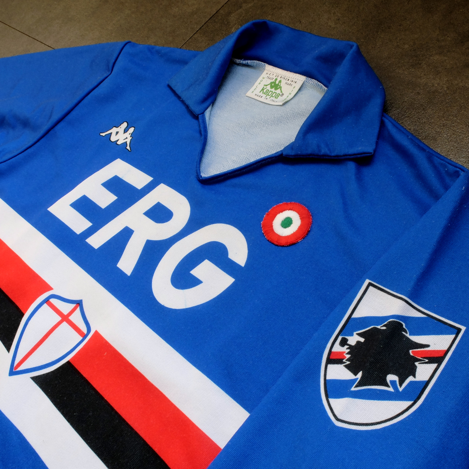


Sampdoria’s shirt rarely fails to deliver, but Kappa’s effort towards the end of the 1980s is the best of the lot. (Ennerre’s wasn’t bad either.) Oddly, what sets it apart, aside from the sinuous neckline and collar, is the italicised typeface of the sponsor, ERG. Everything else about it is routine. It has to be because there’s so much going on: the red, white and black horizontal stripes, the stemma San Giorgio at its centre, the manufacturer’s trademark. Maybe this is why in 1981 Ennerre decided to move the club’s crest to the left sleeve – to tidy it up a bit. At any rate, in doing so they made room for the coccarda, reward for winning the Coppa Italia. Sampdoria lifted the trophy in 1988 and again in 1989, so this particular jersey was never without it.
ASICS took over from Kappa in 1990 and barely changed a thing. They did, however, use a thinner material, which had the effect of altering the colour slightly, making it a touch lighter. 


NAPOLI, 1988-90


The jersey in which Napoli won their first ever scudetto is regarded as one of football’s greatest, but on closer inspection it can be found wanting. The sponsor, Buitoni, certainly looks the business, but the material – usually acrylic, sometimes cotton – belonged to a different era. In 1988 Ennerre finally got with the programme. While they continued to issue shirts made from their trademarked Lanetta (acrylic by another name), they also produced a polyester version, designed more than likely for the summer months.
At the same time Mars succeeded Buitoni as the club’s sponsor, initially written in white and then, later, black – presumably to improve visibility. Napoli won the UEFA Cup in 1989 and a second championship in 1990, whereafter the form of Diego Maradona began to deteriorate. It didn’t matter: he had become synonymous with Napoli and brought them unprecedented success, immortalising Ennerre’s shirt in the process.


FIORENTINA, 1989-90


When a friend introduced me to the delights of 110 Goals Italia Style in 1989 (on VHS) it wasn’t immediately obvious just how good Fiorentina’s shirt actually was. This is because they were wearing it with purple shirts and white socks, which detracted from its magnificence. When we sat down to watch the sequel in 1990, it became apparent (about a quarter of the way into it, as Baggio curls a diagonal ball into the back of Ascoli’s net) that Fiorentina were now wearing white shorts with purple socks. As well as that, they were sponsored by local rag La Nazione, rather than non-alcoholic aperitif Crodino, whose yellow and white lettering was less conspicuous than Crodino’s yellow and red. The shirt itself, made by ABM, was micropatterned, employing subtle shifts within the texture of fabric to create a pattern out of ABM’s logo – a stylised ‘S’ for Sportivo. It had a ribbed collar, a V-neck, and was of a moderately loose fit. The badge was the same that was reintroduced in 2021: a red fleur-de-lis appended to the letter ‘F’ set against a white circle with a purple border, far neater than the distended diamond-shaped crest Fiorentina used before and after. 
The following season ABM reinstated the purple shorts and Roberto Baggio was sold to Juventus.


A.S. ROMA, 1990-91


Roma had to wait until 1990 before Ennerre saw fit to provide them with polyester shirts, by which time the trend for micropatterning had begun to really take off. Strangely, Ennerre seemed to hedge their bets, supplying a plain, silky version as well as micropatterned one. (Napoli were presented with the same dilemma). The micropatterned version was hardly used, yet it is the superior iteration. The NR logo, repeated within the fabric of the shirt, is a neat design, and the jersey itself is a deeper, more satisfying shade of red. This, combined with Piero Gratton’s lupetto badge and the white italics of the sponsor, Barilla, qualify it as the club’s best shirt ever. Roma did well in it too, reaching the finals of both the UEFA Cup and the Coppa Italia, losing to Inter in the former and defeating Sampdoria in the latter. 


JUVENTUS, 1990-92


While AC Milan got to dress up in polyester as early as 1987, Juventus had to wait until 1988. Strange, considering that Kappa – the firm that issued both teams their kit – was a subsidiary of a larger firm called Maglificio Calzificio Torinese. The shirt in question, when it arrived, was sponsored by Ariston, the same company that had its name emblazoned upon the acrylic sarks Juventus wore the previous season. Then in 1989 Upim replaced Ariston, whose rounder font complimented the jersey’s simplicity. However, it still lacked something, which was colour. Juventus won the Coppa Italia in 1990, which provided it. Turns out they needn’t have bothered. Kappa, in a moment of genius, decided that their logo would now be coloured green. This seemingly innocuous detail meant that when the coccarda was removed in 1991, the shirt sustained its visual impact. In fact, it looked better without it, the green insignia on the right singularly complementing the two gold stars to the left. Danone succeeded Upim in ’92, and the svelte neckline and collar – the same that had graced the shirts of Sampdoria and Milan – were exchanged for something more substantial. Still a good effort, but the 1991-92 iteration takes the honours.


TORINO, 1992-93


By 1992-93 Italian football strips were on the slide, Umbro and Lotto being the main offenders. There were still some quality shirts knocking about – Brescia, Roma, Milan, Pescara, Juventus – but only one that really mattered: Torino’s. ABM were responsible, in a working relationship that stretched back to 1990. Nothing much changed throughout their three-year tenure, save for the sponsor in ‘91 (from Indesit to Beretta) and the introduction of a polo-style neck opening in ’92. (ASICS did a similar thing with Sampdoria’s jersey the same year but couldn’t resist adding horizontal stripes beneath the placket; less is always more.) Unlike with the shirts they’d supplied for clubs like Fiorentina, Pescara and Piacenza, ABM never embellished the fabric with their emblem. As a result, the deep burgundy really jumps out at you and contrasts nicely with the small amount of blue that features in Torino’s badge. It’s that collar that does it, though.

-------

If football tops like these were typical of the late 1990s then they would be highly prized, the reason being that people of a certain age became fans of Italian football off the back of Gazzetta Football Italia, which ran from 1992 through to 2002
. It’s question of cognitive bias: not of objective value judgements but subjective realities based upon nostalgia and fond memories. Precedently, football shirts had been governed by practical necessity, and were all the better for it. Thereafter, they became fashion accessories, as preposterous now as flares, bubble perms or a particularly bushy pair of sideburns.


[For a more in-depth analysis of each of these seven shirts, follow these links: Inter, Sampdoria, NapoliFiorentina, RomaJuventus, Torino.]

Sunday, 21 August 2022

STADIA: STADIO GIUSEPPE MEAZZA AND STADIO COMUNALE LUIGI FERRARIS


The 1986 FIFA World Cup was supposed to be held in Colombia. In late 1982, the prospective host withdrew from its commitment citing 'economic difficulties' (actually asymmetric internal armed conflict) and Mexico was awarded the privilege in their place. The tournament went on to be a great success – the collected images of Diego Maradona are some of the most iconic in the sport – but it’s been said that the physical infrastructure was found wanting. The fact of the matter is that Mexico wasn’t afforded the time to adequately prepare for the job – just three years. Most of the venues dated back to the 1960s, some were even older. Throw a major earthquake into the mix, eight months before the competition was due to start, and one begins to think that maybe the Mexican Football Federation pulled off something of a coup. Furthermore, despite their age some of the stadiums were actually quite impressive. The Estadio Olímpico Universitario, completed in 1952, is an extraordinary building, while the mighty Estadio Azteca, opened in 1966, is one of the most imposing structures of its kind.
Such tribulations were unlikely to befall Italy’s preparations for hosting the world cup in 1990 (although it is a place vulnerable to seismic activity). Not only did the Federazione Italiana Giuoco Calcio (FIGC) have the more usual six years in which to prepare for the tournament, but Serie A was the preeminent league of its day. There was the feeling that this could be the greatest World Cup ever.
The Italians elected to use the same number of stadia as the Mexicans. Of those twelve, two were new-builds (the Stadio delle Alpi in Turin and Stadio San Nicola in Bari), another two may have well been (the Stadio Comunale Luigi Ferraris in Genoa and Rome’s Stadio Olimpico), while the remaining eight were enlarged, reconfigured and refurbished. This posed various problems and architects came up with various solutions ranging from the ostentatious through to the subtle, by way of the ingenious, with varying degrees of success. But it was never about volume. What the FIGC was paying for was architecture.
In the end the quality of the actual football was relatively disappointing. The tournament saw the lowest goals-per-game average for a World Cup and what at the time was a record of 16 red cards. More to the point, it wasn’t always pretty. There was mention of the ball – the Adidas Etrusco Unico – being unfavourably light and thus harder to control, which is a common complaint these days but wasn't so much back then. There might be something in it. Try and find match footage from Mexico ‘86 – Brazil v. France will do – and see how comfortable the players look in possession. Then watch Brazil v. Argentina from Italia ’90 and count how many shots fly high and wide.
But I digress.
A number of problems have since arisen. For one, the quality of the original construction work was not always of a high standard. Within just a few seasons, terracing that had been completely refinished for the world cup was crumbling underfoot and reinforced concrete supports were starting to spall. Second, Serie A is no longer Europe’s wealthiest league: it’s the fourth behind England’s Premiership, Spain’s La Liga and the German Bundesliga. Less money to spend on players means less success means dwindling attendances means less revenue to spend on the upkeep of the stadia. Finally, the oval stadium format which permeates throughout much of Italy has slowly become redundant as European clubs have embraced the rectangular ‘English style’ which deems a running track an encumbrance. (Italian football grounds have historically been built using public funds. For this reason, local authorities have reasonably insisted that they cater for athletics.)
In 1990 the Stadio delle Alpi and Stadio San Nicola were admired for their architectural adventurousness. Today, the former has been demolished and the Juventus Stadium erected in its place, while the latter presents a sorry sight, many of its Teflon roof sections blowing in the wind or ripped from their fastenings entirely. To be fair the grounds they replaced also had athletics tracks. However, the Stadio Comunale and Stadio Della Vittoria were smaller stadiums. At full capacity a running track isn’t so much of a problem. The Stadio delle Alpi and Stadio San Nicola was/is never full to capacity.
It’s not so much that the Italian authorities made a mistake but missed an opportunity. It’s a moot point as far as Verona or Bologna or Napoli or Cagliari are concerned, because Verona and Bologna and Napoli and Cagliari didn’t have new grounds built for them. The only cities that really benefitted, in that they were left with stadiums that anticipated the emerging trend, were Milan and Genoa.


When Stadio Giuseppe Meazza – or plain ‘San Siro’ as it was called up until 1980, whereupon it was renamed after the former AC and Inter player who died the previous year – was built in 1925, it was unusual for not encompassing a running track. The reason why is because the San Siro was privately funded by a consortium headed by A.C. Milan’s then president Piero Pirelli – of the homonymous tyre company – enabling them to build in any style they pleased. They opted for the Anglo-Saxon model, comprising of four rectilinear stands, including a covered main stand, and space for 35,000 spectators, 20,000 on seats (the remaining 10,000 stood upon parterres situated in front of the three uncovered tribuna). Possibly because of its configuration, the ground proved very popular, and up until the inauguration of Rome’s Stadio Olimpico in 1937 was the venue of choice for the national football team. Realising its financial potential, in 1935 the local council purchased the ground and set about increasing its size still further. By 1937 the smaller goal-end terraces had been extended and all four stands connected by way of four curved corner sections, allowing for a capacity approaching 65,000. In 1947 local rivals Internazionale became tenants, ushering in a period of Milanese semi-domination with four of next available eight scudettos ending up in the city, honours even. (The 1949 Superga air disaster certainly had something to do with this, wiping out the Grande Torino who’d dominated Serie A since the end of the war, and to an extent before it).
The next phase of development happened in 1955 and would come to define the stadium. The plan initially was to raise the capacity to 150,000 by way of two additional tiers. Perhaps realising the sheer ambition of the scheme – or the cost – the plans were retrenched. Instead, a single, continuous freestanding tier was built around the existing structure, completely enveloping it, making enough room for a mere 82,000 spectators. Nothing particularly innovative going on here – Real Madrid had done something similar eight years earlier at what was then known as the Nuevo Estadio Chamartín – except architect Armando Ronca had carefully considered the question of access, economy of space and aesthetics. Nineteen 200 metre long helical ramps were attached to the stadium’s exterior, each rising gradually to a height of nearly 20 metres. These parallel walkways led directly to individual vomitories providing access to the second tier at equidistant points, thus displacing the crowds that would otherwise have gathered outside. More than that, it gave the stadium a visual identify to set it apart from other football grounds; it became a thing of architectural interest in its own right. [Ronca’s most recognised work is probably the Eurotel in Marano (1958-1960) which appears to have taken its inspiration from Le Corbusier’s Unité d'habitation.]
Italy’s winning bid for the 1990 world cup brought with it terms and conditions. If the Stadio Giuseppe Meazza was to host the opening game (restitution for the final being played in Rome) then it would need an all-seated capacity of at least 80,000, two thirds of which would have to be under cover. The Milan Municipal Administration decided against building something bespoke and awarded the architects Ragazzi, Hoffer and Finzi the task of surmounting these obstacles by way of refurbishment.
The issue of space was dealt with in the same way it was 30-odd years earlier: a single freestanding tier was built around the existing structure, completely enveloping it. Ostensibly, this upper gallery is a continuation of the one already in place, but it rests upon eleven cylindrical, reinforced-concrete pillars aligned to the stadium’s curved rectangular perimeter. These colossal towers have their own ramps, spiralling upwards in accord with the existing architecture. It should be noted that this third tier is incomplete: the stadium is hampered on one side due to the presence of the racecourse – hence the odd number of supporting pillars – and so the east side of the ground remains as it was. An all-seated capacity of 85,700 is achieved nonetheless.
As well as propping up the third tier, the four (larger) corner towers support four perpendicular steel girders, their ends protruding horizontally beyond the polycarbonate fabric of the roof itself, which hangs above the stadium like an open-sided pavilion. The burgundy-matt finish of the steel complements the pale grey patina of the reinforced concrete, the effect accentuated against the backdrop of a cloudless azure sky. It is a readily attainable perspective: San Siro – the district from whence the stadium first got its name – is suburban, low-rise, remote, and to the west of the ground lies a vast expanse of concrete, from which the sheer scale of the building becomes apparent.


The parallels between A.C. Milan and Genoa C.F.C. are manifold. Both clubs began life as sort of English expatriate associations with a side-line in cricket. In each instance, the English orthography would prevail: Milan rather than Milano, Genoa instead of Genova. Milan Cricket and Football Club proceeded to privately build an exclusively football-orientated ground, and so too did Genoa Cricket and Football Club. These same grounds were subsequently sold to their respective local authorities and were also renamed after bygone players. And just as A.C. Milan would end up sharing grounds with their local rival, F.C. Internazionale Milano, in 1946 Genoa C.F.C. invited the newly formed U.C. Sampdoria to play at theirs.
Stadio Comunale Luigi Ferraris began life in 1911 as the Campo di Via del Piano (also known as Campo Marassi) and was then little more than a green surrounded by a horse racing track overlooked by a single stand with a gable in the middle. In 1928 the pitch was rotated by 90 degrees and work began on what would become the Stadio Comunale. By the time Brazil and Spain faced off in the first round of the 1934 World Cup, the ground’s capacity had risen from a notional 28,000 to a substantial 51,000 and had been entitled in honour of former player (and engineer) Luigi Ferraris, killed in action during the Great War. At this point, the stadium wasn’t too dissimilar in aspect to the San Siro: rectilinear terracing with a vaguely neo-classical façade. But whereas the stands at San Siro were joined up to form a coherent hole, the work at Comunale Luigi Ferraris displayed no overarching strategy. Cantilevered roof extensions were later added to each end of the main stand, with spiral walkways providing access to the goal-end terraces, achieving a symmetry of sorts. In 1951 an open double-decker stand was erected along the stadium’s east side, facing the covered single-tiered stand opposite. The ground as it then was could accommodate 55,773 spectators, 40,000 of them seated, which is impressive considering the physical impediments that surround the site: housing tenements, the Villa Mussi Piantelli, the Bisagno River, even a prison.


If the Luigi Ferraris had been a stadium in Mexico in 1983, it would have been left very much alone and may even have gone on to host a quarter final. Had it been located anywhere else in Italy but the undulating and beset city of Genoa, they would have probably knocked it down and replaced it with something on the edge of town. In the event, the Luigi Ferraris was knocked down but then rebuilt where it had formerly stood, and because there was nowhere else for Genoa and Sampdoria to play in the interim, it was literally done one half at a time. At no point did it not exist, and by the time it was finished the ground was completely transformed.
But why was Luigi Ferraris rebuilt at all? It was already large enough to host international football (just) and granted no less protection from the elements than Stadio Artemio Franchi in Florence or Stadio Renato Dall'Ara in Bologna. Did its piecemeal design finally catch up with it? Was the stadium just a little too ‘English’ for its own good? Whatever the reasons, the FIGC got their money’s worth. Vittorio Gregotti was given the job of sorting it out and went about imposing his trademark rectangular prisms (see the Università degli Studi di Milano-Bicocca) upon the limited space available.
If the Giuseppe Meazza reflects a moderately Brutalist, post-war impression of modernism, then the Luigi Ferraris is pure pre-war Bauhaus functionalism; where Giuseppe Meazza embraces curves and oblique lines, Luigi Ferraris is bound by right angles. The structure appears as rectangles as the sum of squares, and the motif is repeated throughout: four square gaps in the external wall behind each goal-end terrace; six protruding square-shaped stairwells above the stadium’s main entrance; large square apertures in the sidewalls revealing ramped walkways behind; fifteen smaller quadratic openings in the walls diagonally opposite; rectilinear lines etched into the concrete itself. Holding this diffuse geometry together are four rectangular towers, which support the roof by way of white steel trusses and allow the building to prevail upon the skyline. The roofs themselves are formed of an indistinguishable metal framework but are countersunk and not visible from street level.
Unlike the Giuseppe Meazza, which depends on distance to be appreciated, this assemblage of terracotta red boxes would look adrift upon the wastelands of San Siro. In among the compact, quadrate edifices of Marassi, the order of the Luigi Ferraris makes perfect sense. It can be viewed in sections; it is to be viewed in sections. It is not the sum of its parts but a collection of perpendicular vignettes comprised of linear planes. Under the same conditions, the Giuseppe Meazza would have an intimidating effect and might itself be confused with something like a multi-storey car park.


Over recent years, AC Milan and Inter have entertained the possibility of abandoning their home in favour of a brand new build, more than likely on the periphery of a motorway somewhere. The fashion for constructing stadia in the most insalubrious of surroundings aside, the problem with the Giuseppe Meazza is that it’s too big. Over the course 2016-17, Internazionale and AC Milan averaged an attendance of 46,620 and 40,294 respectively (although when they played each other approximately 78,000 fans turned up). There’s also the impression of neglect. Regardless, the intimation that the building could have run its course is an alarming one. Not for a moment would anybody entertain tearing down the Duomo di Milano, no matter what its condition, so why is the thinking different here?
The same goes for the Luigi Ferraris. Genoa’s terrain limits either club’s options, but I’ve read of plans to install strange viewing galleries upon the roofs, amounting to what would be an act of architectural vandalism. Such schemes are indicative of a trend that regards modern architecture as something ephemeral, to be disposed of in accordance with the vagaries of fashion. Everybody wants to build a Veltins-Arena all of a sudden, despite the fact that the Veltins-Arena could be easily mistaken for an electrical wholesalers’ superstore on an industrial estate. Armando Ronca and Vittorio Gregotti’s efforts deserve more. 

-------------

Postscript: In 2022 I visited Stadio Giuseppe Meazza expecting to find it in a bad way. I didn’t. And yet its days are apparently numbered. The decision to award the American firm Populous with a contract to build the ground's replacement is indicative of humankind's profligacy and appetite for novelty – for building anew for its own sake. To say that the Giuseppe Mezza is no longer 'fit for purpose' is defeatist, inarticulate, lazy and patently untrue. The structure is sound, the viewing angles are perfect and there's more room for manoeuvre than there is in many newer grounds (it is after all a UEFA Category 4 accredited stadium). If an architect can't find a way to put in place whatever amenities are supposedly lacking then they're not much of an architect. Moreover, if anybody makes a claim for sustainability, they're having a laugh. The environmental and economic impact of tearing down and disposing of a ground of this size will be massive, not to mention the cost of putting in place the foundations for what follows. And if you think I’m being naïve, cynical or overly romantic, then consider this. Stadio Giuseppe Meazza might be the most iconic and recognisable stadium in Europe. In an age where branding counts for so much, what sense does it make to get rid of it?


[The body of this article was originally published in February 2017.]

Friday, 10 August 2018

THE SARTORIAL ELEGANCE OF SERIE A: INTERNAZIONALE, 1988-91 [UHLSPORT]


Internazionale Milano hold the honour – or potentially poisoned chalice – of having never been relegated from Italy’s top division, be it Serie A or the various incarnations that preceded it. And since their foundation in 1908 Inter have, save for one season, remained more or less faithful to their livery: blue and black vertical stripes with black shorts and socks. The season that they didn't was the campaign of 1928-29, whereupon the ruling Fascists, who objected to Inter’s cosmopolitan origins, insisted they merge with Unione Sportiva Milanese to become Società Sportiva Ambrosiana, named after the patron saint of Milan. The new shirt would be white with a red cross – the city’s flag, basically. As one might expect, Inter’s fans were not best pleased.
In 1929 the club’s owner, Ernesto Torrusio, who was himself a member of the Fascist Party (and also a Freemason), handed over the reins to Orestes Simonotti, who quickly reinstated the club’s traditional colours. [It wouldn’t be until after the war that they got their original name back, although ‘Inter’ was appended to ‘Ambrosiana’ in 1932 as a sort of compromise.] From there on the only things that changed was the number and gauge of the stripes and the shade of the blue.

And the badge. In 1979, perhaps inspired by what Piero Gratton and Pouchain were getting up to with Roma, Lazio, Palermo et al, Inter replaced their circular monogram, comprised of the club’s initials – F, C, I and M – and replaced it with a shield containing a profile of a snake – the biscione – set against two transverse black and blue stripes, with a star in the top left corner.
        The newly branded Inter got off to a good start, winning their 12th scudetto in 1980 and their 3rd Coppa Italia in '82, wearing gear produced by Puma and Mec Sport respectively. Their form thereafter indicated a gradual decline, culminating in a sixth place finish in 1986. A  change in technical sponsor followed, to Le Coq Sportif, coinciding with the arrival of Giovanni Trapattoni as coach; neither had immediate an impact. Karl-Heiz Rummenigge, whose time in Italy had been blighted by injury, left the club in 1987 and was replaced by Aldo Serena, who Trapattoni had brought in from his old club, having purchased him from Inter in the first instance while at Juventus. Serena scored just six goals in 22 matches. The Belgian attacking midfielder Enzo Scifo also disappointed, scoring a mere four times over 28 games. Alessandoro Altobelli managed a respectable nine goals in what would be the aging forward’s final year for the Nerazzurri, but it wasn’t enough for the club to finish the season any higher than fifth – two places down on the previous season.
Trapattoni didn't muck about. Scifo was sold to Girondins de Bordeaux, Altobelli moved to Juventus for one final fling in Italy’s top flight, and Daniel Passarella returned to Rive Plate. In their place came established German internationals Andreas Brehme and Lothar Matthäus, two promising Italians by the name of Allesandro Bianchi and Nicola Berti, and a proven Argentine, Ramón Díaz. (Díaz was actually a late replacement for the Algerian Rabah Madjer, who failed the club’s medical exam.)
The arrival of these new players coincided with the appointment of Uhlsport as kit supplier. The shirt didn't change much: the sponsor, Misura, remained the same, so too the club’s crest and number of stripes. Only the German manufacturer’s logo was noticeably different – square instead of triangular. Nor was the all-white away jersey radically altered, save for a band of alternating blue and black rhomboids, slightly out of sync with each other, across the front of the shirt. There was, however, one modification that completely transformed the strip's general appearance, and that was the shift from acrylic to polyester. Inter's Milanese neighbours had been wearing polyester since 1986, but the rest of Italy had been slow on the uptake. The dull patina of acrylic now gone, the team looked, quite literally, like a modern outfit.
Internazionale dominated in 1988-89, winning 26 matches, losing only twice, and accumulating a record-breaking 58 points, at a time when two points were still being awarded for a win and Serie A only accommodated 18 teams. Aldo Serena racked up 22 goals – the highest number in any one season since Paoli Rossi’s 24 for Juventus over the course 1977-78 – Lothar Matthäus provided nine, Nicola Berti seven, and Ramón Díaz contributed twelve, many of them absolute belters. In total, Inter Milan scored 67 times, which is an impressive number in a league renowned then for its defensive acumen.


Inter began the 1989-90 season with the scudetto sewn upon their shirts and the club’s badge relegated to the shoulder. But it wasn’t the same badge. Inter ditched the biscione in favour of their original emblem, which had never previously graced the shirt on account of the fact that Italian clubs only began to display their crests sometime towards the end of the 1970s.
Most Italian jerseys come alive when bearing the scudetto. AC Milan’s handles it very well, while for Juventus the opportunity to inject some colour into that achromatic strip of theirs must come as something of a relief. Strangely, Inter’s away shirt carried it better than the home equivalent; the away shirt was improved by it, whereas the home shirt suffered. It could be that the blue and black stripes combined with the red dots incorporated into the word ‘Misura’ detracted from the scudetto’s visual impact, whereas the predominantly white iteration offered something of a blanker canvas.
Inter were unable to reproduce the imperious form that had secured their 13th domestic title. They started well, beating Sampdoria in the Supercoppa Italia (Italy’s version of the Community Shield, except held in higher regard), but exited the European Cup in its early stages, losing to Roy Hodgson’s Malmo, and finished the season seven points behind champions Napoli, in third place behind cohabitants AC Milan. The problem? New signing Jürgen Klinsmann, brought in to replace Ramón Díaz, failed to combine with Aldo Serena the way the Argentine had the previous season. Despite this, the German striker finished the season as Inter’s top scorer with thirteen league goals, compared to Serena’s nine and Matthäus’s eleven. Meanwhile, Díaz scored fourteen times for Monaco playing three games less than Klinsmann.

In 1990, the Italian colours of the scudetto now absent, Internazionale’s badge shifted from the right shoulder to the left breast. Tradition prevailed, as any temptation to revert back to the ‘serpent’ badge was resisted, a decision that stands to this day. Inter went on to repeat their third place finish of the previous year, albeit by a slighter margin. This time it was Sampdoria who were victorious, with AC Milan again finishing in second place. But all was not lost. Inter made it to the final of the UEFA Cup, beating eventual Coppa Italia winners Roma 2-1 on aggregate. (English readers may recall Inter knocking out Aston Villa in the second round, courtesy of goals from Klinsmann, Berti and Bianchi during the second leg at the San Siro).
Giovanni Trapattoni returned to Juventus in 1991 in an effort to curtail the club’s gradual decline (he partially succeeded, winning 1993’s UEFA Cup, before moving on again to manage Bayern Munich). In an act that can be seen as retrospectively symbolic, Inter turned to Umbro to supply their gear – an association that would last the next seven years. During this period, Inter won the UEFA Cup for a second and third time… but nothing else. Moreover, their league form became erratic. Placed second in 1992-93, followed by thirteenth in 1993-94, it would be more than ten years before they were again crowned champions of Italy.


'Away'

The Uhlsport strip represents something of a high-water mark, a three year period where Inter were more than equal to whatever AC Milan or Napoli could throw at them, but which didn’t quite lead to where it perhaps should have. It is not the point of this article to reason why but merely to delight in how fortuitous it was that Inter’s brief resurgence, as the eighties turned into the nineties, corresponded with shirts that were worthy of the moment. If only they'd kept that badge...