Showing posts with label Uhlsport. Show all posts

Saturday, 17 February 2024

THE SARTORIAL ELEGANCE OF SERIE A: SEVEN SHIRTS


Football shirts in the late 1990s described a sartorial nightmare, and this was as true in Italy as anywhere else. That grey and black horizontally striped 'third shirt' that Ronaldo wore for Inter. Juventus away, in which they won their last European Cup. Fiorentina jerseys sponsored by Nintendo, made by Fila. Parma in yellow and blue hoops. If they had fitted, that would have been something. Instead, they flapped about like an artisan’s smock.
One of the reasons for this was the rise of football as a global phenomenon, promulgated by the theatre of Italia '90. Hitherto, replica shirts had been aimed primarily at kids; hooligans didn’t tend to wear them for fear of attracting the wrong sort of attention. All of a sudden football was cool, and the fashion at that time was for loose fitting clothes. Companies that had only a passing association with the game, such as Puma, Reebok and Nike, decided that they’d like a piece of the action, which obliged more established firms, such as Adidas, Diadora and Kappa, to adopt more adventurous strategies. Nothing wrong with this from a business point of view, but fashion is not the same thing as good taste. Ergo, as football became more popular, the shirts became more ostentatious.
Up until the early 1980s they hadn’t been ostentatious enough. What changed was the introduction of polyester and the right for clubs to bear commercial sponsors. It is counter-intuitive that things like this could make a difference, but they did. Something else: back then, club badges and manufacturer emblems were sewn on, rather than printed, dye-sublimated or ironed, which gave the shirts a tactility that belied their true value. As well as all that, they fitted properly, were invariably V-necked and had collars.
Here are some of the finest examples.


INTERNAZIONALE, 1988-89


When Uhlsport took over from Le Coq Sportif in 1988 not much about Inter’s shirt changed: the sponsor remained the same, the club’s crest, the number of vertical stripes. What did change – aside from the manufacturer’s insignia and – was the textile: polyester in place of acrylic. This had an effect on the shade of blue, making it lighter, but it also allowed Uhlsport to radically overhaul the away shirt, which was white, installing a band of alternating blue and black rhomboids printed across the front of the shirt (the same motif would be adopted by the club generally, adorning flags and tickets).
The uppercase font of the sponsor, MISURA, is a delight, as are the two red dots that form part of it. The collar is simple, sleek and in harmony with the V-shaped neckline. Finally, Inter’s now defunct biscione ensign, with the gold star above, and Uhlsport’s logo, a black stylised letter U set against a white square with a red border. It was probably cheap to make but didn’t look it. How much of this was by design is another matter.


SAMPDORIA, 1988-90
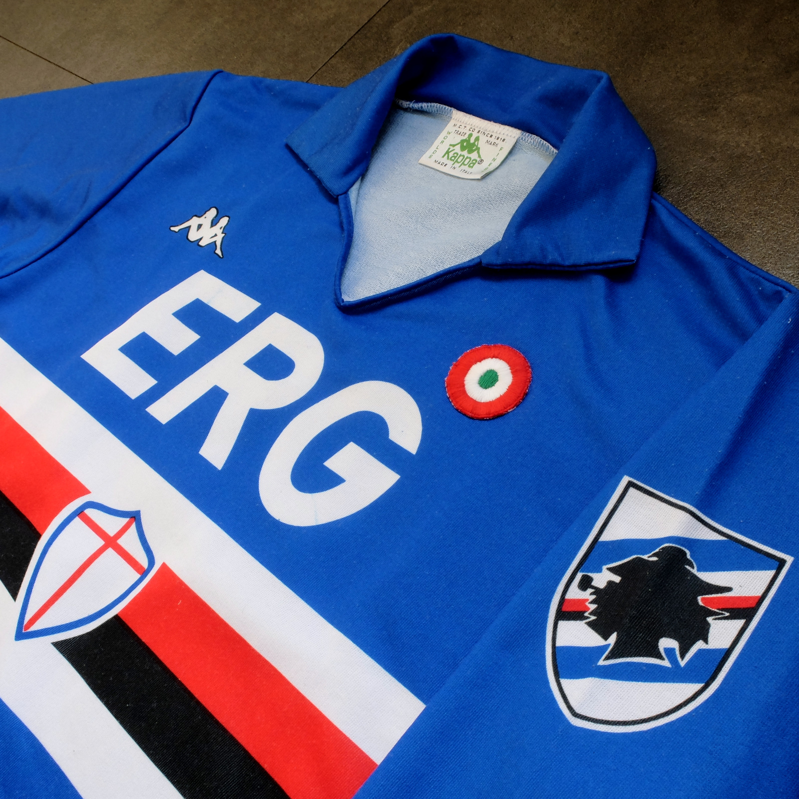


Sampdoria’s shirt rarely fails to deliver, but Kappa’s effort towards the end of the 1980s is the best of the lot. (Ennerre’s wasn’t bad either.) Oddly, what sets it apart, aside from the sinuous neckline and collar, is the italicised typeface of the sponsor, ERG. Everything else about it is routine. It has to be because there’s so much going on: the red, white and black horizontal stripes, the stemma San Giorgio at its centre, the manufacturer’s trademark. Maybe this is why in 1981 Ennerre decided to move the club’s crest to the left sleeve – to tidy it up a bit. At any rate, in doing so they made room for the coccarda, reward for winning the Coppa Italia. Sampdoria lifted the trophy in 1988 and again in 1989, so this particular jersey was never without it.
ASICS took over from Kappa in 1990 and barely changed a thing. They did, however, use a thinner material, which had the effect of altering the colour slightly, making it a touch lighter. 


NAPOLI, 1988-90


The jersey in which Napoli won their first ever scudetto is regarded as one of football’s greatest, but on closer inspection it can be found wanting. The sponsor, Buitoni, certainly looks the business, but the material – usually acrylic, sometimes cotton – belonged to a different era. In 1988 Ennerre finally got with the programme. While they continued to issue shirts made from their trademarked Lanetta (acrylic by another name), they also produced a polyester version, designed more than likely for the summer months.
At the same time Mars succeeded Buitoni as the club’s sponsor, initially written in white and then, later, black – presumably to improve visibility. Napoli won the UEFA Cup in 1989 and a second championship in 1990, whereafter the form of Diego Maradona began to deteriorate. It didn’t matter: he had become synonymous with Napoli and brought them unprecedented success, immortalising Ennerre’s shirt in the process.


FIORENTINA, 1989-90


When a friend introduced me to the delights of 110 Goals Italia Style in 1989 (on VHS) it wasn’t immediately obvious just how good Fiorentina’s shirt actually was. This is because they were wearing it with purple shirts and white socks, which detracted from its magnificence. When we sat down to watch the sequel in 1990, it became apparent (about a quarter of the way into it, as Baggio curls a diagonal ball into the back of Ascoli’s net) that Fiorentina were now wearing white shorts with purple socks. As well as that, they were sponsored by local rag La Nazione, rather than non-alcoholic aperitif Crodino, whose yellow and white lettering was less conspicuous than Crodino’s yellow and red. The shirt itself, made by ABM, was micropatterned, employing subtle shifts within the texture of fabric to create a pattern out of ABM’s logo – a stylised ‘S’ for Sportivo. It had a ribbed collar, a V-neck, and was of a moderately loose fit. The badge was the same that was reintroduced in 2021: a red fleur-de-lis appended to the letter ‘F’ set against a white circle with a purple border, far neater than the distended diamond-shaped crest Fiorentina used before and after. 
The following season ABM reinstated the purple shorts and Roberto Baggio was sold to Juventus.


A.S. ROMA, 1990-91


Roma had to wait until 1990 before Ennerre saw fit to provide them with polyester shirts, by which time the trend for micropatterning had begun to really take off. Strangely, Ennerre seemed to hedge their bets, supplying a plain, silky version as well as micropatterned one. (Napoli were presented with the same dilemma). The micropatterned version was hardly used, yet it is the superior iteration. The NR logo, repeated within the fabric of the shirt, is a neat design, and the jersey itself is a deeper, more satisfying shade of red. This, combined with Piero Gratton’s lupetto badge and the white italics of the sponsor, Barilla, qualify it as the club’s best shirt ever. Roma did well in it too, reaching the finals of both the UEFA Cup and the Coppa Italia, losing to Inter in the former and defeating Sampdoria in the latter. 


JUVENTUS, 1990-92


While AC Milan got to dress up in polyester as early as 1987, Juventus had to wait until 1988. Strange, considering that Kappa – the firm that issued both teams their kit – was a subsidiary of a larger firm called Maglificio Calzificio Torinese. The shirt in question, when it arrived, was sponsored by Ariston, the same company that had its name emblazoned upon the acrylic sarks Juventus wore the previous season. Then in 1989 Upim replaced Ariston, whose rounder font complimented the jersey’s simplicity. However, it still lacked something, which was colour. Juventus won the Coppa Italia in 1990, which provided it. Turns out they needn’t have bothered. Kappa, in a moment of genius, decided that their logo would now be coloured green. This seemingly innocuous detail meant that when the coccarda was removed in 1991, the shirt sustained its visual impact. In fact, it looked better without it, the green insignia on the right singularly complementing the two gold stars to the left. Danone succeeded Upim in ’92, and the svelte neckline and collar – the same that had graced the shirts of Sampdoria and Milan – were exchanged for something more substantial. Still a good effort, but the 1991-92 iteration takes the honours.


TORINO, 1992-93


By 1992-93 Italian football strips were on the slide, Umbro and Lotto being the main offenders. There were still some quality shirts knocking about – Brescia, Roma, Milan, Pescara, Juventus – but only one that really mattered: Torino’s. ABM were responsible, in a working relationship that stretched back to 1990. Nothing much changed throughout their three-year tenure, save for the sponsor in ‘91 (from Indesit to Beretta) and the introduction of a polo-style neck opening in ’92. (ASICS did a similar thing with Sampdoria’s jersey the same year but couldn’t resist adding horizontal stripes beneath the placket; less is always more.) Unlike with the shirts they’d supplied for clubs like Fiorentina, Pescara and Piacenza, ABM never embellished the fabric with their emblem. As a result, the deep burgundy really jumps out at you and contrasts nicely with the small amount of blue that features in Torino’s badge. It’s that collar that does it, though.

-------

If football tops like these were typical of the late 1990s then they would be highly prized, the reason being that people of a certain age became fans of Italian football off the back of Gazzetta Football Italia, which ran from 1992 through to 2002
. It’s question of cognitive bias: not of objective value judgements but subjective realities based upon nostalgia and fond memories. Precedently, football shirts had been governed by practical necessity, and were all the better for it. Thereafter, they became fashion accessories, as preposterous now as flares, bubble perms or a particularly bushy pair of sideburns.


[For a more in-depth analysis of each of these seven shirts, follow these links: Inter, Sampdoria, NapoliFiorentina, RomaJuventus, Torino.]

Saturday, 4 September 2021

THE SARTORIAL ELEGANCE OF SERIE A: BRESCIA CALCIO, 1992-94 [UHLSPORT]


Brescia Calcio came about in 1911 after the coming together of the Società Ginnastica La Victoria Brescia and Unione Sportiva Bresciana e Gimnasium. They wore then orange and blue vertical stripes with black shorts, a fairly unusual combination in itself but not as distinctive as the white V set against a blue background that has typified the shirt since. Società Ginnastica La Victoria Brescia – who were themselves the result of a merger between Forti e Liberi and Club Sportivo Brixia – had played in blue jerseys with a white vertical line down the middle, which would suggest that Unione Sportiva Bresciana e Gimnasium may well have worn orange. At any rate, by 1915 Football Club Brescia, as they were now known, were playing in blue and white stripes in Group E of the Prima Categoria.
Despite the FIGC’s efforts to reinstall the single league format trialled in 1909-10, the sheer weight of numbers wanting to compete after the end of the First World War meant a return to the bloated format they’d been lumbered with before the conflict started. In the event, Brescia finished their preliminary round – Group A: Lombardy Section – in second place behind Inter, thus qualifying for the national semi-finals, finishing fifth in a pool of six. They did this wearing plain (savoy) blue.
It was in 1927 that Brescia came up with the distinguishing white V, or chevron, and did so in homage to the ‘Fathers of Peace’ (Voluntas Pace) who granted the team use their stadium (Stadio di Viale Piave) for a nominal fee. The intervening period had proved to be reasonably successful, so when the FIGC finally established Serie A as a singular league in 1929-30, the Biancazzurri were part of it. Moreover, they finished its inaugural season in ninth place, seven points clear of relegation.
 
In 1936 the club changed its name to Associazione Calcio Brescia and were subsequently relegated. After a brief stint in Serie C, Brescia made it into Serie A in 1943. The Second World War necessitated a temporary retreat to the multigroup set-up, lasting until 1946-47, whereupon the club was again demoted to Serie B. In between – 1940 to be precise – they’d reverted to wearing all blue. In 1948, Brescia inverted their colours – white shirt, blue shorts – but by the 1950s had effected an about-face.
In 1961 the chevron was reintroduced, and in 1965 Brescia were promoted into Serie A as champions. They managed three consecutive seasons in Italy’s top flight before being relegated, but bounced back the following year. For their return to Serie A, the jersey was altered once more, except this time the V was replaced with a diagonal white stripe, or sash. This configuration lasted as long as Brescia’s tenure in Serie A – just one term. Perhaps sensing that this radical departure had brought them bad luck, the chevron was hastily reinstated and remained in place until 1974. Thereafter, the club experimented with a more diminutive V before reverting to plain blue in summer of ’76, the year they officially became Brescia Calcio.


And that’s how things pretty much stayed until Uhlsport took over from Bontempi Sport in 1991-92, the season Brescia won Serie B under the guidance of Romanian coach Mircea Lucescu. In truth, Uhlsport’s first crack at the shirt wasn’t all that, the revived chevron obscured by the emblem of the club’s new sponsor, CAB (Credito Agrario Bresciano).
In 1992, no doubt under the direction of Lucescu, Brescia signed Florin Răducioiu from Verona, Ioan Sabău from Feyenoord, and the mercurial Gheorghe Hagi from real Madrid, although they also sold their top scorer, Maurizio Ganz, to Atalanta. At the same time, Uhlsport got their act together. The dark blue lozenge behind the sponsor’s initials was got rid of, revealing the chevron underneath. Where the ends of the white V had previously faded into blue towards the shoulder, they now remained constant. The club’s badge was no longer printed but sewn on, as was the manufacturer’s own insignia. Finally, Uhlsport adopted a geometrically micropatterned fabric (also used for Verona and Cremonese) that gave the shirt a vivid sheen. The away version, in red, was equally lustrous.
Brescia lost their relegation playoff against Udinese and went straight back down, kept the same strip and went straight back up. This time around, ABM would provide the gear – not their best – but the result was the same, just more comprehensive: Brescia finished bottom of the table.


The club’s best years were ahead of them, courtesy of Roberto Baggio, wearing kits supplied by Garman, Umbro and Kappa, all of them hideous. Aside from the occasional foray into Serie A, Brescia have once again made Serie B their home, which isn’t a bad place to be, all things considered. Indeed, they have spent more seasons in Italian football’s second tier than any other team: 63 and counting.

Saturday, 26 December 2020

THE SARTORIAL ELEGANCE OF SERIE A: HELLAS VERONA, 1992-95 [UHLSPORT]


Associazione Calcio Hellas was named in honour of the Hellenic Republic at the suggestion of Professor Decio Corubolo, who taught Greek at the Liceo ginnasio statale Scipione Maffei. Rather than wearing the colours that this association implied, the club opted for black and white halved shirts. The year this happened – 1903 – football was only played professionally within the regions of Piedmont, Lombardy and Liguria, and so A.C. Hellas had to content itself with friendly games against local sides. By the time they found themselves competing in the Prima Categoria (Emilia-Veneto division) in 1910, they were sporting the colours of the city of Verona, derived from the municipality’s coat of arms – a yellow cross against a blue background.
In 1919 A.C. Hellas merged with F.C. Verona to become Football Club Hellas Verona. Ten years later, at the behest of the fascist regime, two more teams were assimilated: Bentegodi and Scaligera. The resulting enterprise was retitled Associazione Calcio Verona, which may or may not have been intended as an anti-Greco gesture (by 1940 Italy and Greece would be at war with each other). Unfortunately, Hellas Verona had just finished Group B of the Divisione Nazionale in 13th place, thus failing to qualify for Serie A’s inaugural season.
World War II saw A.C. Verona relegated to Serie C, although they were back in Serie B by the end of it. In the meantime they experimented with a number of configurations – such as grey shirts with a horizontal blue and yellow band around the middle in 1946-47 – before settling for yellow shirts and blue shorts.
After coming close in 1948, Verona were promoted to Serie A in 1956. To celebrate they adopted to a kit resembling that of Boca Juniors, but were subsequently relegated. The following year Verona absorbed yet another local team, by the name of A.S. Hellas. Sensing an opportunity to connect with its past, the club rechristened itself Associazione Calcio Hellas Verona. Another change or colours: blue shorts, white jerseys with blue sleeves, and hint of yellow adorning the neckline. It’s uncertain how long they persisted with this arrangement but it appears that by the end of the decade their shirts were once again yellow.
Hellas Verona returned to Serie A in 1968 wearing blue and yellow vertically striped jerseys paired with black shorts – had been since 1964. The team’s second spell in Italy’s top flight was relatively successful, lasting six consecutive seasons. In 1970 they reverted to yellow shirts with blue trim, before switching to blue shirts with yellow trim the following year. Shorts were by now generally white.


1984-85

The strip Verona wore during their title winning campaign of 1984-85 is considered to be one of their best. Manufactured by Adidas and sponsored by Canon, it differed slightly from previous kits in that the shorts were also blue while the shirts incorporated yellow pinstripes. Ricoh replaced Canon in 1986, then Hummel took over from Adidas in 1987. The partnership with Hummel lasted three years, culminating in relegation. Adidas stepped back into the fold, the club were immediately promoted, whereafter Verona hooked up with German firm Uhlsport.
Verona’s kit for 1991-92 was mediocre. All blue with a yellow collar and yellow rectangles running down the outside edge of the arms, the sponsor, Rana, printed in a white, rounded uppercase font, it looked cheap. Predictably, the away kit was a mere inversion of the home. However, there existed a superfluous third shirt comprising the same yellow and blue stripes that had been worn during the second half of the 1960s. Relegation ensued, but the jersey was reappropriated for home use the following season.
The shirt itself adhered to the same template Uhlsport were using for U.S. Cremonese. The stripes were of roughly the same gauge, the fabric was micropatterned in the same manner, both had collars, and the manufacturer’s logo and club’s badge were sewn on, except the sponsor’s name was black. The badge is of particular interest. In 1984, club president Ferdinando Chiampan had commissioned the advertising agency Orti Manara to come up with a new insignia. The chosen design included two mastiffs facing away from each other, joined in the middle by a staircase/ladder – symbols relating to the local heraldry – to form a stylised V, encapsulated within a sort of rhombus. The first iteration had the mastiffs and the edging rendered in yellow. Uhlsport inverted the colour scheme and added the colours of the Italian flag within the top-left border and ‘Verona F.C.’ in the one diametrically opposite.


The Uhlsport years were ineffectual. The reason the word ‘Hellas’ had been omitted from the revamped badge was because in February 1991 the club had to re-register under a different name to avoid bankruptcy. In 1995 they got their old name back, swapped Uhlsport for Errea, were promoted and then relegated again. It would get worse before it got better. Hellas Verona are currently enjoying a second consecutive season in Serie A, their kit supplied by Macron. 

Friday, 20 November 2020

THE SARTORIAL ELEGANCE OF SERIE A: U.S. CREMONESE, 1992-95 [UHLSPORT]


As is often the case, Cremonese haven’t always worn their current colours. In 1903, the year the club came together, they wore white shirts adorned with a lilac collar, paired with black shorts and socks. Cremonese was a mere sporting association back then, and it’s not even certain they played any football. This changed in 1910, around the time they changed their name to Unione Sportiva Cremonese. Football was catching on, and the following year the team appointed a coach by the name of Nino Gandelli, with aim of playing the sport competitively. It seems he took the role seriously enough, recruiting the best local talent he could find, and by 1912 they'd signed up with the Federazione Italiana Giuoco Calcio (FICG).
Ahead of the 1913-14 Promozione, U.S. Cremonese merged with the recently formed Associazione Calcio Cremona. A new strip was in order, and it was towards the city’s heraldry that they looked for inspiration. Cremona’s coat of arms consists of a shield split down the middle, with silver and red horizontal stripes on one side and on the other a depiction of an arm holding aloft a golden ball. For now, the colours would do: grey shirts with red trim, to be worn with white shorts.
Cremonese’s first season was a success, winning promotion into the Prima Categoria at the first attempt. The following year’s campaign was mediocre, and when Italy joined The Great War in 1915 so did many of their players (most notably goalkeeper Giovanni Zini, who served as a stretcher-bearer but died in Cividale del Friuli in 1915 after contracting typhus).
In 1919, Cremonese assimilated another local team by the name of Football Club Aurora. Despite bolstering their ranks the club finished bottom of their six-team group, which ordinarily would have resulted in relegation back to the Promozione. The Prima Categoria was in effect a qualifying round whereby teams competed in regional divisions to gain entry into the national semi-finals. The regional committees operated with complete autonomy, determining how many teams over however many leagues were allowed to take part. Ahead of the 1920-21 season, rather than reduce the number of entrants, as the FICG and a few of the bigger clubs were keen to do, Lombardia elected to move from three groups of six to six groups of four, making room for Cremonese.
The next five years were spent playing in a restructured Prima Divisione. Then in 1926 tensions between the FICG and Confederazione Calcistica Italiana (CCI) finally gave way to the establishment of a national league, under the auspices of the (Fascist) Direttorio Divisioni Superiori (DDS). At the same time Cremonese embellished their grey shirts with a red cross, only to finish their group in ninth place. Once more, this should have been low enough to see them relegated, but an enforced merger between Sampierdarenese and Andrea Doria (albeit a temporary one) freed up and extra space.
In 1928 Cremonese tinkered with their strip for a third time, exchanging the cross for a horizontal stripe wrapped around the chest. Seventh place was enough to qualify for the preceding season’s inaugural single-group format – in other words, Serie A – from which they were immediately relegated. They continued to play in Serie B up until 1938, whereupon they dropped down into Serie C. In 1942 Cremonese returned to Serie B but were again relegated in 1951. For their 50th anniversary, they wore grey and red quartered shirts before finally settling for the stripes worn to this day.


The 1960s were spent playing in Serie C with the occasional foray into Serie D. The 1970s saw some improvement, culminating in promotion to Serie B in 1977 – the same season that saw Cremonese decked out in red shirts with a single grey stripe descending vertically from left shoulder. Relegation swiftly followed, but by 1981 they were back playing in Serie B.
In 1984 Cremonese finally made a return to Serie A after a 54 year absence. Unfortunately, the man who scored most of the goals that got them there – a certain Gianluca Vialli – was subsequently sold to Sampdoria. His replacement, the Brazilian forward Juary, made little impact and the club finished bottom of the table. But Cremonese appeared to have turned a corner and over the course of the next decade were promoted to Serie A on four separate occasions, oscillating between the top two tiers of Italian football. In the first instance their gear had been supplied by Puma. The second time around it was ABM (1988-89) and then Patrick (1990-91). For 1992-93’s successful push for promotion the kit was supplied by German sports manufacturer Uhlsport.

Uhlsport made shirts for a number of Italian football teams in the late ‘80s and early ‘90s, most notably Inter and Bologna, as well as Verona and Brescia. They all came with collars, as did most shirts tailored towards the Italian market at that time. In truth, the jersey Uhlsport came up with was not so different to the ones that ABM and Patrick had provided before them. There were, however, a few compelling disparities.
First off, ABM and Patrick never bothered with appending the club’s crest. In ABM’s case, this may have come down to financial expediency, given that ABM were attaching crests to the shirts of Fiorentina, Torino, Pescara, Palermo. In any case, the absence of a badge cheapened the jersey. Moreover, Cremonese had redesigned their crest in 1985, and it was worthy of attachment: a simplified rendering of a golden ball held aloft, as depicted in the city’s coat of arms, with a diagonal red and grey bend (sinister) behind it. (When Uhlsport handed over to Puma in 1997, the club reverted to its traditional emblem.)
Second, the team’s sponsors during Patrick and ABM’s tenures did not present as nicely as the one that adorned the Uhlsport shirts – local retailer Moncart. It’s not that the company name was written in a particularly distinctive font, just that the simplicity of Moncart’s sans-serif, uppercase lettering worked well in this instance.
Finally, Uhlsport had recently discovered the art of micro-patterning. To be fair, this was a relatively recent phenomenon, and it’s debatable whether Inter’s shirt would have benefitted from it, but in the case of Cremonese it combined well with the colours, muting them slightly.


In 1995-96 cured-meat specialist Negroni took over sponsorship from Moncart, Enrico Chiesa returned to his parent-club, Sampdoria, and U.S. Cremonese were relegated. But I Grigiorossi had survived three consecutive seasons in Serie A, a feat not bettered by them before or since, and they did it wearing a shirt of some distinction.
 

Wednesday, 30 September 2020

THE SARTORIAL ELEGANCE OF SERIE A: BOLOGNA FC, 1988-91 [UHLSPORT]


Bologna Football Club was founded in 1909 and from the start played in red and blue. The reason for this is fortuitous and involves an Austro-Hungarian by the name of Emilio Arnstein and Italian called Arrigo Gradi. Arnstein was born in Votice, in what is now the Czech Republic, and studied in Prague and Vienna before moving to Trieste, where he formed Black Star Football Club along with his brother and a handful of English ex-pats. In 1908 he moved to Bologna and immediately set about finding the local football club. Legend has that a taxi took him straight to Prati di Caprara, a military training facility hired out to any local teams that needed it. There Arnstein met Gradi, wearing the red and blue halved shirt of the college he had previously attended in Switzerland.
Gradi, along with his brothers, a Swiss dentist by the name of Louis Rauch, and a number of students from the local Spanish College (including Antonio Bernabéu, brother of Santiago, who would later play for and preside over Real Madrid) had set up a team of sorts by the name of Felsineo. It was Armstein who provided the impetus to establish a proper club, and in 1909 a patron was found willing to support the venture in the shape of Carlo Sandoni, president of the Circolo Turistico Bolognese. Louis Rauch was subsequently appointed as president, Emilio Arnstein was named as a director and Arrigo Gradi club captain.
By 1910 Bologna Football Club was no longer under Sandoni’s patronage and Arnstein was president. The jersey they'd initially come up with was modelled on the one Gradi had been wearing on that fateful day in 1908. Perhaps in an attempt to define their own image – or to differentiate themselves from the Genoa Cricket & Football Club –  the shirts were now modified to form vertical stripes of the same colour, which is the template the club uses to this day.
There has been an exception: in 1925, the year Bologna won their first scudetto, they played in green at the behest of their then manager Enrico Sabattini, in tribute to the Austrian club Rapid Vienna. You could imagine a precedent such as that sticking, but Bologna soon reverted to their traditional colours and over the course of the next 16 years added another five championships to their palmarès. In fact, for a while Bologna – alongside Juventus – were considered the preeminent force in Italian football, and with seven championships to their name are historically the sixth most successful team to play in Serie A.
Bologna were last crowned champions in 1964, were runners up in ’66 and finished third in ’67. In the early 1970s came two Coppa Italia victories. In 1982 Bologna were relegated for the first time in the club's history, and within a year found themselves playing in Serie C1. Bologna won promotion straight back into Serie B, but struggled. Luigi Corioni assumed the club’s presidency in 1985 and in ‘87 brought in a young manager called Luigi Maifredi, who he’d worked with previously while at Ospitaletto. The appointment paid immediate dividends with Bologna finishing the season in first place.
 

1970-71 [Courtesy Bologna FC 1909.]

From 1982 though to 1988, Bologna’s kit was made by Ennerre/NR. For their return to Serie A, Uhlsport became the club's technical supplier. Whereas Ennere had utilised four broad-gauge stripes, Uhlsport opted for five with a dark blue one down the middle. (Bologna may be known as the Rossoblù, but the blue is more often than not navy blue.) The shirt was V-necked, fitted with a collar, and was sponsored by Italian coffee roaster Segafredo Zanetti. Shorts and socks were also blue. Whereas Ennerre’s shirts had been made from their trademark heavyweight fabric Lanetta, Uhlsport’s were polyester. Bologna ended their first season back in Serie A in 14th place.
The next year, against the backdrop of a stadium that was being renovated ahead of the 1990 World Cup, Bologna fared better. Having added the Brazilian midfielder Geovani Silva, German striker Herbert Waas, Hungarian defender Nikolaj Iliev and ex-Juventus and San Marino midfielder Massimo Bonini to their ranks, Bologna finished the season in a very respectable 8th place – high enough to gain entry into next year's UEFA Cup. The shirts in which they achieved this feat were identical to those they'd worn the season before, save for the sponsor's name printed upon them: Mercatone Uno in place Segafredo Zanetti. Away from home, the previous all-white strip was embellished to include a blue and red horizontal stripe flicking diagonally upward towards the left shoulder, which made it more interesting.
Bologna’s success came at a price, attracting the attention of Juventus who promptly installed Luigi Maifredi as Dino Zoff’s successor. In 1991 Bologna were relegated, wearing the same shirt, although not before making it to the quarter finals of both the Coppa Italia and the UEFA Cup, losing out to Napoli and Sporting Lisbon respectively.
Uhlsport stood by Bologna but Mercatone Uno didn’t. The electronics manufacturer Sinudyne  took over as the club’s sponsor, whose typeface wasn’t nearly as eye-catching as Segafredo’s or Mercatone’s. Perhaps for this reason Uhlsport employed micropatterning, and also came up with their best away shirt yet: white as before, but with alternating dark blue and red inverted triangles running down the side of sleeves, and ascending from right to left under the sponsor’s name.
 

1989-91

Things didn’t work out. Luigi Maifredi was re-instated as coach after his unsuccessful stint at Juventus, but could only secure 13
th place. He then left again ten games into the next season to join Genoa, Bologna were relegated to Serie C, and bankruptcy followed. The club quickly re-registered as Bologna Football Club 1909 and clawed their way back to Serie A, where they’ve been playing since 2015.

Friday, 10 August 2018

THE SARTORIAL ELEGANCE OF SERIE A: INTERNAZIONALE, 1988-91 [UHLSPORT]


Internazionale Milano hold the honour – or potentially poisoned chalice – of having never been relegated from Italy’s top division, be it Serie A or the various incarnations that preceded it. And since their foundation in 1908 Inter have, save for one season, remained more or less faithful to their livery: blue and black vertical stripes with black shorts and socks. The season that they didn't was the campaign of 1928-29, whereupon the ruling Fascists, who objected to Inter’s cosmopolitan origins, insisted they merge with Unione Sportiva Milanese to become Società Sportiva Ambrosiana, named after the patron saint of Milan. The new shirt would be white with a red cross – the city’s flag, basically. As one might expect, Inter’s fans were not best pleased.
In 1929 the club’s owner, Ernesto Torrusio, who was himself a member of the Fascist Party (and also a Freemason), handed over the reins to Orestes Simonotti, who quickly reinstated the club’s traditional colours. [It wouldn’t be until after the war that they got their original name back, although ‘Inter’ was appended to ‘Ambrosiana’ in 1932 as a sort of compromise.] From there on the only things that changed was the number and gauge of the stripes and the shade of the blue.

And the badge. In 1979, perhaps inspired by what Piero Gratton and Pouchain were getting up to with Roma, Lazio, Palermo et al, Inter replaced their circular monogram, comprised of the club’s initials – F, C, I and M – and replaced it with a shield containing a profile of a snake – the biscione – set against two transverse black and blue stripes, with a star in the top left corner.
        The newly branded Inter got off to a good start, winning their 12th scudetto in 1980 and their 3rd Coppa Italia in '82, wearing gear produced by Puma and Mec Sport respectively. Their form thereafter indicated a gradual decline, culminating in a sixth place finish in 1986. A  change in technical sponsor followed, to Le Coq Sportif, coinciding with the arrival of Giovanni Trapattoni as coach; neither had immediate an impact. Karl-Heiz Rummenigge, whose time in Italy had been blighted by injury, left the club in 1987 and was replaced by Aldo Serena, who Trapattoni had brought in from his old club, having purchased him from Inter in the first instance while at Juventus. Serena scored just six goals in 22 matches. The Belgian attacking midfielder Enzo Scifo also disappointed, scoring a mere four times over 28 games. Alessandoro Altobelli managed a respectable nine goals in what would be the aging forward’s final year for the Nerazzurri, but it wasn’t enough for the club to finish the season any higher than fifth – two places down on the previous season.
Trapattoni didn't muck about. Scifo was sold to Girondins de Bordeaux, Altobelli moved to Juventus for one final fling in Italy’s top flight, and Daniel Passarella returned to Rive Plate. In their place came established German internationals Andreas Brehme and Lothar Matthäus, two promising Italians by the name of Allesandro Bianchi and Nicola Berti, and a proven Argentine, Ramón Díaz. (Díaz was actually a late replacement for the Algerian Rabah Madjer, who failed the club’s medical exam.)
The arrival of these new players coincided with the appointment of Uhlsport as kit supplier. The shirt didn't change much: the sponsor, Misura, remained the same, so too the club’s crest and number of stripes. Only the German manufacturer’s logo was noticeably different – square instead of triangular. Nor was the all-white away jersey radically altered, save for a band of alternating blue and black rhomboids, slightly out of sync with each other, across the front of the shirt. There was, however, one modification that completely transformed the strip's general appearance, and that was the shift from acrylic to polyester. Inter's Milanese neighbours had been wearing polyester since 1986, but the rest of Italy had been slow on the uptake. The dull patina of acrylic now gone, the team looked, quite literally, like a modern outfit.
Internazionale dominated in 1988-89, winning 26 matches, losing only twice, and accumulating a record-breaking 58 points, at a time when two points were still being awarded for a win and Serie A only accommodated 18 teams. Aldo Serena racked up 22 goals – the highest number in any one season since Paoli Rossi’s 24 for Juventus over the course 1977-78 – Lothar Matthäus provided nine, Nicola Berti seven, and Ramón Díaz contributed twelve, many of them absolute belters. In total, Inter Milan scored 67 times, which is an impressive number in a league renowned then for its defensive acumen.


Inter began the 1989-90 season with the scudetto sewn upon their shirts and the club’s badge relegated to the shoulder. But it wasn’t the same badge. Inter ditched the biscione in favour of their original emblem, which had never previously graced the shirt on account of the fact that Italian clubs only began to display their crests sometime towards the end of the 1970s.
Most Italian jerseys come alive when bearing the scudetto. AC Milan’s handles it very well, while for Juventus the opportunity to inject some colour into that achromatic strip of theirs must come as something of a relief. Strangely, Inter’s away shirt carried it better than the home equivalent; the away shirt was improved by it, whereas the home shirt suffered. It could be that the blue and black stripes combined with the red dots incorporated into the word ‘Misura’ detracted from the scudetto’s visual impact, whereas the predominantly white iteration offered something of a blanker canvas.
Inter were unable to reproduce the imperious form that had secured their 13th domestic title. They started well, beating Sampdoria in the Supercoppa Italia (Italy’s version of the Community Shield, except held in higher regard), but exited the European Cup in its early stages, losing to Roy Hodgson’s Malmo, and finished the season seven points behind champions Napoli, in third place behind cohabitants AC Milan. The problem? New signing Jürgen Klinsmann, brought in to replace Ramón Díaz, failed to combine with Aldo Serena the way the Argentine had the previous season. Despite this, the German striker finished the season as Inter’s top scorer with thirteen league goals, compared to Serena’s nine and Matthäus’s eleven. Meanwhile, Díaz scored fourteen times for Monaco playing three games less than Klinsmann.

In 1990, the Italian colours of the scudetto now absent, Internazionale’s badge shifted from the right shoulder to the left breast. Tradition prevailed, as any temptation to revert back to the ‘serpent’ badge was resisted, a decision that stands to this day. Inter went on to repeat their third place finish of the previous year, albeit by a slighter margin. This time it was Sampdoria who were victorious, with AC Milan again finishing in second place. But all was not lost. Inter made it to the final of the UEFA Cup, beating eventual Coppa Italia winners Roma 2-1 on aggregate. (English readers may recall Inter knocking out Aston Villa in the second round, courtesy of goals from Klinsmann, Berti and Bianchi during the second leg at the San Siro).
Giovanni Trapattoni returned to Juventus in 1991 in an effort to curtail the club’s gradual decline (he partially succeeded, winning 1993’s UEFA Cup, before moving on again to manage Bayern Munich). In an act that can be seen as retrospectively symbolic, Inter turned to Umbro to supply their gear – an association that would last the next seven years. During this period, Inter won the UEFA Cup for a second and third time… but nothing else. Moreover, their league form became erratic. Placed second in 1992-93, followed by thirteenth in 1993-94, it would be more than ten years before they were again crowned champions of Italy.


'Away'

The Uhlsport strip represents something of a high-water mark, a three year period where Inter were more than equal to whatever AC Milan or Napoli could throw at them, but which didn’t quite lead to where it perhaps should have. It is not the point of this article to reason why but merely to delight in how fortuitous it was that Inter’s brief resurgence, as the eighties turned into the nineties, corresponded with shirts that were worthy of the moment. If only they'd kept that badge...

Thursday, 1 February 2018

THE SARTORIAL ELEGANCE OF SERIE A


It all started to go wrong in and around 1989. Strange details began to permeate the shirts of England’s old First Division: white, triangular, expressionistic flecks on Liverpool’s Candy sponsored jersey, a terrible zigzag effect making a mess of Manchester City’s, and a similar geometric mash-up staining Chelsea's and Everton’s. At least they still fitted.
Meanwhile, on the continent the football kit was reaching its zenith, Italy's Serie A at the epicentre of it all. AC Milan and Internazionale were exploiting stripes in a manner rarely bettered, with away kits that were possibly even smarter still. In Spain, Barcelona were strutting around in a contender for the best football shirt of all time, a svelte little number that Gary Lineker was lucky enough to sport for the entire three years he spent playing for the Catalan giants. Anderlecht, Auxerre, Ajax… You should see the jerseys they were wearing in Brazil.
In fairness, English clubs too had contributed to this wealth of taste. Adidas and Umbro dominated the market, refining classic templates that would flatter the most incongruous of club colours: simple collars, minimal trim, subtle micropatterning, pared-down club crests adorning sensibly sized kits that flattered the physique. Back then it was not unusual for teams to wear the same strip for as many as three consecutive seasons, and so any changes came gradually. Tottenham and Arsenal, for example, were assured sartorial clemency until the summer of 1990, protected from those bizarre experiments introduced a year earlier.
It was during Italia '90 that it became evident that those strange goings-on in England were more than a mere aberration. Ironically, Umbro did quite a good job with England's jersey. Sure, there was a spot of striped, buttoned-up tomfoolery playing about the collar, but it fitted okay and the colour scheme remained as it should (we’ll forget the third kit ever happened). Indeed, the better teams that qualified for that World Cup got off lightly, a slight loosening of fit being the worst crime committed against the shirts of Argentina, Brazil, Holland, West Germany and the hosts, Italy. Instead, it was in the strips of nations like Romania, Columbia, the USA, Cameroon and Czechoslovakia (all manufactured by Adidas, incidentally) that one could see sewn the prophecy of the football shirt gone mad – excessively silky fabrics, ultra-wide V-neck collars, misplaced stripes, a looser fit.

Back to Serie A. What was it about those shirts that resonates to this day? We need to start in the early 1980s when, like with cycling jerseys, football kits were beholden to their material: heavy acrylic with a tendency to stretch and hang. They looked pretty good actually, but on closer inspection, a little cheap. Take Michel Platini decked out in Juventus colours: a flimsy excuse for a collar, plunging neck-line and, except when Juve were reigning champions and wore the scudetto, no shield to speak of. (This does seem to be a Juventus thing: other clubs more normally attached their badge to the upper arm.)
Then for the 1986-87 season S.S.C. Napoli introduced a real game-changer. Manufactured by newly conceived sports’ brand NR (Ennerre), it was the jersey in which Napoli won their first Italian Championship, Diego Maradona at the helm. There was nothing particularly technical about this jersey – it was made from something called 'Lanetta', which was really just acrylic – but it featured the club’s crest on the chest, a classic V-neck collar, was sympathetically proportioned and a pleasing shade of blue.

1987-88: Kappa was the next company to raise their game, tidying up Juventus’s kit (still no badge though) and making a good go of AC Milan’s: thin, traditional collar with no trim, a satisfying gauge of stripe, the sponsor’s name MEDIOLANUM, replete with minimally obscure symbol, and the Kappa emblem – the silhouette of a man and a woman sat back-to-back – in white. AC Milan won the league that season, and the shirt looked even better the next with the scudetto sewn onto it.


1988-89: Kappa took over Sampdoria from Ennerre, who hadn’t done a bad job. Sampdoria had won the Coppa Italia the previous season and thus bore the coccarda (a roundel in, as with the scudetto, the colours of the Italian flag) upon their breast. Sampdoria’s strip never fails to please. Comprised of blue shirts with a red, black and two white horizontal stripes wrapped around the trunk, with a crossed shield in the middle, it’s one of the most distinctive shirts of any league. Moreover, the club’s crest (now attached to the sleeve to make room for the coccarda) displays the silhouette of a shabby looking sailor smoking a pipe; the club colours bend sinister behind him. Shorts and socks are white so as not to detract (a jersey should never be judged in isolation but appreciated within the context of the entire kit).
At the same time, German firm Uhlsport was providing for Internazionale and Bologna. These shirts were notable for their lack of give, which may or may not have been a deliberate ploy to prevent players from tugging at them. Back then Inter were using their short-lived ‘serpent’ logo, which is a bit more interesting that the montage of letters they’ve employed since. The hue of blue was slightly lighter than now, and the sponsor – Misura, a health food manufacturer – brought with it red dots that, along with the gold star denoting ten title triumphs, added some welcome colour to the otherwise exclusively blue and black mix. The away strip was better still: same black socks, same black shorts, but a white shirt with alternative blue and black diagonal rhomboids in a line across the chest.


[Courtesy: Fotboll.Farg.Form.]

1989-90: When Italian sportswear company ABM took on Fiorentina’s kit the previous season, they’d provided a decent enough shirt, but there was a problem: they matched this with purple shorts. Moreover, these shorts, as is often the case, were made from a different material than the jersey. The effect was that Fiorentina weren’t actually playing in the same colour, but in two shades of the same colour, and two shades of a colour as vivid as purple. Perhaps sensing their error, Fiorentina were now issued with white shorts, giving them maybe the best strip in the division; the sight of Roberto Baggio battling against Juventus in that year’s UEFA Cup final is one of the era’s iconic images.
Inter still had the same strip but as reigning champions wore the scudetto in place of that serpent on a shield, with the circular montage of letters present on the upper arm. And Kappa finally got around to using the same template for Juventus that they’d been using for AC Milan, a lovely looking shirt sponsored by department-store chain Upim.

1990-91: Had the World Cup not been held in Italy might things have remained as they were? Probably not, but if there’s a high water-mark for kit design it can be found here. Torino had just been promoted from Serie B (as champions) and were rewarded with a contract with ABM: maroon shirts, white shorts with black socks, sponsored by white goods manufacturer Indesit. (Sadly for Fiorentina, ABM decided to bring back the purple shorts.)
Ennerre was making similarly good work of Roma and Napoli's shirts. Replacing Lanetta with polyester, these kits were micropatterned, creating subtle shifts in the fabric’s texture to make a motif out of the manufacturer’s logo.
        Sampdoria was now supplied by ASICS, but the kit looked very much the same. AC Milan had gone over to Adidas but the kit looked very much the same – a rare triumph for Adidas in this context. Juventus’s stayed with Kappa, but the kit looked very much the same, save for the addition of the coccarda awarded for the previous season's victory in the Coppa Italia. The best shirt of the year was probably Bologna away: white with maroon and navy equilateral triangles arranged in horizontal lines, their number diminishing as they worked their way down the front of the shirt.


Unlike many of my generation, it wasn’t Channel Four’s Football Italia on a Sunday that provoked my interest in Italian football, but a VHS tape entitled 110 Goals Italia Style – 1988-89 (quickly followed by 110 Goals Italia Style 2 – 1989-90). I was certainly grateful for Channel 4’s effort when it came but was a more faithful viewer of Gazzetta Football Italia on a Saturday morning (and Transworld Sport too, which would also round up the previous weekend's Serie A action). The reasons were threefold. First, I preferred playing football to watching it, so on a Sunday I was normally kicking a ball about a park wearing either my Internazionale away top, circa 1989-90, or my Fiorentina home shirt, circa 1990-91. Second, there was James Richardson, who had much more to do hosting Gazzetta than he did introducing Sunday’s games, sitting in front of cafes waving La Gazzeta dello Sport in our faces, bringing us up-to-date with recent events. Third, all of this started off the back of Paul Gascoigne’s move to Lazio in 1992, by which time I was taking my A-levels, shortly to leave for university, which distracted me.
But aside from all that, I’d become disillusioned with what I perceived to be a waning aesthetic. What had begun in the English First Division in the late 1980s was spilling over onto Italian shores in the early-to-mid 1990s. Umbro, who had hitherto made kits for Cagliari, Lazio and Parma, got their hands on Napoli and Inter’s, absolutely destroying them in the process. Italian brand Lotto muscled in on Torino, Fiorentina, AC Milan and Atalanta, dressing them in shirts that resembled fake replicas sold down weekend markets. ASICS started getting inventive with Sampdoria’s jersey, adding drawstrings around the collar. Football fashion was suddenly kitsch.
Football shirts would never be the same, and probably never will be.