Showing posts with label Serie B. Show all posts

Wednesday, 19 March 2025

THE SARTORIAL ELEGANCE OF SERIE A: PALERMO, 1990-92 [ABM]


Same old story: Palermo got their colours after a laundry incident turned their football shirts pink. The club had previously worn a combination of red and blue, so it's doubtful that such a mutation is even possible. In any case, the more widely accepted explanation is based upon a letter sent to the club's president, Joshua 'Giuseppe' Whitaker, in 1905 suggesting the change to pink and black to represent the rosolio and amaro produced by Whitaker's family business, which was drunk after a game in accordance with the result: rosolio – which is pink, sweet – after a win, and amaro – black, bitter – in defeat. (It is not known what was consumed in the event of a draw.)
The new colours weren't in fact implemented until 1907, the same year the club changed its name to Palermo Foot-Ball Club. Hitherto, they'd identified as the Anglo-Palermitan Athletic and Foot-Ball Club, reflecting the team's English ties: the aforementioned ornithologist Joseph Whitaker, Viceconsul Edward De Garston, Norman Olsen, George Blake, who had previously been involved in the establishment of Genoa Cricket and Football Club, as well as Ignazio Pagano, a local Italian who had been introduced to football during his two years spent studying in England.
The opportunity to actually play football was scarce and centred around matches against the crews of passing British ships. Indeed, the only other team in Sicily at the time was Messina FC, founded in 1900 by Alfredo Marangolo, who had studied alongside Ignazio Pagano in London. In 1901, the two of them would get together and organise a match between their respective teams, and again in 1904, before the arrangement was solidified with the creation of the Whitaker Challenge Cup in 1905. This annual fixture ran for four consecutive years (honours even) before the 1908 Messina earthquake put a terrible stop to it.
In its place, and quite independent from it, came the Lipton Challenge Cup. One of the crews Palermo had played against had been that of the Erin, a privately owned yacht belonging Sir Thomas Lipton. Palermo had won, and the tea-magnate rewarded them with a formidable trophy. Unable to commit to a rematch, Lipton stipulated that teams from Sicily and Campania should compete annually for the cup, which effectively meant Palermo playing against either Naples Foot-Ball Club or Unione Sportiva Internazionale Napoli. This competition ran until 1915, cut short by Italy's entrance into the First World War.
In the wake of the conflict, a number of smaller clubs emerged: Trinacria, Itala, Esperia, and Racing FBC. Valentino Columbo, who'd played for Palermo prior to the war, purchased Racing FBC, who played in blue and white halved shirt, and rebranded them Unione Sportiva Palermo. Within a year, he changed the colours to pink and black, facilitating a sense of continuity between the new club and the older one. More mergers were to follow – with Unione Sportiva Leoni in 1922, Sport Club Libertas Palermo in 1923, and 'Vigor' in 1927 – and another name change, to Palermo Football Club. Meanwhile, the team muddled along in Lega Sud, struggling financially.
By the time of Serie A's inauguration in 1929, Palermo were playing in Group D – the 'Southern Directory Circle' – and came top of it, gaining promotion into Serie B. Coincidently, that same year the club commissioned a new badge, which is worthy of note because it was designed by the Italian painter and futurist Giuseppe 'Pippo' Rizzo. Comprised of a horizontally inclined rhombus set against a stylised, brown leather football, it was replaced as early as 1932 after Palermo won promotion into Serie A. This was the moment at which the club adopted the symbol of the golden eagle, derived from the city’s coat of arms, which remains in place to this day.
 
Like so many other Italian football teams, Palermo would soon fall foul of Fascist initiatives. First they were obliged to ‘Italianise’ their name, and not long after were pressured into taking on the colours of municipal Palermo – red and yellow. In the midst of all this, they were relegated. If that wasn’t bad enough, in 1940 the FIGC kicked them out of the league due to insolvency.
Not for the first time, Palermo were forced into affiliation with a lesser but more economically stable local rival. The team in question was Juventina Palermo, who just so happened to wear the same colours that Racing FBC had. The partnership was retitled Unione Sportiva Palermo-Juventina and within a couple of years were playing in pink and black; within four, they were called more simply Unione Sportiva Palermo.
The 1950s and 1960s would represent a period of relative stability for Palermo. Flitting between series A and B, the most dramatic thing that happened to them was another change of name, to Società Sportiva Calcio Palermo, a by-product of the club listing itself as a joint-stock company. At some point during this period – probably the late 1960s – Palermo started experimenting with stripes. By the 1970s, this trend seemed to have passed, a decade that was spent almost entirely within the confines of Serie B.
 

1979-80

The idea that the football shirt, and sportswear in general, is something other than utilitarian came about in the 1970s. If you wanted to identify a 'year zero' then 1972 might do, when Adidas launched their trefoil logo in the run up to the Munich Olympics. Up until then, branding in football had been low key, often non-existent. By the end of the decade it would be ubiquitous, thanks to the efforts of firms such as Admiral, Umbro, Puma and, of course, Adidas. In Italy, the company that led the charge was Pouchain.
This golden age of footballing couture would last until the end of the century, whereafter sports kit started to become more technical – or would pretend to be. Even though the notion of the football shirt as high performing sportwear is slightly disingenuous, it is fair to say that the invention of manmade fabrics has been of some benefit to the game, has it has for many other sports. When Pouchain were active, acrylic was the material of choice, which had itself superseded wool and cotton. Ennerre favoured acrylic, before eventually getting on board with polyester in the early 1990s, while ABM liked to mix polyester with cotton.
Palermo have had gear manufactured by all three: Pouchain from 1979-80, Ennerre from 1980-86, and ABM from 1990-96. Designed by Piero Gratton, Pouchain’s shirt had by far the best badge: the silhouetted profile of an eagle's head framed within the outline of a diamond. The problem with it was that the fashion of the day dictated that the jerseys were tightly fitted. The Ennerre shirts were more forgiving but suffered from the fact that they didn’t incorporate the club’s insignia, which wasn’t so unusual back then (see also Como, Avellino, even Juventus). After two years with Ennerre’s offshoot company Ennedue, who were equally negligent, Hummel stepped into the fold. Again, the Danish firm didn’t see fit to incorporate a badge, but otherwise showed promise. Finally, ABM took over, and knocked the ball out of the park.
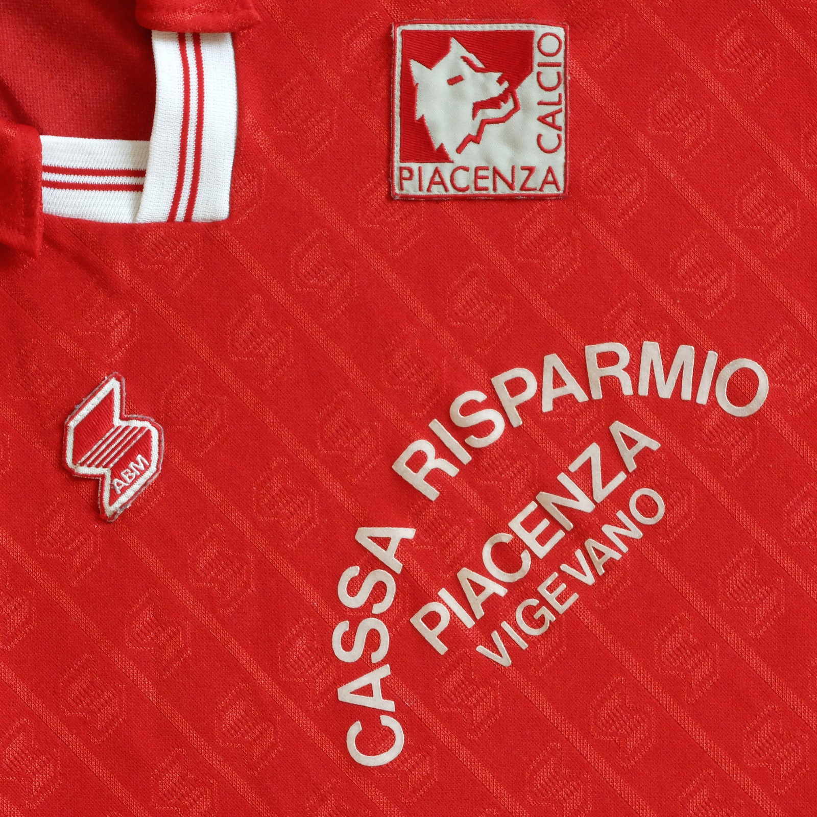
Palermo’s 1990-91 shirt might be their best. For one, it had a badge, although not Gratton’s, which the club had got rid of in 1987. Instead, a Iberian style shield, of the type Inter used throughout the 1980s, with an oblique pink and black stripe running through the middle and the basic outline of an eagle’s head over the top. The template itself was the same that was being used at Fiorentina, Piacenza, Messina and Ternana: collar, trimmed V-neck, ABM's logo running in vertical micropatterned lines within the fabric of the shirt. The sponsor was ‘Citta di Palermo’ in what I can only assume was some sort of tourism initiative, which let it down a bit.
For the next season, the minimal club crest was dropped for a more complicated rendering of an eagle almost in flight. The collar was now black, while the new sponsor – consumer electronics producer Sèleco – was printed in blue. ABM also produced a pink and black striped third version with diagonal micropatterning, which hardly seemed necessary but looked good all the same.
 

1991-92

The 1990s saw Palermo – or Unione Sportiva Città di Palermo, as they were known from 1994 onward – yo-yoing between series B and C. The new century brought with it a revival of fortune, with the club qualifying for the UEFA Cup/Europa League on three separate occasions. The bubble finally burst in 2019, whereupon Palermo were forced to reregister as Palermo Società Sportiva Dilettantistica and ply their trade in Serie D. Upon promotion into Serie C in 2020, they were permitted to restitute the name Palermo Football Club, and are currently playing in Serie B wearing gear supplied by Puma.

Monday, 23 September 2024

THE SARTORIAL ELEGANCE OF SERIE A: UDINESE CALCIO, 1987-90 [ABM]


Anyone with more than a passing interest in Italian football will probably know that the country's first football club was Genoa, established in 1893. But how many of us can name the second? Answer: Udinese, established in 1896. Just as Genoa began life as Genoa Cricket & Athletic Club, Udinese operated under the patronage of the Società Udinese di Ginnastica e Scherma (Udinese Gymnastics and Fencing Society). Such multifaceted sporting arrangements were not uncommon back then, and many an Italian team can testify to such origins. There normally came a point, however, when the football-oriented wing of these organizations would seek to establish its own identify.
For Udinese that point came in 1911, with the formation of the Associazione del Calcio Udine. Exchanging their all-black jerseys for black and white halved ones, the club registered with the Federazione Italiana Giuoco Calcio (FIGC), and were duly allocated a regional place in the 1912-13 Promozione. Pitted against Unione Sportiva Petrarca and Calcio Padova, Udinese came second in their group, which was enough to gain entry into the Veneto-Emilian section of next season's Prima Categoria, where they remained up World War 1.
Conflict over, Udinese became part of Associazione Sportiva Udinese, and the team's colours were again tinkered with: black-trimmed white shirts paired with white shorts and black socks. It was in this kit that Udinese made it to the first ever final of the Coppa Italia, losing to FC Vado by one goal, in 1922. [It should be noted that most of the so-called 'bigger' clubs in Italy were at the time registered with the Confederazione Calcistica Italiana and not eligible to compete in the Italian Cup, which was the initiative of the FIGC.] The same year the club was promoted into the newly created Prima Divisione, only to be relegated the following season.
Meanwhile, Udinese's mounting debts precipitated a separation from the Associazione Sportiva and would have ended in dissolution had the club's president, Alessandro del Torso, not raised enough money to keep them afloat. A reconfigured Associazione Calcio Udinese were promoted back into the Prima Divisione in 1825, but were relegated the year after into Group B of what was also called the Prima Divisione, given that the highest league had been rebranded as the Divisione Nazionale.


In 1930 Udinese advanced into a newly conceptualized Serie B as champions of the Prima Divisione, after coming top of Group C (Northern Division) and then defeating Palermo 3-1 in a played-off final. By now Udinese were wearing black and white striped shirts, a combination they would wear consistently over the course of the next five decades. Their form would remain consistent too, in a sense. The 1930s would be played out in Serie C, the 1940s saw Udinese competing in Serie B, the 1950s in Serie A, and the latter half of the '60s and most of the '70s spent back in Serie C.
It was towards the end of the 1970s that club began to revive itself. Having moved into a newly built stadium in 1976 – the Stadio Friuli, with its distinctive elliptical arch – Udinese completed a treble of sorts, finishing top of Group A of Serie C and winning both the Coppa Italia Lega Pro and the Anglo-Italian Cup. The following year, after abbreviating their name to Udinese Calcio, they were promoted into Serie A as champions of Serie B. Finally, in 1980, Udinese defeated Čelik Zenica in the final of the Coppa Mitropa.
 
After decades of sartorial stability, Udinese decided it was time for another change. Discarding the traditional black and white stripes, the club opted for a shirt con palo – literally, 'with pole'. In other words, white with a wide, black vertical stripe straight down the middle. Made by Pouchain it also featured a new crest, designed by the great Piero Gratton, depicting a zebra's head inscribed within a green circle. The badge didn't last long and was replaced in 1981 with a white shield displaying an inverted black V with a red Z beneath it – which stood for the home appliance manufacturer 'Zanussi', who had recently taken the club over – and the words 'udinese calcio' (lower case) printed above it. (For 1981-82, the jersey itself, produced by the Italian fashion brand Americanino, was adorned with the Z on its own, which I don't suppose went down very well.)
In 1984 Diadora succeeded Americanino as technical sponsor and made further alterations. The new shirt was essentially black but with a thick white band running diagonally from the left arm down across the torso, and also bore the name of a commercial sponsor, Agfacolor. Then in 1986 ABM took over from Diadora but left the jersey well alone.


Things came to a head in 1987. The Brazilian Zico had come and gone and Udinese's results hadn't been going their way. The club's involvement in the 1986 Italian football betting scandal saw them hit with a nine-point penalty deduction, resulting inevitably in relegation. As if taking stock, ABM reverted to the evenly gauged black and white stripes of Udinese's past. And a new sponsor: Rex, a high-end subsidiary of Zanussi. Writ in amber against a black background, and with a deliberately misaligned E, it brought welcome relief to an otherwise achromatic template – as did ABM's red, angular insignia. A neat, trimmed collar completed the look.
Udinese rounded off 1987-88 season in a mediocre tenth place, although the appointment of Nedo Sonetti as head coach in December had brought with it an improvement in form during the second half of the season. So it proved. In 1989, with the collar now removed, Udinese finished third, which got them back into Serie A. Foreign players were then purchased in an effort to stay there – the Argentines Abel Balbo and Nestor Sensini, Spanish veteran Ricardo Gallego – and a new coach too – Bruno Mazzia. ABM reinstated the missing collars, but everything else about the strip remained the same.
It didn't work out. Udinese were condemned to Serie B on the last day of the season, despite beating Inter 4-3. The club subsequently became embroiled in another match-fixing scandal that deferred their return to Serie A for a couple of years. Adidas replaced ABM before Lotto came along and ruined everything. Now firmly entrenched within Serie A, Udinese's gear is currently provided by Macron, who have seen fit to experiment with the various formats of their predecessors.

Friday, 16 September 2022

STADIA: STADIO GIUSEPPE SINIGAGLIA, COMO


In The Football Grounds of Great Britain, Simon Inglis surmises that, 'Plymouth, surely, has the ground location which most clubs would die for.' If he were to ever write a similar tome regarding the football grounds of Italy then he might say something similar about the Stadio Giuseppe Sinigaglia in Como. But whereas the milieu at Home Park is verdant, in Como it is riparian, overlooking the lake named after the town, with pre-alpine mountains visible beyond.
 
The stadium itself isn’t pretty, although it once was – certainly as far as Lando Ferretti, president of the Comitato Olimpico Nazionale Italiano, was concerned, who thought it ‘divinely beautiful’. Not that the ground had anything to do with the Olympics; it was born out the Opera Nazionale Dopolavoro (OND), a Fascist initiative aimed at encouraging recreational activities among the populace (which might explain how its architect, Giovanni Greppi, ended up co-designing the colossal ossuaries at Monte Grappa and Redipuglia).
Actually, when the OND was established in 1925, the year work started on the Singaglia, it was a politically benign organisation. By 1927, the year the work was completed, it was not. In 1932, the Opera Nazionale Balilla – OND for kids – assumed control of the ground as its regional headquarters and commissioned Gianni Mantero to add on a swimming pool, gym, fencing room and offices. As part of the deal, the original, neo-classical facade was replaced with something more in keeping with the vogue for architettura razionale, which was an offshoot of modernism.
At any rate, the stadium as a whole consisted of a 450-metre running track and a 500-metre cycling track encircling a football pitch of approximately 7,200 square metres, with room for approximately 6,000 spectators, the majority of which were located in the Tribuna Centrale, the rest in the Distinti opposite. Short on space, the Distinti was expanded sometime during the 1940s – just the two ends of it initially, with a view over the lake in between. By the 1950s the space had been filled, with narrow apertures separating the newer portion of the terrace from the two older sections. This is pretty much how the stadium looked when Como went about rebuilding the Tribuna in 1990, soon after the club had been relegated into Serie C1.
 

1950s

By the turn of the century the ground was in a mess. The concrete cycle track existed in segments behind the goals, with temporary stands mounted in front of them. Above the Curva Azzura another bank of provisional terracing, looming precariously over the remains of the cycling track. Something had to be done, and in 2002 the Curva Azzurra was dismantled and a pair of steel-trussed terraces erected in its place, at a slight angle to each other. The Curva Monumento came down in 2003 and was rebuilt almost as it was, tracing the perimeter of the old bicycle track, which was demolished completely. This left room for more prefabricated terracing running parallel to the Distinti and the Curva Monumento, giving a total capacity of about 14,000.

The Stadio Giuseppe Sinigaglia presents as architectural bricolage, because it is architectural bricolage. Every augmentation has been circumscribed by that which preceded it. The Tribuna seems unusually placed, with a large empty space in front of it where the cycling and athletics tracks once stood. Either side Gianni Mantero’s asymmetric utilities, painted terracotta red, with a curved, grid-framed bay window protruding from each, running the full height of the building, but at different points.
The Distinti looks like it does because the curvature of the stand, as prescribed by the aforementioned cycling track, prevents prefabricated seating from being installed along its whole length; the gaps aren’t deep enough at either end. The Curva Azzura (or Curva Como, as it is now known) is comprised of two separate banks of terracing – their seats a brilliant blue – because the arc allows for it, and a greater capacity is achieved as a result. The Curva Monumento maintains a low profile, maybe because planning regulations dictated that it couldn't be built any higher than the edifice it displaced.
The cumulative effect is of not being hemmed in, of a ground that feels open and connected to its environment. It is an environment worth feeling connected to. Not just the hills and the lake and the trees but the adjacent buildings: the seaplane hangar behind the Curva Como; the rowing club opposite the Distinti; the war memorial just behind the Curva Monumento; an apartment building, designed by the rationalist architect Giuseppe Terragni, facing the entrance to the Tribuna; the facade of the Tribuna, made from Musso marble.


Should Como 1907 make it into Serie A (they’re presently in Serie B) the Sinigaglia will need modernising. The problem primarily is there aren’t enough seats. Officially, the capacity stands at 13,602, and I assume the upper terrace of the Distinti doesn’t contribute towards that number, for it is unseated and unoccupied. Instead, the word ‘COMO’ painted in blue, with the red and white-crossed flag of the city in its midst. That would soon go, and who knows what else, which would be a shame, but is perhaps inevitable.

Tuesday, 28 June 2022

THE SARTORIAL ELEGANCE OF SERIE A: ASCOLI CALCIO, 1991-92 [NR/ENNERRE]


When the Federazione Italiana Giuoco Calcio (FIGC) set up the Terza Divisione in 1922, the commune of Ascoli Piceno didn’t have a team in it. Nor had they in the league that preceded it – the Promozione – which excluded clubs southeast of Tuscany and Emilia-Romagna. Then in 1923, the FICG established regional divisions in Lazio, Puglia, Marche and Campania. Marche and Campania had enough teams to justify the inclusion of two groups – same as the northern leagues. By 1926, Marche had just one, comprising Gruppo Sportivo Vis Pesaro, Vigor Senigallia, Unione Sportiva Sambenedettese, and Circolo Sportivo Vigor, who were from Ascoli Piceno.
Circolo Sportivo Vigor actually started off as Candido Augusto Vecchi in 1898, named in honour of a local Garibaldian colonel. Typically, football was not the association’s main concern, cycling was, and only friendly games against minor local teams were played. The change of name came about in 1905, for what Ascoli Calcio’s website mysteriously describes as ‘political reasons’.
It wasn’t until 1919 that football became the primary focus, and the Unione Sportiva Ascolana was the result. Their cause was helped further when the municipality elected to build a stadium. The Comunale dei Giardini was completed in 1926, the same year the club was granted entry into the Terza Divisione (Marche Section), having reverted to their previous designation. Circolo Sportivo Vigor subsequently came top of their group and so were promoted to the Seconda Divisione (Group South), which is where they stayed for next few seasons.
In 1929, they changed their name again, to Società Sportiva Ascoli, and won promotion into the Prima Divisione off the back of it. Unfortunately, due to the restructuring of the leagues, the Prima Divisione was the first division in name only and was in effect Italian football’s third tier. Divided into six interregional groups, the top two teams in the four Northern groups were then split across another two groups with the winner of each being allowed into Serie B. The same theory was applied to the two Southern groups, but with just one spot to play for.
Ascoli never made it beyond the preliminary stages before demoting itself in 1933, despite having just finished sixth in a group of fourteen. The following year they went bankrupt, which may explain the decision to voluntarily drop down a league. If that wasn’t bad enough, the club re-registered as Fascio Giovanile di Combattimento di Ascoli, albeit just for a season. The second division then became the first, so the first could become Serie C, and by 1938 Ascoli were competing in it.
We can only assume that throughout all of this Ascoli, under whichever guise, were wearing black and white striped shirts. ‘The social colours are black and white,’ is the only thing Ascoli’s website has to say on the subject, and there are photographs taken in the 1940s to corroborate this. In any case, after the end of the war Ascoli carried on where they’d left off, but struggled. In 1948 they were relegated to the Promozione, and in 1955 to the Promozione Regionale. To stop the rot, the club merged with the Società Sportiva Lillo Del Duca to become Associazione Sportiva Del Duca Ascoli. It seemed to do the trick, and by 1959 they were playing in group B of Serie C.
 
It would take just over a decade for Ascoli to finally make it into Serie B, and as soon as they did they changed their name to Ascoli Calcio 1898. These were the beginnings of the club’s glory years, when they punched above their weight (Ascoli Piceno is not a big place). In 1972-73 – their first season in Serie B – Ascoli came fourth, missing out on promotion by a single point. The next year they made sure of it, coming second, equal to the champions, Varese, on points, but not goal difference.
As debut seasons in Serie A go, 1974-75 wasn’t bad one. Ascoli placed 12th in what was at that time a 16-team league, and commissioned a new badge. Whereas their previous insignia had involved some sort of shield – split down the middle with black and white vertical stripes occupying one half, a rendering of a castle the other – this iteration was circular with ‘A.S. ASCOLI 1898’ written around its periphery. In 1976 they finished 14th and were relegated.


Within a couple of years, Ascoli were back in Serie A, as winners of Serie B, wearing gear supplied by Admiral – the English firm’s naval trademark appended to the right side of the chest. The next season (still in Serie A) the club hooked up with Pouchain. What Pouchain did for Italian football is a subject in itself, revolutionising the very notion of what a football strip could be. Graphic designer Piero Gratton was the man responsible, and for Ascoli he got rid of the castle and replaced it with a cartoon woodpecker (the team’s nickname is I Picchi – 'The Woodpeckers'). Unfortunately, the partnership lasted just two years, whereupon Ascoli partnered up with the Italian jeans company POP84, who promptly ditched Gratton’s distinctive motif.
A contract with Adidas followed in 1984, and the introduction of another new badge. Set within a green, rectangular border with rounded corners, a woodpecker was depicted in profile with a modernist simplicity of which Gratton would surely have approved. On the downside, Adidas’s tenure would be marred by the presentation of the club’s commercial sponsors: first Olio San Giorgio, slapped across the chest like an afterthought, and then Norditalia, written in a jarringly Gothic script. Both versions were V-necked, neither had a collar.
After a brief sojourn in Serie B, Ascoli switched to Uhlsport. The shirt was all right, with a narrower stripe and a black collar, but was again let down by the sponsor: MICROMAX written in white on black in an indistinguishable font. Adidas returned in 1989 and used the same design as before, although the new sponsor, COCIF, was easier on the eye than the previous incumbents. Relegation ensued.


In 1991, after Walter Casagrande’s 22 goals helped secure another promotion, Ascoli Calcio signed up with Ennerre (NR). At once, industrial washing manufacturer IMESA climbed on board as commercial sponsor. Utilising the template Ennerre had provided for Napoli, Atalanta and Roma the previous season, the shirt suddenly looked the business. In IMESA, Ascoli at last had a typeface that worked: round, bold, uppercase, with a red dot where the horizontal bar of the letter 'A' would usually be. The collar was now white, as was the neckline, and stripes were of a satisfying gauge. Finally, Ennerre’s green logo complimented the green outline of Ascoli’s stylised badge, which they would soon relinquish.
Ascoli Calcio went straight back down but this time didn’t bounce straight back up. IMESA jumped ship, COCIF were reinstated, and in 1995 the club dropped down into Serie C wearing kit made by Admiral. The delineated woodpecker was wheeled out for the club's centenary in 1998, sewn onto the right sleeve, and was then gone again.

Saturday, 9 October 2021

THE SARTORIAL ELEGANCE OF SERIE A: PIACENZA CALCIO, 1990-92 [ABM]


Piacenza Football Club was formed in 1919, the result of a merger between two Piacentino clubs – Giovine Italia and Unione Football Club Piacenza – under the stewardship of an eighteen year-old student by the name of Giovanni Dosi. After registering with the Federazione Italiana Giuoco Calcio (FIGC), they were granted admittance into the 1919-20 La Promozione Emiliana, came out on top and were promoted into the Prima Categoria wearing red and white kit.
The Emilian section of the Prima Categoria was separated into two groups of five. Piacenza participated in Group A, drawn against Modena, Parma, Reggiana and Carpi, and finished third, which wasn’t enough to qualify for the next round. The following season the football federation split in two, with many of the smaller clubs remaining with the FIGC and the larger, more successful teams breaking away to form the Prima Divisione, overseen by the newly created Confederazione Calcistica Italiana (CCI). Piacenza won their three-team qualifying group, ahead of Parma and Mantovana, but came last in the regional finals behind SPAL, Virtus Bolognese and Parma.
The schism between the competing associations was resolved in 1922 by way of the Colombo Compromise, which had the effect of consigning Piacenza to a lower, second division – a sort of regional Serie B. Except there was no way out of it, although teams still faced the threat of relegation. It could be said, then, that the Charter of Viareggio in 1926 was of potential benefit for clubs stuck in the lower divisions. The idea behind the charter was to nationalise the sport (in the name of Fascism), meaning that the existing Northern and Southern leagues would be amalgamated. The restructured Divisione Nazionale comprised two leagues of ten, whereafter the top three teams in each would play against each other to determine the winner. All well and good but it had the effect of downgrading the division beneath: the Prima Divisione became the second tier and the Seconda Divisione (North and South) the third.
It’s doubtful that such machinations had any material effect on Piacenza’s fortunes. What did have an impact was the decision in 1928 to divide the Divisione Nazionale into Series A and B. In 1927-28, the club finished top of Group D of the Second Division (North) which would ordinarily would have seen them promoted into Italian football’s second tier, except the First Division – the second division in all but name – now became the third. Piacenza remained in the First Division up until 1935, at which point it was renamed Serie C.
Piacenza Calcio would have to wait a while before they could play legitimately in Serie B. I say legitimately because in the aftermath of World War II they briefly featured in a combined Serie B/C Alta Italia, a temporary solution in the face of logistical and bureaucratic restrictions on travel. By 1948-49 they were back in Serie C.
After a brief spell in Serie IV/D, Piacenza were promoted to Serie B in 1968-69, but were then relegated. I have read that in the 1960s Piacenza sometimes wore white shirts with a red sash but I can find no images to corroborate this. In any case, upon the club’s return to Serie B in 1974-75 they were wearing red shirts, white shorts and red socks.
 

1975-76

In 1983 a man by the name of Leonardo Garilli became Piacenza’s president. One of the first things this qualified mechanical engineer did, aside from implementing some sort of fiscal structure, was to commission a new badge. The graphic designer(s) responsible drew upon the province’s heraldry: a red shield encapsulating a silver square and a Roman ‘she-wolf’. The shield was discarded, the square rotated through 45 degrees, and the wolf’s head rendered with a simplicity worthy of Piero Gratton himself. It is used to this day.
The new emblem didn’t appear on Piacenza’s actual shirts until 1986, provided by a company named Dafra. The club immediately won promotion into Serie B as champions, Armando Madonna the star of the show. (A young Giuseppe Signori made 14 appearances, scored one goal.) NR then took over as technical supplier while Cassa Risparmio Piacenza continued as commercial sponsor, albeit with e Vigevano now appended to their name. Despite starting well, Piacenza ended their campaign in 13th place. The following year they were relegated, and ‘Beppe’ Signori was sold to Foggia for 1.5 billion lire.
After an indifferent season in 1989-90, Piacenza added a second Serie C (1) championship to its palmarès in 1990-91. They did this wearing clobber manufactured by Abbigliamento Sportivo (ABM) utilising the same template employed at Fiorentina, Salernitana, Palermo, Messina (but not Torino). Made from polyester and cotton, the jersey was micropatterned with ABM’s motif running in vertical lines. It had a collar, an elasticated V-neck and was loose-fitting, as most jerseys were during this period.
Piacenza bedded in. They took on loan the goalkeeper Davide Pinato from Atalanta and attacking midfielder Armando Madonna from Lazio, who had been sold to Atalanta in 1988 after his previous five-year stint with Piacenza. More significantly, the striker Antonio De Vitis signed from Udinese. They finished mid-table.


In 1992-93, Piacenza won promotion into Serie A. In the meantime, ABM had tinkered with the shirt, adding a pop-stud neck opening (used at Torino), a more abstract micropattern and a white collar. The club made a quick return to Serie B but an equally speedy return to Serie A, this time as champions. Moreover, Piacenza made it stick, spending five consecutive seasons in Italy’s preeminent division before again being relegated, by which time Lotto was supplying the gear.
Unfortunately, the club went bankrupt in 2012, re-established itself as Società Sportiva Dilettantistica Piacenza Calcio 1919 in 2013 (subsequently shortened to Piacenza Calcio 1919) and have only been able to make it back as far as Serie C.

Saturday, 4 September 2021

THE SARTORIAL ELEGANCE OF SERIE A: BRESCIA CALCIO, 1992-94 [UHLSPORT]


Brescia Calcio came about in 1911 after the coming together of the Società Ginnastica La Victoria Brescia and Unione Sportiva Bresciana e Gimnasium. They wore then orange and blue vertical stripes with black shorts, a fairly unusual combination in itself but not as distinctive as the white V set against a blue background that has typified the shirt since. Società Ginnastica La Victoria Brescia – who were themselves the result of a merger between Forti e Liberi and Club Sportivo Brixia – had played in blue jerseys with a white vertical line down the middle, which would suggest that Unione Sportiva Bresciana e Gimnasium may well have worn orange. At any rate, by 1915 Football Club Brescia, as they were now known, were playing in blue and white stripes in Group E of the Prima Categoria.
Despite the FIGC’s efforts to reinstall the single league format trialled in 1909-10, the sheer weight of numbers wanting to compete after the end of the First World War meant a return to the bloated format they’d been lumbered with before the conflict started. In the event, Brescia finished their preliminary round – Group A: Lombardy Section – in second place behind Inter, thus qualifying for the national semi-finals, finishing fifth in a pool of six. They did this wearing plain (savoy) blue.
It was in 1927 that Brescia came up with the distinguishing white V, or chevron, and did so in homage to the ‘Fathers of Peace’ (Voluntas Pace) who granted the team use their stadium (Stadio di Viale Piave) for a nominal fee. The intervening period had proved to be reasonably successful, so when the FIGC finally established Serie A as a singular league in 1929-30, the Biancazzurri were part of it. Moreover, they finished its inaugural season in ninth place, seven points clear of relegation.
 
In 1936 the club changed its name to Associazione Calcio Brescia and were subsequently relegated. After a brief stint in Serie C, Brescia made it into Serie A in 1943. The Second World War necessitated a temporary retreat to the multigroup set-up, lasting until 1946-47, whereupon the club was again demoted to Serie B. In between – 1940 to be precise – they’d reverted to wearing all blue. In 1948, Brescia inverted their colours – white shirt, blue shorts – but by the 1950s had effected an about-face.
In 1961 the chevron was reintroduced, and in 1965 Brescia were promoted into Serie A as champions. They managed three consecutive seasons in Italy’s top flight before being relegated, but bounced back the following year. For their return to Serie A, the jersey was altered once more, except this time the V was replaced with a diagonal white stripe, or sash. This configuration lasted as long as Brescia’s tenure in Serie A – just one term. Perhaps sensing that this radical departure had brought them bad luck, the chevron was hastily reinstated and remained in place until 1974. Thereafter, the club experimented with a more diminutive V before reverting to plain blue in summer of ’76, the year they officially became Brescia Calcio.


And that’s how things pretty much stayed until Uhlsport took over from Bontempi Sport in 1991-92, the season Brescia won Serie B under the guidance of Romanian coach Mircea Lucescu. In truth, Uhlsport’s first crack at the shirt wasn’t all that, the revived chevron obscured by the emblem of the club’s new sponsor, CAB (Credito Agrario Bresciano).
In 1992, no doubt under the direction of Lucescu, Brescia signed Florin Răducioiu from Verona, Ioan Sabău from Feyenoord, and the mercurial Gheorghe Hagi from real Madrid, although they also sold their top scorer, Maurizio Ganz, to Atalanta. At the same time, Uhlsport got their act together. The dark blue lozenge behind the sponsor’s initials was got rid of, revealing the chevron underneath. Where the ends of the white V had previously faded into blue towards the shoulder, they now remained constant. The club’s badge was no longer printed but sewn on, as was the manufacturer’s own insignia. Finally, Uhlsport adopted a geometrically micropatterned fabric (also used for Verona and Cremonese) that gave the shirt a vivid sheen. The away version, in red, was equally lustrous.
Brescia lost their relegation playoff against Udinese and went straight back down, kept the same strip and went straight back up. This time around, ABM would provide the gear – not their best – but the result was the same, just more comprehensive: Brescia finished bottom of the table.


The club’s best years were ahead of them, courtesy of Roberto Baggio, wearing kits supplied by Garman, Umbro and Kappa, all of them hideous. Aside from the occasional foray into Serie A, Brescia have once again made Serie B their home, which isn’t a bad place to be, all things considered. Indeed, they have spent more seasons in Italian football’s second tier than any other team: 63 and counting.