Showing posts with label Napoli. Show all posts

Wednesday, 31 July 2024

STADIA: STADIO DIEGO ARMANDO MARADONA, NAPLES


They don’t build stadiums like the Stadio Diego Armando Maradona/San Paolo anymore. They never really did, at least not in Europe. It is an approach more common to South America.
What is this approach? An elliptical, continuous terrace with a raised, uncovered tier overlooking it, made of concrete. There are other Italian grounds built in a similar style – Lecce’s Stadio Via del Mare, Avellino’s Stadio Partenio – but they are much smaller and only partially covered. The trend in Italy generally has been for cheaper ‘stadium’ shaped stadiums: obround arenas with straight sides and curved ends. Rectangular football grounds, traditionally referred to as ‘English-style’, used to be a rarity, which is no longer the case.
The Stadio del Sole (it officially became known as Stadio San Paolo in 1963) was constructed between 1952 and 1959 after the previous ground, in the hilltop district of Vomero, proved too small to accommodate SSC Napoli’s burgeoning popularity. Designed by a team led by the rationalist architect Carlo Cocchia, the new stadium had a capacity of 85,012. By comparison, the San Siro in Milan stood at around 82,000, having undergone a major overhaul in 1955. Both stadia were uncovered and had two lines of symmetry.
They also shared an aesthetic quality. Although shaped differently – one an ellipse, the other a rounded rectangle – the two grounds were constructed from reinforced concrete, with no attempt made to disguise the fact. Whereas Italian stadia built during the interwar period had hidden, quite literally, behind the façade of Italian Rationalism (which used to be Cocchia’s thing, incidentally) the San Paolo and San Siro leaned towards Brutalism.
The San Paolo went further than the San Siro in that its infrastructure was left completely exposed. The nineteen 200-metre long helical ramps that enveloped the San Siro presented a solid geometry; the 56 vertical concrete ribs that supported the upper tier of the San Paolo did not. In between these ribs, at semi-regular intervals, were perpendicular stairwells working their way upward along the underside of the bowl. In common with the San Siro, plenty of empty space surrounded it providing enough distance from which to appreciate the shape and scale of the building.
Pier Luigi Nervi (responsible for the Stadio Flaminio in Rome and Stadio Comunale in Florence, and a dab hand when it came to reinforcing concrete) was said to be impressed with Cocchia’s work. It is not known whether he was similarly appreciative of Armando Ronca’s.
 

1950s

Napoli didn’t perform as well in their new environment as might have been expected, succumbing to relegation within two years of moving in. That said, the club won promotion back into Serie A at the first attempt, winning the Coppa Italia – their first major trophy – in the process. It would be another 14 years before Napoli won another, although they were consistent enough in the league, generally finishing in the upper half of the table.
In the meantime, the San Paolo was proving its worth. As well as playing host to the Italian national team, it was used for football in the 1960 Olympic Games, was the main venue for the 1963 Mediterranean Games, was selected for the 1968 European Championship (one of three grounds chosen), the 1980 European Championship (one of four) and the 1990 World Cup (one of twelve).
It was in preparing for the 1990 World Cup that the San Paolo’s troubles started, a project to be supervised by Fabrizio Cocchia, son of the original architect. Certain improvements were straightforward enough. The lower tier was reconfigured to allow for a steeper rake. The lack of facilities, and space for them, was dealt with by erecting a raised concourse around the base of the stadium. New dressing rooms were constructed beneath the running track, as well as an underground multi-storey car park with room enough for 2,000 vehicles. Red seats were installed throughout, reducing the overall capacity. The upper tier was to be extended upwards to offset this reduction, and was, but not until after the World Cup.
And then there was the roof. Not the roof we see today but the one that the architect Giuseppe Squillante had envisaged. The issue was steel and a tender involving 8.5 million kilos of the stuff. Squillante’s more elegant design only required 2 million, and so was vetoed. The covering built in its place (engineered by Luigi Corradi) wasn’t unpleasant to look at but the twenty-eight L-shaped steel masts needed to support it were. The roof itself was made up of what the manufacturer, Caoduro, called ‘thermoformed radial tunnels’ – translucent polycarbonate panels, semi-circular along the length of the overhanging beams, like inverted gutters, and triangular in between, creating a sort of concertina effect. A sizeable gap was left between the perimeter of the upper tier and the underside of the roof, letting in light, ventilating the interior, and giving the impression that the canopy was somehow floating in mid-air.
From within it didn't look at all bad. From without it was a different story. Surrounded by steel pylons, the impact of the concrete bowl was lost. The extension to the upper tier, once finished, added yet more steel and detracted from the stadium's pre-existing rim, one of its most pleasing features. The effect was of something incomplete.


The 2019 Summer Universiade (University Games) provided an incentive to address some of the stadium's shortcomings, but not many. This 'restyling project' involved replacing the faded red seats with a pleasing mix of blue, grey, white and yellow ones, refitting the athletics track, installing two large digital screens, and refurbishing the changing facilities and the sound and lighting systems.
What it didn't address was the stadium's exterior, which needed, and still needs, a lot of work. The underside of the concrete bowl is spalled and the area that surrounds it is a mess. It is accepted that the best thing to do would be to dismantle the tier extension – and even the roof – but it appears that there's not enough money to be made in salvaging all that steel. Other issues include poor sight-lines, the rarely used athletics track, the perpetually empty car-park, and a reduced capacity of 54,732, which is decent enough by most club's standards but insufficient by Napoli's. The club's president, Aurelio De Laurentiis, has mooted the possibility of building a new ground somewhere else, free from the municipality's intransigency and lack of investment, but you can't see it happening anytime soon.
Yet the Stadio Diego Armando Maradona, as it has been known since 2019, is the scene of the some of the greatest moments in Napoli's history. Moreover, it generates an atmosphere and has a unique charm that can be hard to find in more modern constructions. It will gladly do for the time being.


Saturday, 17 February 2024

THE SARTORIAL ELEGANCE OF SERIE A: SEVEN SHIRTS


Football shirts in the late 1990s described a sartorial nightmare, and this was as true in Italy as anywhere else. That grey and black horizontally striped 'third shirt' that Ronaldo wore for Inter. Juventus away, in which they won their last European Cup. Fiorentina jerseys sponsored by Nintendo, made by Fila. Parma in yellow and blue hoops. If they had fitted, that would have been something. Instead, they flapped about like an artisan’s smock.
One of the reasons for this was the rise of football as a global phenomenon, promulgated by the theatre of Italia '90. Hitherto, replica shirts had been aimed primarily at kids; hooligans didn’t tend to wear them for fear of attracting the wrong sort of attention. All of a sudden football was cool, and the fashion at that time was for loose fitting clothes. Companies that had only a passing association with the game, such as Puma, Reebok and Nike, decided that they’d like a piece of the action, which obliged more established firms, such as Adidas, Diadora and Kappa, to adopt more adventurous strategies. Nothing wrong with this from a business point of view, but fashion is not the same thing as good taste. Ergo, as football became more popular, the shirts became more ostentatious.
Up until the early 1980s they hadn’t been ostentatious enough. What changed was the introduction of polyester and the right for clubs to bear commercial sponsors. It is counter-intuitive that things like this could make a difference, but they did. Something else: back then, club badges and manufacturer emblems were sewn on, rather than printed, dye-sublimated or ironed, which gave the shirts a tactility that belied their true value. As well as all that, they fitted properly, were invariably V-necked and had collars.
Here are some of the finest examples.


INTERNAZIONALE, 1988-89


When Uhlsport took over from Le Coq Sportif in 1988 not much about Inter’s shirt changed: the sponsor remained the same, the club’s crest, the number of vertical stripes. What did change – aside from the manufacturer’s insignia and – was the textile: polyester in place of acrylic. This had an effect on the shade of blue, making it lighter, but it also allowed Uhlsport to radically overhaul the away shirt, which was white, installing a band of alternating blue and black rhomboids printed across the front of the shirt (the same motif would be adopted by the club generally, adorning flags and tickets).
The uppercase font of the sponsor, MISURA, is a delight, as are the two red dots that form part of it. The collar is simple, sleek and in harmony with the V-shaped neckline. Finally, Inter’s now defunct biscione ensign, with the gold star above, and Uhlsport’s logo, a black stylised letter U set against a white square with a red border. It was probably cheap to make but didn’t look it. How much of this was by design is another matter.


SAMPDORIA, 1988-90


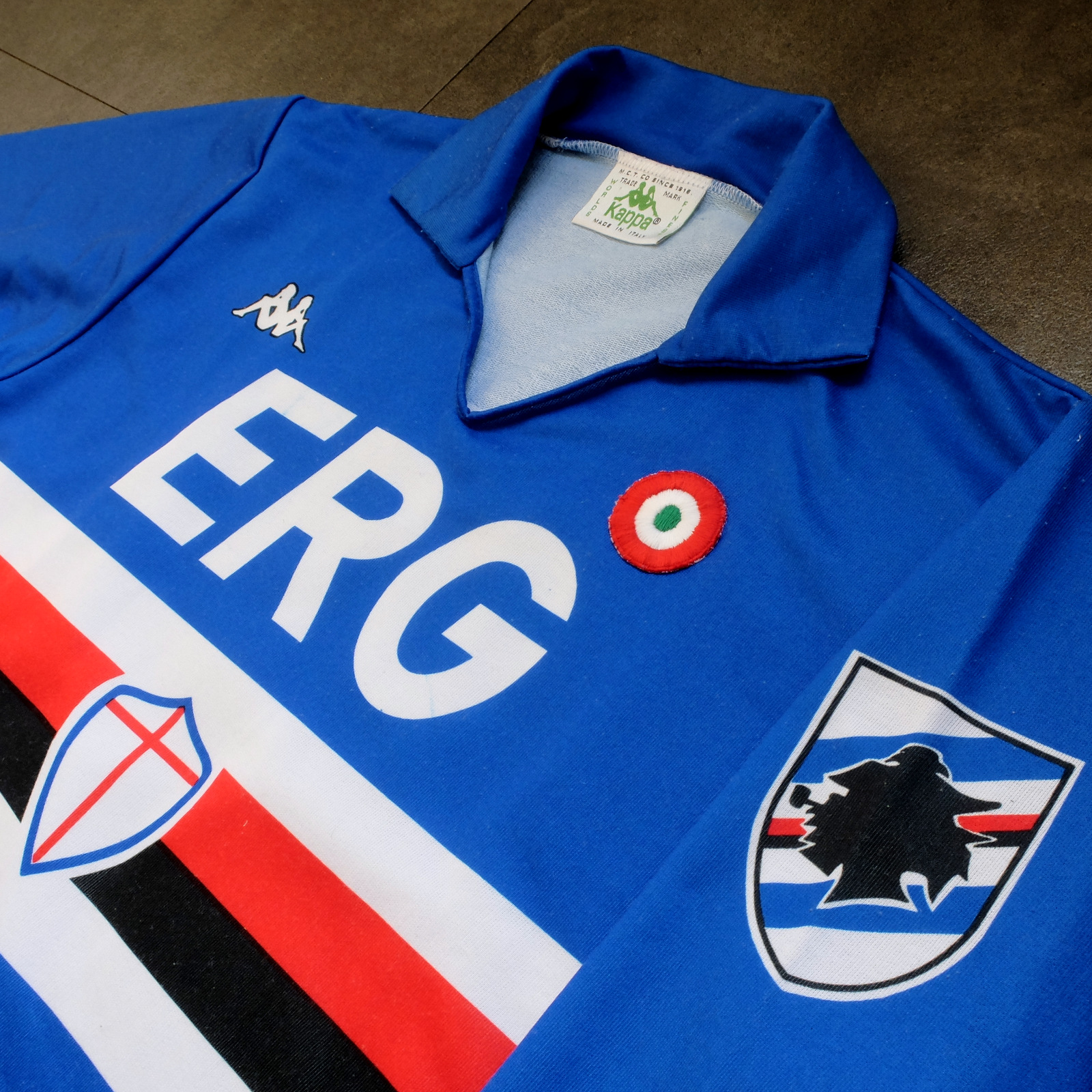
Sampdoria’s shirt rarely fails to deliver, but Kappa’s effort towards the end of the 1980s is the best of the lot. (Ennerre’s wasn’t bad either.) Oddly, what sets it apart, aside from the sinuous neckline and collar, is the italicised typeface of the sponsor, ERG. Everything else about it is routine. It has to be because there’s so much going on: the red, white and black horizontal stripes, the stemma San Giorgio at its centre, the manufacturer’s trademark. Maybe this is why in 1981 Ennerre decided to move the club’s crest to the left sleeve – to tidy it up a bit. At any rate, in doing so they made room for the coccarda, reward for winning the Coppa Italia. Sampdoria lifted the trophy in 1988 and again in 1989, so this particular jersey was never without it.
ASICS took over from Kappa in 1990 and barely changed a thing. They did, however, use a thinner material, which had the effect of altering the colour slightly, making it a touch lighter. 


NAPOLI, 1988-90


The jersey in which Napoli won their first ever scudetto is regarded as one of football’s greatest, but on closer inspection it can be found wanting. The sponsor, Buitoni, certainly looks the business, but the material – usually acrylic, sometimes cotton – belonged to a different era. In 1988 Ennerre finally got with the programme. While they continued to issue shirts made from their trademarked Lanetta (acrylic by another name), they also produced a polyester version, designed more than likely for the summer months.
At the same time Mars succeeded Buitoni as the club’s sponsor, initially written in white and then, later, black – presumably to improve visibility. Napoli won the UEFA Cup in 1989 and a second championship in 1990, whereafter the form of Diego Maradona began to deteriorate. It didn’t matter: he had become synonymous with Napoli and brought them unprecedented success, immortalising Ennerre’s shirt in the process.


FIORENTINA, 1989-90


When a friend introduced me to the delights of 110 Goals Italia Style in 1989 (on VHS) it wasn’t immediately obvious just how good Fiorentina’s shirt actually was. This is because they were wearing it with purple shirts and white socks, which detracted from its magnificence. When we sat down to watch the sequel in 1990, it became apparent (about a quarter of the way into it, as Baggio curls a diagonal ball into the back of Ascoli’s net) that Fiorentina were now wearing white shorts with purple socks. As well as that, they were sponsored by local rag La Nazione, rather than non-alcoholic aperitif Crodino, whose yellow and white lettering was less conspicuous than Crodino’s yellow and red. The shirt itself, made by ABM, was micropatterned, employing subtle shifts within the texture of fabric to create a pattern out of ABM’s logo – a stylised ‘S’ for Sportivo. It had a ribbed collar, a V-neck, and was of a moderately loose fit. The badge was the same that was reintroduced in 2021: a red fleur-de-lis appended to the letter ‘F’ set against a white circle with a purple border, far neater than the distended diamond-shaped crest Fiorentina used before and after. 
The following season ABM reinstated the purple shorts and Roberto Baggio was sold to Juventus.


A.S. ROMA, 1990-91


Roma had to wait until 1990 before Ennerre saw fit to provide them with polyester shirts, by which time the trend for micropatterning had begun to really take off. Strangely, Ennerre seemed to hedge their bets, supplying a plain, silky version as well as micropatterned one. (Napoli were presented with the same dilemma). The micropatterned version was hardly used, yet it is the superior iteration. The NR logo, repeated within the fabric of the shirt, is a neat design, and the jersey itself is a deeper, more satisfying shade of red. This, combined with Piero Gratton’s lupetto badge and the white italics of the sponsor, Barilla, qualify it as the club’s best shirt ever. Roma did well in it too, reaching the finals of both the UEFA Cup and the Coppa Italia, losing to Inter in the former and defeating Sampdoria in the latter. 


JUVENTUS, 1990-92


While AC Milan got to dress up in polyester as early as 1987, Juventus had to wait until 1988. Strange, considering that Kappa – the firm that issued both teams their kit – was a subsidiary of a larger firm called Maglificio Calzificio Torinese. The shirt in question, when it arrived, was sponsored by Ariston, the same company that had its name emblazoned upon the acrylic sarks Juventus wore the previous season. Then in 1989 Upim replaced Ariston, whose rounder font complimented the jersey’s simplicity. However, it still lacked something, which was colour. Juventus won the Coppa Italia in 1990, which provided it. Turns out they needn’t have bothered. Kappa, in a moment of genius, decided that their logo would now be coloured green. This seemingly innocuous detail meant that when the coccarda was removed in 1991, the shirt sustained its visual impact. In fact, it looked better without it, the green insignia on the right singularly complementing the two gold stars to the left. Danone succeeded Upim in ’92, and the svelte neckline and collar – the same that had graced the shirts of Sampdoria and Milan – were exchanged for something more substantial. Still a good effort, but the 1991-92 iteration takes the honours.


TORINO, 1992-93


By 1992-93 Italian football strips were on the slide, Umbro and Lotto being the main offenders. There were still some quality shirts knocking about – Brescia, Roma, Milan, Pescara, Juventus – but only one that really mattered: Torino’s. ABM were responsible, in a working relationship that stretched back to 1990. Nothing much changed throughout their three-year tenure, save for the sponsor in ‘91 (from Indesit to Beretta) and the introduction of a polo-style neck opening in ’92. (ASICS did a similar thing with Sampdoria’s jersey the same year but couldn’t resist adding horizontal stripes beneath the placket; less is always more.) Unlike with the shirts they’d supplied for clubs like Fiorentina, Pescara and Piacenza, ABM never embellished the fabric with their emblem. As a result, the deep burgundy really jumps out at you and contrasts nicely with the small amount of blue that features in Torino’s badge. It’s that collar that does it, though.

-------

If football tops like these were typical of the late 1990s then they would be highly prized, the reason being that people of a certain age became fans of Italian football off the back of Gazzetta Football Italia, which ran from 1992 through to 2002
. It’s question of cognitive bias: not of objective value judgements but subjective realities based upon nostalgia and fond memories. Precedently, football shirts had been governed by practical necessity, and were all the better for it. Thereafter, they became fashion accessories, as preposterous now as flares, bubble perms or a particularly bushy pair of sideburns.


[For a more in-depth analysis of each of these seven shirts, follow these links: Inter, Sampdoria, NapoliFiorentina, RomaJuventus, Torino.]

Wednesday, 5 July 2023

THE SARTORIAL ELEGANCE OF SERIE A: S.S.C. NAPOLI, 1988-90 [NR/ENNERRE]


Napoli’s colours are tenuously informed by those of their ancestors: Naples Foot-Ball Club and Unione Sportiva Internazionale Napoli. The former wore sky and navy blue striped shirts with black shorts and socks; the latter, darker blue shirts and socks with white shorts.
US Internazionale Napoli were in fact the result of a schism within Naples FBC itself. In 1911, wishing to engage teams from the north and perhaps feeling that the existing organisation wasn’t ambitious enough, the foreign (mostly English) members of Naples Foot-Ball Club decided to go it alone. The split imposed a financial burden on both parties and so in 1922 they re-amalgamated, taking on the name Foot-Ball Club Internazionale-Naples. As a sort of compromise, they would wear white-trimmed sky blue jerseys and socks paired with white shorts, the same that would become the colours of Associazione Calcio Napoli.
Yet the arrangement seemed to be skewed in the expatriates' favour. The appointed president, Emilio Reale, had also been president of Internazionale, and their chosen ground in Agnano was the one they used to play on. Even the sports’ press appeared to be in on it, habitually referring to the team as 'Internazionale' in their match reports.
The years that followed were relatively uneventful until the signing of the Charter of Viareggio in 1926, which granted the team entry into the newly formed Divisione Nazionale. The charter was essentially a Fascist initiative, and so under duress the company’s shareholders elected to take on the name Associazione Calcio Napoli, which had a more nationalist ring to it (one of the provisions of the charter was a ban on foreign players). It is this incarnation of the club that is officially recognised as being the first.
Napoli struggled and would have been relegated (twice) if the FIGC hadn’t intervened, on the basis that for the National Division to succeed it needed teams in it from the south. Just as well, because 1928-29 would effectively be a qualifying tournament for the leagues that were to proceed it: Series A and B
Again, Napoli got lucky. The original idea was to create two groups of 16 with the best eight in each being rewarded with a place in Serie A, while the remaining 16 teams would be allocated places in Serie B. Napoli finished eighth in their group, tied on points with Società Sportiva Lazio. A play-off ensued, which ended in a draw. A replay was on the cards until the club’s chairman, Giorgio Ascarelli, was able to convince the head of the FICG to expand Serie A to accommodate 18 teams, allowing both Napoli and Lazio to qualify. (Triestina were the beneficiary in the other group.)
Giorgio Ascarelli may have realised that this was a defining moment in the club’s history, for he prepared accordingly. William Garbutt, the English coach who had revolutionised Italian football during his 15 year stint with Genoa, was poached from southern rivals AS Roma. Attacking midfielders Antonio Vojak and Marcello Mihalich were signed from Juventus and Fiumana respectively, providing striker Attila Sallustro with support (although he’d done all right without them, scoring 22 goals the previous season). Finally, work began on a new purpose-built ground: Stadio Partenopeo – also known as Stadio Vesuvio, and soon to become Stadio Giorgio Ascarelli when the man who financed it died suddenly in February 1930, just a couple of weeks after its inauguration. The club finished the season in fifth place.

Napoli breezed through the 1930s but were then relegated in 1942. In 1944 they moved to a stadium in Vomero on a hill on the northwestern edge of the city, before events caught up with them and they were forced to suspend all activities.
In the aftermath of the Second World War Napoli were obliged to take part in the Serie A/B Centro-Sud Championship, a temporary solution designed to overcome the impracticality of travelling long distances in a country ravaged by conflict. Because most Serie A teams were from the north, they constituted one division, while the central and southern Serie A and B teams were put together in another. Given that Napoli were effectively a Serie B outfit they weren’t fancied, but won their group regardless. Not only did this put them through to the final, national round, but it ensured promotion to Serie A for the subsequent year.
Following a brief spell in Serie B from 1948-50 Napoli then managed eleven consecutive seasons in Italy’s top flight, whilst also constructing and moving into the Stadio San Paolo. On being relegated in 1961 they made it back into Serie A at the first attempt, winning the Coppa Italia in the process. The next year, after reaching the quarter finals of the Cup Winner’s Cup, where they lost to OFK Beograd on away goals, Napoli were again relegated. Burdened with debt, local businessman Roberto Fiore bought into the club in 1964, making it a joint-stock company. Now known as Società Sportiva Calcio Napoli, they won promotion the following year wearing for the most part their away strip: all white with a sbarra (sash or 'bar') tracing a diagonal line from the right shoulder of the shirt down to the left. (When running in the opposite direction, it is instead referred to as a banda.)
Former president Achille Lauro was still a 40% stakeholder and so invested in the team, bringing in Omar Sívori from Juventus and José Altafini from Milan. It paid dividends. SSC Napoli finished the championship in third place and were also victorious in the Coppa delle Alpi. They achieved this wearing a darker shade of blue, introduced in 1960. For 1966-67, which was also relatively successful, they would revert to the lighter blue more commonly associated with the club.
It would be another ten years before Napoli won another trophy – the Coppa Italia in 1976 – which is not to say they did badly in between. The club regularly finished in the higher echelons of Serie A and made the semi-finals of the Italian Cup on three occasions, wearing sky blue white-trimmed jerseys. The next significant change, both in the team’s fortunes and its livery, occurred in the mid-1980s.


1988-89

When Diego Armando Maradona signed for Napoli in 1984 their kit supplier was a manufacturer called Linea Time, more commonly associated with cycling. Despite doing a decent job, Ennerre/NR took over in 1985. Their acrylic jersey, sponsored by Buitoni, did away with the white trim and added a collar. [Ennerre also supplied a trimmed polyester version with faint pinstripes, possibly intended for warmer conditions.] The same strip was used for a consecutive season whereupon Napoli won their first Scudetto and third Coppa Italia.
In 1987, as testament to their recent achievements, Napoli’s shirt was adorned with both the scudetto and the coccarda – a shield and a roundel respectively, incorporating the colours of the Italian flag. To make room for the scudetto, the club's badge was moved to the left shoulder. The coccarda, meanwhile, was positioned directly beneath Ennerre's logo, just above the 'B' in Buitoni. It looked a mess. The club did, however, purchase the Brazilian striker Careca.
After winning nothing in 1987-88 the shirt could have potentially reverted to its previous configuration. Instead, the confectioners Mars took over sponsorship from food producer Buitoni. 'Mars' was initially printed in white, but was switched to black about halfway through the season, presumably to enhance its definition. Moreover, NR issued the shirt in two different materials: polyester and Lanetta, which is basically acrylic. New signings included the Brazilian Alemão from Atlético Madrid, Luca Fusi from Sampdoria, and Massimo Crippa from Torino. Napoli finished runners-up to Inter in the championship, lost to Sampdoria in the final of the Coppa Italia, but beat Stuggart over two legs to win the UEFA Cup. This unadorned jersey remained unchanged for following season, as Maradona led Napoli to victory in Serie A. They won more games, scored more goals, amassed more points than during their previous title-winning campaign, but the winning margin was less: two points more than AC Milan, compared to three ahead of Juventus. Maradona was top scorer with 16 league goals, Careca second with 10.
Maradona’s final season with Napoli would also be Ennerre’s (before Umbro stepped into the fold, ruining everything). NR didn’t see fit to change what wasn’t broken, although there were a few twists. Again, two shirts were made, both in polyester: a plain, almost silky iteration as before, and a matt version micro-patterned with the NR insignia. (AS Roma were presented with the same dilemma.) If that wasn’t enough, an alternative ‘Cup Shirt’ was produced. Blue with an undulating white band across the front, it was worn in the 5-1 drubbing of Juventus in the 1990 Supercoppa Italiana, against Cosenza in the Coppa Italia, Spartak Moscow in the second round of the European Cup (whereupon Napoli were beaten on penalties), and in a number of league games early on in the season. The template was also used for a red, third shirt, while the away kit was white with pale blue rhomboids running horizontally across the chest. Napoli ended the season in a disappointing eighth place.


Cup Shirt, 1990-91

Considering how few changes Ennerre actually made, it is amazing to think how many different jerseys they produced during their six year tenure. The 1986-7 edition seems to be the most popular, in which Napoli won their first scudetto. You might equally fancy the first Mars shirt; it might simply come down to whether you like your fonts with or without serifs. Or maybe you prefer the contrast in colour the scudetto and the coccarda bring, even if the overall effect is a bit busy. Whichever version you favour, they’re all representative of a specific moment in time: Maradona in his pomp, and the fairy tale he bestowed upon the city of Naples and its people.