Showing posts with label ABM. Show all posts

Wednesday, 19 March 2025

THE SARTORIAL ELEGANCE OF SERIE A: PALERMO, 1990-92 [ABM]


Same old story: Palermo got their colours after a laundry incident turned their football shirts pink. The club had previously worn a combination of red and blue, so it's doubtful that such a mutation is even possible. In any case, the more widely accepted explanation is based upon a letter sent to the club's president, Joshua 'Giuseppe' Whitaker, in 1905 suggesting the change to pink and black to represent the rosolio and amaro produced by Whitaker's family business, which was drunk after a game in accordance with the result: rosolio – which is pink, sweet – after a win, and amaro – black, bitter – in defeat. (It is not known what was consumed in the event of a draw.)
The new colours weren't in fact implemented until 1907, the same year the club changed its name to Palermo Foot-Ball Club. Hitherto, they'd identified as the Anglo-Palermitan Athletic and Foot-Ball Club, reflecting the team's English ties: the aforementioned ornithologist Joseph Whitaker, Viceconsul Edward De Garston, Norman Olsen, George Blake, who had previously been involved in the establishment of Genoa Cricket and Football Club, as well as Ignazio Pagano, a local Italian who had been introduced to football during his two years spent studying in England.
The opportunity to actually play football was scarce and centred around matches against the crews of passing British ships. Indeed, the only other team in Sicily at the time was Messina FC, founded in 1900 by Alfredo Marangolo, who had studied alongside Ignazio Pagano in London. In 1901, the two of them would get together and organise a match between their respective teams, and again in 1904, before the arrangement was solidified with the creation of the Whitaker Challenge Cup in 1905. This annual fixture ran for four consecutive years (honours even) before the 1908 Messina earthquake put a terrible stop to it.
In its place, and quite independent from it, came the Lipton Challenge Cup. One of the crews Palermo had played against had been that of the Erin, a privately owned yacht belonging Sir Thomas Lipton. Palermo had won, and the tea-magnate rewarded them with a formidable trophy. Unable to commit to a rematch, Lipton stipulated that teams from Sicily and Campania should compete annually for the cup, which effectively meant Palermo playing against either Naples Foot-Ball Club or Unione Sportiva Internazionale Napoli. This competition ran until 1915, cut short by Italy's entrance into the First World War.
In the wake of the conflict, a number of smaller clubs emerged: Trinacria, Itala, Esperia, and Racing FBC. Valentino Columbo, who'd played for Palermo prior to the war, purchased Racing FBC, who played in blue and white halved shirt, and rebranded them Unione Sportiva Palermo. Within a year, he changed the colours to pink and black, facilitating a sense of continuity between the new club and the older one. More mergers were to follow – with Unione Sportiva Leoni in 1922, Sport Club Libertas Palermo in 1923, and 'Vigor' in 1927 – and another name change, to Palermo Football Club. Meanwhile, the team muddled along in Lega Sud, struggling financially.
By the time of Serie A's inauguration in 1929, Palermo were playing in Group D – the 'Southern Directory Circle' – and came top of it, gaining promotion into Serie B. Coincidently, that same year the club commissioned a new badge, which is worthy of note because it was designed by the Italian painter and futurist Giuseppe 'Pippo' Rizzo. Comprised of a horizontally inclined rhombus set against a stylised, brown leather football, it was replaced as early as 1932 after Palermo won promotion into Serie A. This was the moment at which the club adopted the symbol of the golden eagle, derived from the city’s coat of arms, which remains in place to this day.
 
Like so many other Italian football teams, Palermo would soon fall foul of Fascist initiatives. First they were obliged to ‘Italianise’ their name, and not long after were pressured into taking on the colours of municipal Palermo – red and yellow. In the midst of all this, they were relegated. If that wasn’t bad enough, in 1940 the FIGC kicked them out of the league due to insolvency.
Not for the first time, Palermo were forced into affiliation with a lesser but more economically stable local rival. The team in question was Juventina Palermo, who just so happened to wear the same colours that Racing FBC had. The partnership was retitled Unione Sportiva Palermo-Juventina and within a couple of years were playing in pink and black; within four, they were called more simply Unione Sportiva Palermo.
The 1950s and 1960s would represent a period of relative stability for Palermo. Flitting between series A and B, the most dramatic thing that happened to them was another change of name, to Società Sportiva Calcio Palermo, a by-product of the club listing itself as a joint-stock company. At some point during this period – probably the late 1960s – Palermo started experimenting with stripes. By the 1970s, this trend seemed to have passed, a decade that was spent almost entirely within the confines of Serie B.
 

1979-80

The idea that the football shirt, and sportswear in general, is something other than utilitarian came about in the 1970s. If you wanted to identify a 'year zero' then 1972 might do, when Adidas launched their trefoil logo in the run up to the Munich Olympics. Up until then, branding in football had been low key, often non-existent. By the end of the decade it would be ubiquitous, thanks to the efforts of firms such as Admiral, Umbro, Puma and, of course, Adidas. In Italy, the company that led the charge was Pouchain.
This golden age of footballing couture would last until the end of the century, whereafter sports kit started to become more technical – or would pretend to be. Even though the notion of the football shirt as high performing sportwear is slightly disingenuous, it is fair to say that the invention of manmade fabrics has been of some benefit to the game, has it has for many other sports. When Pouchain were active, acrylic was the material of choice, which had itself superseded wool and cotton. Ennerre favoured acrylic, before eventually getting on board with polyester in the early 1990s, while ABM liked to mix polyester with cotton.
Palermo have had gear manufactured by all three: Pouchain from 1979-80, Ennerre from 1980-86, and ABM from 1990-96. Designed by Piero Gratton, Pouchain’s shirt had by far the best badge: the silhouetted profile of an eagle's head framed within the outline of a diamond. The problem with it was that the fashion of the day dictated that the jerseys were tightly fitted. The Ennerre shirts were more forgiving but suffered from the fact that they didn’t incorporate the club’s insignia, which wasn’t so unusual back then (see also Como, Avellino, even Juventus). After two years with Ennerre’s offshoot company Ennedue, who were equally negligent, Hummel stepped into the fold. Again, the Danish firm didn’t see fit to incorporate a badge, but otherwise showed promise. Finally, ABM took over, and knocked the ball out of the park.
Palermo’s 1990-91 shirt might be their best. For one, it had a badge, although not Gratton’s, which the club had got rid of in 1987. Instead, a Iberian style shield, of the type Inter used throughout the 1980s, with an oblique pink and black stripe running through the middle and the basic outline of an eagle’s head over the top. The template itself was the same that was being used at Fiorentina, Piacenza, Messina and Ternana: collar, trimmed V-neck, ABM's logo running in vertical micropatterned lines within the fabric of the shirt. The sponsor was ‘Citta di Palermo’ in what I can only assume was some sort of tourism initiative, which let it down a bit.
For the next season, the minimal club crest was dropped for a more complicated rendering of an eagle almost in flight. The collar was now black, while the new sponsor – consumer electronics producer Sèleco – was printed in blue. ABM also produced a pink and black striped third version with diagonal micropatterning, which hardly seemed necessary but looked good all the same.
 

1991-92

The 1990s saw Palermo – or Unione Sportiva Città di Palermo, as they were known from 1994 onward – yo-yoing between series B and C. The new century brought with it a revival of fortune, with the club qualifying for the UEFA Cup/Europa League on three separate occasions. The bubble finally burst in 2019, whereupon Palermo were forced to reregister as Palermo Società Sportiva Dilettantistica and ply their trade in Serie D. Upon promotion into Serie C in 2020, they were permitted to restitute the name Palermo Football Club, and are currently playing in Serie B wearing gear supplied by Puma.

Monday, 23 September 2024

THE SARTORIAL ELEGANCE OF SERIE A: UDINESE CALCIO, 1987-90 [ABM]


Anyone with more than a passing interest in Italian football will probably know that the country's first football club was Genoa, established in 1893. But how many of us can name the second? Answer: Udinese, established in 1896. Just as Genoa began life as Genoa Cricket & Athletic Club, Udinese operated under the patronage of the Società Udinese di Ginnastica e Scherma (Udinese Gymnastics and Fencing Society). Such multifaceted sporting arrangements were not uncommon back then, and many an Italian team can testify to such origins. There normally came a point, however, when the football-oriented wing of these organizations would seek to establish its own identify.
For Udinese that point came in 1911, with the formation of the Associazione del Calcio Udine. Exchanging their all-black jerseys for black and white halved ones, the club registered with the Federazione Italiana Giuoco Calcio (FIGC), and were duly allocated a regional place in the 1912-13 Promozione. Pitted against Unione Sportiva Petrarca and Calcio Padova, Udinese came second in their group, which was enough to gain entry into the Veneto-Emilian section of next season's Prima Categoria, where they remained up World War 1.
Conflict over, Udinese became part of Associazione Sportiva Udinese, and the team's colours were again tinkered with: black-trimmed white shirts paired with white shorts and black socks. It was in this kit that Udinese made it to the first ever final of the Coppa Italia, losing to FC Vado by one goal, in 1922. [It should be noted that most of the so-called 'bigger' clubs in Italy were at the time registered with the Confederazione Calcistica Italiana and not eligible to compete in the Italian Cup, which was the initiative of the FIGC.] The same year the club was promoted into the newly created Prima Divisione, only to be relegated the following season.
Meanwhile, Udinese's mounting debts precipitated a separation from the Associazione Sportiva and would have ended in dissolution had the club's president, Alessandro del Torso, not raised enough money to keep them afloat. A reconfigured Associazione Calcio Udinese were promoted back into the Prima Divisione in 1825, but were relegated the year after into Group B of what was also called the Prima Divisione, given that the highest league had been rebranded as the Divisione Nazionale.


In 1930 Udinese advanced into a newly conceptualized Serie B as champions of the Prima Divisione, after coming top of Group C (Northern Division) and then defeating Palermo 3-1 in a played-off final. By now Udinese were wearing black and white striped shirts, a combination they would wear consistently over the course of the next five decades. Their form would remain consistent too, in a sense. The 1930s would be played out in Serie C, the 1940s saw Udinese competing in Serie B, the 1950s in Serie A, and the latter half of the '60s and most of the '70s spent back in Serie C.
It was towards the end of the 1970s that club began to revive itself. Having moved into a newly built stadium in 1976 – the Stadio Friuli, with its distinctive elliptical arch – Udinese completed a treble of sorts, finishing top of Group A of Serie C and winning both the Coppa Italia Lega Pro and the Anglo-Italian Cup. The following year, after abbreviating their name to Udinese Calcio, they were promoted into Serie A as champions of Serie B. Finally, in 1980, Udinese defeated Čelik Zenica in the final of the Coppa Mitropa.
 
After decades of sartorial stability, Udinese decided it was time for another change. Discarding the traditional black and white stripes, the club opted for a shirt con palo – literally, 'with pole'. In other words, white with a wide, black vertical stripe straight down the middle. Made by Pouchain it also featured a new crest, designed by the great Piero Gratton, depicting a zebra's head inscribed within a green circle. The badge didn't last long and was replaced in 1981 with a white shield displaying an inverted black V with a red Z beneath it – which stood for the home appliance manufacturer 'Zanussi', who had recently taken the club over – and the words 'udinese calcio' (lower case) printed above it. (For 1981-82, the jersey itself, produced by the Italian fashion brand Americanino, was adorned with the Z on its own, which I don't suppose went down very well.)
In 1984 Diadora succeeded Americanino as technical sponsor and made further alterations. The new shirt was essentially black but with a thick white band running diagonally from the left arm down across the torso, and also bore the name of a commercial sponsor, Agfacolor. Then in 1986 ABM took over from Diadora but left the jersey well alone.


Things came to a head in 1987. The Brazilian Zico had come and gone and Udinese's results hadn't been going their way. The club's involvement in the 1986 Italian football betting scandal saw them hit with a nine-point penalty deduction, resulting inevitably in relegation. As if taking stock, ABM reverted to the evenly gauged black and white stripes of Udinese's past. And a new sponsor: Rex, a high-end subsidiary of Zanussi. Writ in amber against a black background, and with a deliberately misaligned E, it brought welcome relief to an otherwise achromatic template – as did ABM's red, angular insignia. A neat, trimmed collar completed the look.
Udinese rounded off 1987-88 season in a mediocre tenth place, although the appointment of Nedo Sonetti as head coach in December had brought with it an improvement in form during the second half of the season. So it proved. In 1989, with the collar now removed, Udinese finished third, which got them back into Serie A. Foreign players were then purchased in an effort to stay there – the Argentines Abel Balbo and Nestor Sensini, Spanish veteran Ricardo Gallego – and a new coach too – Bruno Mazzia. ABM reinstated the missing collars, but everything else about the strip remained the same.
It didn't work out. Udinese were condemned to Serie B on the last day of the season, despite beating Inter 4-3. The club subsequently became embroiled in another match-fixing scandal that deferred their return to Serie A for a couple of years. Adidas replaced ABM before Lotto came along and ruined everything. Now firmly entrenched within Serie A, Udinese's gear is currently provided by Macron, who have seen fit to experiment with the various formats of their predecessors.

Saturday, 17 February 2024

THE SARTORIAL ELEGANCE OF SERIE A: SEVEN SHIRTS


Football shirts in the late 1990s described a sartorial nightmare, and this was as true in Italy as anywhere else. That grey and black horizontally striped 'third shirt' that Ronaldo wore for Inter. Juventus away, in which they won their last European Cup. Fiorentina jerseys sponsored by Nintendo, made by Fila. Parma in yellow and blue hoops. If they had fitted, that would have been something. Instead, they flapped about like an artisan’s smock.
One of the reasons for this was the rise of football as a global phenomenon, promulgated by the theatre of Italia '90. Hitherto, replica shirts had been aimed primarily at kids; hooligans didn’t tend to wear them for fear of attracting the wrong sort of attention. All of a sudden football was cool, and the fashion at that time was for loose fitting clothes. Companies that had only a passing association with the game, such as Puma, Reebok and Nike, decided that they’d like a piece of the action, which obliged more established firms, such as Adidas, Diadora and Kappa, to adopt more adventurous strategies. Nothing wrong with this from a business point of view, but fashion is not the same thing as good taste. Ergo, as football became more popular, the shirts became more ostentatious.
Up until the early 1980s they hadn’t been ostentatious enough. What changed was the introduction of polyester and the right for clubs to bear commercial sponsors. It is counter-intuitive that things like this could make a difference, but they did. Something else: back then, club badges and manufacturer emblems were sewn on, rather than printed, dye-sublimated or ironed, which gave the shirts a tactility that belied their true value. As well as all that, they fitted properly, were invariably V-necked and had collars.
Here are some of the finest examples.


INTERNAZIONALE, 1988-89


When Uhlsport took over from Le Coq Sportif in 1988 not much about Inter’s shirt changed: the sponsor remained the same, the club’s crest, the number of vertical stripes. What did change – aside from the manufacturer’s insignia and – was the textile: polyester in place of acrylic. This had an effect on the shade of blue, making it lighter, but it also allowed Uhlsport to radically overhaul the away shirt, which was white, installing a band of alternating blue and black rhomboids printed across the front of the shirt (the same motif would be adopted by the club generally, adorning flags and tickets).
The uppercase font of the sponsor, MISURA, is a delight, as are the two red dots that form part of it. The collar is simple, sleek and in harmony with the V-shaped neckline. Finally, Inter’s now defunct biscione ensign, with the gold star above, and Uhlsport’s logo, a black stylised letter U set against a white square with a red border. It was probably cheap to make but didn’t look it. How much of this was by design is another matter.


SAMPDORIA, 1988-90


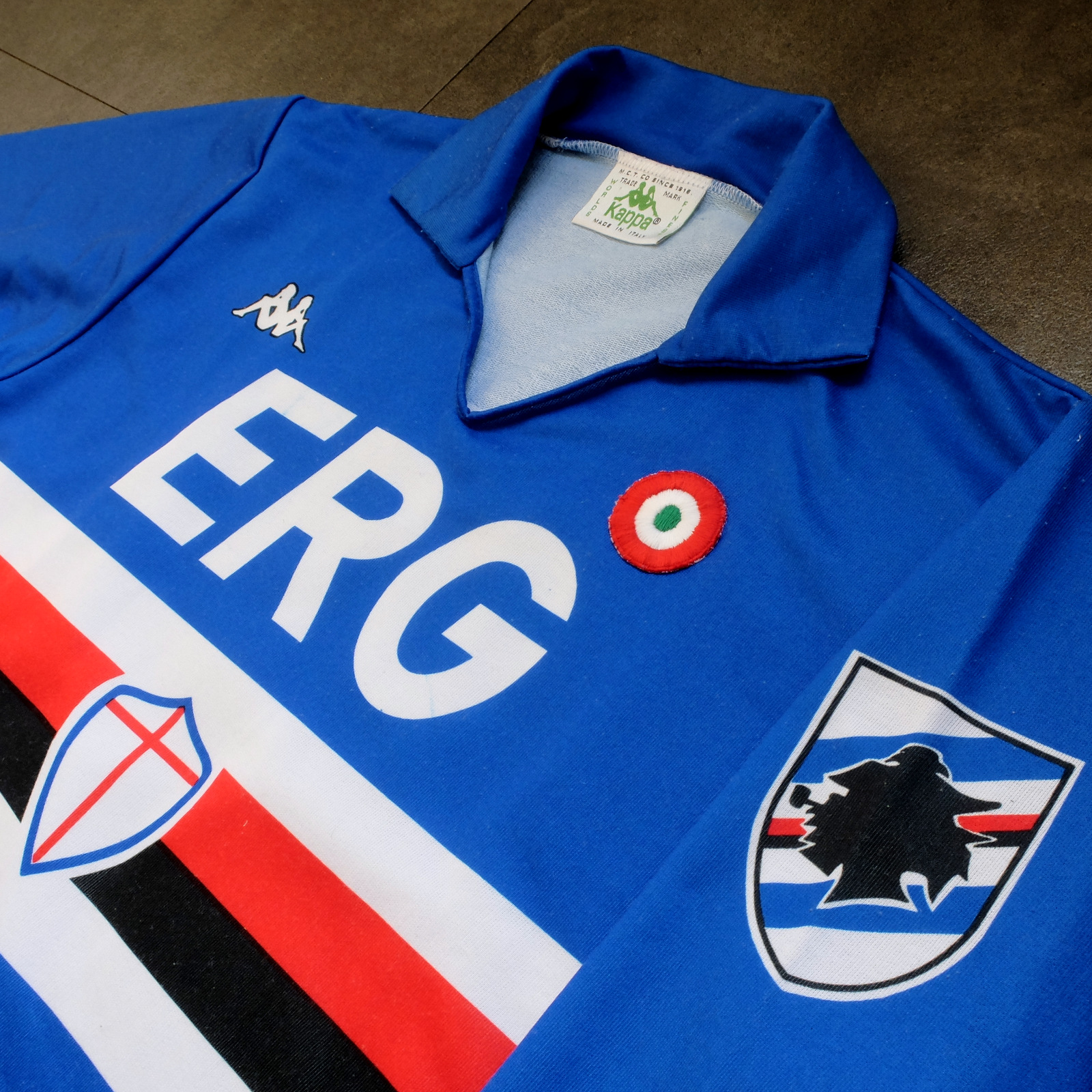
Sampdoria’s shirt rarely fails to deliver, but Kappa’s effort towards the end of the 1980s is the best of the lot. (Ennerre’s wasn’t bad either.) Oddly, what sets it apart, aside from the sinuous neckline and collar, is the italicised typeface of the sponsor, ERG. Everything else about it is routine. It has to be because there’s so much going on: the red, white and black horizontal stripes, the stemma San Giorgio at its centre, the manufacturer’s trademark. Maybe this is why in 1981 Ennerre decided to move the club’s crest to the left sleeve – to tidy it up a bit. At any rate, in doing so they made room for the coccarda, reward for winning the Coppa Italia. Sampdoria lifted the trophy in 1988 and again in 1989, so this particular jersey was never without it.
ASICS took over from Kappa in 1990 and barely changed a thing. They did, however, use a thinner material, which had the effect of altering the colour slightly, making it a touch lighter. 


NAPOLI, 1988-90


The jersey in which Napoli won their first ever scudetto is regarded as one of football’s greatest, but on closer inspection it can be found wanting. The sponsor, Buitoni, certainly looks the business, but the material – usually acrylic, sometimes cotton – belonged to a different era. In 1988 Ennerre finally got with the programme. While they continued to issue shirts made from their trademarked Lanetta (acrylic by another name), they also produced a polyester version, designed more than likely for the summer months.
At the same time Mars succeeded Buitoni as the club’s sponsor, initially written in white and then, later, black – presumably to improve visibility. Napoli won the UEFA Cup in 1989 and a second championship in 1990, whereafter the form of Diego Maradona began to deteriorate. It didn’t matter: he had become synonymous with Napoli and brought them unprecedented success, immortalising Ennerre’s shirt in the process.


FIORENTINA, 1989-90


When a friend introduced me to the delights of 110 Goals Italia Style in 1989 (on VHS) it wasn’t immediately obvious just how good Fiorentina’s shirt actually was. This is because they were wearing it with purple shirts and white socks, which detracted from its magnificence. When we sat down to watch the sequel in 1990, it became apparent (about a quarter of the way into it, as Baggio curls a diagonal ball into the back of Ascoli’s net) that Fiorentina were now wearing white shorts with purple socks. As well as that, they were sponsored by local rag La Nazione, rather than non-alcoholic aperitif Crodino, whose yellow and white lettering was less conspicuous than Crodino’s yellow and red. The shirt itself, made by ABM, was micropatterned, employing subtle shifts within the texture of fabric to create a pattern out of ABM’s logo – a stylised ‘S’ for Sportivo. It had a ribbed collar, a V-neck, and was of a moderately loose fit. The badge was the same that was reintroduced in 2021: a red fleur-de-lis appended to the letter ‘F’ set against a white circle with a purple border, far neater than the distended diamond-shaped crest Fiorentina used before and after. 
The following season ABM reinstated the purple shorts and Roberto Baggio was sold to Juventus.


A.S. ROMA, 1990-91


Roma had to wait until 1990 before Ennerre saw fit to provide them with polyester shirts, by which time the trend for micropatterning had begun to really take off. Strangely, Ennerre seemed to hedge their bets, supplying a plain, silky version as well as micropatterned one. (Napoli were presented with the same dilemma). The micropatterned version was hardly used, yet it is the superior iteration. The NR logo, repeated within the fabric of the shirt, is a neat design, and the jersey itself is a deeper, more satisfying shade of red. This, combined with Piero Gratton’s lupetto badge and the white italics of the sponsor, Barilla, qualify it as the club’s best shirt ever. Roma did well in it too, reaching the finals of both the UEFA Cup and the Coppa Italia, losing to Inter in the former and defeating Sampdoria in the latter. 


JUVENTUS, 1990-92


While AC Milan got to dress up in polyester as early as 1987, Juventus had to wait until 1988. Strange, considering that Kappa – the firm that issued both teams their kit – was a subsidiary of a larger firm called Maglificio Calzificio Torinese. The shirt in question, when it arrived, was sponsored by Ariston, the same company that had its name emblazoned upon the acrylic sarks Juventus wore the previous season. Then in 1989 Upim replaced Ariston, whose rounder font complimented the jersey’s simplicity. However, it still lacked something, which was colour. Juventus won the Coppa Italia in 1990, which provided it. Turns out they needn’t have bothered. Kappa, in a moment of genius, decided that their logo would now be coloured green. This seemingly innocuous detail meant that when the coccarda was removed in 1991, the shirt sustained its visual impact. In fact, it looked better without it, the green insignia on the right singularly complementing the two gold stars to the left. Danone succeeded Upim in ’92, and the svelte neckline and collar – the same that had graced the shirts of Sampdoria and Milan – were exchanged for something more substantial. Still a good effort, but the 1991-92 iteration takes the honours.


TORINO, 1992-93


By 1992-93 Italian football strips were on the slide, Umbro and Lotto being the main offenders. There were still some quality shirts knocking about – Brescia, Roma, Milan, Pescara, Juventus – but only one that really mattered: Torino’s. ABM were responsible, in a working relationship that stretched back to 1990. Nothing much changed throughout their three-year tenure, save for the sponsor in ‘91 (from Indesit to Beretta) and the introduction of a polo-style neck opening in ’92. (ASICS did a similar thing with Sampdoria’s jersey the same year but couldn’t resist adding horizontal stripes beneath the placket; less is always more.) Unlike with the shirts they’d supplied for clubs like Fiorentina, Pescara and Piacenza, ABM never embellished the fabric with their emblem. As a result, the deep burgundy really jumps out at you and contrasts nicely with the small amount of blue that features in Torino’s badge. It’s that collar that does it, though.

-------

If football tops like these were typical of the late 1990s then they would be highly prized, the reason being that people of a certain age became fans of Italian football off the back of Gazzetta Football Italia, which ran from 1992 through to 2002
. It’s question of cognitive bias: not of objective value judgements but subjective realities based upon nostalgia and fond memories. Precedently, football shirts had been governed by practical necessity, and were all the better for it. Thereafter, they became fashion accessories, as preposterous now as flares, bubble perms or a particularly bushy pair of sideburns.


[For a more in-depth analysis of each of these seven shirts, follow these links: Inter, Sampdoria, NapoliFiorentina, RomaJuventus, Torino.]

Saturday, 9 October 2021

THE SARTORIAL ELEGANCE OF SERIE A: PIACENZA CALCIO, 1990-92 [ABM]


Piacenza Football Club was formed in 1919, the result of a merger between two Piacentino clubs – Giovine Italia and Unione Football Club Piacenza – under the stewardship of an eighteen year-old student by the name of Giovanni Dosi. After registering with the Federazione Italiana Giuoco Calcio (FIGC), they were granted admittance into the 1919-20 La Promozione Emiliana, came out on top and were promoted into the Prima Categoria wearing red and white kit.
The Emilian section of the Prima Categoria was separated into two groups of five. Piacenza participated in Group A, drawn against Modena, Parma, Reggiana and Carpi, and finished third, which wasn’t enough to qualify for the next round. The following season the football federation split in two, with many of the smaller clubs remaining with the FIGC and the larger, more successful teams breaking away to form the Prima Divisione, overseen by the newly created Confederazione Calcistica Italiana (CCI). Piacenza won their three-team qualifying group, ahead of Parma and Mantovana, but came last in the regional finals behind SPAL, Virtus Bolognese and Parma.
The schism between the competing associations was resolved in 1922 by way of the Colombo Compromise, which had the effect of consigning Piacenza to a lower, second division – a sort of regional Serie B. Except there was no way out of it, although teams still faced the threat of relegation. It could be said, then, that the Charter of Viareggio in 1926 was of potential benefit for clubs stuck in the lower divisions. The idea behind the charter was to nationalise the sport (in the name of Fascism), meaning that the existing Northern and Southern leagues would be amalgamated. The restructured Divisione Nazionale comprised two leagues of ten, whereafter the top three teams in each would play against each other to determine the winner. All well and good but it had the effect of downgrading the division beneath: the Prima Divisione became the second tier and the Seconda Divisione (North and South) the third.
It’s doubtful that such machinations had any material effect on Piacenza’s fortunes. What did have an impact was the decision in 1928 to divide the Divisione Nazionale into Series A and B. In 1927-28, the club finished top of Group D of the Second Division (North) which would ordinarily would have seen them promoted into Italian football’s second tier, except the First Division – the second division in all but name – now became the third. Piacenza remained in the First Division up until 1935, at which point it was renamed Serie C.
Piacenza Calcio would have to wait a while before they could play legitimately in Serie B. I say legitimately because in the aftermath of World War II they briefly featured in a combined Serie B/C Alta Italia, a temporary solution in the face of logistical and bureaucratic restrictions on travel. By 1948-49 they were back in Serie C.
After a brief spell in Serie IV/D, Piacenza were promoted to Serie B in 1968-69, but were then relegated. I have read that in the 1960s Piacenza sometimes wore white shirts with a red sash but I can find no images to corroborate this. In any case, upon the club’s return to Serie B in 1974-75 they were wearing red shirts, white shorts and red socks.
 

1975-76

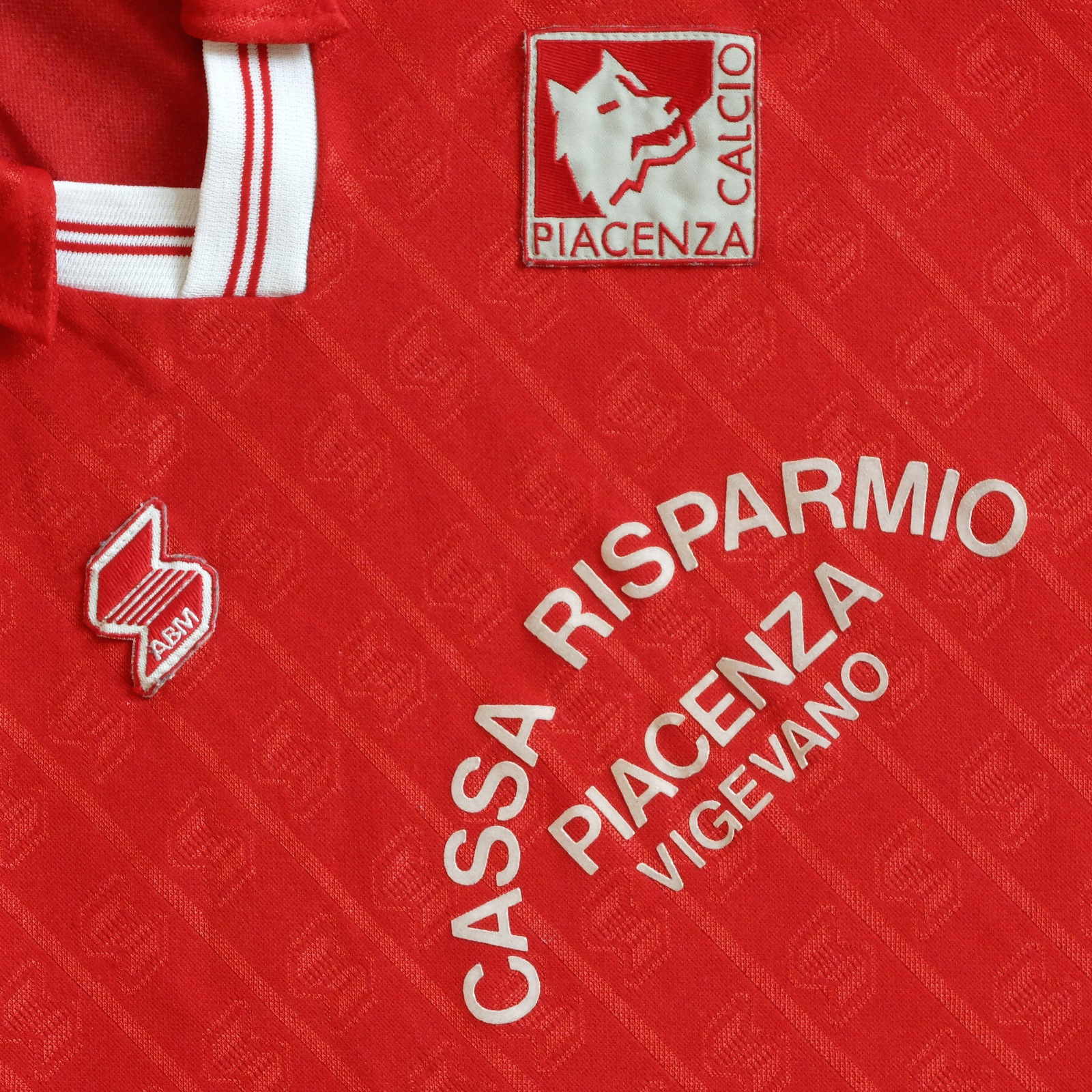
In 1983 a man by the name of Leonardo Garilli became Piacenza’s president. One of the first things this qualified mechanical engineer did, aside from implementing some sort of fiscal structure, was to commission a new badge. The graphic designer(s) responsible drew upon the province’s heraldry: a red shield encapsulating a silver square and a Roman ‘she-wolf’. The shield was discarded, the square rotated through 45 degrees, and the wolf’s head rendered with a simplicity worthy of Piero Gratton himself. It is used to this day.
The new emblem didn’t appear on Piacenza’s actual shirts until 1986, provided by a company named Dafra. The club immediately won promotion into Serie B as champions, Armando Madonna the star of the show. (A young Giuseppe Signori made 14 appearances, scored one goal.) NR then took over as technical supplier while Cassa Risparmio Piacenza continued as commercial sponsor, albeit with e Vigevano now appended to their name. Despite starting well, Piacenza ended their campaign in 13th place. The following year they were relegated, and ‘Beppe’ Signori was sold to Foggia for 1.5 billion lire.
After an indifferent season in 1989-90, Piacenza added a second Serie C (1) championship to its palmarès in 1990-91. They did this wearing clobber manufactured by Abbigliamento Sportivo (ABM) utilising the same template employed at Fiorentina, Salernitana, Palermo, Messina (but not Torino). Made from polyester and cotton, the jersey was micropatterned with ABM’s motif running in vertical lines. It had a collar, an elasticated V-neck and was loose-fitting, as most jerseys were during this period.
Piacenza bedded in. They took on loan the goalkeeper Davide Pinato from Atalanta and attacking midfielder Armando Madonna from Lazio, who had been sold to Atalanta in 1988 after his previous five-year stint with Piacenza. More significantly, the striker Antonio De Vitis signed from Udinese. They finished mid-table.


In 1992-93, Piacenza won promotion into Serie A. In the meantime, ABM had tinkered with the shirt, adding a pop-stud neck opening (used at Torino), a more abstract micropattern and a white collar. The club made a quick return to Serie B but an equally speedy return to Serie A, this time as champions. Moreover, Piacenza made it stick, spending five consecutive seasons in Italy’s preeminent division before again being relegated, by which time Lotto was supplying the gear.
Unfortunately, the club went bankrupt in 2012, re-established itself as Società Sportiva Dilettantistica Piacenza Calcio 1919 in 2013 (subsequently shortened to Piacenza Calcio 1919) and have only been able to make it back as far as Serie C.

Saturday, 1 September 2018

THE SARTORIAL ELEGANCE OF SERIE A: FIORENTINA, 1988-90 [ABM]


Upon its formation in 1926, ACF Fiorentina wore red and white halved shirts, representative of the city of Florence (or more specifically its flag and coat of arms) as well as the two teams from which the new club was formed: Club Sportivo Firenze, who had worn white shirts, and Palestra Ginnastica Fiorentina Libertas, who had worn red. The iconic purple jerseys, used to this day, were introduced in 1929, but nobody can say exactly why. The myth that often prevails is that it was result of a laundering incident. In fact, the switch in livery was a decision made by Luigi Ridolfi, the club's then president, inspired by the kit worn by Újpest, a Hungarian football team against whom Fiorentina played a friendly match in 1928.
It was in this configuration that Fiorentina won their first scudetto in 1956: purple collared shirts, white shorts and purple socks, with a red fleur-de-lis (a stylised lily, or ‘giglio’) set against a white rhombus acting as the club's badge. The presence of a badge of any sort was quite unusual for the time, but it seems to be something Fiorentina adopted from the moment they started wearing purple shirts.
Fiorentina were champions again in 1968-69, now wearing black shorts. It is unclear what motivated this change, or when it came into effect, although the club's two Coppa Italia triumphs in 1961 and 1966 were achieved in white shorts. In any case, the next season Fiorentina were back to wearing white shorts, the fleur-de-lis appended to the corner of the scudetto that adorned the jersey.

The 1970s saw little in the way of sartorial change. Then, in 1980, construction magnate Flavio Pontello assumed control of Fiorentina and appointed his son, Ranieri, as president. Within a year they’d changed the club’s badge and struck a deal with the clothing company JD Farrow’s to sponsor the kit, which was not the done thing back then. The new circular emblem comprised of half a fleur-de-lis appended to the letter F, taking on the appearance of a halberd, and was displayed in the middle of a red-trimmed shirt, occupying a fair proportion of it, with the club’s sponsor transcribed above. On top of all that, the team now wore purple shorts.
Fiorentina’s new look was not popular, but when Pontello & Son started investing in actual players opinions softened. In 1981-82, the club finished Serie A in second place and would probably have won the championship had a goal not been controversially disallowed against Caligari in the last game of the season. Thereafter Fiorentina’s form was inconsistent: in 1983 they placed fifth, in ‘84 third, and in ‘85 ninth. Meanwhile, Ennerre had taken over as kit supplier and set about reducing the size of the club’s inflated crest, while also accommodating car manufacturer Opel as the team sponsor.
1985-86’s strip could itself be considered iconic. The red trim was discarded, white shorts were reintroduced, and the badge moved to the more usual position over the left breast. This made room for Ennerre’s wonderfully minimal green insignia on the right, while the sponsor was set against a white band wrapped around the trunk of the shirt. Fiorentina managed a respectable fourth place that term, although it’s worth pointing out that they drew 13 of their 30 matches, which wouldn’t now place them quite so high (at the time, two points were awarded for a win, inflating the value of a drawn game). Moreover, their top scorer was the defender Daniel Passarella, prompting Inter to divest Fiorentina of the player’s services.
For what would be club captain Giancarlo Antognoni’s final year at the club, Ennerre handed over shirt making responsibilities to the their subsidiary brand, N2 (or 'Ennedue'), to be sponsored by the non-alcoholic aperitif Crodino. N2 reverted to issuing purple shorts, and Fiorentina finished a disappointing ninth, although new signing Ramon Diaz impressed with 10 goals and Nicola Berti was looking like good value after his transfer from Parma in 1985. In 1987 Sven-Goran Eriksson was drafted in as technical director, to be assisted by Sergio Santarini in the role of coach. The managerial partnership coincided with the emergence of Roberto Baggio as a force to be reckoned with after struggling with a serious knee injury the previous season. Fiorentina ended the campaign in eighth place, Diaz scoring seven leagues goals, Baggio six.
The situation for 1988-89 looked precarious. Nicola Berti and Ramon Diaz had both signed for Trapattoni‘s Inter, while doubts still remained regarding Baggio's fitness. Incoming players included defensive-midfielder Dunga, signed from Pisa, and striker Stefano Borgonovo, taken on loan from AC Milan. At the same time sportswear firm ABM succeeded Ennerre/N2, introducing a micro-patterned shirt utilising subtle shifts in the fabric’s texture [65% polyester, 35% cotton] to make a pattern out of the manufacturer’s logo.
Fiorentina did all right, finishing in seventh place and reaching the quarter finals of the Coppa Italia. Fortuitously, AC Milan went on to win the European Cup and Sampdoria the Coppa Italia, effectively freeing up an extra place in the UEFA Cup, which went to Fiorentina after they defeated Roma in a play-off. Even more auspicious was the fact that Baggio and Borgonovo had formed a very effective partnership – as well as a close friendship – scoring 15 and 14 goals respectively. Or it would have been if AC Milan didn’t then recall their man to provide cover for Marco Van Basten.


For 1989-90, Fiorentina were furnished with white shorts and purple socks. It is this iteration of the ABM strip that is by far the best. Local rag La Nazione took over as sponsor, their uppercase, serif-font emblazoned in yellow (yellow being the complimentary colour of purple). The red parallelogram that constituted ABM’s logo complemented the simplicity of the giglio, as well as making its presence felt against the whiteness of the shorts.
Fiorentina replaced Borgonovo with Argentine striker Oscar Dertycia, as well as bringing in Czech midfielder Luboš Kubík, winger Renato Buso, and defender Giuseppe Volpecina, among others. The results were mixed. On the one hand Fiorentina only just avoided relegation after beating Atalanta in their final game. On the other they reached the UEFA Cup final, controversially losing to Juventus 3-1 over two legs; Fiorentina were forced to play their home leg in Avellino, despite having played the rest of their European campaign in Perugia, which was far closer to home (Stadio Artemio Franchi was undergoing refurbishment prior to the 1990 World Cup and judged unfit for European competition). Nonetheless, the images of Roberto Baggio and the rest of the team, resplendent in purple and white, are some of Fiorentina’s finest.


ABM hung around for another year but reverted to issuing purple shorts, as well as adding white trim to the neck-line. In 1991, Lotto took over, and all was lost. Not only did the white shorts go for good but so did Pontello’s giglio. In an era where clubs re-design their insignias with mild regularity, one can only hope it might one day make a return.

Saturday, 30 June 2018

THE SARTORIAL ELEGANCE OF SERIE A: TORINO, 1990-93 [ABM]


It’s almost impossible to write about Torino’s past without alluding to the Grande Torino and the terrible fate that befell them: the near total annihilation of their squad in the Superga air disaster of 1949. At the time of the accident, Torino had won four scudettos on the bounce and were well on their way to adding a fifth. Moreover, the club comprised the backbone of Italy’s national team, contributing as many as ten players for a game against Hungary in May 1947. Torino went on to win the title in 1949 after it was agreed that all clubs involved would field their youth teams for the four remaining games of the season, which was a fitting gesture.
Unsurprisingly, a period of decline ensued, but by the middle of the 1960s Torino had re-established itself as a force to be reckoned with, culminating in 1968’s Coppa Italia triumph (this, despite the tragic death of star-player Luigi Meroni in a bizarre motoring accident). A second Coppa Italia followed in 1971, and in 1976 Torino were crowned champions having wrestled the scudetto from the hands of city rivals Juventus. Indeed, I Granata had a good time of it throughout the 1970s: not once did they finish outside of Serie A’s top ten and every year but two qualified to play in Europe. Such consistency could not be sustained and the 1980s represented a torrid time for Torino, although not without its highlights.


Torino have consistently worn maroon shirts, usually with white shorts and black socks, although during the early 1980s they opted for maroon socks. From 1984 through to 1989 their kit was supplied by Adidas, who did a good job on it. Torino managed a second-place finish in 1985, four points behind champions Verona (this was when just two points were awarded for a win). Over the next three seasons they finished 5th, 11th and 7th consecutively, before being relegated to Serie B in 1989 after placing a lowly 16th. When the club won promotion back to Serie A the following season, they teamed up with Abbigliamento Sportivo – or ABM for short  in an association that would last the next three seasons.
The strip ABM came up with was an exercise in minimalism. No trim and no micro-patterning, just a plain burgundy, collared shirt. Shorts were kept white but the socks reverted to black, giving the kit a better balance. The fit was loose without being overly baggy. Class.
During Torino’s tenure in Serie B, white-goods manufacturer Indesit had been the club’s sponsor and remained so after their return to Serie A, whereupon they ended up a very respectable fifth. Thereafter, it was Beretta – purveyor of cured meats – who paid to have their name on the shirt, and they benefitted from the exposure when Torino made it into the 1991-92 UEFA Cup Final, only to lose to Ajax on the away goal rule. This was the season that saw Enzo Scifo joining the moustachioed Rafael Martín Vázquez in midfield. It’s been said that Vázquez never really settled at Torino, whereas Scifo, who had returned to Italy to redeem himself after failing to make much of an impact at Inter three years earlier, did. The club finished third in the league behind Juventus and champions AC Milan, thus qualifying for the UEFA Cup for a second year in succession.
Vázquez subsequently returned to Real Madrid, by way of Marseille, while Scifo went on to win the Coppa Italia with Torino in 1993, knocking Juventus out along the way. It was this iteration of ABM’s strip that was best. Very little changed save for the addition of a rather tidy snap-fastened placket in place of the preceding V-neck. Unfortunately Torino clinched the Coppa Italia in Rome wearing their away kit, which was nice but not great. In any case, it had been a successful three years and a testament to the managerial talent of the late Emiliano Mondonico.


1992-93

In the summer of 1993 Enzo Scifo left for AS Monaco, goalkeeper Luca Marchegiani moved to Lazio, Walter Casagrande returned to Brazil and Lotto took over as Torino’s kit supplier. Lotto’s shirts, as you may know, were made on the cheap and the badges and logos were often sublimated, rather than sewn on as separate, three-dimensional entities. In 1996 Torino were relegated and have been flitting between Series A and B ever since.

Thursday, 1 February 2018

THE SARTORIAL ELEGANCE OF SERIE A


It all started to go wrong in and around 1989. Strange details began to permeate the shirts of England’s old First Division: white, triangular, expressionistic flecks on Liverpool’s Candy sponsored jersey, a terrible zigzag effect making a mess of Manchester City’s, and a similar geometric mash-up staining Chelsea's and Everton’s. At least they still fitted.
Meanwhile, on the continent the football kit was reaching its zenith, Italy's Serie A at the epicentre of it all. AC Milan and Internazionale were exploiting stripes in a manner rarely bettered, with away kits that were possibly even smarter still. In Spain, Barcelona were strutting around in a contender for the best football shirt of all time, a svelte little number that Gary Lineker was lucky enough to sport for the entire three years he spent playing for the Catalan giants. Anderlecht, Auxerre, Ajax… You should see the jerseys they were wearing in Brazil.
In fairness, English clubs too had contributed to this wealth of taste. Adidas and Umbro dominated the market, refining classic templates that would flatter the most incongruous of club colours: simple collars, minimal trim, subtle micropatterning, pared-down club crests adorning sensibly sized kits that flattered the physique. Back then it was not unusual for teams to wear the same strip for as many as three consecutive seasons, and so any changes came gradually. Tottenham and Arsenal, for example, were assured sartorial clemency until the summer of 1990, protected from those bizarre experiments introduced a year earlier.
It was during Italia '90 that it became evident that those strange goings-on in England were more than a mere aberration. Ironically, Umbro did quite a good job with England's jersey. Sure, there was a spot of striped, buttoned-up tomfoolery playing about the collar, but it fitted okay and the colour scheme remained as it should (we’ll forget the third kit ever happened). Indeed, the better teams that qualified for that World Cup got off lightly, a slight loosening of fit being the worst crime committed against the shirts of Argentina, Brazil, Holland, West Germany and the hosts, Italy. Instead, it was in the strips of nations like Romania, Columbia, the USA, Cameroon and Czechoslovakia (all manufactured by Adidas, incidentally) that one could see sewn the prophecy of the football shirt gone mad – excessively silky fabrics, ultra-wide V-neck collars, misplaced stripes, a looser fit.

Back to Serie A. What was it about those shirts that resonates to this day? We need to start in the early 1980s when, like with cycling jerseys, football kits were beholden to their material: heavy acrylic with a tendency to stretch and hang. They looked pretty good actually, but on closer inspection, a little cheap. Take Michel Platini decked out in Juventus colours: a flimsy excuse for a collar, plunging neck-line and, except when Juve were reigning champions and wore the scudetto, no shield to speak of. (This does seem to be a Juventus thing: other clubs more normally attached their badge to the upper arm.)
Then for the 1986-87 season S.S.C. Napoli introduced a real game-changer. Manufactured by newly conceived sports’ brand NR (Ennerre), it was the jersey in which Napoli won their first Italian Championship, Diego Maradona at the helm. There was nothing particularly technical about this jersey – it was made from something called 'Lanetta', which was really just acrylic – but it featured the club’s crest on the chest, a classic V-neck collar, was sympathetically proportioned and a pleasing shade of blue.

1987-88: Kappa was the next company to raise their game, tidying up Juventus’s kit (still no badge though) and making a good go of AC Milan’s: thin, traditional collar with no trim, a satisfying gauge of stripe, the sponsor’s name MEDIOLANUM, replete with minimally obscure symbol, and the Kappa emblem – the silhouette of a man and a woman sat back-to-back – in white. AC Milan won the league that season, and the shirt looked even better the next with the scudetto sewn onto it.


1988-89: Kappa took over Sampdoria from Ennerre, who hadn’t done a bad job. Sampdoria had won the Coppa Italia the previous season and thus bore the coccarda (a roundel in, as with the scudetto, the colours of the Italian flag) upon their breast. Sampdoria’s strip never fails to please. Comprised of blue shirts with a red, black and two white horizontal stripes wrapped around the trunk, with a crossed shield in the middle, it’s one of the most distinctive shirts of any league. Moreover, the club’s crest (now attached to the sleeve to make room for the coccarda) displays the silhouette of a shabby looking sailor smoking a pipe; the club colours bend sinister behind him. Shorts and socks are white so as not to detract (a jersey should never be judged in isolation but appreciated within the context of the entire kit).
At the same time, German firm Uhlsport was providing for Internazionale and Bologna. These shirts were notable for their lack of give, which may or may not have been a deliberate ploy to prevent players from tugging at them. Back then Inter were using their short-lived ‘serpent’ logo, which is a bit more interesting that the montage of letters they’ve employed since. The hue of blue was slightly lighter than now, and the sponsor – Misura, a health food manufacturer – brought with it red dots that, along with the gold star denoting ten title triumphs, added some welcome colour to the otherwise exclusively blue and black mix. The away strip was better still: same black socks, same black shorts, but a white shirt with alternative blue and black diagonal rhomboids in a line across the chest.


[Courtesy: Fotboll.Farg.Form.]

1989-90: When Italian sportswear company ABM took on Fiorentina’s kit the previous season, they’d provided a decent enough shirt, but there was a problem: they matched this with purple shorts. Moreover, these shorts, as is often the case, were made from a different material than the jersey. The effect was that Fiorentina weren’t actually playing in the same colour, but in two shades of the same colour, and two shades of a colour as vivid as purple. Perhaps sensing their error, Fiorentina were now issued with white shorts, giving them maybe the best strip in the division; the sight of Roberto Baggio battling against Juventus in that year’s UEFA Cup final is one of the era’s iconic images.
Inter still had the same strip but as reigning champions wore the scudetto in place of that serpent on a shield, with the circular montage of letters present on the upper arm. And Kappa finally got around to using the same template for Juventus that they’d been using for AC Milan, a lovely looking shirt sponsored by department-store chain Upim.

1990-91: Had the World Cup not been held in Italy might things have remained as they were? Probably not, but if there’s a high water-mark for kit design it can be found here. Torino had just been promoted from Serie B (as champions) and were rewarded with a contract with ABM: maroon shirts, white shorts with black socks, sponsored by white goods manufacturer Indesit. (Sadly for Fiorentina, ABM decided to bring back the purple shorts.)
Ennerre was making similarly good work of Roma and Napoli's shirts. Replacing Lanetta with polyester, these kits were micropatterned, creating subtle shifts in the fabric’s texture to make a motif out of the manufacturer’s logo.
        Sampdoria was now supplied by ASICS, but the kit looked very much the same. AC Milan had gone over to Adidas but the kit looked very much the same – a rare triumph for Adidas in this context. Juventus’s stayed with Kappa, but the kit looked very much the same, save for the addition of the coccarda awarded for the previous season's victory in the Coppa Italia. The best shirt of the year was probably Bologna away: white with maroon and navy equilateral triangles arranged in horizontal lines, their number diminishing as they worked their way down the front of the shirt.


Unlike many of my generation, it wasn’t Channel Four’s Football Italia on a Sunday that provoked my interest in Italian football, but a VHS tape entitled 110 Goals Italia Style – 1988-89 (quickly followed by 110 Goals Italia Style 2 – 1989-90). I was certainly grateful for Channel 4’s effort when it came but was a more faithful viewer of Gazzetta Football Italia on a Saturday morning (and Transworld Sport too, which would also round up the previous weekend's Serie A action). The reasons were threefold. First, I preferred playing football to watching it, so on a Sunday I was normally kicking a ball about a park wearing either my Internazionale away top, circa 1989-90, or my Fiorentina home shirt, circa 1990-91. Second, there was James Richardson, who had much more to do hosting Gazzetta than he did introducing Sunday’s games, sitting in front of cafes waving La Gazzeta dello Sport in our faces, bringing us up-to-date with recent events. Third, all of this started off the back of Paul Gascoigne’s move to Lazio in 1992, by which time I was taking my A-levels, shortly to leave for university, which distracted me.
But aside from all that, I’d become disillusioned with what I perceived to be a waning aesthetic. What had begun in the English First Division in the late 1980s was spilling over onto Italian shores in the early-to-mid 1990s. Umbro, who had hitherto made kits for Cagliari, Lazio and Parma, got their hands on Napoli and Inter’s, absolutely destroying them in the process. Italian brand Lotto muscled in on Torino, Fiorentina, AC Milan and Atalanta, dressing them in shirts that resembled fake replicas sold down weekend markets. ASICS started getting inventive with Sampdoria’s jersey, adding drawstrings around the collar. Football fashion was suddenly kitsch.
Football shirts would never be the same, and probably never will be.