Showing posts with label 1995. Show all posts

Thursday, 1 April 2021

THE SARTORIAL ELEGANCE OF SERIE A: VICENZA CALCIO, 1995-97 [BIEMME]


Vicenza Calcio was founded in 1902 by Professor Tito Buy and Antonio Libero Scarpa, the dean and gymnastics teacher at the Liceo Scientifico Paolo Lioy. Known then as Associazione Del Calcio In Vicenza (abbreviated as ACIVI), they played in red and white stripes from the off. The club’s coat-of-arms consisted of a (Swiss) shield encompassing a white cross on the left – in recognition of the city’s heraldry – and a pallet of red and white stripes to the right, with a white ‘chief’ bearing the script A.C. VICENZA in red. Like most teams in Italy, they were confined to playing provincially; only clubs from Piedmont, Liguria and Lombardy were eligible to contend Italy’s Prima Categoria, while Vicenza competed in the Terza Categoria Veneto Championship.
In 1908, ACIVI joined up with a team called Olympia and changed their name, albeit inappreciably, to Associazione Del Calcio Di Vicenza. At around the same time the FIGC restructured the Prima Categoria to the detriment of the clubs that fielded non-Italian nationals. They did this by organising two separate competitions: an Italian Championship in which only Italian players could compete, and a secondary Federal Championship open to all (assuming Italian residency). Genoa, Torino and Milan consequently boycotted both tournaments, won by Pro Vercelli and Juventus respectively.
The following season the dissenting associations – including Pro Vercelli – chose a different tack, withdrawing from only the Italian Championship in an attempt to legitimise the Federal one. Meanwhile, the FIGC looked to fill the void. As winners of 1907-08’s Terza Categoria, Vicenza was invited to take part in the Italian championship (won by Juventus) and second placed Venezia was granted entry into the Federal event (won by Pro Vercelli). Both Venetian teams proved to be out of their depth.
In 1909 the FIGC conceded and recognised the Federal Championship as the legitimate title (meaning that Pro Vercelli was crowned Campioni d'Italia for a consecutive season). The return to a single-league format in 1909-10 meant there was no room for clubs outside of Italy’s ‘industrial triangle’. Instead, Vicenza, Venezia and Padova were allocated their own Seconda Categoria.
The pressure remained to expand Italian football beyond its traditional borders, so in 1910-11 a separate Venetian-Emilian 'first category' was established, comprising Hellas Verona, Venezia, Bologna and Vicenza. The winner of this division would then face the winner of the Northwestern league to determine the overall champion. Vicenza qualified for the final, which they lost to Pro Vercelli 1-5 on aggregate.
Over the succeeding years the championship was expanded and tweaked to accommodate teams from the peninsula. Vincenza did all right, coming top of their section in 1913 and 1914, before the First World War happened, arresting their progress.
 
By 1923 Vicenza was playing in Group C of the third division. In 1928 they merged with another local team (Circolo Cotonificio Rossi) and renamed themselves Associazione Calcio Vicenza, sporting white shirts with a horizontal red band around the middle – or vice versa – paired with red shorts and socks. In 1932 they were made to change their name to Associazione Fascista Calcio Vicenza, and also removed the red band from the jerseys, leaving them white.
A period of recovery ensued, culminating in promotion to Serie B in 1939-40 and Serie A in 1941-42. After the Second World War the club reverted to its previous name and wearing their traditional red and white stripes. In 1948 Vicenza dropped back into Serie B, embracing mediocrity and struggling financially. Then in 1953 the textile firm Lanerossi bought the club out and rechristened it Associazione Calcio Lanerossi Vicenza. More than a mere sponsorship, the team became part of the Lanerossi business, to the extent that it even took on the company logo – a knotted letter R. The partnership got off to a flying start and within two seasons Vicenza were back in Serie A, where they would remain for the next twenty years.


Lanerossi Vicenza, 1976-77

Lanerossi Vicenza was relegated in 1975. After narrowly avoiding a successive relegation in 1976, new coach Giovanni Fabbri had the idea of redeploying the promising young right-winger Paulo Rossi as a centre-forward. The move reaped immediate rewards. Rossi’s 21 goals sent the club back into the Italian first division, winning Serie B in the process, with the knotted R coloured blue, enlivening what might have otherwise been an uninspiring shirt.
Vincenza’s return to the top flight exceeded expectations, with Paulo Rossi's 24 goals securing them an unprecedented second place finish. They finished the season in second place with Paulo Rossi scoring 24 times. Their success was to be short-lived. The next season Lanerossi was relegated and by 1981 were back playing in Serie C.
The decade that followed was a volatile one: victory in the Serie C Cup, promotion to Serie B, a revoked promotion to Serie A, relegation back into Serie C, the professional debut of Roberto Baggio, and a rotating cast of presidents. Lanerossi sold their stake in the company in 1989 and the club re-registered itself as Vicenza Calcio. A new badge was commissioned, designed by Antonio Toni Vedù, incorporating a white (French) shield with a red border encapsulating a double-lined, red V with a horizontal break on one side delineating a white cross. The words VICENZA CALCIO 1902 were printed above in red.
After a few false starts Vicenza got their act together, gaining promotion into Serie B in 1993 and then Serie A in 1995. In 1997 they won the Coppa Italia and in ‘98 made it to the semi-finals of the European Cup Winners’ Cup, losing to the eventual winners, Chelsea.

From 1992 to 1995, Vicenza’s kit was made by Virma and sponsored by men’s clothing manufacturer Pal Zileri. Ahead of their return to Serie A, the club joined up with sports’ firm Biemme with Pal Zileri remaining as commercial sponsor. The new shirt was barely discernible from the last: the collar, the press-studded placket, the dye-sublimated crest and the thinner gauge of stripe were all pretty much the same. Biemme’s shirt, however, was micropatterned. Vicenza finished the season in ninth place.
In 1996 Biemme made a few subtle but significant alterations. First, they widened the stripes, which meant that the manufacturer’s logo and the club’s badge were now set against a white background. Second, the trim around the collar and cuffs was changed from a motif based upon Biemme’s insignia to something resembling a series of comets travelling in the same direction. Finally, Vicenza’s badge was embroidered and given a yellow border. Overall, the shirt was an improvement on the last. That it was also the top in which Vicenza won the Coppa Italia is fortuitous.


In 1997 Lotto succeeded Biemme as the club's kit provider. The most striking disparity between the new shirt and the last was the addition of the coccarda. Other modifications included a less intricate micropattern, an elasticated collar and neckline, and more conventional trim. What really set the two jerseys apart, though, were the emblems of the companies that made them. Biemme don’t use it anymore but back then it amounted to a stylised letter B filled in with the colours of the Italian tricolour, framed within a white square with rounded corners. Lotto’s logo was, and is, bland by comparison.

Saturday, 26 December 2020

THE SARTORIAL ELEGANCE OF SERIE A: HELLAS VERONA, 1992-95 [UHLSPORT]


Associazione Calcio Hellas was named in honour of the Hellenic Republic at the suggestion of Professor Decio Corubolo, who taught Greek at the Liceo ginnasio statale Scipione Maffei. Rather than wearing the colours that this association implied, the club opted for black and white halved shirts. The year this happened – 1903 – football was only played professionally within the regions of Piedmont, Lombardy and Liguria, and so A.C. Hellas had to content itself with friendly games against local sides. By the time they found themselves competing in the Prima Categoria (Emilia-Veneto division) in 1910, they were sporting the colours of the city of Verona, derived from the municipality’s coat of arms – a yellow cross against a blue background.
In 1919 A.C. Hellas merged with F.C. Verona to become Football Club Hellas Verona. Ten years later, at the behest of the fascist regime, two more teams were assimilated: Bentegodi and Scaligera. The resulting enterprise was retitled Associazione Calcio Verona, which may or may not have been intended as an anti-Greco gesture (by 1940 Italy and Greece would be at war with each other). Unfortunately, Hellas Verona had just finished Group B of the Divisione Nazionale in 13th place, thus failing to qualify for Serie A’s inaugural season.
World War II saw A.C. Verona relegated to Serie C, although they were back in Serie B by the end of it. In the meantime they experimented with a number of configurations – such as grey shirts with a horizontal blue and yellow band around the middle in 1946-47 – before settling for yellow shirts and blue shorts.
After coming close in 1948, Verona were promoted to Serie A in 1956. To celebrate they adopted to a kit resembling that of Boca Juniors, but were subsequently relegated. The following year Verona absorbed yet another local team, by the name of A.S. Hellas. Sensing an opportunity to connect with its past, the club rechristened itself Associazione Calcio Hellas Verona. Another change or colours: blue shorts, white jerseys with blue sleeves, and hint of yellow adorning the neckline. It’s uncertain how long they persisted with this arrangement but it appears that by the end of the decade their shirts were once again yellow.
Hellas Verona returned to Serie A in 1968 wearing blue and yellow vertically striped jerseys paired with black shorts – had been since 1964. The team’s second spell in Italy’s top flight was relatively successful, lasting six consecutive seasons. In 1970 they reverted to yellow shirts with blue trim, before switching to blue shirts with yellow trim the following year. Shorts were by now generally white.


1984-85

The strip Verona wore during their title winning campaign of 1984-85 is considered to be one of their best. Manufactured by Adidas and sponsored by Canon, it differed slightly from previous kits in that the shorts were also blue while the shirts incorporated yellow pinstripes. Ricoh replaced Canon in 1986, then Hummel took over from Adidas in 1987. The partnership with Hummel lasted three years, culminating in relegation. Adidas stepped back into the fold, the club were immediately promoted, whereafter Verona hooked up with German firm Uhlsport.
Verona’s kit for 1991-92 was mediocre. All blue with a yellow collar and yellow rectangles running down the outside edge of the arms, the sponsor, Rana, printed in a white, rounded uppercase font, it looked cheap. Predictably, the away kit was a mere inversion of the home. However, there existed a superfluous third shirt comprising the same yellow and blue stripes that had been worn during the second half of the 1960s. Relegation ensued, but the jersey was reappropriated for home use the following season.
The shirt itself adhered to the same template Uhlsport were using for U.S. Cremonese. The stripes were of roughly the same gauge, the fabric was micropatterned in the same manner, both had collars, and the manufacturer’s logo and club’s badge were sewn on, except the sponsor’s name was black. The badge is of particular interest. In 1984, club president Ferdinando Chiampan had commissioned the advertising agency Orti Manara to come up with a new insignia. The chosen design included two mastiffs facing away from each other, joined in the middle by a staircase/ladder – symbols relating to the local heraldry – to form a stylised V, encapsulated within a sort of rhombus. The first iteration had the mastiffs and the edging rendered in yellow. Uhlsport inverted the colour scheme and added the colours of the Italian flag within the top-left border and ‘Verona F.C.’ in the one diametrically opposite.


The Uhlsport years were ineffectual. The reason the word ‘Hellas’ had been omitted from the revamped badge was because in February 1991 the club had to re-register under a different name to avoid bankruptcy. In 1995 they got their old name back, swapped Uhlsport for Errea, were promoted and then relegated again. It would get worse before it got better. Hellas Verona are currently enjoying a second consecutive season in Serie A, their kit supplied by Macron. 

Friday, 20 November 2020

THE SARTORIAL ELEGANCE OF SERIE A: U.S. CREMONESE, 1992-95 [UHLSPORT]


As is often the case, Cremonese haven’t always worn their current colours. In 1903, the year the club came together, they wore white shirts adorned with a lilac collar, paired with black shorts and socks. Cremonese was a mere sporting association back then, and it’s not even certain they played any football. This changed in 1910, around the time they changed their name to Unione Sportiva Cremonese. Football was catching on, and the following year the team appointed a coach by the name of Nino Gandelli, with aim of playing the sport competitively. It seems he took the role seriously enough, recruiting the best local talent he could find, and by 1912 they'd signed up with the Federazione Italiana Giuoco Calcio (FICG).
Ahead of the 1913-14 Promozione, U.S. Cremonese merged with the recently formed Associazione Calcio Cremona. A new strip was in order, and it was towards the city’s heraldry that they looked for inspiration. Cremona’s coat of arms consists of a shield split down the middle, with silver and red horizontal stripes on one side and on the other a depiction of an arm holding aloft a golden ball. For now, the colours would do: grey shirts with red trim, to be worn with white shorts.
Cremonese’s first season was a success, winning promotion into the Prima Categoria at the first attempt. The following year’s campaign was mediocre, and when Italy joined The Great War in 1915 so did many of their players (most notably goalkeeper Giovanni Zini, who served as a stretcher-bearer but died in Cividale del Friuli in 1915 after contracting typhus).
In 1919, Cremonese assimilated another local team by the name of Football Club Aurora. Despite bolstering their ranks the club finished bottom of their six-team group, which ordinarily would have resulted in relegation back to the Promozione. The Prima Categoria was in effect a qualifying round whereby teams competed in regional divisions to gain entry into the national semi-finals. The regional committees operated with complete autonomy, determining how many teams over however many leagues were allowed to take part. Ahead of the 1920-21 season, rather than reduce the number of entrants, as the FICG and a few of the bigger clubs were keen to do, Lombardia elected to move from three groups of six to six groups of four, making room for Cremonese.
The next five years were spent playing in a restructured Prima Divisione. Then in 1926 tensions between the FICG and Confederazione Calcistica Italiana (CCI) finally gave way to the establishment of a national league, under the auspices of the (Fascist) Direttorio Divisioni Superiori (DDS). At the same time Cremonese embellished their grey shirts with a red cross, only to finish their group in ninth place. Once more, this should have been low enough to see them relegated, but an enforced merger between Sampierdarenese and Andrea Doria (albeit a temporary one) freed up and extra space.
In 1928 Cremonese tinkered with their strip for a third time, exchanging the cross for a horizontal stripe wrapped around the chest. Seventh place was enough to qualify for the preceding season’s inaugural single-group format – in other words, Serie A – from which they were immediately relegated. They continued to play in Serie B up until 1938, whereupon they dropped down into Serie C. In 1942 Cremonese returned to Serie B but were again relegated in 1951. For their 50th anniversary, they wore grey and red quartered shirts before finally settling for the stripes worn to this day.


The 1960s were spent playing in Serie C with the occasional foray into Serie D. The 1970s saw some improvement, culminating in promotion to Serie B in 1977 – the same season that saw Cremonese decked out in red shirts with a single grey stripe descending vertically from left shoulder. Relegation swiftly followed, but by 1981 they were back playing in Serie B.
In 1984 Cremonese finally made a return to Serie A after a 54 year absence. Unfortunately, the man who scored most of the goals that got them there – a certain Gianluca Vialli – was subsequently sold to Sampdoria. His replacement, the Brazilian forward Juary, made little impact and the club finished bottom of the table. But Cremonese appeared to have turned a corner and over the course of the next decade were promoted to Serie A on four separate occasions, oscillating between the top two tiers of Italian football. In the first instance their gear had been supplied by Puma. The second time around it was ABM (1988-89) and then Patrick (1990-91). For 1992-93’s successful push for promotion the kit was supplied by German sports manufacturer Uhlsport.

Uhlsport made shirts for a number of Italian football teams in the late ‘80s and early ‘90s, most notably Inter and Bologna, as well as Verona and Brescia. They all came with collars, as did most shirts tailored towards the Italian market at that time. In truth, the jersey Uhlsport came up with was not so different to the ones that ABM and Patrick had provided before them. There were, however, a few compelling disparities.
First off, ABM and Patrick never bothered with appending the club’s crest. In ABM’s case, this may have come down to financial expediency, given that ABM were attaching crests to the shirts of Fiorentina, Torino, Pescara, Palermo. In any case, the absence of a badge cheapened the jersey. Moreover, Cremonese had redesigned their crest in 1985, and it was worthy of attachment: a simplified rendering of a golden ball held aloft, as depicted in the city’s coat of arms, with a diagonal red and grey bend (sinister) behind it. (When Uhlsport handed over to Puma in 1997, the club reverted to its traditional emblem.)
Second, the team’s sponsors during Patrick and ABM’s tenures did not present as nicely as the one that adorned the Uhlsport shirts – local retailer Moncart. It’s not that the company name was written in a particularly distinctive font, just that the simplicity of Moncart’s sans-serif, uppercase lettering worked well in this instance.
Finally, Uhlsport had recently discovered the art of micro-patterning. To be fair, this was a relatively recent phenomenon, and it’s debatable whether Inter’s shirt would have benefitted from it, but in the case of Cremonese it combined well with the colours, muting them slightly.


In 1995-96 cured-meat specialist Negroni took over sponsorship from Moncart, Enrico Chiesa returned to his parent-club, Sampdoria, and U.S. Cremonese were relegated. But I Grigiorossi had survived three consecutive seasons in Serie A, a feat not bettered by them before or since, and they did it wearing a shirt of some distinction.
 

Monday, 30 January 2017

LINER NOTES: CARRINGTON CLASSICS [1994-95]


1.     Cherub Rock – Smashing Pumpkins
2.     Brassneck – The Wedding Present
3.     She’s So High – Blur
4.     That’s Entertainment – The Jam
5.     Inbetweener – Sleeper
6.     Lipgloss – Pulp
7.     Brenda – The Jon Spencer Blues Explosion
8.     Itchycoo Park – Small Faces
9.     Jumpin’ Jack Flash – The Rolling Stones
10.   Cucaraca Macara – Harvey Averne Barrio Band
11.   Teenage Kicks – Undertones
12.   Deny – The Clash
13.   A Morning Odyssey – The Sea Urchins
14.   Try – Razorcuts
15.   M
aybe the People Would be the Times or Between Clark and Hilldale – Love
16.   Sweet Jane – The Velvet Underground
17.   She’s so Loose – Supergrass
18.   S
our Times – Portishead
19.   Science Friction – Orbital
20.   Sing – Blur
21.   I Don’t Know – Teenage Fanclub
22.   Starlust – Lush
23.   Stop Me if You Think You’ve Heard This One Before – The Smiths
24.   You Should All be Murdered – Another Sunny Day
25.   Sunflower – The Springfields
26.   Sure to See – 14 Iced Bears
27.   So Said Kay – The Field Mice
28.   Sabotage – Beastie Boys


The Treaty Centre presides over Hounslow like a red-bricked monolith  only the modernist Holy Trinity Church can compete. The Chariot, The Noble Half and the South Western are our pubs of choice, although if we’ve just missed the H37 we’ll stop off for a swift bourbon & coke (easy on the coke) in the Duke of Cambridge on Kingsley Road while we wait for another. The high street has recently been, and only partially, pedestrianised. In spite of this, people continuously get in your way, careering out of Boots without due care or attention. Maybe that’s why we seem to spend so much time in The Noble Half, The Chariot and the South Western.
       The Chariot is what’s been termed a flat-roofed pub. It is not necessarily a description to be taken literally. The appellation is supposed to convey the building’s age, interior decor and its clientele (post-war, brightly lit, hard drinking). The Chariot does have a flat roof but only if you take into consideration the office space between. Like the Treaty Centre, it has a red-bricked facade. Inside, there are fake plants, faux Roman busts, large mirrors, paintings of Piccadilly Circus on rain sodden nights and an actual red telephone box. The people it attracts are a strange mix: students, leather clad rockers and an assortment of downtrodden locals. The jukebox contains Hot Rocks 1964-1971 by The Rolling Stones. Despite the lighting being a bit on the bright side, it is a wonderful place to drink.
         The Noble Half is also flat roofed but it is smaller and darker. Tuesday night is student night, and the many students who reside locally, in shabby semi-detached domiciles with archaic furnishings and neglected gardens, will turn up and take full advantage of the cheap booze. People we know have organised the event and called it Lyfe. I don’t know why they chose this name or elected to spell it that way.
The South Western on Whitton Road is a more traditional drinking establishment. Prodigious fenestrations flanked by faded velvet drapery, the carpet is well worn. Students don’t tend to rent around these parts and it pays to be a little more discreet. We mainly go there to play pool and put money in the jukebox: more Rolling Stones (Jagger warming up in the wings), and the Small Faces too.
Carrington Avenue is a road in a residential area of Hounslow rife with avenues (Argyle, Park, Murray, Grasmere). It lies south of the train line that runs diagonally through Hounslow’s south-eastern corner, as close to Whitton high street than to Hounslow town centre. The feeling is of being on the periphery of something, separate from it.
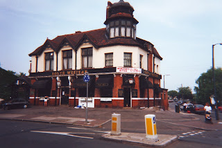
 
The South Western

I was supposed to be moving in with a fellow from Cornwall, the lad who lent me The Sound of the Suburbs and the guy with the indie tapes. I’m not really sure how it happened but the guy with tapes backed out after the rest of us found a house and offered him the smallest room. We advertised for someone to fill the void and ended up taking in a first-year student from Brighton, who was our age but had taken a year out to make movies.
The house itself was a bit of a dive, very typical of student accommodation in the Hounslow area: a semi-detached three-bedroom dwelling with an interior that looked like it hadn’t been re-decorated since the 1970s, and maybe hadn't. We had to move the dining room table to the lounge to free up the dining room to be used as a fourth bedroom, which was taken by our Cornish friend. I took upstairs-front, ‘Sound of the Suburbs’ took upstairs-back and the bloke from Brighton the box room adjacent to that. The rent on the whole house was about £700 a month.
Britpop was now recognised as a distinct movement, but the residents of 23 Carrington Avenue perceived it only as a vaguely entertaining sideshow. I’d sooner listen to Smashing Pumpkins or The Wedding Present than the likes of Cast or Shed 7. Actually, I wasn't sure about Smashing Pumpkins but could get on with Siamese Dream, which one of my Plymouth friends played for me while visiting him in Portsmouth. The jukebox down the student union had 'Brassneck' by The Wedding Present on it, and I then borrowed the album Bizarro from a Scottish bloke who resembled the ‘control freak’ from an advert for the Volvo 850 T-5. The Wedding Present’s guitars are fast, repetitive, and David Gedge’s vocal style is droll, almost deadpan. Both these bands could be described as voluminous, in that guitars – loud guitars – are integral to their sound. Britpop tends not to paint broadly with guitars. Oasis are the exception, and in this respect maybe they’re not really a Britpop band at all. If there is a signature Britpop sound – and you’ll struggle to identify one – then it’s the stabbing, staccato guitars of punk and new wave.
This not to say we were completely disinterested in what was going on. When a chap I’d got to know towards the end of my first year (who would later introduce me to Sarah Records) informed us that he was going to see Blur at Alexandra Palace, the residents of Carrington Avenue expressed interest. The chap who later introduced me to Sarah Records went on ahead with his associate from Ealing, while the rest of us – save our Cornish friend, who wasn’t up for it – went about the business of trying to find tickets. With a limited budget our situation initially looked precarious, but we were given hope after a tout said to us, 'don't go home just yet.' We found a pub, played some pool, put on The Jam to get us in the mood, returned about an hour later and managed to buy three tickets at pretty much face value. We missed Corduroy and Supergrass but did arrive in time to see Pulp. For any Blur fans out there, here’s the set-list:

Lot 105 / Sunday Sunday / Jubilee / Tracy Jacks / Magic America / End of A Century / Popscene / Trouble in the Message Centre / She's So High / For Tomorrow / Chemical World / Badhead / There's No Other Way / To The End / Advert – 1st Encore: Supa Shoppa / Mr. Robinson's Quango / Parklife (with Phil Daniels) – 2nd Encore: Girls & Boys / Bank Holiday / This Is a Low.

We were especially pleased when they played 'She’s So High', which was a ‘can night' favourite. Can nights started off as a precursor to Friday evenings at the student union but might often happen before a Saturday night at The Chariot, or just randomly in the middle of the week. As the name suggests, they involved buying four cans of cheap lager or bitter – in my case Castlemaine XXXX – and then sitting around in someone’s room – usually mine – and listening to records, often at great volume.
Can’t remember who picked up a copy of The Jam greatest hits compilation Snap! but I recall taping what of it I could onto the B-side of my Rolling Stones compendium. I think the Stones material had been recorded off of Shaky Tim, a music student who had been my neighbour in our halls of residence and was now living with the girl who was a massive Blondie fan (not in the biblical sense). The girl who was a massive Blondie fan was also into Manic Street Preachers, Senseless Things, Jane's Addiction, Porno for Pyros, and she had recently discovered Green Day. None of this appealed to me, shedding some light on our increasingly rocky relationship.
According to lead singer Louise Wener’s T-shirt, Sleeper were just ‘another female fronted band’. She had a point – there was Elastica, Salad, Echobelly, and more on the way – but if Wener was trying to utilise irony to suggest Sleeper offered anything different she was wide of the mark. 'Inbetweener' is a jolly enough single though, as is the lesser known B-side, 'Little Annie'.
Pulp's His ‘n’ Hers had been out since April '94 but I’d invested more time listening to Intro – The Gift Recordings, released the previous October. I eventually bonded with His ‘n’ Hers on a National Express coach back to London at the start of a new term, disembarking at Heathrow Airport whereupon I got on the tube to Hounslow Central for a pint(s) in the Bulstrode with the chap who was to introduce me to Sarah Records. His 'n' Hers is probably the best record of the Britpop era. Take your pick: 'Joyriders', 'Lipgloss', 'Have You Seen Her Lately?', 'Pink Glove', 'David's Last Summer'. These songs invoke the spirit of Britpop in the way others seldom did. They spoke of people and situations that were relatable, if only from a distance. As opposed to Blur, whose lyrics were informed by the novels of Martin Amis and the city of London. Or Oasis, who didn't really sing about anything at all.
The Jon Spencer Blues Explosion are chaotic, exultant – punk meets blues. I taped the album Orange off of the guy with the indie tapes. I liked it so much I later bought it on vinyl. The record did well. Despite Britpop, there was still an interest in things like this, in Beck or Pavement or Sonic Youth, even if it wasn’t what was getting the mainstream airplay.


Britpop's sense of fashion was confused, a diffuse spread of influences ranging from '60s mod to '70s punk to '80s casual, consisting of desert boots, Ben Sherman button-down shirts, roll neck sweaters, Chelsea boots, anything by Fred Perry, Harrington jackets, anoraks, wide collared shirts in man-made fabrics, flares, corduroy trousers, Adidas tracksuit tops, old-school trainers, blazers, even ties (especially if you were in Blur). It should be appreciated that wearing this sort of gear bid trouble. Having your hair layered, over the ears but not as far as your collar, invited derision. People would laugh openly at your flared jeans. You were neither a 'townie' nor a 'metaller' or a 'raver' and therefore an object of suspicion. We didn't let it bother us, and tunes like 'Itchycoo Park' and 'Lazy Sunday' by the Small Faces and 'Jumpin’ Jack Flash' and 'Wild Horses' by The Rolling Stones provided a backdrop to games of pool in the back room of The South Western in amongst the locals.
The influence of punk and new wave, although slightly diminished since that new wave of new wave thing had been supplanted by Britpop, persisted. As well as The Jam, groups like The Clash and The Undertones would find their way onto any respectable indie DJ’s set list. 'Teenage Kicks' was ready to go courtesy of The Sound of the Suburbs and I found The Clash’s first album in a charity shop in Plymouth, probably while shopping for second-hand Fred Perry polo shirts and Adidas tracksuit tops.

The chap who introduced me to Sarah Records came around with a stack of records he thought I might like: Storyteller by Razorcuts, Stardust by The Sea Urchins, Loaded by the Velvet Underground, Forever Changes by Love, Singles Going Steady by Buzzcocks, a couple of Field Mice albums and EPs, and a few Sarah Records compilations. The Sarah Records’ records made a firm impression. Formed in Bristol in 1987, the record label was resolutely anti-fashion, anti-London music scene and anti-lad rock, which is what Britpop was mutating into. This political sensibility was married to a very British sort of aesthetic. But if Britpop fixated on, say, Get Carter, Blow-Up and Quadrophenia as its cinematic archetypes then Sarah Records channelled more the spirit of Kes or Billy Liar, as well as French New Wave.
The Sarah Records’ band I really took to was probably the band least representative of that particular scene: The Sea Urchins. In Sam Knee’s excellent indie-fashion retrospective A Scene In Between he describes The Sea Urchins as veering off 'in a more militant pop-art mod fashion direction'. Think Jeff Beck in the Yardbirds.
The Razorcuts could have very easily been a Sarah Records act but were instead signed to Creation. I put their album Storyteller onto the other side of the cassette I recorded The Sea Urchins’ Stardust, a tape I would often listen to on the two mile walk into college, along Whitton Dene and past Twickenham Ruby Stadium.
If 23 Carrington Avenue had a specific soundtrack then it would be Love’s third album, 1967's Forever Changes. I’d never heard of it before but was quickly won over by its string arrangements, Tijuana horns and Flamenco guitar. The chap who introduced us to it – who would often join us for can nights – was quite taken aback by our enthusiasm and returned to his record collection to bring us Da Capo, Love's earlier work, which was almost as well received.
Loaded was Velvet Underground’s last proper LP (Squeeze was a contractual obligation written and recorded by Doug Yule featuring none of the original group members). Having wasted the opportunity to get to know the band during my first year, I wasn’t well versed in Velvet Underground mythology and so took the record at face value. It's probably the band's most accessible work, and the reason why the chap who introduced me to Sarah Records had hold of it. The idea of him grooving away to the noise-rock of something like 'Sister Ray' or 'Venus in Furs' is barely conceivable.
I wonder if I’d seen Supergrass supporting Pulp supporting Blur at Alexandra Palace I would have liked them more. I didn’t have anything against Supergrass per se, but their whole shtick seemed a little silly. Almost 20, maybe I was too old for it. Nevertheless, 'She’s So Loose' is a very good tune, and so lip service is paid.


Orbital and Portishead were a portent of things to come, the acceptability – nay, the expectancy – of absorbing genres that beforehand had been perceived as tribally distinct. I came across Dummy by Portishead on the same trip to Portsmouth that had me re-evaluating the Smashing Pumpkins. The hype surrounding the record had yet to transpire, and I didn’t see it coming, but I ended up copying the copy I took back with me to London for a number of friends. The Orbital album was recorded off of my brother in the summer before I left for university but proved less popular among my inner circle. Such eclecticism reflected the limitations of Britpop. I even took to playing some of my old Acid Jazz records, much to the delight of our cohabitant from Brighton who fell for 'Cucaraca Macara' by the Harvey Averne Barrio Band in a big way.
Which leads to the missing pieces of this aural jigsaw: techno, acid and trance. This sort of music came ready-mixed, be it via the DJ Tsuyoshi cassette somebody copied for me or the tape exploring similar themes compiled by my brother, who was bang into this sort of stuff. It couldn’t very well be assimilated into my other, more identifiable, auditory explorations and so stood alone, to be listened to on my Walkman. This, along with hard house, was the music that would play at any student house party worth its salt. The idea of a load of kids jumping around in someone’s living room to an Oasis record appals me. Fortunately such abominations never came to pass. Carrington’s classics were confined to my bedroom mostly, or my headphones, or around the house of the guy who continued to amass tapes.

By the time we moved out there were eleven empty bottles of High Commissioner whiskey lined up on the mantelpiece and we owed a couple of months’ rent – taking into account the deposits we’d already surrendered in lieu. A few days after the May Ball my Cornish friend passed out in Debenhams and was taken to hospital concussed, requiring stitches. The cohabitant from Brighton had abandoned university altogether and I'd lost too much weight through not eating enough.
It had been a strange and tumultuous year. The summer would usher in the farce that was Blur vs. Oasis. It is amazing how quickly Britpop revealed itself for the asinine nonsense that for the most part comprised it, and so I got back into the Beastie Boys and continued to harvest my brother’s record collection for sonic alternatives.

[Listen to here.]