Friday, 22 March 2019

STADIA: STADIO PIERLUIGI PENZO, VENICE


What is Venice? It is an agglomeration of over 100 islands, but it is the city’s six historic sestieri that more usually defines it: Cannaregio, San Polo, Santa Croce, Castello, Dorsoduro (inclusive of La Giudecca and Sacca Fisola) and San Marco (including San Giorgio Maggiore). La Giudecca, Sacca Fisola and San Giorgio Maggiore are separate islands, while Cannaregio, Dorsoduro, San Polo, Santa Croce, Castello and San Marco are contiguous, despite the serpentine Canal Grande’s best efforts to split them down the middle. And of course each district is in turn riddled with smaller, more easily traversed channels.
San Marco gets given the job of representing the municipality. The Piazza San Marco (St Mark's Square) is overlooked by two of Venice’s most iconic buildings: the Basilica Cattedrale Patriarcale di San Marco and the Campanile di San Marco – the famous bell tower. Adjacent to this is Piazzetta di San Marco – St. Mark’s little square – which rests beneath the Palazzo Ducale, Biblioteca Nazionale Marciana and two columns supporting two patron saints – Saint Theodore on one and the Lion of Venice, standing in for Saint Mark the Evangelist, on the other. St Mark's Square is where tourists predictably gather, to queue for a view from the campanile, to marvel at the mosaic-encrusted domed interior of the Byzantine basilica, or just to take photographs of themselves. This is all well and good but it’s not a reason in itself to travel to Venice. The fact that there are no roads, and so no cars, is.
In truth, there are some roads. The Ponte della Libertà connects mainland Veneto to Venice but doesn’t get very far, terminating at Piazzale Roma, which acts as a sort of bus station; cars are siphoned off into a number or carparks nearby. Unless you’re exploring west of Dorsoduro then you would be none the wiser. It’s worth doing: head for Campo Santa Margherita for some light lunch, then follow the Rio de Carmini down towards San Nicolò dei Mendicoli (the church that Donald Sutherland’s character is tasked with restoring in the film Don’t Look Now), wend your way south before walking east along the waterfront, where you will find the Gallerie dell'Accademia, Basilica di Santa Maria, Peggy Guggenheim Collection, and the Corner Pub Venezia on Calle della Chiesa.
Despite the crowds, San Marco itself rarely stifles. If you feel the need to escape then simply follow the path of least resistance. Such diversions will invariably lead to another bridge over another canal, to an irregularly shaped ‘campo’, or to vistas that have barely altered since they were conceived. This is consistent with Venice’s reputation: all grand squares and labyrinthine alleyways, which is generally the case and precludes much in the way of flora. The eastern tip of Castello proves to be the exception. There you will find the Giardini della Biennale (gardens), Parco delle Rimembranze (a park), and Pier Luigi Penzo (a stadium), home to Venezia’s football team.

Stadio Pier Luigi Penzo is not of much interest architecturally because architecturally it isn’t really a ‘thing’. Built in 1913, it is Italy’s second oldest football ground (the first being Luigi Ferraris in Genoa) but very little remains of how it once stood. The stadium was almost decimated in 1971 by a particularly virulent tornado, leaving only the concrete tribuna partially intact. Venezia F.C. were playing in Serie C at the time, so rebuilding the ground wasn’t a top priority, although had the club not narrowly missed out on promotion in 1972-73 it might have been a different matter. As it happened, Venezia mucked along for a few more seasons in Serie C before succumbing to relegation. By 1987, they were facing administration and an enforced merger with mainland-Venice team Associazione Calcio Mestre, who played their football at the modest Stadio Francesco Baracca. The alliance appears to have been an uneasy one, but was temporary. In 1990, ‘Venezia Mestre’ was reborn as Associazione Calcio Venezia 1907 (while A.C. Mestre carried on as they were). Promotion to Serie B followed in 1991, which facilitated a move back to a rehabilitated Stadio Pier Luigi Penzo.
In 1998, Venezia (as the locals insisted on still calling them) finished the season as runner’s up. They lasted two seasons in Serie A and then dropped back down into Serie B, but were promoted again in 2001, before being relegated for a second time. The club descended into bankruptcy, eventually reforming as Società Sportiva Calcio Venezia in 2005 (still referred to colloquially as ‘Venezia’ one would assume). By 2009 the club once again became insolvent, and yet another name change was legally enforced: Foot Ball Club Unione Venezia. This latest incarnation made a good go of it, winning Serie D in 2011-12 and attaining promotion to the old Serie C in 2013-14, before finally going bust in 2015. As it stands Venezia F.C. S.r.l.d. are currently competing in Serie B.

(Courtesy: Giacomo Cosua)

Since returning to their old stomping ground in 1991 not much has changed. The idea for a while has been to build a new stadium in the suburb of Tessera, not far from the airport. In the meantime Pier Luigi Penzo must suffice.
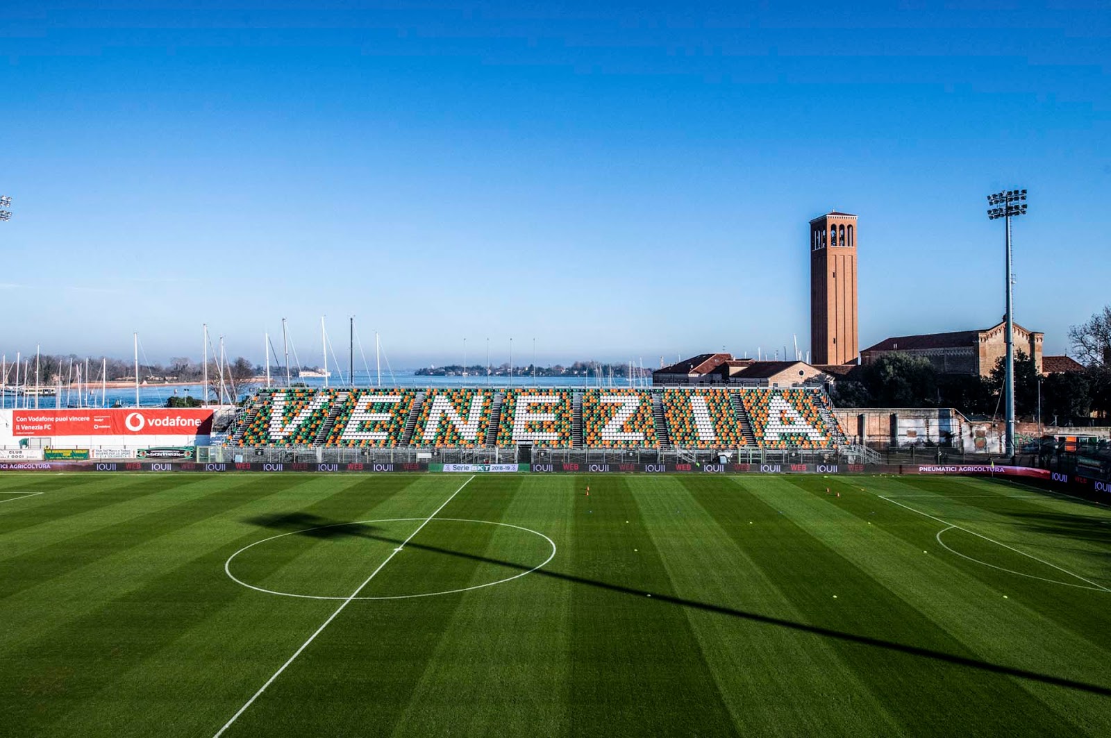
Only the tribuna centrale exists as an actual building, while the other three sides of the ground accommodate the sort of tubular metal structures you see plenty of all over Italy – scaffolding, effectively. More often deployed as a means of bringing the crowd closer to the pitch where a running or cycling track has stood in the way – at Brescia, Cagliari, Siena, Como – the makeshift stands in Venice are merely expedient. An effort has been made to beautify these right-angled triangular prisms by randomly installing black, green and orange plastic seats – the club’s colours. This combination works well and the temporary stands appear more substantial than they otherwise might. On the west-side opposite the tribuna white chairs spell out ‘VENEZIA’. The masts of yachts can be seen behind, the Church of Saint Elena rises to its side. Beyond the curva sud, a row of trees. Above the curva ospiti, clear sky. Of these three provisional gantries only the curva sud measures the full width of the pitch. The open spaces in-between are left bare.
Among this utilitarian simplicity the central tribuna stands proud. Running eight rows deep and made of concrete it is the only stand that has a roof. Resting upon this canopy’s middle third is a row of executive boxes – the tribuna d’onore. To the front a parterre – really just a gap between the building itself and the fence that runs around the pitch’s perimeter. It’s a modest set-up but a well maintained one with plenty of character.
There are probably a good many lower-league grounds like this in Italy but I doubt many enjoy such beautiful surroundings. Behind the tribuna runs the Rio Sant'Elena, which cuts off the island of Sant'Elena from the rest of Venice. In truth, it’s a fairly narrow body of water and not particularly long either. What it does, though, is force a certain perspective of the stadium from the river’s western edge: of the river itself, the small boats moored along it and the small bridges that cross over, the trees and bushes planted beside, the path above the opposing bank and the external rendering of the stadium itself – stucco painted yellow, flaking in places to reveal the brickwork beneath. This is the view that any visiting football fan will encounter after walking from the nearest ferry terminal. Should that same fan choose to follow the ground’s perimeter they wouldn’t be disappointed. A bricked wall obscures the metal struts that support the curva sud but leads to the Church beyond. Walk in the opposite direction, past the tribuna, and one will come across a marina stuffed with yachts.


Venice’s football ground is the antithesis of Siena's Artemio Franchi, which, despite being comprised mostly of the same temporary, gossamer-like structures, comes across as beset upon and untidy. Conversely, Stadio Penzo feels open, neat and accessible, almost like a minor-county cricket ground. The problem is its size. A capacity of 7,450 is just about enough to get by on in Serie B but would be problematic in Serie A. Then there’s climate, which can be unkind, and the location, which is hemmed in. Could a solution to these problems be found that is simultaneously sympathetic to the environment? You can understand why a move to Tessera has been proposed.


Friday, 18 January 2019

LINER NOTES: POSTCARDS FROM ITALY [2018]


1.    Come Again – Au Pairs
2.    Nice – Kleenex
3.    Lie Dream of a Casino Soul – The Fall
4.    Cathedral – Felt
5.    Speaking Terms – Snail Mail
6.    If I Was an Animal – Chain & the Gang
7.    Drained [Single Version] – The Brian Jonestown Massacre
8.    Mountain - Stereolab
9.    Rated X – Miles Davis
10.  Inner City Blues – Reuben Wilson
11.  Maria Tambien – Khruangbin
12.  Colorado – Manassas
13.  Wicked Gil – Band of Horses
14.  Total Football – Parquet Courts
15.  Secret for a Song – Mercury Rev
16.  When It Grows Darkest – Laura Veirs
17.  Heat Wave – Snail Mail
18.  If Not Tomorrow – Comet Gain
19.  Postcards from Italy – Beirut
20.  John's Theme (Children Play) – Pino Donaggio


The 1960s saw a large number of female artistes making a credible impact across a wide range of genres. Selected randomly: Nina Simone, Ella Fitzgerald, Aretha Franklin, Dionne Warwick, Etta James, Fontella Bass, Joan Baez, Joni Mitchell, Janis Joplin, Grace Slick, Bobbie Gentry, Patsy Kline, Emmylou Harris, Jacqui McShee, Sandy Denny, Julie Felix, Nico, Carole King, Dolly Parton, Nancy Sinatra, Tammy Wynette, Dusty Springfield, Julie Driscoll, Carol Kaye, Dorothy Ashby, Tina Turner, Tammy Terrell, The Supremes, The Shangri-Las, The Chiffons, The Ronettes. The early 1970s weren’t nearly so inclusive. The nascent heavy metal scene, the glam rock scene (ironically) and the southern rock scene were movements orientated towards the male. Patriarchy re-asserted itself by way of the sex, drugs and rock & roll myth, which encouraged women to prostrate themselves before the icons of the day: Mick Jagger, Robert Plant, David Bowie, Marc Bolan, etc.
It’s no coincidence that punk and new wave carried a strong female presence. Despite its provocative stance and reputation as anti-social, punk was actually a fairly conservative movement, rebelling simultaneously against the perceived decadence of the establishment and the music industry itself. The previous generation, who had sloganeered and campaigned through the 1960s, had sold out for a life of material worth and part-time licentiousness, and punk existed to shine a light on uncomfortable truths. Patti Smith, Debbie Harry, Tina Weymouth, Kate Pierson and Cindy Wilson from the B52’s, Siouxsie Sioux, Au Pairs, The Slits, The Raincoats, Dolly Mixture, Poison Ivy of The Cramps, Gaye Advert of The Adverts… imagine what punk might have mutated into without them. At the very least, it wouldn’t have been half as interesting. At worst, ‘Oi!’ may have triumphed as punk’s prevalent strain, and machismo would once again have held sway.
Having been made redundant at the end of 2017, which I was sanguine about, the first half of 2018 brought with it weekly walks into Twickenham, whereupon I discovered Eel Pie Records. Although not financially stretched (it didn't stop me going to Hamburg in April) my predicament demanded that I exercise caution and avoid buying records impulsively. On one such visit they were playing the Au Pairs. It certainly sounded like my sort of thing, but to be sure I returned home and looked into it. A comparison with Gang of Four was enough to convince me, and by the end of the week Playing with a Different Sex was mine.
While conducting my research, YouTube wondered if I might like to listen to 'Nice' by Swiss all-girl post-punk band Kleenex, which I did. Kleenex changed their name to LiLiput after the Kimberly-Clark Corporation threatened to sue them for infringement of copyright. Eel Pie Records didn’t have a copy of Kleenex/LiLiPUT (The Complete Recordings), so I downloaded 'Nice' to follow on from 'Come Again' by the Au Pairs.


Hamburg

People who get upset over the death of someone famous like they would do a friend or relative are either weird or just pretending. More likely pretending. And yet when I found out that Mark E Smith had passed away I certainly felt sad about it. I put this down to the unusually high regard in which I held him as a lyricist and the length of time I’d been listening to The Fall (over 25 years at the time of writing). Such is the wealth of material available to Fall fans that I’m still discovering new tunes to this day, but how the hell did 'Lie Dream of a Casino Soul' evade me for so long?
The record label Cherry Red are in the process of re-issuing Felt’s back catalogue on vinyl. I intended on buying Forever Breathes the Lonely Word, which includes 'A Wave Crashed on Rocks', a song that I included on the compilation I retrospectively put together to reflect my listening habits in 1997-98. However, I found footage of Felt performing on Spanish TV and was impressed by their performance of 'Cathedral', which comes from their first LP, Crumbling The Antiseptic Beauty. I am presented with a dilemma, because although I’m working again I still can’t afford to spend 20-odd pounds willy-nilly, which is the going rate for vinyl these days.
This is why I purchased the album Lush by Lindsey Jordan – aka ‘Snail Mail’ – on CD (from HMV in Wimbledon). Had I been set on owning Lush on vinyl then I’d have returned to Eel Pie Records. Anyway, 'Speaking Terms' is my favourite track on the album. The record as a whole brings to mind American indie-rock of the early 1990s, before Lindsey Jordan was even born.

Early in the year – late February, a few days before the ‘beast from the east’ announced itself – Ian Svenonius’s group Chain & The Gang were back in town. I’d been trying to find a copy of the band’s sixth album, Experimental Music, since its release in September 2017, but to no avail; Rough Trade, Banquet Records, various independent records stores in Brighton – nowhere stocked it. As expected, copies were available at the Oslo in Hackney, where Ian and his band were scheduled to perform. The only tune Chain & The Gang deigned not to play from their latest offering was 'If I Was an Animal', maybe because it doesn’t lend itself so readily to Ian’s high-energy live performance.
Anton Newcombe was throwing demos around on YouTube. 'Drained' sounded like it was ready to go, but when the track-listing for The Brian Jonestown Massacre’s new album was announced it was found to be missing. I purchased Something Else regardless, and downloaded 'Drained'. (The song showed up later on the B-side of the single 'Hold That Thought' and also on The Brian Jonestown Massacre’s eponymously named album the following year, albeit in a slightly altered form.)
Like Felt, Stereolab are in the process of re-releasing a large portion of their back catalogue on vinyl. They began in 2018 by reissuing their ‘Switched On’ series: three separate compilations that gather together singles, B-sides, rarities, oddities. I already own Aluminum [sic] Tunes [Switched On Volume 3] and used to have a copy of Refried Ectoplasm [Switched On Volume 2] taped off of the Former Cohabitant from Brighton back in 1995. I’ve been without a cassette player for many years now, and so I thought I may as well purchase Volume 2. I wouldn’t normally include material like this on a contemporary compendium – tunes that date back to a completely different time and place – but it’s been so long since I’ve listened to this record that I’ve been able to enjoy it from a relatively fresh perspective. 'Mountain' was originally one half of a split-single released in 1993 ('Where Are All Those Puerto Rican Boys?' by Unrest was the other).

In summer – after the FIFA World Cup had finished, I’m pleased to note – I began work at The National Archives. One day there, I caught my supervisor talking music with a colleague, specifically about this track called 'Rated X' by Miles Davis. He was saying how he’d once heard it played at a club and that it cleared the dance floor almost at once. Since hearing 'Rated X' for myself, I can appreciate why this might happen. It starts with a discordant keyboard, played by Davis, before Al Foster on drums, James Mtume on percussion and Badal Roy on tablas all jump in at about 14 seconds with a funky and aggressive rhythm. After another 15 seconds Reggie Lucas joins in with a repetitive wah-wah guitar riff, which he plays relentlessly for the duration of the record. Michael Henderson’s bass chugs along in the background and Cedric Lawson and Khalil Balakrishna make weird noises with an electric piano and an electric sitar. Every so often the rhythm section will pause abruptly, just for second or so, before carrying on as if nothing ever happened. It’s one of most wonderful things I’ve ever heard.
Galvanised by this strange groove, I entered into another one of my hip hop phases. These typically last for a number of weeks but don’t usually involve listening to anything I haven’t already got. They can, however, prompt me to investigate particular samples, especially where they’ve been borrowed from jazz or funk. I derived 'Inner City Blues' by Reuben Wilson from 'Youthful Expression' by A Tribe Called Quest, a lesser known tune taken from their debut album People's Instinctive Travels and the Paths of Rhythm. Reuben Wilson is a jazz organist in the tradition of Jimmy Smith, or even Lonnie Smith. Marvin Gaye fans may have guessed that 'Inner City Blues' is a cover. Ramon Morris on tenor saxophone, Lloyd Davis on guitar, and so on.
I came by Khruangbin in Banquet Records, Kingston, where they were playing this group’s latest record, 'Con Todo El Mundo'. I thought about buying it there and then but was on my way to meet someone and didn’t fancy carrying it around. Their music is hard to describe: soul-jazz, psychedelia, world? I detect a sort of Moorish, middle-eastern vibe emanating from this trio, although they’re actually from Huston, Texas, and I’m still pondering whether or not I should go back and buy the album.
Manassas is the name of the group Stephen Still put together in 1971 after he crossed paths with The Flying Burrito Brothers while they were all touring the States. The Burritos were on their last legs, Stills sensed an opportunity and invited former Byrds man Chris Hillman, pedal-steel guitarist Al Perkins and fiddle player Byron Berline to join him and his band in the studio to work on what would become Manassas. I’ve written before about how Chris Hillman seemed content to play a more supporting role, be it in The Byrds, Flying Burrito Brothers, or Manassas. But that’s an impressive palmarès, as a song like 'Colorado' proves.
When I returned to Eel Pie Records to buy Playing with a Different Sex by the Au Pairs, they had on Everything All the Time by Band of Horses, who are from Seattle. Not knowing what it was, I made enquiries and almost left the shop £40 lighter. 'Wicked Gil' was the track that nearly persuaded me, since downloaded. I was surprised to find that this album was 15 years old, which goes to show how little indie-rock changes nowadays.
If you’ve read my liner notes to 2014’s The Big Nod then you’ll know I’m partial to Parquet Courts. The first song I heard from their new album – 'Mardi Gras Beads' – didn’t do it for me. The second – 'Total Football' – did. Previous works by Parquet Courts (as well as Parkay Quarts) brought to mind the Velvet Underground. 'Total Football' sounds like 'Harmony in My Head' by Buzzcocks with Devo doing the chorus. I should probably buy the album Wide Awake! on the strength of this alone.

It’s about here that I start to build towards some sort of resolution. I had 'Secret for a Song' by Mercury Rev knocking around on my laptop, completely neglected, so in it went. This inadvertently provided a convenient platform from which to launch 'When It Grows Darkest' by Laura Veirs, yet another new release chanced upon in Eel Pie Records. Her music reminds me of Kristen Hirsh from Throwing Muses, although I don’t know how helpful it really is to say that.
'Heat Wave' was the song by Snail Mail that I could remember playing in Eel Pie Records. It's more vigorous than 'Speaking Terms' and serves as the compilation’s apex, because 'If Not Tomorrow' by Comet Gain, which follows, has something doleful about it. For those less familiar with my anthologies, they rarely pander to the year in which they’ve been compiled, but 'If Not Tomorrow' is one of six tunes actually released in 2018 – seven if you include the re-release of the Stereolab track, eight if you allow for the fact that the Chain & the Gang album wasn’t available to buy in the UK until the group brought it with them on this year's tour.


Venice

At the ripe old age of 18, Italy was the first foreign country I went to. My father spent a large part of his youth overseas, on account of my grandfather being a fitter in the RAF, and my mother never really liked flying all that much, so vacationing abroad didn't have the same appeal for them as it did for me. Then there was the expense, which was a question of my parents' priorities  slumming it with hoi polloi on Costa Brava not being one of them. Instead, our holidays would involve caravans and cottages in places like Brean Sands and Cornwall, or staying with friends in Woking and Kidderminster.
How I longed to go abroad, to the extent that I'd religiously tune into The Travel Show every week, hanging off Penny Junor and Simon Calder's every word. In 1993, just months before I left for university, I finally got my wish. To Pallanza in Italy, overlooking Lake Maggiore, with excursions to Como and Milan, also Switzerland. I was so happy. Italy had more than met my expectations, and If there had been some way I could have remained there, never to return, I would have. Since then I’ve been to Volterra, Siena, Florence and Genoa, and in 2018 I made it to Venice.
I never got around to buying The Flying Club Cup by Beirut in 2017 but it’s on that ever expanding list of records to potentially purchase. In the meantime I’ve downloaded 'Postcards from Italy'. The fact that I have recently been in the habit of sending memos from the same place is mere coincidence. The addition of 'John's Theme' from Nicolas Roeg's Don't Look Now, set in Venice, is on the other hand contrived.


[Listen to here.]

Monday, 1 October 2018

THE SARTORIAL ELEGANCE OF SERIE A: A.C. MILAN, 1987-90 [KAPPA]


What makes for a good football strip? A number of things, but distilled to its essence there are four primary concerns: colour, array, trim, fit. Colour can be problematic as it can't really be tinkered with (unless your team’s majority shareholder has other ideas). The array – or pattern, if you prefer – tends to be more mutable, although radical alterations may invoke the ire of any football club’s loyal fan base. Embellishments, such as those to the collar and neckline, will vary from season to season, normally without so much as a raised eyebrow. Finally, the way a kit is cut will only ever come under close scrutiny if it’s noticeably out of keeping with prevailing trends – for example, the shirt Kappa presented to the Italian national team for the 2000 UEFA European Championship, which had the players so spooked they insisted on sizing up.
But wait, there’s something else to consider, something that football purists would rather wasn’t there, but is so we must: the football team’s sponsor writ large across the chest. It might seem odd that something as ostensibly functional as text should amount to anything more than a mere distraction, until one remembers that such monograms were in the first instance designed to hold the eye. This is one of the reasons why the football shirts A.C. Milan wore from 1987 through to 1992 are superior to those that came immediately before and after.

The A.C. Milan of the early 1980s was in bad shape. Saddled with debt, they’d not won a major trophy since their Serie A triumph of 1978-79 and had been relegated to Serie B twice (once as punishment for their involvement in the Totonero match-fixing scandal of 1980) which for a club of Milan’s standing represented failure, not to say ignominy. That being said, the thinly striped jerseys they played in during this period looked pretty good, especially the Oscar Mondadori sponsored edition that the English paring of Ray Wilkins and Mark Hateley had the pleasure of wearing in 1984-85. Whether this acrylic sark was particularly comfortable is another matter.
Then in 1986 the media tycoon, politician, and former crooner, Silvio Berlusconi decided to buy the club, paid off its debts and set about the business of reviving its fortunes. Within a year he’d offloaded Wilkins and Hateley and added the Dutch internationals Ruud Gullit and Marco Van Basten to a squad that already contained the likes of Franco Baresi, Roberto Donadoni, Pietro Virdis, Mauro Tassotti and a youthful Paulo Maldini. Only then did Silvio Berlusconi consider who he wanted as coach, sacking the incumbent Nils Liedholm in April and appointing Primavera manager Fabio Capello as caretaker while he made up his mind. More than likely, Berlusconi had Arrigo Sacchi’s card marked from the moment his team dumped Milan out of the Coppa Italia in the second round. By summer the former Parma manager was in charge and proceeded to bring in Carlo Ancelotti from Roma and Angelo Colombo from Udinese.
A.C. Milan won the league in 1987-88 by a three point margin over reigning champions Napoli. They did this wearing a jersey provided by Kappa that was quite different to the one the firm was supplying to Juventus over in Turin. Made from polyester, rather than cotton, the Milan version had a shorter collar and a shallower neckline. Moreover, whereas the sponsor’s name on Juve’s kit was flocked, on Milan’s it was printed by way of a process known as dye-sublimation. (It should be noted that Italian sportswear manufacturers were behind the curve in this respect, and I wonder whether Berlusconi might have recognised this and persuaded Kappa to utilise more up-to-date methods.) Then there was the sponsor itself – financial servicing firm Mediolanum – with its name written in a sans-serif, uppercase font and the company logo hovering above, all in white. This simple text, resting neatly beneath the Kappa logo sewn to the right, and a gold star (denoting 10 titles won) on the left, is almost as recognisable as the colourway of the strip itself; one cannot conceive of the shirt without it.
In 1988 the Italian football authorities allowed for an extra foreign player, and Frank Rijkaard was invited to join his fellow Dutchmen in Milan. All three of them had been instrumental in The Netherlands' victory in the 1988 UEFA European Championship in Germany that summer. With the scudetto now adorning their chests they must have felt like a million dollars.
The 1988-89 season didn’t go entirely to plan. City rivals Inter won the title, and comfortably so, while A.C. finished third behind Napoli. But Serie A was no longer Berlusconi’s priority, the European Cup was, and in that regard the season was a huge success. Despite wobbling against Red Star Belgrade in the second round, the rossoneri went on to beat Steaua București 4-0 in the final. Perhaps even more revealing was the 5-0 demolition job they did on Real Madrid in the second leg of the semi-final.
Ostensibly, Milan’s strip remained the same for the following year’s campaign, but there were a few subtle changes. As with Juventus, Kappa still didn’t feel the need to append anything like a club crest (although they afforded Sampdoria the privilege) but they did see fit to attach an embroidered, celebratory image of the European Cup in place of the previous season’s scudetto. Then there was the material itself, which now incorporated a micropatterned matrix made up of hollow, inverted squares. (Juventus’s shirt received the same treatment, but not Sampdoria’s.) AC Milan finished 1989-90 second in the league, again behind Napoli, and retained the European Cup, beating Benfica 1-0 in Vienna.


In 1990 Milan ended their association with Kappa and signed a contract with Adidas. Under normal circumstances I’d finish this article here, but the shirt Adidas came up with was so similar to Kappa’s that I feel I must to go on. Adidas didn’t have much of a presence in Italy at the time so maybe they wanted to avoid making a statement. They didn’t even bother adding their name beneath their – admittedly, instantly identifiable – trefoil logo. The micropatterning was removed and the neckline trimmed, but in every other respect the jersey was very much the same: same colour, same collar, same width of stripe, same patron, same embroidered European Cup motif.
The move to Adidas did not immediately pay dividends. A.C. Milan were Serie A runners-up for a consecutive season – this time trailing Sampdoria – and were knocked out of the European Cup by Marseille in the quarter-finals. (Arrigo Sacchi subsequently accepted an offer to manage the Italian national team, and Fabio Capello was appointed in his place.) This meant that for 1991-92 Milan’s shirt would for the first time in three years be reduced to displaying a solitary star.
Or it would have had they not decided to fill the void with a depiction of the Intercontinental Cup that they’d won the year prior, positioned beside the star rather than under. When Red Star Belgrade beat Chilean side Colo-Colo in December to claim the same trophy, A.C. were obliged to get rid of it. Instead, they saw out the season with club crest attached to the jersey. By May, the rossoneri had been crowned champions again, unbeaten and eight points clear of second placed Juventus.


1990-91

Italian confectioner Motta succeeded Mediolanum as club sponsor, and the year after Italian sportswear manufacturer Lotto wrestled control from a reticent Adidas. ‘Motta’ lacked the graphic subtlety of ‘Mediolanum’, whereas Lotto relied too heavily on dye-sublimation, refusing to sew key details into the fabric the way their predecessors did – be it the Kappa or Adidas logos, the scudetto, the European Cup, that solitary star – which made their shirts look cheap.
But five years in pretty much the same shirt was good going, even back then. If you had to narrow it down then the Kappa version probably edges it over Adidas’s effort – the 1988-89 iteration in particular, with the scudetto contrasting nicely against the red and black stripes of A.C. Milan. In any case, Arrigo Sacchi’s team more than lived up to the standard this iconic top conferred upon them.

Saturday, 1 September 2018

THE SARTORIAL ELEGANCE OF SERIE A: FIORENTINA, 1988-90 [ABM]


Upon its formation in 1926, ACF Fiorentina wore red and white halved shirts, representative of the city of Florence (or more specifically its flag and coat of arms) as well as the two teams from which the new club was formed: Club Sportivo Firenze, who had worn white shirts, and Palestra Ginnastica Fiorentina Libertas, who had worn red. The iconic purple jerseys, used to this day, were introduced in 1929, but nobody can say exactly why. The myth that often prevails is that it was result of a laundering incident. In fact, the switch in livery was a decision made by Luigi Ridolfi, the club's then president, inspired by the kit worn by Újpest, a Hungarian football team against whom Fiorentina played a friendly match in 1928.
It was in this configuration that Fiorentina won their first scudetto in 1956: purple collared shirts, white shorts and purple socks, with a red fleur-de-lis (a stylised lily, or ‘giglio’) set against a white rhombus acting as the club's badge. The presence of a badge of any sort was quite unusual for the time, but it seems to be something Fiorentina adopted from the moment they started wearing purple shirts.
Fiorentina were champions again in 1968-69, now wearing black shorts. It is unclear what motivated this change, or when it came into effect, although the club's two Coppa Italia triumphs in 1961 and 1966 were achieved in white shorts. In any case, the next season Fiorentina were back to wearing white shorts, the fleur-de-lis appended to the corner of the scudetto that adorned the jersey.

The 1970s saw little in the way of sartorial change. Then, in 1980, construction magnate Flavio Pontello assumed control of Fiorentina and appointed his son, Ranieri, as president. Within a year they’d changed the club’s badge and struck a deal with the clothing company JD Farrow’s to sponsor the kit, which was not the done thing back then. The new circular emblem comprised of half a fleur-de-lis appended to the letter F, taking on the appearance of a halberd, and was displayed in the middle of a red-trimmed shirt, occupying a fair proportion of it, with the club’s sponsor transcribed above. On top of all that, the team now wore purple shorts.
Fiorentina’s new look was not popular, but when Pontello & Son started investing in actual players opinions softened. In 1981-82, the club finished Serie A in second place and would probably have won the championship had a goal not been controversially disallowed against Caligari in the last game of the season. Thereafter Fiorentina’s form was inconsistent: in 1983 they placed fifth, in ‘84 third, and in ‘85 ninth. Meanwhile, Ennerre had taken over as kit supplier and set about reducing the size of the club’s inflated crest, while also accommodating car manufacturer Opel as the team sponsor.
1985-86’s strip could itself be considered iconic. The red trim was discarded, white shorts were reintroduced, and the badge moved to the more usual position over the left breast. This made room for Ennerre’s wonderfully minimal green insignia on the right, while the sponsor was set against a white band wrapped around the trunk of the shirt. Fiorentina managed a respectable fourth place that term, although it’s worth pointing out that they drew 13 of their 30 matches, which wouldn’t now place them quite so high (at the time, two points were awarded for a win, inflating the value of a drawn game). Moreover, their top scorer was the defender Daniel Passarella, prompting Inter to divest Fiorentina of the player’s services.
For what would be club captain Giancarlo Antognoni’s final year at the club, Ennerre handed over shirt making responsibilities to the their subsidiary brand, N2 (or 'Ennedue'), to be sponsored by the non-alcoholic aperitif Crodino. N2 reverted to issuing purple shorts, and Fiorentina finished a disappointing ninth, although new signing Ramon Diaz impressed with 10 goals and Nicola Berti was looking like good value after his transfer from Parma in 1985. In 1987 Sven-Goran Eriksson was drafted in as technical director, to be assisted by Sergio Santarini in the role of coach. The managerial partnership coincided with the emergence of Roberto Baggio as a force to be reckoned with after struggling with a serious knee injury the previous season. Fiorentina ended the campaign in eighth place, Diaz scoring seven leagues goals, Baggio six.
The situation for 1988-89 looked precarious. Nicola Berti and Ramon Diaz had both signed for Trapattoni‘s Inter, while doubts still remained regarding Baggio's fitness. Incoming players included defensive-midfielder Dunga, signed from Pisa, and striker Stefano Borgonovo, taken on loan from AC Milan. At the same time sportswear firm ABM succeeded Ennerre/N2, introducing a micro-patterned shirt utilising subtle shifts in the fabric’s texture [65% polyester, 35% cotton] to make a pattern out of the manufacturer’s logo.
Fiorentina did all right, finishing in seventh place and reaching the quarter finals of the Coppa Italia. Fortuitously, AC Milan went on to win the European Cup and Sampdoria the Coppa Italia, effectively freeing up an extra place in the UEFA Cup, which went to Fiorentina after they defeated Roma in a play-off. Even more auspicious was the fact that Baggio and Borgonovo had formed a very effective partnership – as well as a close friendship – scoring 15 and 14 goals respectively. Or it would have been if AC Milan didn’t then recall their man to provide cover for Marco Van Basten.


For 1989-90, Fiorentina were furnished with white shorts and purple socks. It is this iteration of the ABM strip that is by far the best. Local rag La Nazione took over as sponsor, their uppercase, serif-font emblazoned in yellow (yellow being the complimentary colour of purple). The red parallelogram that constituted ABM’s logo complemented the simplicity of the giglio, as well as making its presence felt against the whiteness of the shorts.
Fiorentina replaced Borgonovo with Argentine striker Oscar Dertycia, as well as bringing in Czech midfielder Luboš Kubík, winger Renato Buso, and defender Giuseppe Volpecina, among others. The results were mixed. On the one hand Fiorentina only just avoided relegation after beating Atalanta in their final game. On the other they reached the UEFA Cup final, controversially losing to Juventus 3-1 over two legs; Fiorentina were forced to play their home leg in Avellino, despite having played the rest of their European campaign in Perugia, which was far closer to home (Stadio Artemio Franchi was undergoing refurbishment prior to the 1990 World Cup and judged unfit for European competition). Nonetheless, the images of Roberto Baggio and the rest of the team, resplendent in purple and white, are some of Fiorentina’s finest.


ABM hung around for another year but reverted to issuing purple shorts, as well as adding white trim to the neck-line. In 1991, Lotto took over, and all was lost. Not only did the white shorts go for good but so did Pontello’s giglio. In an era where clubs re-design their insignias with mild regularity, one can only hope it might one day make a return.

Friday, 10 August 2018

THE SARTORIAL ELEGANCE OF SERIE A: INTERNAZIONALE, 1988-91 [UHLSPORT]


Internazionale Milano hold the honour – or potentially poisoned chalice – of having never been relegated from Italy’s top division, be it Serie A or the various incarnations that preceded it. And since their foundation in 1908 Inter have, save for one season, remained more or less faithful to their livery: blue and black vertical stripes with black shorts and socks. The season that they didn't was the campaign of 1928-29, whereupon the ruling Fascists, who objected to Inter’s cosmopolitan origins, insisted they merge with Unione Sportiva Milanese to become Società Sportiva Ambrosiana, named after the patron saint of Milan. The new shirt would be white with a red cross – the city’s flag, basically. As one might expect, Inter’s fans were not best pleased.
In 1929 the club’s owner, Ernesto Torrusio, who was himself a member of the Fascist Party (and also a Freemason), handed over the reins to Orestes Simonotti, who quickly reinstated the club’s traditional colours. [It wouldn’t be until after the war that they got their original name back, although ‘Inter’ was appended to ‘Ambrosiana’ in 1932 as a sort of compromise.] From there on the only things that changed was the number and gauge of the stripes and the shade of the blue.

And the badge. In 1979, perhaps inspired by what Piero Gratton and Pouchain were getting up to with Roma, Lazio, Palermo et al, Inter replaced their circular monogram, comprised of the club’s initials – F, C, I and M – and replaced it with a shield containing a profile of a snake – the biscione – set against two transverse black and blue stripes, with a star in the top left corner.
        The newly branded Inter got off to a good start, winning their 12th scudetto in 1980 and their 3rd Coppa Italia in '82, wearing gear produced by Puma and Mec Sport respectively. Their form thereafter indicated a gradual decline, culminating in a sixth place finish in 1986. A  change in technical sponsor followed, to Le Coq Sportif, coinciding with the arrival of Giovanni Trapattoni as coach; neither had immediate an impact. Karl-Heiz Rummenigge, whose time in Italy had been blighted by injury, left the club in 1987 and was replaced by Aldo Serena, who Trapattoni had brought in from his old club, having purchased him from Inter in the first instance while at Juventus. Serena scored just six goals in 22 matches. The Belgian attacking midfielder Enzo Scifo also disappointed, scoring a mere four times over 28 games. Alessandoro Altobelli managed a respectable nine goals in what would be the aging forward’s final year for the Nerazzurri, but it wasn’t enough for the club to finish the season any higher than fifth – two places down on the previous season.
Trapattoni didn't muck about. Scifo was sold to Girondins de Bordeaux, Altobelli moved to Juventus for one final fling in Italy’s top flight, and Daniel Passarella returned to Rive Plate. In their place came established German internationals Andreas Brehme and Lothar Matthäus, two promising Italians by the name of Allesandro Bianchi and Nicola Berti, and a proven Argentine, Ramón Díaz. (Díaz was actually a late replacement for the Algerian Rabah Madjer, who failed the club’s medical exam.)
The arrival of these new players coincided with the appointment of Uhlsport as kit supplier. The shirt didn't change much: the sponsor, Misura, remained the same, so too the club’s crest and number of stripes. Only the German manufacturer’s logo was noticeably different – square instead of triangular. Nor was the all-white away jersey radically altered, save for a band of alternating blue and black rhomboids, slightly out of sync with each other, across the front of the shirt. There was, however, one modification that completely transformed the strip's general appearance, and that was the shift from acrylic to polyester. Inter's Milanese neighbours had been wearing polyester since 1986, but the rest of Italy had been slow on the uptake. The dull patina of acrylic now gone, the team looked, quite literally, like a modern outfit.
Internazionale dominated in 1988-89, winning 26 matches, losing only twice, and accumulating a record-breaking 58 points, at a time when two points were still being awarded for a win and Serie A only accommodated 18 teams. Aldo Serena racked up 22 goals – the highest number in any one season since Paoli Rossi’s 24 for Juventus over the course 1977-78 – Lothar Matthäus provided nine, Nicola Berti seven, and Ramón Díaz contributed twelve, many of them absolute belters. In total, Inter Milan scored 67 times, which is an impressive number in a league renowned then for its defensive acumen.


Inter began the 1989-90 season with the scudetto sewn upon their shirts and the club’s badge relegated to the shoulder. But it wasn’t the same badge. Inter ditched the biscione in favour of their original emblem, which had never previously graced the shirt on account of the fact that Italian clubs only began to display their crests sometime towards the end of the 1970s.
Most Italian jerseys come alive when bearing the scudetto. AC Milan’s handles it very well, while for Juventus the opportunity to inject some colour into that achromatic strip of theirs must come as something of a relief. Strangely, Inter’s away shirt carried it better than the home equivalent; the away shirt was improved by it, whereas the home shirt suffered. It could be that the blue and black stripes combined with the red dots incorporated into the word ‘Misura’ detracted from the scudetto’s visual impact, whereas the predominantly white iteration offered something of a blanker canvas.
Inter were unable to reproduce the imperious form that had secured their 13th domestic title. They started well, beating Sampdoria in the Supercoppa Italia (Italy’s version of the Community Shield, except held in higher regard), but exited the European Cup in its early stages, losing to Roy Hodgson’s Malmo, and finished the season seven points behind champions Napoli, in third place behind cohabitants AC Milan. The problem? New signing Jürgen Klinsmann, brought in to replace Ramón Díaz, failed to combine with Aldo Serena the way the Argentine had the previous season. Despite this, the German striker finished the season as Inter’s top scorer with thirteen league goals, compared to Serena’s nine and Matthäus’s eleven. Meanwhile, Díaz scored fourteen times for Monaco playing three games less than Klinsmann.

In 1990, the Italian colours of the scudetto now absent, Internazionale’s badge shifted from the right shoulder to the left breast. Tradition prevailed, as any temptation to revert back to the ‘serpent’ badge was resisted, a decision that stands to this day. Inter went on to repeat their third place finish of the previous year, albeit by a slighter margin. This time it was Sampdoria who were victorious, with AC Milan again finishing in second place. But all was not lost. Inter made it to the final of the UEFA Cup, beating eventual Coppa Italia winners Roma 2-1 on aggregate. (English readers may recall Inter knocking out Aston Villa in the second round, courtesy of goals from Klinsmann, Berti and Bianchi during the second leg at the San Siro).
Giovanni Trapattoni returned to Juventus in 1991 in an effort to curtail the club’s gradual decline (he partially succeeded, winning 1993’s UEFA Cup, before moving on again to manage Bayern Munich). In an act that can be seen as retrospectively symbolic, Inter turned to Umbro to supply their gear – an association that would last the next seven years. During this period, Inter won the UEFA Cup for a second and third time… but nothing else. Moreover, their league form became erratic. Placed second in 1992-93, followed by thirteenth in 1993-94, it would be more than ten years before they were again crowned champions of Italy.


'Away'

The Uhlsport strip represents something of a high-water mark, a three year period where Inter were more than equal to whatever AC Milan or Napoli could throw at them, but which didn’t quite lead to where it perhaps should have. It is not the point of this article to reason why but merely to delight in how fortuitous it was that Inter’s brief resurgence, as the eighties turned into the nineties, corresponded with shirts that were worthy of the moment. If only they'd kept that badge...

Wednesday, 1 August 2018

STADIA: STADI COMUNALE ARTEMIO FRANCHI, FLORENCE AND SIENA


Purple permeates the city – Florence in Tuscany – in tribute to the football team that represents it – ACF Fiorentina, aka La Viola. It is said that the colour has no actual connotation but came about fortuitously after the original red-and-white halved shirts of Fiorentina were washed, presumably at too high a temperature, and the colours ran. Most likely apocryphal, and cannot explain the switch from black to white shorts that followed. In any case, such a diffusion would have resulted in pink.
Conversely, the club's badge is informed by the city's heraldry. The roles are transposed, a fleur-de-lis does for both, typically in red mounted on a white background, certainly in the case of Fiorentina and often for the metropolis too. An ordinary state of affairs, except Florence is a UNESCO designated World Heritage Site – has been since 1982 – remarkable for its Renaissance architecture. Football is an irrelevance generally for those who visit here and few will make the connection, let alone be aware of it. But the effect is the same: purple seems to suit the environment, just as if some design agency had proposed it as an apposite hue (no doubt for an exorbitant fee).

Stadio Comunale Artemio Franchi is placed well away from the older material that draws in the tourists, probably with intent. Why locate something as utilitarian as a football stadium alongside buildings as venerable as the Cattedrale di Santa Maria del Fiore, the Palazzo Vecchio? Yet the Artemio Franchi offers more than mere function and was perhaps as progressive in its day as the Il Duomo di Firenze was in its.
Pier Luigi Nervi was tasked with building the ground: a structural engineer and architect renowned for his pioneering appropriation of reinforced concrete, and a progenitor of Italian Modernism. Work began in 1930, was completed in 1932, and the stadium has changed little since. It could be said that Stadio Artemio Franchi kick started Nervi’s career. His portfolio is impressive: he designed the UNESCO Headquarters in Paris; the Torino Esposizioni in – you guessed it – Turin; the Palazzetto dello Sport in Rome; the ‘Hall of the Pontifical Audiences’, which bridges the border between Italy and the Vatican City; and he also had a hand in engineering the Pirelli Tower in Milan. [Built some 25 years later, Nervi’s finest contribution to stadium architecture is actually the Stadio Flaminio in Rome, which the Italian Rugby Federation is supposedly in the process of bastardising while their rugby team play out their international fixtures at the capital’s aesthetically flawed Stadio Olimpico.]


The slightly out-of-town location of the Artemio Franchi works to its advantage. It is a very low-rise structure, save for its svelte tower, and would be utterly overwhelmed among the grandeur of central Florence. Instead, we have residential tenements to the west, the modest Stadio Luigi Ridolfi to the south (a municipal athletics facility), and unabridged views towards the mountains north and east – the Florentine hills of Fiesole and Settignano. Trees dot the perimeter and a road encircles it. The stadium’s concrete framework can be viewed from all around.
From above, the stadium’s footprint traces a rather awkward ‘D’ shape. This is because the Artemio Franchi once accommodated a 220 metre sprint track – so long to cater for the completion of marathons. In preparation for the 1990 World Cup, the entire running track was removed to allow for a second, shallower tier, requiring that the pitch be lowered by 2.4 metres. This in turn facilitated the extraction of the temporary stands set behind each goal, which stood in isolation and probably didn’t hold that many spectators anyway, as well as freeing up the parterre to function once more as a parterre, rather than the secondary viewing platform it had ineffectually become. Other changes included the replacement of some pretty awful roof extensions with ones more sympathetic – although still far from ideal – and the installation of individual seats in place of the existing wooden benches. The seats of the new lower tier were initially green, which worked, the rest a tasteful shade of grey. Now almost all are grey save for those in the tribuna centrale (grandstand) and the lower tier facing it, which are purple – as is the club’s name spelled out in seats in the tier above; this also works. Since the 1990 renovations, the concrete has been refinished a second time and the stairways have been painted yellow.
Despite the increased capacity, plastic chairs, and the removal of much of the clutter that afflicted the stadium prior to 1990, it is many of Artemio Franchi’s pre-existing features that make it interesting: three helicoid staircases that provide external access to the upper gallery; the tower – streamlined, glass-fronted, almost art-nouveau; the bare concrete underside of the terracing and its gentle curve; the outward facade of the tribuna; the roof. The tower might be considered extraneous, the stairs merely salutary, the façade functional, but the roof is to be greatly admired. It is cantilevered – or not, depending how you interpret the stresses placed on the bifurcating structure supporting it: 24 corbels, the tiers below serving as their counterweight. It is a shame the two (genuinely cantilevered) roof extensions weren’t done away with completely, but the original structure doesn’t provide much coverage.
It’s all very pleasing, yet Fiorentina has plans to construct a new home. Perhaps this is why, contrary to the attention lavished on Artemio Franchi’s interior in recent years, the exterior – the underside of the exposed terraces – is spalled, shabby, and neglected. The ground of arch-rivals Juventus has been cited as an inspiration and probable template, a stadium that was built on the site of the much maligned Stadio delle Alpi, which was too large, had a running track, lacked intimacy and atmosphere: built anew in 1990, things didn’t work out and Juventus ended up again sharing the Stadio Olimpico with Torino, before they knocked the Alpi down and put the Juventus Stadium in its place. Fiorentina does not share a ground, and theirs is listed, comfortable in its surroundings. Does it not seem absurd to move away from a unique and perfectly serviceable structure in Florence only to then mimic a building contrived to address a predicament that had arisen in Turin? Could Il Duomo di Firenze have once been torn down and the Mole Antonelliana replicated in its place?


If only Siena was faced with such a dilemma. Despite sharing a name, Siena’s Artemio Franchi – aka Montepaschi Arena – is shambolic by comparison. But then, Siena have not met with the same success as their northern cousin, or much success at all.
Siena have been playing football since 1908, which is longer than Fiorentina, who formed in 1926. Siena’s Artemio Franchi is a very low key affair. Little remains of the structure as it was in 1938 when the ground hosted its first game: a friendly against another Tuscan neighbour, Empoli. Initially consisting of just a single grandstand, it wasn’t until 1955 that the stadium grew in size with the construction of an additional stand directly opposite. These two stands remain, and stood alone for a long while, quietly overlooking the athletics’ track, and themselves quietly overlooked by the surrounding tenements and lines of trees. This wouldn’t do for Serie A, but AC Siena had never played in Serie A. Then, in 2003 AC Siena were promoted to Serie A, and they would have to do something about their stadium.
I can find no definitive information as to whether the Artemio Franchi was expanded in stages or all at once. What I can tell you is that the ground as it looks now was pretty much how I came across it when I visited in 2005, so however they went about it, it took less than two years to complete. In any case, the result is a mess, quite frankly, but not without its charm, comprised of – count them – twelve distinct sections with a collective capacity of 15,373.
The Tribuna Danilo Nannini (the original, covered section of the ground) has aged remarkably well. The cantilevered roof resembles a smaller, slightly less daring version of the one seen at the Artemio Franchi in Florence. Its underside is even the same colour: a sort of pale yellow. To its rear, a private road providing access and the Fortezza Medicea obscured by trees; to its side, a small covered section with room enough for 40 wheelchair users. The Danilo Nannini itself holds 1,500 fans, despite not being be much more than 60 metres in length.
If you’ve come to Siena as a tourist, by car or by bus, chances are you’ve approached from its south-western aspect having disembarked along the western edge of the Fortezza Medicea and wandered through the Giardini Pubblici. There in front of you is the entrance to the Curva Ospiti (Guest Curve). Now would be a good time to point out that Siena’s Artemio Franchi is surrounded by higher ground, which means its barely discernible from any angle. If you tore down the fences, cut back the shrubs, chopped down the trees and tilted your head downwards then you’d behold a symmetry of steel: at the curve’s apex, a fairly low-rise structure; either side, two sets of much larger terraces fan diagonally out; at each end, smaller sections. The Curva Ospiti takes up the smaller section closest to the tribuna, two of the larger sections next along, and the wider, shallower terracing directly behind the goal. Collectively, these stands can accommodate 3,000 away supporters. The south-easterly sections constitute the Curva Beneforti (also known as the Curva San Domenico in tribute to the Basilica of San Domenico that stands behind) and can house 2,000 fans.
Next, the Gradinata De Luca – capacity: 4,081 – on the ground’s eastern edge facing the tribuna. The stand that was added in 1955 has been extended upon, probably about doubling its capacity. This seems natural, but the façade of the lower tier is now completely hidden. Because of the buildings that line Viale Curtatone it wasn’t particularly visible in the first place, and not everyone will consider that a bad thing. Still, the reinforced concrete supports are one of the few architectural details of interest here, so it is a bit of a shame.
Which leaves the Curva Robur and its little brother squeezed into the corner between the Robur and the Gradinata De Luca. The Curva Robur holds 4,700 and it’s from where the ultras offer their support. The other stands have followed the shape of the athletics track. Not the Robur, which has been built parallel to the goal-line on top of the defunct athletics’ track, almost as if it was never there. Behind, more trees, a large hotel, and the Regione Toscana Genio Civile, which I think is something related to civil engineering.
All these (relatively) recent additions are essentially temporary structures that have become permanent. They are supported by identical steel trusses and are equipped with identical green, plastic seats. Behind them all, either trees or buildings, or both. It is this backdrop, augmented by the fact that the stadium has been built into the ground to maintain a lower profile, that provides a cohesion that is structurally lacking. The ground is so beautifully hemmed in, that those coming to marvel at the Piazza del Campo will probably miss it.


Curva Robur circa 2005

In 2009/2010, AC Siena were relegated to Serie B. They bounced straight back only to be relegated for a second time in 2013. Within a year the club was bankrupt and had to register under a different name – Robur Siena – and begin again in Serie D (although they have since been promoted to Serie C).
Siena had plans to build a new ground, but these have understandably been shelved. The concept looked strong but, as with Fiorentina, it involved moving away from the town centre, sacrificing views and vistas that imbue a sense of identity and create a unique atmosphere. Neither club should mind if such schemes never reach fruition.